Book Design and Illustration: My Bookhouse Series

My two year old daughter has always been really interested in books (as I’m sure most kids her age are) and so I’ve been thinking a lot about children’s books–specifically, I’ve been thinking a lot about how crappy looking and shoddily constructed most modern children’s books are.  At some point, I’m going to maybe do a full post about specifically about the terrible, terrible binding methods that are employed almost universally with modern children’s books that virtually guarantee that they’ll wind up in the recycling bin in a year or two.  For now, though, I just wanted to post a few images from a beautiful set of books that were just passed on to my daughter from a relative: the My Bookhouse series edited by Olive Beaupre Miller.

We were lucky enough to receive a full six volume set of the original 1920-1922 edition of the series and they’re all in really remarkable shape.  The material is selected to advance as the reader ages.  So the first volume is mostly nursery rhymes and such, but by the final volumes selections are things from Robert Burns, Alfred Tennyson, Tolstoy, Shakespeare, etc. along with myths, legends, mythology and Bible stories.  I imagine it’ll be a while before my daughter’s interested in reading Don Quixote, even the  condensed excerpt here, but in the meantime I’m content to just look through them myself.  Here are a few scans:

bookhouse_01

This is the beautiful cover image to Volume Five, done by an illustrator I’ve not heard of: M.D. Charleson.  Volume four, though, has an N.C. Wyeth cover.

bookhouse_02

This gorgeous image appears as the endpapers in the front and back of all six volumes.

bookhouse_04

What a beautiful title page.  I love computers as much as the next guy, but damn that pre-helvetica hand-done typography is amazing.  I love the way it mixes so many different typefaces and combinations of  upper and lower case letters, yet it all coheres somehow.

bookhouse_03

Here’s an interior illustration from the Don Quixote section.  The books use a number of different illustrators, but this individual–I believe it’s Donn P. Crane–is my favorite.  What a great image: amazing composition, beautiful draftsmanship, and I love the restrained color palate.
Amelia Reviewed in The NY Times

14stone-popup

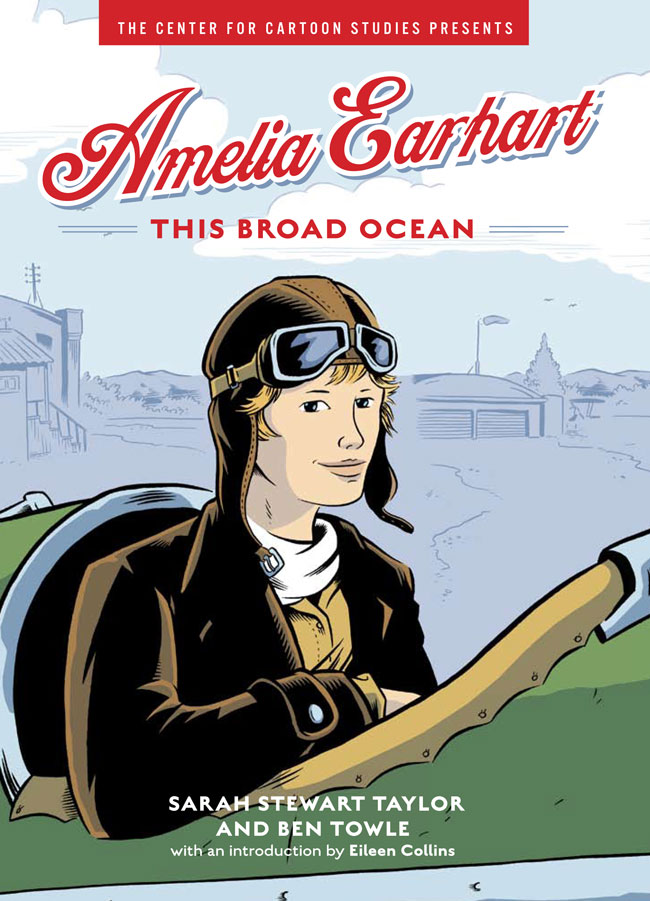
Here’s a pleasant surprise from last week: Amelia Earhart – This Broad Ocean was reviewed in the Sunday (3/14) New York Times books section–certainly the highest profile review any project I’ve worked on has received.

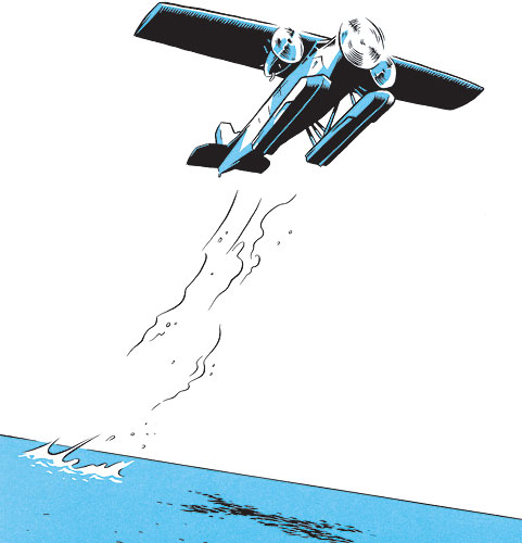
It’s very well written, even captivating at times, and Ben Towle’s black, white and blue art suggests the feeling of flight when it moves from panel-packed spreads to more open and expansive ones as the story, along with Amelia’s plane, takes off. The presentation — a sort of graphic-novel-style biography — is a breath of fresh air. ( read… )

The image above was included in the print edition as well.

Craft: Wide Awake Press FCBD 2010 Cover

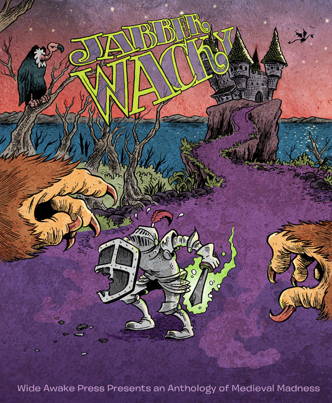
As they have for the last few years, the folks a Wide Awake Press are putting out a free dowloadable comic for Free Comic Book Day this year.  For last year’s issue, Ancient, I was–alas–only able to do a spot illustration.  This year, though, I was offered the cover, and of course snapped it up.  This year’s theme is things medieval and magical, and the title is “Jabberwacky.”  After a bit of back and forth with editor J. Chris Campbell, we decided on a basic Jabberwocky -derived image: a knight with a magical sword fending off some sort of giant beast.  For anyone what’s interested, here’s how the process went start to finish:

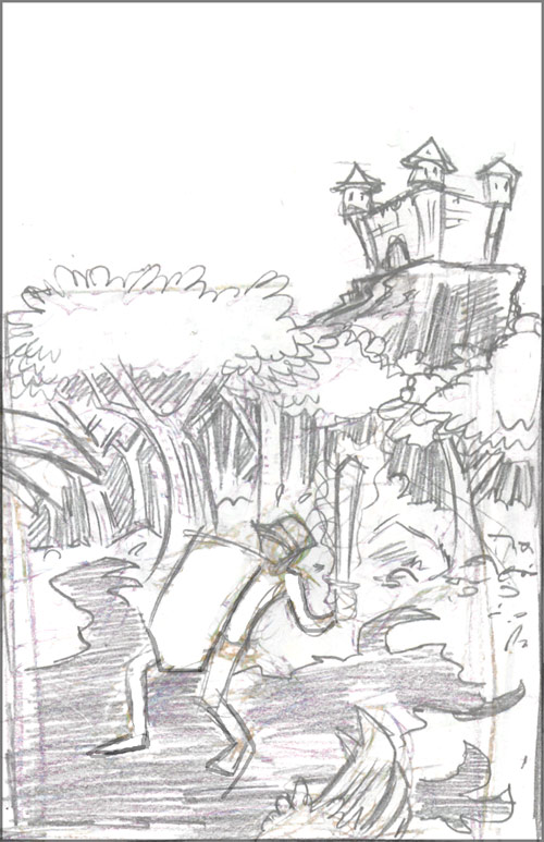
We’d decided to have the monster be out of the composition and maybe just suggested via shadows and/or a little bit of a claw, tail, or whatnot.  I think Chris had in mind that the knight would be running toward the viewer with the monster behind.  For whatever reason, I instinctively had him facing us with the viewer sort of “cast” as the monster.  Here are my initial thumbnails:

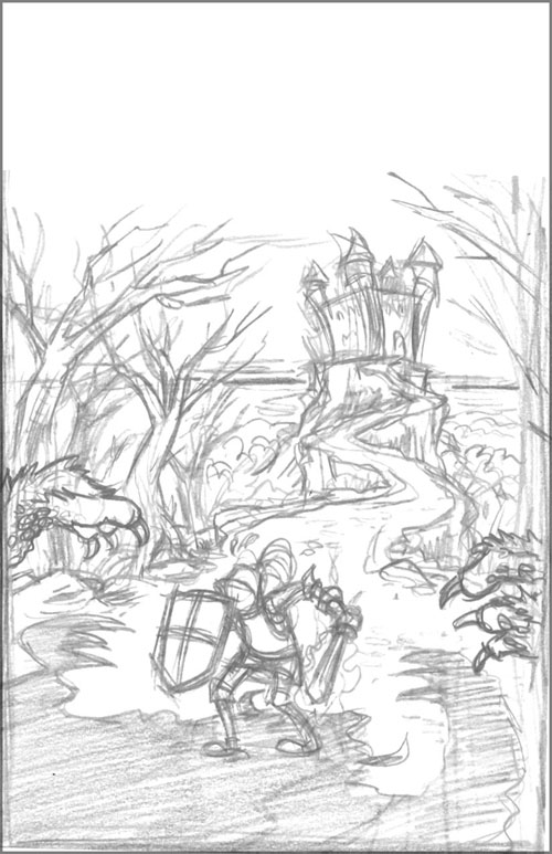
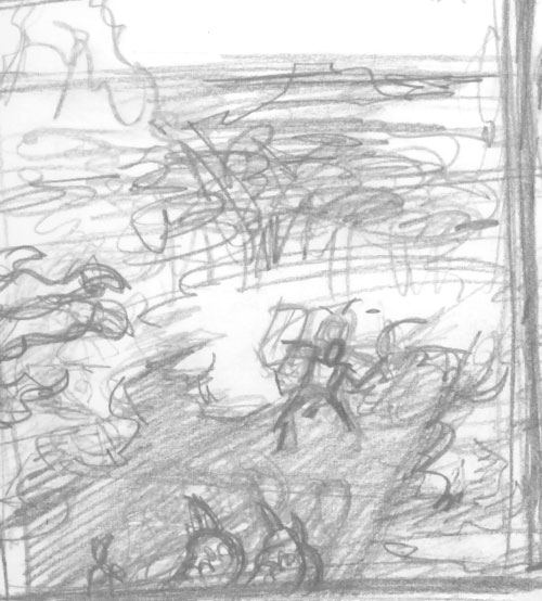
rough_01

rough_02

rough_03

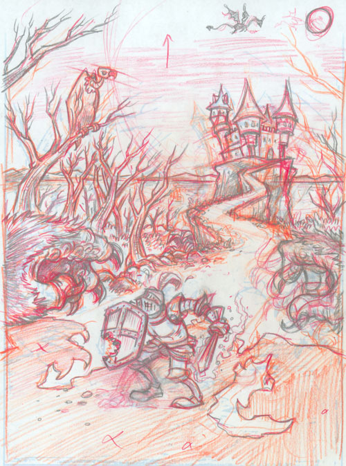
I liked the aerial view (#3), but I thought it made the figure too small and the creature appear too big–so I went with the middle rough above.  It seemed like a good compromise between the first rough which is ground level and framed pretty close to the figure, and that third aerial view.  As is my usual practice these days, I just scanned the rough, enlarged it, turned it all to a light blue, and printed it out to work on further.  I used orange, red, and finally a regular lead pencil to work over the image and tighten it up:

colored_p

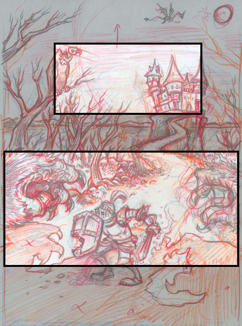
At this stage, though, the overall composition was bugging me.  I realized that the source of the problem was that the elements of the scene were forming two nearly-symmetrical  “layers” that were sort of stacked on top of one another in a visually uninteresting way.

colored_p_1

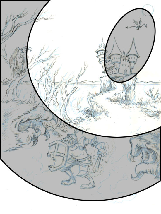
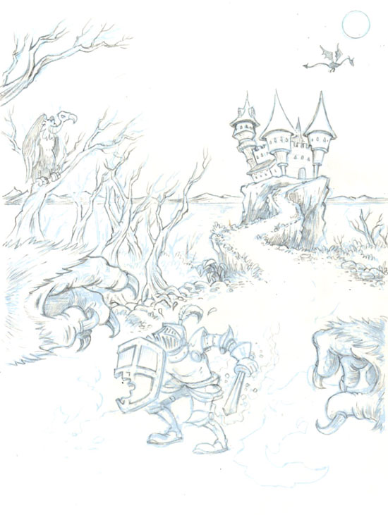
So, after scanning the image, I moved some things around in Photoshop to try to create a more interesting composition.  Once that was completed, I once again turned the whole thing to light blue and then did my final pencil drawing over that.  Here’s the pencil stage both with the compositional changes highlighted and without:

pencils_01

pencils_01a

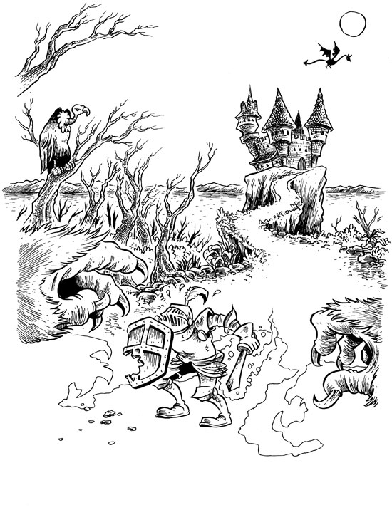
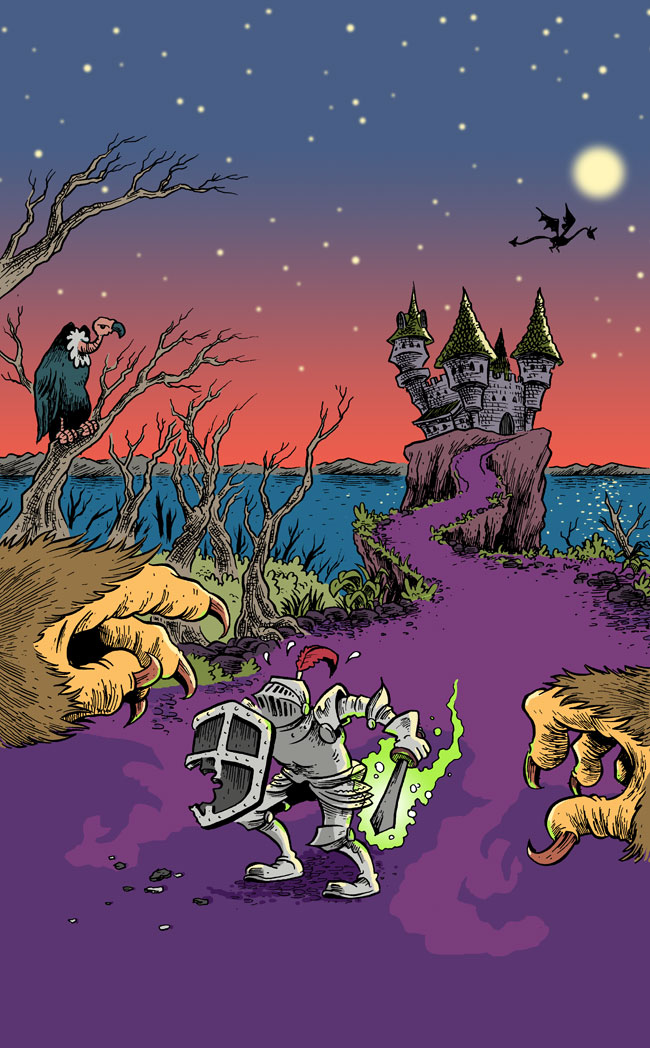
From this point onward, it was a fairly straight-ahead process.  I’d printed the final turned-blue image on two-ply bristol board that my printer only chokes on about 50% of the time, and then penciled on that.  I did the inking with various G-pen nibs, then scanned and colored in Photoshop:

inks_01

jabberwacky_final

At this point, though, the project moved from being solely mine to being one that involved…

wonderpets

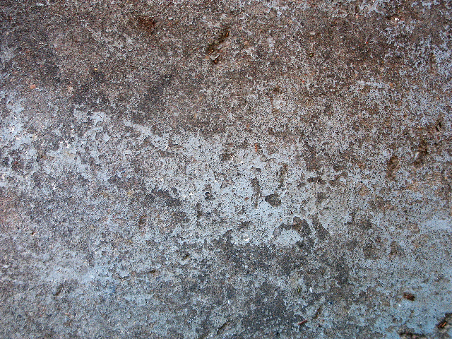
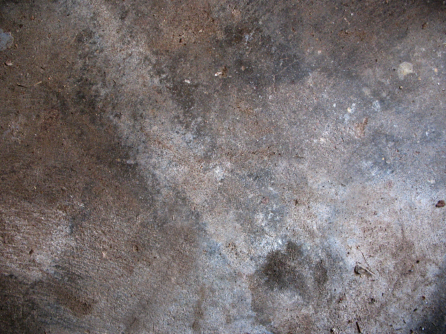
Teamwork!  So, off it went to J. Chris Campbell for a little tweaking.  He “texturized” things a bit, using these images for the ground and sky areas of the cover:

earth

stars

Then, finally, J. Chris added this fantastic hand-drawn lettering from fellow WAPpie,  Dustin Harbin.  Here’s the final cover for the Wide Awake Press Free Comic Book Day issue, “Jabberwacky“:

jabberwacky-cover

The original art for this is for sale here.

Amelia Press Roundup 3/8

amelia_jacket

When my last book, Midnight Sun, came out I made a point of posting links to all of the reviews it received.  I noticed eventually, though, that most of the more substantive reviews wound up getting links from ComicsReporter and/or Journalista, so I vowed that with whatever book I did next, I’d stop posting review links.  Curiously, though, with Amelia, a lot of the reviews so far don’t seem to be getting picked up by the comics news sites.  This is, I think, probably tied in somehow with Amelia being from a big, primarily prose publisher–rather than a dedicated comics and graphic novels house.  At some point I’m going to a post about the various differences between doing a book for a company like SLG vs. a big trade publisher.  There are certainly some interesting differences.  In the meantime, though, here’re a few appearances of Amelia-related stuff around the interwebs:

Sketchbook 2/19

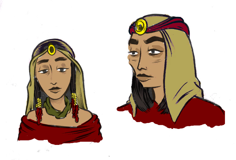
…And yet a few more Count of Monte Cristo sketches, this time of Haydee.  She’s a character who often gets cut, or at least diminished, in film/TV versions but I’d definitley find a way to keep her front and center if possible.  I’m not really happy with either of these designs, but you gotta start somewhere.

haydee