
I recently received an inquiry from a writer at the Daily Telegraph, asking me a few questions about Steve Ditko’s art style for an article he was working on–presumably to coincide with the release of the most recent Spider-Man movie. Why me? I’m guessing because this old post of mine on Ditko probably turned up in this writer’s Google searching.
Here’s what I was asked specifically:
“I was curious about just how starkly his art departed from the style of the time and had this weirdly intense quality – that was almost avant garde. So I wondered if you had any thoughts on his influence and impact on comics – Marvel never really tried to replicate that style, so far as I can tell.”
This is the kind of thing I love to think about so I (predictably) wound up writing a pretty lengthy and in-the-weeds response. Needless to say, given how ” inside baseball” most of it was, pretty much none of it got mentioned in the actual article when it came out. (It’s paywalled or I’d link to it here.) So, for what it’s worth, here’re my responses:
How starkly his art departed from the style of the time:
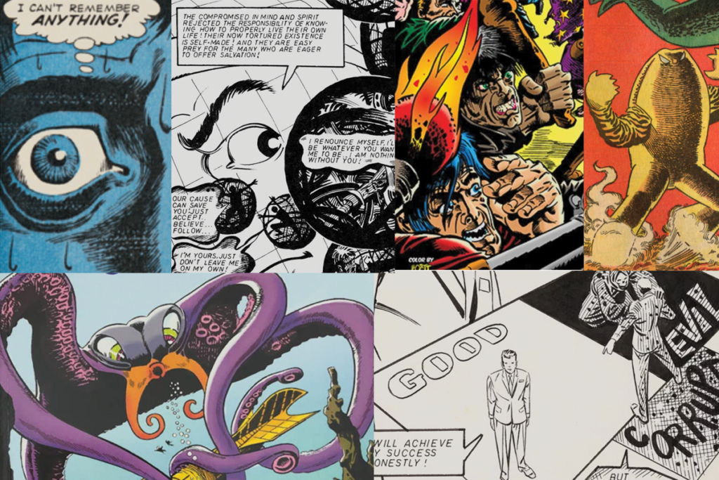
Ditko’s work really didn’t look like what was–even then–the general art style of other comic books. When you look at the Marvel books that were coming out contemporaneously with Ditko’s output (Spider-Man, Dr. Strange) his work stands in stark contrast. From a purely practical standpoint, there’s a simple explanation for this: there was apparently a Marvel-wide editorial edict that the early “bullpen” artists draw in a style that emulated the other foundational Marvel artist, Jack Kirby. But since Ditko’s initial Marvel book, Spider-Man, was obviously a huge success for the company, Stan Lee supposedly exempted Ditko from this edict; he was allowed to continue drawing in his own, idiosyncratic style. As they say, “if it ain’t broke, don’t fix it.”
That explanation, though, skirts the more interesting question, though: why was Ditko’s style so odd and unsettling to begin with? Ditko was famously interview-averse, so what follows is largely speculation, but I’d look first at his influences, and then at how those influences manifested themselves visually through Ditko’s moral compass.
Ditko’s childhood favorite artist–whom he later studied under at Cartoonists and Illustrators School–was Jerry Robinson, the (then uncredited) Batman artist who was responsible for creating The Joker, a character whose bizarre and unsettling design no doubt impacted young Steve Ditko.
(Mort Meskin)
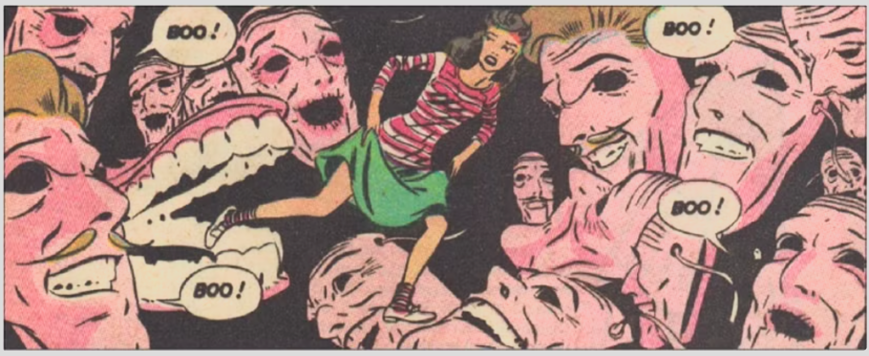
I’d posit, though, that the more visually impactful influence on Ditko’s mature style would be Mort Meskin, a cartoonist of the previous generation who Ditko worked with a decade or so before Marvel. You can see the direct Meskin influence throughout Ditko’s work: page/panel layout, the slight stiffness of all the characters, even the “floating head” composition that Ditko would frequently employ. Beyond those elements, though, Ditko seemed to get “stuck” style-wise in this chronological period of his artistic development. Ditko’s mise-en-scene seems to become trapped in amber during this period of working with Meskin: Ditko’s characters will forever be wearing tailored mid-50’s suits and fedoras, he’ll rarely draw a car that looks like it was built after about 1960.
(Chester Gould)
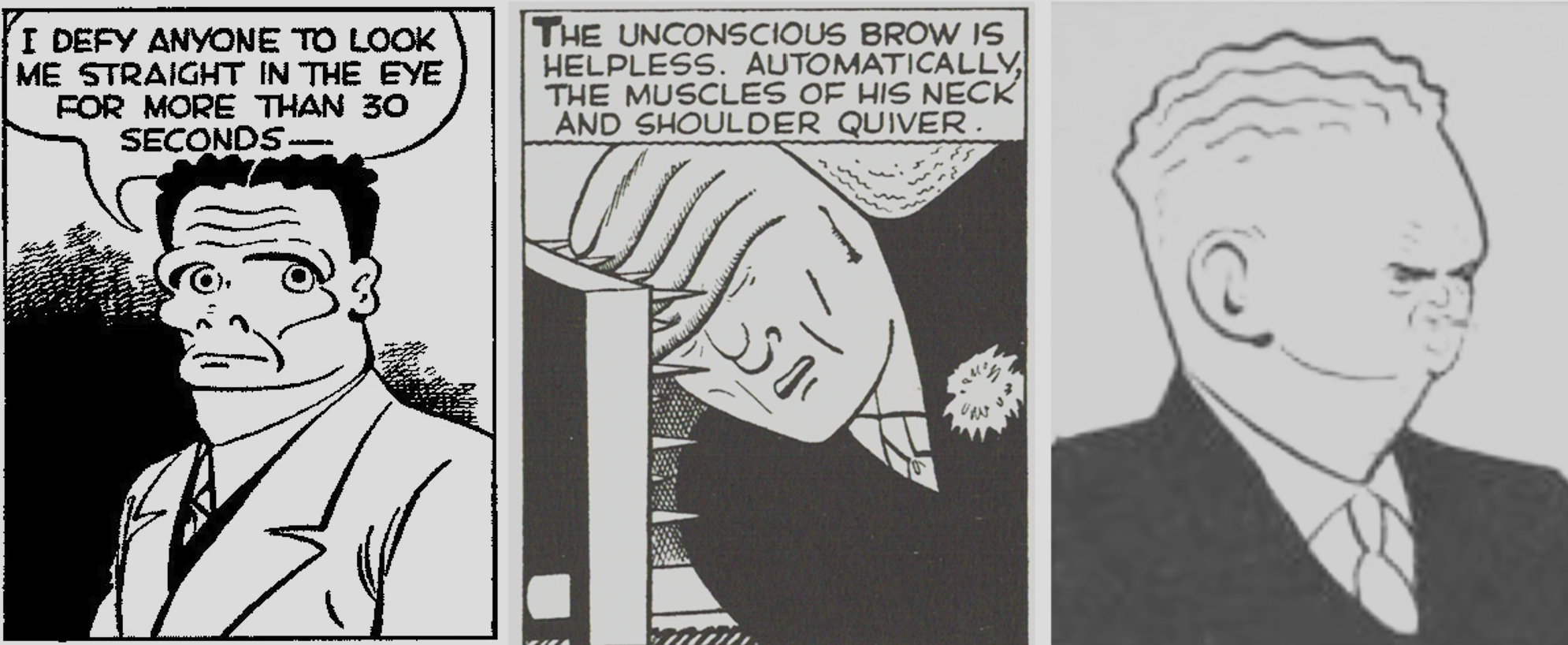
I also think some of the weirdness of his character designs originates from his deeply-held belief system, which famously later gives rise to his adoption of Ayn Rand’s objectivist philosophy. He’s someone who’s a moral absolutist–there are “ good guys” and “bad guys” and nothing in between. And I think you see this expressed visually in his art: the “good guys” look strong, virile, and wholesome. The “bad guys” are grotesque caricatures. Given the era Ditko grew up in and his obvious fixation in crime and criminality, I’d be surprised if he didn’t grow up reading Chester Gould’s Dick Tracy in the newspaper. Gould is known for his trademark grotesque, bizarrely caricatured villains like Flattop Jones and Prune Face. I don’t think it’s a stretch to suggest Ditko would later use this Dick Tracy-style visual grotesquery in his character designs– something that you really don’t see from his contemporaries at the time–to communicate his black-and-white moral sensibilities on the page.
(His art) had this weirdly intense quality – that was almost avant garde/ Thoughts on his influence and impact on comics:
Even with his 50’s an 60’s work there’s an unsettling oddness to his work. In his later years when he’s largely self-publishing, I’d say his art becomes truly, literally avant garde. He becomes obsessed with certain symbolic and diagramatic ways of drawing and begins obsessively employing patterns (stars/asterisks, parallel lines, question marks, etc.) in his work.
Even his early superhero work, though, manifests this unsettling peculiarity and is I’m sure why Ditko has many admirers but very few imitators among later superhero comics artists: his style is just too weird. The world of superhero comics post-60’s Marvel would follow the lead of his Marvel contemporary Jack Kirby, not Ditko.
(Charles Burns, Dan Clowes)
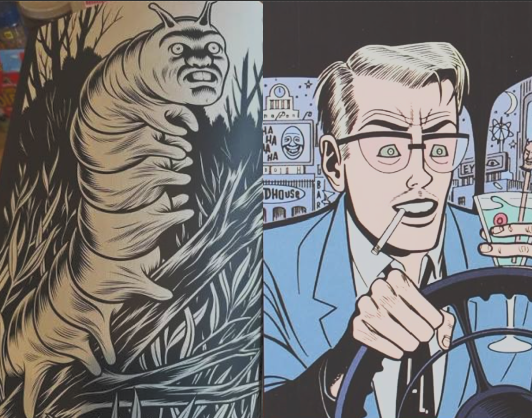
Conversely, though, that same odd, unsettling quality to his work is exactly why I think the principal area of comics where you see his visual influence is among cartoonists outside of the superhero genre. (The one exception that comes to mind is Michel Fiffe’s brilliant superhero pastiche, COPRA–although it’s notable that it was published and gained popularity well outside of the Marvel/DC publishing ecosystem.) Artists like Charles Burns and Daniel Clowes show far more of an overt Ditko influence than pretty much any superhero artist I can think of–Burns embracing Ditko’s grotesquery and heavy spot black inking, Clowes adopting Ditko’s slightly stiff, fedora-wearing, out-of-place mid-century everyman character designs.
Recent Comments