“Trenches” vs. “Tranchees” – A look at the Fantagraphics and Casterman Editions of Tardi

trenches_01

trenches_02

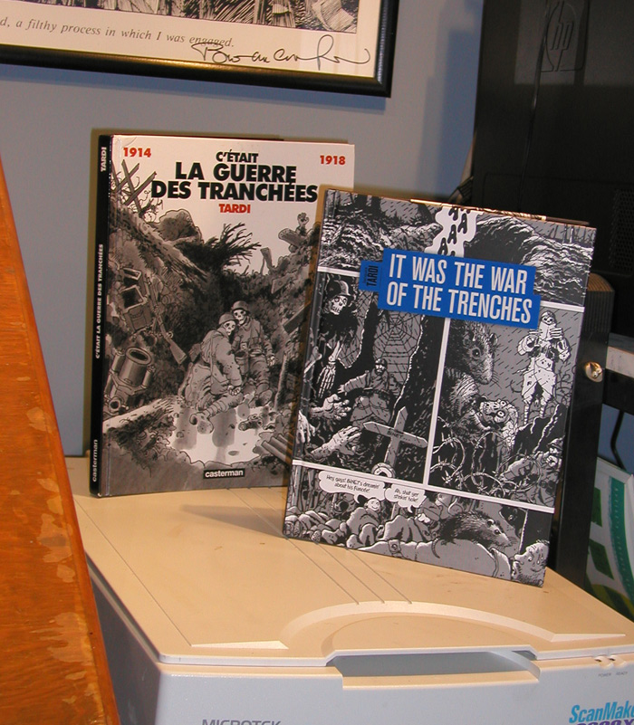
I had a big Jacques Tardi “phase” a while back–and in particular, I was really enamored of the bits and pieces of C’était la Guerre des Tranchées that had appeared in various anthologies up to that point. In fact, the “duotone” style of drawing that I’ve been using in most of my longer work (Farewell, Georgia, Midnight Sun, and Amelia Earhart – This Broad Ocean) is derived directly from my interest at the time in Tardi and the American strip cartoonist Roy Crane, who used duoshade board to get a gray tone effect much like Tardi’s.  So I was of course really excited to hear that Fantagraphics was doing a series of translated Tardi books, including C’était la Guerre des Tranchées–now titled It was the War of the Trenches.  I’ve had the French Casterman edition for a while, but I got my new Fantagraphics copy last week and just for fun I thought I’d take a look at the two side by side.

The first thing I noticed was the covers, of course.  I think on a purely aesthetic level, I prefer the Casterman cover, but after my grousing a week or two back about publishers not keeping their series designs consistent, I’m sure not going to complain about the cover; it looks fantastic next to the other books in the series to-date, West Coast Blues and You are There.

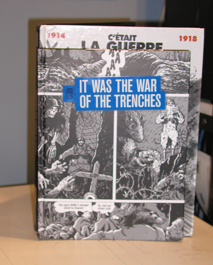
The trim size is somewhat smaller as well.   I’m sure there’s some reason for this that probably has to do with the retail book trade in Europe vs. in the U.S., but it’s a not a huge reduction in page size.   The French edition is 9 x 12 inches, whereas the Fanta edition is 8 1/4 by 10 3/4.  It’s slightly smaller, but thankfully not Gus and his Gang smaller.

Interestingly, the Fanta edition is printed on matte, rather than glossy, paper.  I generally prefer matte paper stocks to glossy stocks and this isn’t really a noticeable change here other than the blacks being a little less black, something that just comes with the turf when printing on matte paper as far as I can tell.

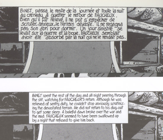
My French language skills are barely “caveman level,” so I can’t really make any comment on the translation (and also, I haven’t actually read it yet), but the Tardi font that they’ve made for the book looks fantastic.  Here’s a sample where you can see Tardi’s original hand lettering side-by-side with the font used for the Fanta edition.  You can also see the size difference between the two editions and even see a bit of the difference between the way the blacks appear in each.
text

The most curious difference between the two editions is their weight.  They’re presumably both the same length as far as page count goes, and they’re just about the same size, but the French edition seems like it weighs a ton compared to the Fanta edition.  I put them both on my postal scale and indeed the French edition weighs nearly a half pound more.  I guess maybe glossy paper weighs more per-sheet than uncoated matte paper? (You’d think the American would be the one overweight, haw haw haw!)

Anyway, this is a great-looking edition of this book and I’m really looking forward to reading it for the first time complete, in English, start to finish.  This Fantagraphics series is maybe the third–or even fourth–time that a U.S. publisher has tried to get Tardi’s work to “stick” with an American audience.  I hope they’re successful.

When Nerds Procreate

dollhouse

My in-laws were in town recently and very generously purchased a dollhouse for my daughter.  She, though, quickly decided that the “stock” dolls that came with the house needed to be augmented and some of her other toys–like Brobee and Muno here–took up residence in the house.  Even that was not sufficient, however, and she finally got into my own figurines.*  So what you see here is Cleetus the Slack-Jawed Yokel from The Simpsons apparently “taking a nap” with Bob Burden’s Flaming Carrot.  See folks, this is what you call a “slippery slope.”  First you get one ah’ them liberal “socialist”-types in the White House, and next thing you know it’s OK for two men–one of whom has a giant carrot for a head–to “nap” together in the same bed.

* No, they’re not dolls, goddammit!

Dear Publishers, Please Stop Doing This

I was trying to get my bookshelves more organized a few days ago but was having a hard time staying focused because this kind of stuff drives me nuts!  (OK, admittedly, I’m a little obsessive/compulsive for sure, but…)  I’m as glad as the next guy that comics are no longer available exclusively as saddle-stitched periodicals or shoddily put together trade paperbacks, but if you’re going to go for the “bookshelf crowd,” at least make sure your books look good on a shelf!

pilgrim

ARGGGH!  If you’re going to “revamp” the look of a series, at least let it finish out first.

usagi

See comment above.

tcj

What happened here?  Maybe since they got “The Comics Journal Library” the wrong color in volume two, they just said To Hell with it from there on out?

isaac

Seriously, it takes more effort to do this wrong (assuming you’re just modifying an existing InDesign template for each volume).  Bonus WTF points here: they switched from glossy to smooth paper for no apparent reason for Volume 2.

gon

I don’t want to seem like a total curmudgeon, so here’s how it’s done well. Q: Why is it that every Manga series looks great collected on your shelf?  A: Manga nerds post pictures of their bookshelves to message boards and they don’t put up with the foolishness on display above.

crogan

Another nice looking series.

Sketchbook 3/31

Up top here is a possible design for Mercedes from The Count of Monte Cristo project, and down below are two possible designs for a bartender in Oyster War.

sketchbook_033110

Interview at Sweet Union ‘Toonists

You can find a short Q&A/interview with me over at the Sweet Union ‘Toonists blog.  The blog is promoting the upcoming Union West Regional Library Mini-Con (Indian Trail, NC –  June 26-27) where I’ll be appearing along with folks like Al Bigley, Marcus Hamilton, and Chrissie Zullo.

Q: When did you first discover comics and why did you notice them?
A: I’m not sure I can isolate one particular instance where I first “discovered” comics; they were much more ubiquitous when I was younger then they are now and you’d see comics at drug stores, grocery stores, convenience stores, etc. Probably the first comic books I ever really read were the Marvel Star Wars tie-ins, from the mid 70s. Before then, though, I’d read various collections of newspaper strips–Little Orphan Annie, Rupert and Betty Boop are the ones I recall.  (read more…)

If you click through to the main page, you can find a great interview with Marcus Hamilton along with a ton of his non-Dennis the Menace artwork that I’d never seen before.