
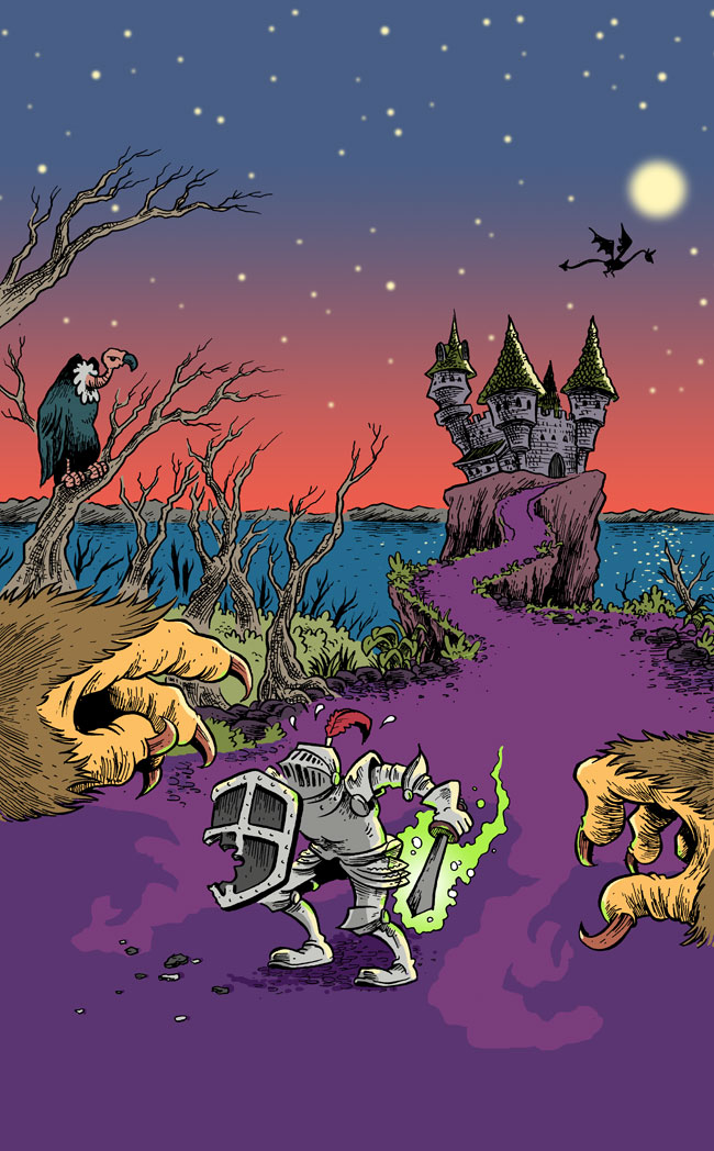
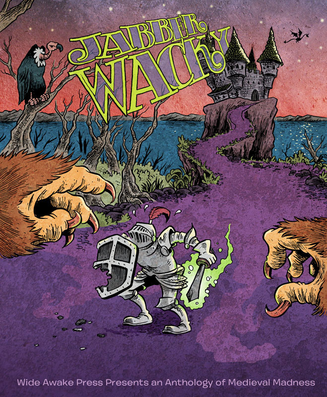
As they have for the last few years, the folks a Wide Awake Press are putting out a free dowloadable comic for Free Comic Book Day this year. For last year’s issue, Ancient, I was–alas–only able to do a spot illustration. This year, though, I was offered the cover, and of course snapped it up. This year’s theme is things medieval and magical, and the title is “Jabberwacky.” After a bit of back and forth with editor J. Chris Campbell, we decided on a basic Jabberwocky -derived image: a knight with a magical sword fending off some sort of giant beast. For anyone what’s interested, here’s how the process went start to finish:
We’d decided to have the monster be out of the composition and maybe just suggested via shadows and/or a little bit of a claw, tail, or whatnot. I think Chris had in mind that the knight would be running toward the viewer with the monster behind. For whatever reason, I instinctively had him facing us with the viewer sort of “cast” as the monster. Here are my initial thumbnails:
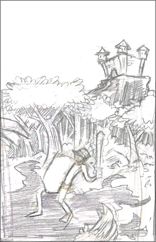
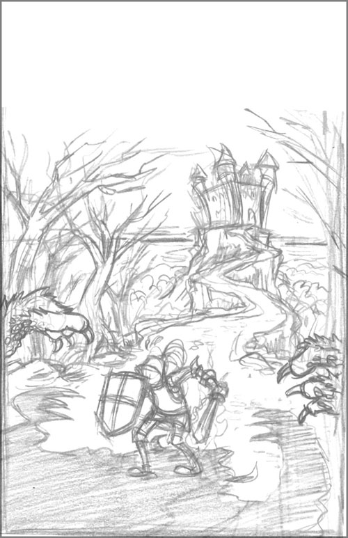
I liked the aerial view (#3), but I thought it made the figure too small and the creature appear too big–so I went with the middle rough above. It seemed like a good compromise between the first rough which is ground level and framed pretty close to the figure, and that third aerial view. As is my usual practice these days, I just scanned the rough, enlarged it, turned it all to a light blue, and printed it out to work on further. I used orange, red, and finally a regular lead pencil to work over the image and tighten it up:
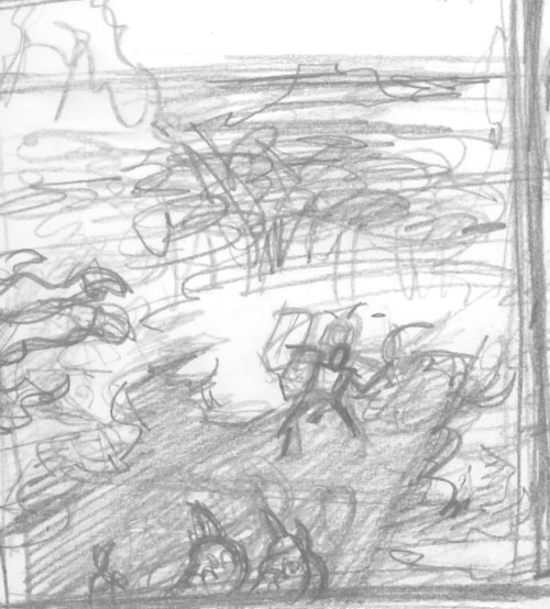
At this stage, though, the overall composition was bugging me. I realized that the source of the problem was that the elements of the scene were forming two nearly-symmetrical “layers” that were sort of stacked on top of one another in a visually uninteresting way.
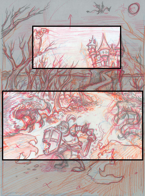
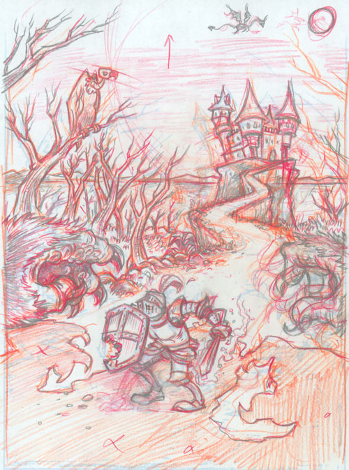
So, after scanning the image, I moved some things around in Photoshop to try to create a more interesting composition. Once that was completed, I once again turned the whole thing to light blue and then did my final pencil drawing over that. Here’s the pencil stage both with the compositional changes highlighted and without:
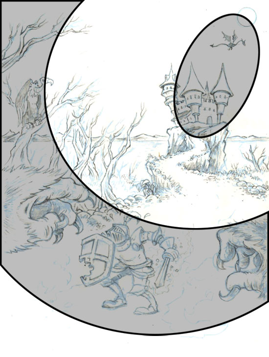
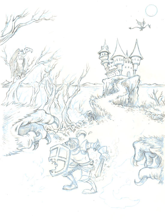
From this point onward, it was a fairly straight-ahead process. I’d printed the final turned-blue image on two-ply bristol board that my printer only chokes on about 50% of the time, and then penciled on that. I did the inking with various G-pen nibs, then scanned and colored in Photoshop:
At this point, though, the project moved from being solely mine to being one that involved…
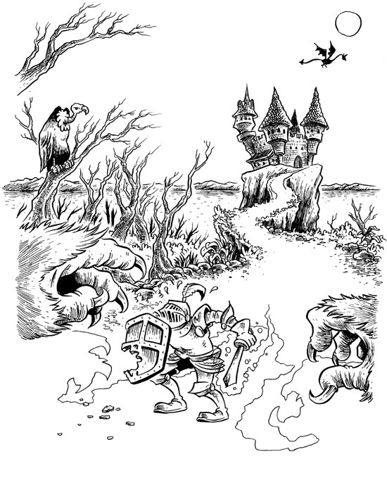
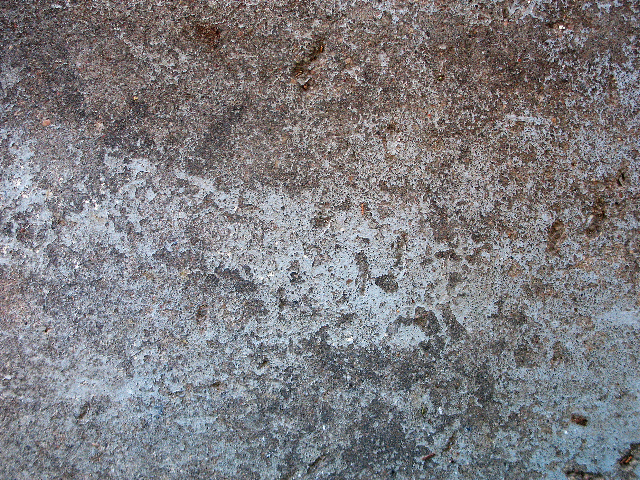
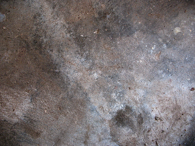
Teamwork! So, off it went to J. Chris Campbell for a little tweaking. He “texturized” things a bit, using these images for the ground and sky areas of the cover:
Then, finally, J. Chris added this fantastic hand-drawn lettering from fellow WAPpie, Dustin Harbin. Here’s the final cover for the Wide Awake Press Free Comic Book Day issue, “Jabberwacky“:
![]() The original art for this is for sale here.
The original art for this is for sale here.
7 comments
1 ping
Skip to comment form
So are you the turtle, the hamster, or the duckling?
Author
Get with the program, Jordan: “the turtle” = Tuck, “the hamster” = Linny, “the duckling” = Ming Ming
I was completely unfamiliar with the Wonderpets until now. So, Dustin is MingMing, you’re Tuck and J. Chris is Linny?
Author
I can live with that, yes.
What a beautiful piece, turtle or no.
Great post.. why use the red and orange pencils though?
Author
@Andrew – I use blue, then orange, then red, then “regular” pencils when I draw so that I can progressively build up and refine the image on the page. It’s similar in purpose to the way some cartoonists work in multiple layers of tracing paper.
Assuming that I’ve got an image I’m happy with by the time I get to working in a regular lead pencil, I can pull the blue orange and red out of the image with Photoshop, turn the lead pencil into a light blue, and then print out and ink over that. You can see a more thorough progression of how this works in some of my COUNT OF MONTE CRISTO posts (scroll down and read them in chronological order):
https://www.benzilla.com/?tag=count-of-monte-cristo
[…] While you’re eagerly waiting to read it, you can check out Ben Towle’s explanation of how he created the awesome cover (which you can feast your eyes upon at […]