Roy Crane: Forever the “Cartoonists’ Cartoonist”?

A few weeks ago I was listening to author/comics historian Glenn Fleishman discussing his new (and amazing) book on the history of comics printing technology, How Comics Were Made, on the podcast Blockhead, and heard this exchange about the use of Craftint:

(at 43:45)

Geoff: I’m just wondering about Roy Crane.. I was actually surprised you didn’t mention Roy Crane.

Glenn: Tell me about Roy Crane…

What caught my ear about this exchange is how, whenever the topic of Craftint comes up, cartoonists–particularly cartoonists of the craft/process-obsessed variety–will immediately bring up Roy Crane… and yet in most contexts other than this, Roy Crane seems to be treated more as a footnote in comics history.

Compared to the voluminous writing about his peers and contemporaries like Milt Caniff, Alex Raymond, Noel Sickles, or even Frank Robbins, there’s relatively little writing about Crane–and much of the writing that does exist is distributed scattershot online in various articles in the comics press, personal blogs, etc. So, one might ask:

Why isn’t Crane better-known and more often discussed?

I’ll posit a few theories:

Genre: neither fish nor fowl – Crane’s most important strip, Wash Tubbs/Captain Easy, ran during some of the most formative years of early 20th century newspaper comics’ development, beginning in 1924 and ending in 1949. The whole art form was formally in flux at the time–finding its feet as far as drawing style, genre, etc. went–and Wash Tubbs was no exception.

At the beginning, the strip was a goofy, largely gag-a-day affair staring the titular character, Wash Tubbs. As the strip ran, though, it slowly morphed into what would become known as an “adventure strip” (Crane is an important figure for this alone–he established the blueprint for this entire genre of comic), with the character Captain Easy–introduced as a secondary character–eventually taking over the strip, getting his own Captain Easy, Soldier of Fortune full-page Sunday strip, and sidelining Washington Tubbs who all but disappeared by the time Crane handed the strip over to his assistant Leslie Turner in 1943.

Art: also neither fish nor fowl – Not only does the genre of Wash Tubbs/Captain Easy fluctuate during its run, but Crane’s drawing style changes as well–and changes in a way that’s often not as straightforward as the strip’s measured drift from gag-a-day to adventure. The early strips are very much of the “big foot” cartooning style that was omnipresent in the 1920’s when the strip began. As the strip moves towards more of an action/adventure angle the cartooning and character designs start to change to reflect this… but the transition is never fully complete nor completely linear. Often you’ll see realistically-drawn characters that would feel at home visually in something like Terry and the Pirates interacting with a goofy, cartoony horse that’s straight out of E.C. Segar’s Thimble Theater. This is one of the things I personally love about the strip: it’s a work that was being made while the visual language of popular comics was very much in flux–the art form was still finding its feet as Crane was crafting the strip.

It’s never been reprinted well – This is the big one, in my opinion. As per the very beginning of this post, what Crane is known for visually as a cartoonist is his mastery of Craftint technique–which he employed only for the daily (not Sunday) strips and only after about 1937. This run of Crane’s work has never been reprinted in a way that showcases his incredible–and to this day unmatched–skill with Craftint.

There have been efforts to reprint his work. Most recently, Fantagraphics did a “best of” collection called, Hurricane Isle and Other Adventures: The Best of Captain Easy and Wash Tubbs. While beautifully produced, the latest story included is from 1932, well before Crane was employing Craftint. The equally beautiful Captain Easy Fantagraphics collections are must-buys, but are obviously the Sunday strips–which also didn’t utilize Craftint.

Prior to that, in the late 1980’s NBM’s Flying Buttress Classics Library did an 18-volume complete reprinting of the dailies. Unfortunately, these are long out of print and extremely expensive (if you can even find them). More to the point re. Craftint, though, they’re printed at about 75% of their original size and the print quality–while good for the time–is pretty iffy in a lot of spots and really doesn’t adequately showcase Crane’s craft.

Here’s a “best case scenario” showing a 1941 panel scanned from an original newspaper clipping (L) vs. the NBM reprint (R):

The NBM books were presumably sourced from newspaper clippings (Bill Blackbeard was the series editor), but as you can see here, some sort of 80’s-era contrast/threshold-type manipulation–or perhaps the reproduction/photostat process itself–has increased the richness of the solid blacks at the expense of the Craftint effects.

And, to make matters worse, the quality varies widely, with much of the work looking more like this:

Unfortunately, a new version of the full run of the strip is unlikely. The appeal is just to selective at this point (not to mention the ubiquitous-for-the-era racial visual stereotyping of Asian characters scattered throughout).

On Craftint

You can find tons of information online about what Craftint is (was?), but in reference to Roy Crane in particular, here’re some specifics of what this tool/technique is and why Crane is still the go-to example of what can be achieved with it.

Crane’s embrace of Craftint had a marked change on the quality of his cartooning, particularly in his ability to set up images with a distinct foreground, midground, and background–and specifically, his use of Craftint to emulate atmospheric perspective.

Backing up slightly, here’s a good close-up example of a Crane original utilizing standard black India ink in conjunction with the two hatching patterns created by Craftint:

(A) here shows use of single line hatching and (B) shows the addition of a second set of parallel hatching lines at 90 degrees from the first. These patterns emerge via the application of two different fluids to the Craftint board.

The Crane image of the plane above shows a fairly standard use of Craftint that numerous artists employed, as seen here in these Angelo Torres panels from MAD Magazine:

Here, the artist has drawn what’s essentially a complete image for each panel in India ink, then afterwards has used the Craftitnt effects to indicate local color/value (as with the sky and road in the first panel and the clothing and motorcycle parts, etc. in the second) and suggest a light source (the right side of the diner entrance in the first panel and the right side of the truck in the second).

The addition of Craftint is an aesthetic improvement over just a black and white image–and it helps define objects, indicate light source, and indicate local color. That said, these images would also function as complete illustrative images without the addition of the Craftint. Crane sometimes–particularly with “talking head” panels–used Craftint in this fairly straightforward manner, as below, and similar to the Torres images above, the later Craftint-era panels have a more polished look to them than just black and white line art of the pre-Craftint Crane panels:

As with the Torres panels, though, the Crane panels on the right are complete black and white images even without the addition of Craftint–and would function with or without it. The Craftint here is simply an aesthetic addition.

Where Crane’s use of Craftint becomes truly remarkable, though, is when he employs it as an integral part of the illustration–usually as a way to establish environments with distinct foreground/midground/background elements via emulating atmospheric perspective. Here’s that stunning example from a few paragraphs back, but a bit larger:

Notice how Crane’s using black linework and spot blacks for the foreground elements (house, fence, trees, figures, curb) but using solely Caftint for the midground houses and the sky behind them–single hatching pattern for the latter/crosshatch pattern for the former. Unlike the former examples of Craftint, in this Crane panel–and in his best Craftint work–the Craftint effect is integral to the image: remove the Craftint effect and you lose visual information. The background would disappear entirely without the Craftint.

Here’s another striking example of Crane using the same technique, but in this case also perhaps suggesting fog:

As seen in panel three of the strip at the very top of this post, Crane would often employ just a spot black silhouette as a foreground and a single pass of Craftint as a background, a Toth-like paring down of an image to its most elegant components. Here’s another such example:

Crane would also exploit the painterly aspect of Craftint. Unlike the more commonly-seen Zip-a-Tone/screen-tone, in which a dot pattern is printed on an adhesive sheet that’s then cut out with a razor and applied to paper, the two Craftint patterns appear via an activating fluid that’s applied with a brush–hence, the ability to get paint-like effects from it. Here’s a beautiful example with the two Craftint patterns creating the reflections in the water:

Roy Crane created a detailed “scrapbook” called How to Draw Buz Sawyer (his later newspaper strip) that had an extensive section on his Craftint technique. Unfortunately, the only way to get a complete copy of this scrapbook is to request a copy in person from the Syracuse University Manuscript Collection, where he donated his effects, including letters, the scrapbook, etc. You can, though, see excerpts from it over at Mike Lynch’s blog.

More reading on Roy Crane?

As mentioned, there’s unfortunately not a wealth of easily attainable information out there about Crane. Here, though, are a few resources.

Comics Stuff of Note in 2024–and What I Read

So, clearly my New Year’s resolution for 2025 should be to post more, as I’ve only done two other posts since my “What I Read in 2024” write-up. That said, I’ll try to make this year’s round-up a little more robust and less of just a list than last year’s–although I will, if for no other reason than my own internet record keeping, list anything I read this year but didn’t comment on explicitly at the very end of this post

Creating Copra –  Michel Fiffe

With COPRA wrapping up in 2025, it seems appropriate that in 2024 Fiffe put together this amazing history of COPRA/self-publishing how-to book. It’s one of my favorite books of 2025 for sure. I wish the art school where I teach would issue one of these to every incoming Comics student and require them to read it. It’s not just a great how-to on  nuts and bolts things like page & panel layout, production, etc.–it also digs into the financial minutiae of self-publishing vs. working with a publisher, and other practical concerns. And, as one would guess given how beautifully put-together COPRA is, it’s a beautiful book production-wise.  I think the only way you can get one of these is via Fiffe’s Etsy shop, but there still seem to be copies available.

Comics Swipes – ed. Phillipe Capart

I can’t remember how I got wind of this great little book (and I do mean little–it’s about 3 x 2.5 inches) but it was one of my favorite purchases of 2024. It is exactly what it purports to be: each spread in the book shows two images–one is the source, the second is a panel from a comic that’s the swipe. Unfortunately it looks like it’s sold out. Happy hunting!

Comics Exhibits!

2024 was an absolutely banner year for exhibits of original comics art. My three favorites among those that Rebecca and I saw, in roughly chronological order:

Moto Hagio at Angoulême

I did a whole post about this one, which you can find here, but needless to say, this was an absolutely stunning show.  As little as five or six years ago, it was incredibly rare to see shows of original manga pages in the west, but with the continued fervor for manga in France, the Angoulême festival has really taken up the reins here and run with it. Every year I’ve been (and including the upcoming 2025 show) there’ve been at least two huge shows of manga originals–what a delight. 

Joann Sfar at the Musée d’Art et d’Histoire du judaïsme

Winter 2024 in France was truly a abundance of riches exhibits-wise. On the way back from Angoulême, we spent a day in Paris and there were literally more exhibits than we could get to. Ultimately we wound up passing on a Posy Simmonds exhibit (although there will be a Simmonds show at Angoulême in 2025!) in order to get to the big Joann Sfar show–and it did not disappoint. The show was on three floors, if I’m remembering correctly, and was a career-spanning retrospective. I’m partial to Sfar’s work on Donjon and thankfully there were tons of pieces from that on display–including several drawn by Christophe Blain, one of my absolute favorite working cartoonists. Sfar’s color work is often traditional watercolor directly on the page, which afforded a rare opportunity to see a lot of color at an exhibit of comics originals!

Comics 1964 – 2024 at the Centre Pompidou

I’ve been to tons of comics exhibits–here in the U.S., Canada, multiple shows in France, in Japan, etc.–and I’ve never seen anything like this tour de force at the Pompidou this summer. It’s notable obviously for its scale (all five floors had comics stuff on them) and scope (including comics from the U.S., Canada, Europe, the UK, and Japan). Just as laudable to me, though, was that this was a show of comics art at one of the world’s most respected museums and there was a notable absence of any sort of introductory verbiage explaining or justifying why they were doing a major show of comics art.  Just as you’d not need to supply any explanation for why you’re exhibiting impressionist oil paintings, the curators here simply took it for granted that comics is an important art form. As Dan Nadel noted in his write-up of the exhibit in ArtForum:

“The exhibition was successful in part thanks to what it didn’t do: no toys, costumes, or figurines; no Pop art; no content warnings for the often difficult images; no ‘this is what a comic is’ didactic material. There were no apologies in this show, and no equivocations. The curators trusted that the public had enough experience with comics that they could simply present the material for viewing.”

There’s a beautiful catalog (French and English versions)… but you can also see some of the pictures I took on my ever-expanding thread on the show over at Bluesky.

Jim Curious and the Jungle Journey by Matthias Picard 

This is, I believe, the third in the Jim Curious series–and this installment is just as fun and visually stunning as the previous two.  These are beautiful, wordless, 3-D comics that are I assume intended for kids, but they’re absolutely enjoyable for grown-ups–mostly because of the gobsmackingly beautiful art and well-done 3-D effects. The general conceit of each story visually is that the first few introductory pages are “normal,” but once the titular Jim enters some new world (the sea, the ocean, etc.) the pages become 3-D. Unlike a lot of 3-D comics, the art and imagery here are designed with 3-D in mind and with the 3-D as an essential part of the narrative. My favorite 3-D comics, second only to the O.G. Mighty Mouse Three Dimension Comics–so glad to see a new installment this year. 

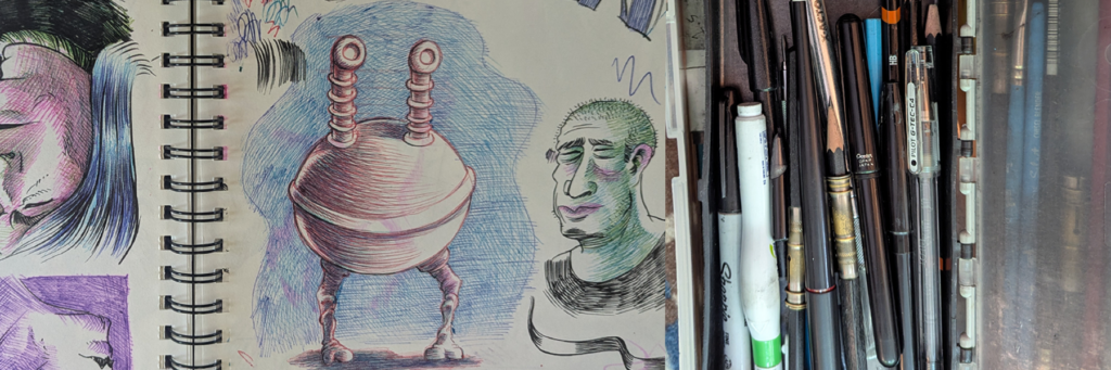
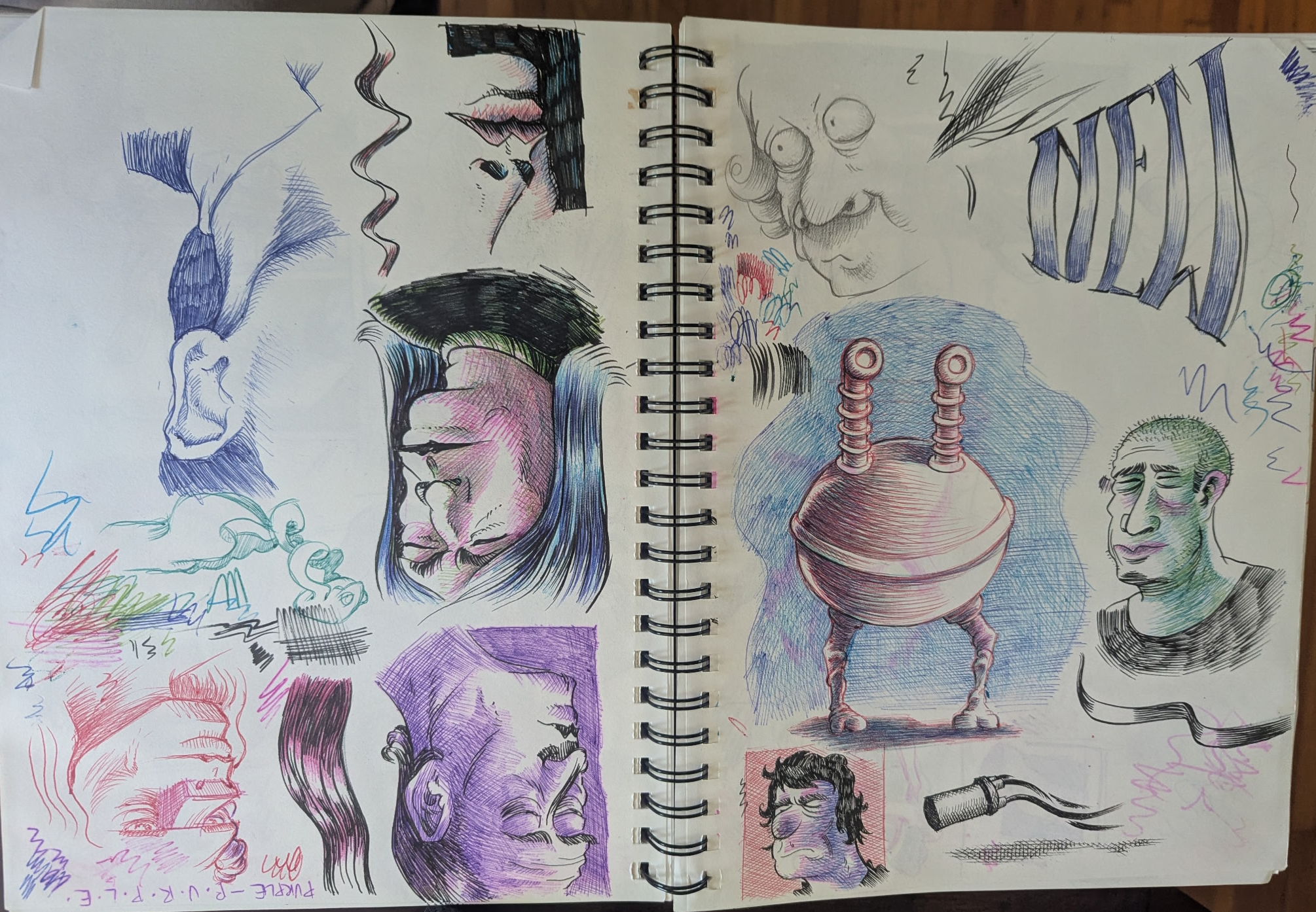
R.I.P. Bic Velocity Color Ballpoint Pens

And now some sad news from 2024: Bic has apparently discontinued the color versions of my absolute favorite ballpoint pens for drawing. I started messing around with ballpoint pens for drawing four or five years ago and intially would pick up pretty much any variety of them I happened upon and throw them into my art box to try out. (You can see some of my sketchbook goofing around with ballpoint over at my Instagram page.) Over the years I honed down my toolkit to what I thought were the very best pens–and hands down my favorites are the Bic Velocity color pens. Sadly, it looks like as of 2024 Bic is no longer making the Velocity pens in any colors other than black and blue–the traditional colors for writing–which seems like a baffling decision since the creamy, blendable ink in these pens that make them amazing for drawing must make them terrible for actual writing.  RIP Bic Velocity. (P.S. don’t be fooled by the Bic “gel-ocity”line of gel pens. They are, obviously, gel pens, not ballpoints.)

Antsy & Sucko by Tim Fuller

I’m a sucker for the ol’ “comics with the original dialog replaced” gag  (my all time fave is Truer than True Romance… a classic of the genre) and this one is a hilariously solid example. Based, obviously, on mid-century Nancy and Nancy and Sluggo comic book stories,  Antsy & Sucko capitalizes on the inherent absurdity of the setups and visuals of the originals and plays them up further for laughs. The production is nicely done as well–the paper patina, off-register printing, etc. is all preserved and the new lettering blends in perfectly. I picked our copies up directly from the creator at SPACE here in Columbus but you can get either a digital or hard copy here

When We Were Trekkies 1-10 – Joe Sikoryak

Another absolute favorite read for me in 2024 is this charming biographical coming-of-age comics series about the early days of Star Trek fandom. This was an easy sell for me, given that I’m a huge Star Trek fan and also someone who’s just generally interested in fandom–particularly pre-internet fandom. So I of course loved reading all the stories about day tripping in to NYC to various costume shops for cosplay supplies, attending early SF conventions, etc.  I’ve read a ton of prose books about early Trek fandom, but there’s something wonderful about reading a first-hand account–and one that’s a comic! These read best as a single, complete story–and it looks like you can now get them as a complete box set via Birdcage Bottom Books.

Leroy Automatic Lettering Machine

I don’t remember how I even became aware that this thing ever existed, but it was a few years ago–and when I did, I immediately set up an Ebay alert for one. Cut to years later in 2024 and I finally got a hit! Needless to say, I bought it. Most comics people are aware of the 50’s-era Leroy lettering set (I have one of those too), the hand-operated mechanical lettering system that created the odd but distinctive lettering seen most notably in E.C. comics and early Wonder Woman comics. This, though, is a 1980’s version that has a digital interface/keyboard and an automated “scriber” that does the lettering. I assume these things promptly disappeared as “desktop publishing” was becoming a thing by this point, thus rendering things like the Leroy Automatic Lettering Machine obsolete. You can see it in action in this old Twitter post of mine.

Pentel Fude Touch Brush Sign Pen

I was given one of these pens for my birthday last year and it’s become new new favorite sketchbook drawing tool. I’ve never tried the colored ones, but the black pen is amazing. Feel-wise it’s sort of halfway between a “dead line” felt-tip tech pen like a Micron and a full brush pen like the Pentel Pocket Brush Pen.  It has a small protruding conical nib that produces just enough line weight variation to give your line-work a bit of life… but without necessitating the sort of conscious attention to hand pressure modulation that a full brush pen requires. Nab one at JetPens

1986 – Jim Rugg

Another SPX pickup.  This is a beautifully put-together magazine-size zine focused on everything going on in comics in the year 1986… which, as it turns out, is a stunning amount of stuff: Watchmen, MAUS, early translated manga, TMNT and associated riffs/parodies, the ascendance of Frank Miller, “graphic novels” starting to be a thing, etc. The zine is assembled entirely of press clippings, bits of articles, reviews, editorials, catalog listings, and other source material from the era. Get one now while you still can here.

Charlotte mensuel #1 – 3 ed. Vincent Bernière

I’ve really been digging this new French monthly comics magazine. It features a good mix of translated American, manga, and French comics–mostly serialized ongoing stories. The big draw as far as American stuff goes is the Chris Ware story, The Last Saturday, that was serialized online by The Guardian in 2014, but which has never been printed in physical form until now. More generally, though, Charlotte Mensuel is yet another example of a format that I love, yet seems for some reason to only be viable in places other than the U.S. : the anthology of serialized comics. There’s 2000 AD Weekly, Judge Dredd Weekly, Shonen Jump, Shoujo Beat, etc. I’m not sure why this format historically seems unable to fly here in the U.S. The complaint I usually hear is, “I don’t want to pay for something if I don’t like all the stories,” but that’s the whole point of the format: to be able to try out a bunch of things and find a few you like. Of the 20-ish ongoing stories in Charlotte, I’m regularly reading maybe 30% of them–which is fine! Anyway, even with international shipping, subscriptions aren’t too bad price-wise

John Stanley: The Final Pencil Scripts from Marge’s Little Lulu #197 (1970) – ed. Tom Devlin

I got wind of this via Tom Devlin’s IG and grabbed one immediately from the D&Q booth at CXC. This is a zine that reproduces in full an entire “pencil script” (basically at-size lettered thumbnails) for a previously little-known very late career John Stanley Little Lulu story. It had been generally accepted that Stanley’s last Little Lulu issue was #135 from 1959, but apparently–and for reasons no one really knows–he did this one-off script for #197. I loved seeing this not just because I’m a huge Little Lulu/John Stanley fan, but also because I love seeing any kind of comics behind-the-scenes process. I also generally force my comics students to do a “dummy” of their stories exactly like this, so I also selfishly enjoyed seeing that this is the method one of my comics heroes used for his work! I don’t think there’s a way to get one of these other than from Tom.

Short Notes:

Marvel Artist Select Series: Fantastic Four by John Byrne – As with all these IDW collections, the production here is gorgeous. The selection of material in this, though, was absolutely baffling. I couldn’t have come up with a more random list of issues from this run with one of those Powerball things.

Doctor Moebius and Mister Gir by Numa Sadoul, Jean Giraud/Moebius – I’d been waiting for this oft-delayed book through the whole pandemic and it finally arrived! It’s a fascinating look at the artist as a person/personality. I was, though left wishing there’d been more nuts-and-bolts craft talk.

Asadora vol 7 by Naoki Urasawa – This continues to be my favorite ongoing manga. It’s baffling to me that Urasawa, easily one of the absolute best working cartoonists today, has an ongoing (excellent) series and you hear so little talk of it in comics circles.

Batman: The Court of Owls Saga by Scott Snyder & Greg Capullo – I read this in the new “DC Compact Comics” format. I generally love the smaller manga-ish size of this line–and getting a complete story for around $10! The already kinda-murky color, though, didn’t appear to be adjusted pre-press for uncoated newsprint stock and was very muddy in places. Hoping they’ll change this in future installments of the line.

Sal vol. 1 by E.B. Sciales – This mini of short stories and gag panels about a tiny artist was my favorite pickup at SPX this year. It’s charming, funny, and beautifully-drawn in a sort of classic mid-century cartooning style. 

Daniel Clowes Across the Street by Daniel Clowes – I got wind of this little book via Cartoonist Kayfabe (RIP Ed, you’re missed). It’s a gallery catalog from the recent Clowes exhibit in Paris and it’s a beautiful little volume filled with Clowes’s colored pencil preliminary drawings, a beautiful foldout of an original cover, etc. 

The Follies of Richard Wadsworth by Nick Maandag – Speaking of Clowes… when he was here in Columbus for CXC he mentioned that Nick Maandag was one of his favorite cartoonists, so I of course went to his table and bought a bunch of his books. This book is absolutely laugh-out-loud hilarious. 

Other Stuff I Read in 2024:

Anatomy of Comics – Damien Macdonald
Copra Master Collection Book One – Michel Fiffe
Suddenly One Summer Camp from Hell #1 – by Shelly Bond & Liz Prince
Dreamland Japan: Writings on Modern Manga – Frederik L. Schodt
Pizza, Pickles, and Apple Pie: The Stories Behind the Foods We Love – David Rickert
The Translator Without Talent – Ryan Holmberg
Osamu Tezuka: Anime & Manga Character Sketchbook – Haruji Mori/Osamu Tezuka
Watership Down: The Graphic Novel – Richard Adams, James Sturm, and Joe Sutphin
The Cartoonists, God Bless ‘Em – Summer Pierre
Blessed Be – Rick Altergott
See You at San Diego: An Oral History of Comic-Con, Fandom, and the Triumph of Geek Culture – Mathew Klickstein
Ain’t It Fun: Peter Laughner & Proto-Punk in the Secret City – Aaron Lange
Leo (FR) – Moto Hagio
Paul Bunyan: The Invention of an American Legend – Noah Van Sciver
Night Stories: Folktales from Latin America – Liniers
Jones et autres rêves (FR) – Franco Matticchio
The Nancy Show: Celebrating the Art of Ernie Bushmiller – ed. Peter Maresca and Brian Walker
Les Mondes de Wallace Wood (FR) – various
Comics (1964–2024)
Dummy #1 – ed. John Kelly
The Popeye Story – Bridget Terry
HATE Revisited #1, 2, 3, 4 – Peter Bagge
Look Back – Tatsuki Fujimoto
The Comics Journal # 310 – Ed. Kristy Valenti & Austin English
Creating Copra – Michel Fiffe
Little Lulu #87
Corto Maltese: The Golden House of Samarkand – Hugo Pratt
Les Cahiers de la BD #22 – #27 (FR) – ed. Vincent Bernière
Witch Hat Atelier vol 7 – Kamome Shirahama
Unwholesome Love – Charles Burns


Angoulême 2024: Moto Hagio!

Yeah, Angoulême was six months ago, but that doesn’t mean I’m not gonna post a few pics from the amazing Moto Hagio show!

Shows of original manga pages are rarer than the proverbial hen’s teeth. I’ve seen exactly three: this one, Junji Ito at a previous Angoulême, and Kaoru Mori at the Kyoto Manga Museum. I’ve always been intrigued by why original manga art is so rarely seen–or offered for sale–and never really had a definitive answer until I stumbled on this article (in French, but Google Translate does a pretty good job of translating it). Whatever the reason, whenever I have the opportunity to see manga originals, I take it–especially in the case of someone of Moto Hagio’s stature! 

The exhibt was vast–and quite crowded–so I didn’t take a ton of pictures, but here are a few highlights chosen, as is my wont, mostly for interesting cartooning craft reasons:

I love the page layout here. The final vertical panel is amazing. Check out, though, this crazy stippling! This kind of thing turns up in several of her pages on display here. 

This page is worth posting just because it’s insanely gorgeous. But, check out how the artist has combined crosshatching with opaque white to create the glitter/star effects:

Some really nice nib-work with opaque white on this page:


Just throwing this one in because I absolutely love these sorts of pages that you often see in shōjo manga: a big one-page image that’s a sort of “poster of a character’s emotional state.” (And of course, yet another reason that thinking about comics in terms of “shots,” “camera angles,” etc. is such unproductive nonsense.) There is some nice stippling in that robe though!

Some more really nice space/stars effects with opaque white in the corner of this page. And note the corrected leg position of the character:

Another gorgeous page! 

Check out how many different patterns are going on here–some hand-done (cross-hatching, the plaid on the clothes) and others screen-tone–but the drawings all read very clearly visually:

The stippling in this panel is 100% bonkers:

I was largely unfamiliar with Moto Hagio’s SF work, but there were some truly stunning originals in that genre at the show. Check out the insane hatching here in this giant/close-up eyeball:

I can’t even begin to think about how you’d set up an image like this with multiple mirror surfaces:

Welcome to Crazytown!

The pattern on the coat here is not screen-tone; it’s hand-drawn.

Check the hatching and stippling combo here in this outer space panel.

Amazing usage of screen-tone without outlines/contour lines for some of the jigsaw puzzle pieces here.

I have no idea what’s going on with the wavy-patterned screen-tone here–tone with a pre-printed pattern? White areas pulled out with a razor?

She’d give Bill Woggon a run in the clothes-drawing deparment!

The razor-work on the screen-tone on this original is gobsmacking:

On the way out of the exhibit I bought a copy of Moto Hagio’s L’il Leo in French, not aware that there was an English translation of it. It’s ostensibly a lighthearted kid-friendly collection of stores about the titular Leo, a talking cat. It’s a great read, but there’s a surprising amount of pathos in some of the stories–particularly the lead story where Leo winds up going to school and being ostracised by the other students for doing cat stuff at school, not knowing how to behave in a classroom, etc.

We left Angoulême early Sunday morning by train so we could spend a bit of time in Paris before heading back to Columbus. While there, we caught the Joan Sfar exhibit. It was similarly amazing–but that’s a post for another time!

Frank Miller interviews Kazuo Koike and Goseki Kojima!

A few years ago I was a guest at a con I won’t name… because it was an entirely dismal affair sales-wise. Needless to say, I was bored to tears after a couple of hours sitting behind a table with zero happening. So, I began wandering around the floor trying to enterntain myself. Thankfully, there were tons of longboxes on the floor and one such $2 bin had a handful of old Comics Interview magazines from the 90’s in it–and among them was this gem, the September 1995 “Manga and Anime” issue:

There’s a ton of interesting stuff in here. It’s a fascinating time capsule of where the “mainstream” comics industry was at the time vis-a-vis manga. For context, 1995 was seven years after Epic starting publishing Akira as flipped, colored, individual comic book issues, but two years before Tokyopop woud start publishing unflipped manga in tankōbon format. So, we’re at a point here where manga is about to become a huge cultural force in comics, but it hasn’t quite happened yet. Hence, some now-hilarious-seeming articles in the magazine like “What is anime and why is everyone talking about it?” (And, as you can see on the cover, the term “Japanimation” is still in use!)

One of the longer articles is one of the most intersting: a big interview with a group of western cartoonists who took a Tezuka Studios-sponsored trip to Japan to hang out with Japanese comics artists and animators. Here’s the group. Not pictured is Will Eisner and foundational manga translator Frederick L. Schodt, who were also present. 

The real gem of bunch, though, article-wise is a reprinting of a 1987 Frank Miller interview with Lone Wolf and Cub’s Kazuo Koike and Goseki Kojima! Frank Miller was obviously hugely influenced by Lone Wolf and Cub–most evidently in Ronin–and championed the English language publication of the series at First Comics, even providing cover art for a lot of the issues.  

I posted a picture of one page of the interview on Twitter back when I first bought the magazine and read the interview but then pretty much forgot about it… until I was recently emailed pretty much out of the blue by an associate of cartoonist Paul Smith’s wondering if I could send them scans of the whole interview–which I did.  Given that I now have nice scans of the whole interview, I figured I’d post them for general consumption! So, here you go–JPGs below and a PDF down at the bottom:

Frank Miller interviewing Kazuo Koike and Goseki Kojima [PDF] 


What I Read in 2023

As I’ve been doing for the last few years, here’s a list of comics and comics-related things that I read in the past year–with some scattered commentary as I see fit!


Catwoman: Lonely City – Cliff Chiang

Catwoman: Lonely City (2021-) #1 eBook : Chiang, Cliff, Chiang, Cliff, Chiang, Cliff, Chiang, Cliff, Chiang, Cliff: Kindle Store - Amazon.com

I mentioned this book in a “so, what are you reading?” conversation with a friend at one point and I got a “I didn’t know you were down with superhero stuff” reply. I guess, looking over the rest of this year’s list, that I shouldn’t really be surprised by that perception of my comics taste… but, for what it’s worth, I used to read plenty of superhero stuff. The reason I don’t so much these days isn’t that I’m some artsy-comics snob, but rather that I just don’t have the time and energy to keep up with continuing, serialized, monthly books. And that’s why, when something like Catwoman: Lonely City comes out–a self-contained superhero book with a beginning, middle, and end by a good artist–I’m usually game to check it out. 

Catwoman: Lonely City is Cliff Chiang’s “one last heist” Catwoman story and it’s thoroughly enjoyable. It wears its influences on its sleeve–Darwyn Cooke’s New Frontier and Catwoman, Batman: Year One,  and The Dark Knight Returns most notably,  Chiang is an incredible draftsperson and he’s too precise and exacting to pull of the Mazzucchelli “dumb line” look that some of this material seems to consciously reference–but that’s fine; if I want Mazzucchelli, I’ll read Mazzucchelli.  If there were more superhero stories like these–done by top-notch cartoonists with a singular, distinctive aesthetic, and consumable as a stand-alone story, I’d read a lot more “capes and tights” stuff.

Asadora vol 1, 2, 3, 4, 5, 6 – Naoki Urasawa

Asadora vol 1-7 English Manga Graphic Novel Brand New Lot Viz Media Up To Date | eBay

As I type this, I have Volume 7 of this most recent Naoki Urasawa series on hold at the library–so, maybe I’ll squeeze in one more volume of this in 2023! 

I don’t think I’m going out on a limb in saying that Naoki Urasawa is one of–if not the–most revered manga-ka working today… which is why I’m kind of surprised that there’s not more buzz about this book in comics and manga circles, You’d think Naoki Urasawa doing a (spolier alert!) kaiju story would be a hell of a lot bigger deal! The story’s a bit of a slow build and very occasionally elements involving the title character border on saccharine, but I was 100% sold after the first volume. It should go without saying, but Urasawa’s artwork is gobsmackingly-great. In this one you get plenty of hardware (including some flashbacks featuring WWII planes and warships) as well as his always-stunning mastery of character design and facial expressions. Get onboard, y’all!  

Fusion – Moebius

Judge Dredd Brian Bolland Apex Edition – Brian Bolland

Witch Hat Atelier vol 5, 6 – Kamome Shirahama

Scribbles – Kaoru Mori

The History of Hentai Manga: an Expressionist Examination of Eromanga – Kimi Rito

Image

If you’ve been waiting patiently for a 400+ page scholarly (you can tell it’s scholarly because there’s the obligatory colon in the title) volume that examines, analyzes, and catalogs phenomena specifically related to hentai–AKA Japanese porn comics–then your wait is over! This volume is divided into six initial chapters that examine formal and/or drawing techniques that are specific to hentai (“The Spread of the Nipple Afterimage,” “Reinventing the Tentacle,” etc.), then two chapters on historical issues related to hentai publication and production (censorship, translation), then a final catch-all chapter for any other formal/drawing stuff that didn’t merit a full chapter at the beginning. 

While I may sound a little glib (I mean, given the subject matter…) this is actually a very interesting and thorough look at a subset of comics that we in the west don’t get a ton of exposure to–and I’m always fascinated by areas of comics that develop their own unique formal visual language. In the case of hentai examined here, it’s particularly interesting since much of this formal language has arisen as a way to circumvent Japan’s sometimes stringent/sometimes less-so (but always in flux) censorship laws.

Batman Year One Absolute Edition – Frank Miller, David Mazzuccheli, Richmond Lewis

King-Cat Comix & Stories #82 – John Porcellino

Malgré tout (FR) – Jordi Lafebre

Thankfully now out in English as Always Never via Dark Horse, Malgré Tout was hands-down one of my favorite books of 2023. If you follow me on any social media (or have read my past yearly “what I read in…” posts) you know I think Jordi Lafebre is one of the very, very best working cartoonists right now. His pure cartooning chops–especially his mastery of pose, gesture, and facial expressions–are pretty much unmatched by anyone currently in the field.  (Hey, here’s a baller move: a cover that’s an illustration of your story’s main characters’ upside-down reflection in a rain puddle.)

This book is, I think, the first I’ve read with Lafebre as the writer and artist, and it’s a banger: a beautifully-drawn (literally and figuratively) story of a couple who have been madly in love for years, but whose lives went on radically different trajectories. The narrative is brilliantly-structured in reverse chronology. As the book progresses, we move farther back in each character’s life, seeing how they’ve somehow missed each other at various key points, then, finally to their initial meeting and falling in love. It’s not, though, a story of regret and missed opportunities, but rather, a beautiful, brilliant meditation on fate and persistence. 

Les Cahiers de la BD #21 (FR) – ed. Vincent Bernière

Manga! Manga!: The World of Japanese Comics – Frederik L. Schodt

Marvel Comics in the 1970s – Eliot Borenstein

Bubbles #1, 3, 11, 12 – ed. Brian Baynes

Boys Run the Riot vol 1 – Keito Gaku

One Beautiful Spring Day – Jim Woodring

The Other 1980s: Reframing Comics’ Crucial Decade – ed. Brannon Costello & Brian Cremins

If–like me–your formative comics reading took place in the 1980’s, but was not focused mainly on superhero comics, and specifically not on the oft-cited “comics aren’t just for kids anymore” trio of Watchmen, The Dark Knight Returns, and MAUS, you’ll most certainly find plenty of interest in this collection of essays. The editors here assemble a strong slate of material focusing on some of the lesser-discussed, but arguably just as important, comics works from the 80’s. My favorites were, predictably, those essays that discussed work that was formative for me during this period: The Flaming Carrot, Neil the Horse,  The ‘ Nam, Shuriken, etc. The latter half of the book focuses more on retroactively examining 80’s comics through the lens of modern understandings of social issues rather than sticking largely to comics history as in the first half–but that’s to be expected, given that most of the authors are academics. I’d love to see a similar collection of essays that picks up where this one leaves off: examining small press and off-the-beaten-path comics from the early ’90s. 

The Bulidings are Barking: Diane Noomin in Memormiam – Bill Griffith

Popeye (Giant Comic Album) – Bud Sagendorf

The Forgotten Velvet – Luke Geddis

Spreading the gospel of Yule — Luke Geddes

I’m a sucker for Chick Tract homages/parodies and I’m also a sucker for comics about music–so this little Chick Tract format comic about later-era Velvet Underground memeber Doug Yule was 100% my jam. Often people who do tract-format comics just borrow the trim size and cover design, but don’t do much in the way of matching Chick’s (or Fred Carter’s) art style. And very few even attempt to craft a Chick-style proselytizing narrative. The Forgotten Velvet does all of the above–and does it well! Bonus: I was “converted” by the track’s argument. I was remided that my favorite VU records–The Velvet Underground and Loaded–are both Yule joints. 

Dwellings #1 – Jay Stephens

Tiki: A Very Ruff Year by David Azencot and Fred Leclerc

Three Rocks: The Story of Ernie Bushmiller: The Man Who Created Nancy – Bill Griffith

All Tomorrow’s Parties: The Velvet Underground Story- Koren Shadmi

Monica – Dan Clowes

Monica - The Comics Journal

The highest compliment I can pay a book is this–which is absolutely the case with Monica: The minute I was done reading it I wanted to re-read it. This is not a book that one can evaluate on a single reading, but I’m pretty confident in saying that this is the best thing he’s done since Ice Haven. A deep dive re-read is definitely in my future.

Les Sauvages Animaux (FR) – Johan De Moor and Stephen Desberg

Les sauvages animaux de Stephen Desberg, Johan De Moor

As mentioned re. The Forgotten Velvet, I love comics about music. I’m also interested in “funny animal” comics–and currently working on a music-related funny animal comic myself, In the Weeds. So, when I saw this French-language comic with animal characters that was about Led Zeppelin manager Peter Grant, I had to pick it up. 

It’s… not exactly what you’d expect from the cover. Somewhat oddly, the only characters in the story who are anthropomorphic animals are Grant and the band; everyone else is human. Even more oddly (or maybe not?) they are animals in-world. Meaning: the human characters often comment on/refer to their being animals, Grant is addicted to honey rather than alcohol, etc. That said, once you get past this odd formal setup it’s a really fun ride. It’s beautifully-drawn and if you’re an afficianado of classic rock, you can spot a lot of deliberate homages to well-known photos of the band.

Dédales – Vols 1,2,3 (FR) – Charles Burns

Dédales vol. 2 by Charles Burns : r/graphicnovels

Frustratingly, Charles Burns’s new series, Dédales, has not had an English release at all and has, instead, been coming out as a series of three album format books in French (and other languages). Supposedly, Abrams Comics Art has an English version in the works now that the French version has completed. I’m a huge Charles Burns fan, though, and there’s no way I was going to wait around for this thing go get translated, so I slogged through all three of them in French.

First off–as with Clowes/Monica–it’s increadibly heartening and impressive to see a mature cartoonist at this point in his carreer doing his absolute best work! It’s also amazing to see that he’s continuing to grow and expand with his drawing techniques. He’s doing a lot of interesting stuff here  that I’ve never seen before–in particular experimenting with color holds and also using 0/0/0/100 blacks (rather than “rich blacks”) to differentiate between the main narrative and  in-world films.

This is Burns’s most down-to-earth long story. Sure, there’s a lot of dream imagery, etc., but no one’s got a mouth growing on their neck, etc. It’s mostly a very personal story about a bunch of twenty-something kids and their personal and creative dynamic.