(Sorry about the bland title; I’d considered titling this post “Catch the Water in your Magic Paintbox,” which is a line from the totally hilarious psychedelic rock song “Rainy Day Sun” by Spın̈al Tap, but that song’s off their second record and I don’t think anyone other than me actually bought it.)
Anyway… Here’s the deal: I don’t know how to paint. I took an introductory painting class in college, but it was taught by one of those artists who just gives you a brush and basically says, “now, go ‘express yourself.'” So, I never really learned the basic mechanics of color theory, color mixing, etc. I really did, though, want to know that kind of stuff. I’ve learned a lot about color theory by reading about/studying it independently and, of course, by doing lots and lots of digital coloring of my own work and of freelance work.
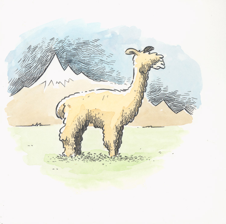
To learn about actual paint, though, you’ve gotta paint. I initially bought a “how to” book about watercolors, but I’m really not a person who learns very well that way; I need a project, a problem to solve. So, when Rob Ullman and I brewed up this Animal Alphabet project, I decided that I’d do them all with watercolors, hopefully learning a bit about watercolor painting in th process. Here’s the first one, an alpaca:
 At this point I was painting with one of those cheap plastic pans of watercolors you can get for five or six dollars at a Michaels or A. C. Moore. A few letters into the project, though, I found myself in Toronto for TCAF (a fantastic yearly comics festival) without my watercolors. I needed to complete the “F” entry while there because it was due Monday, the day after the show, so I hoofed it up to Curry Art Supply in Toronto and bought one of these nice little travel watercolor kits:
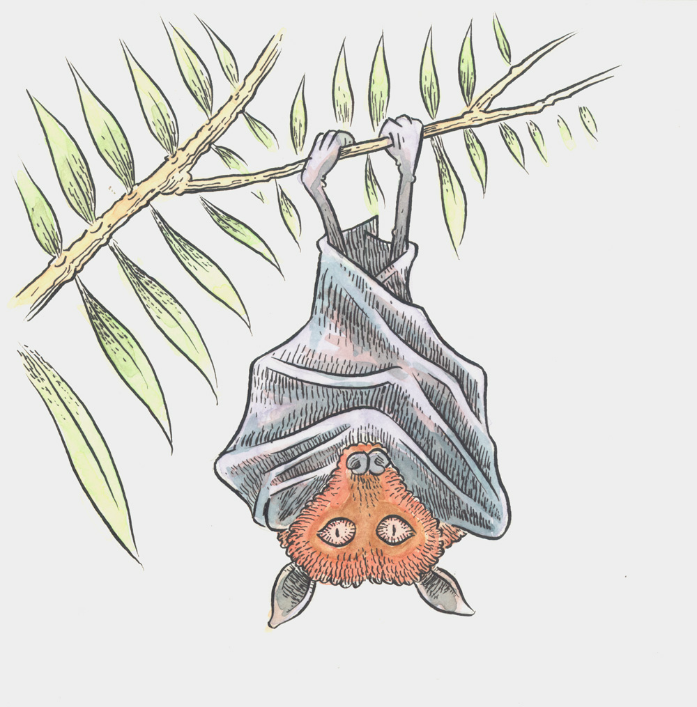
 These are obviously much nicer paints and you can really see the difference in the level of pigment here in the first animal I did with them, the flying fox:
 I’m not sure that I’m getting a whole lot better technique-wise, but I’m really enjoying messing around with watercolors–enjoying it so much that it’s seeping over into my non-Animal Alphabet work. Here, for example, is a recent painting of Bob Dylan I did for my Portrait Night. I’ve ditched the India Ink outlines all together in this one:
 For casual drawing in my sketchbook, I’m tending to use just a basic wash. Since I work in my sketchbook downstairs in the living room (not in my studio), I don’t want to have a whole ton of messy materials out. For a basic wash, though, I can just mix of a small jar of gray or sepia wash and leave it downstairs. Here’re some sketches of hands and safety glasses (sorry about the stuff bleeding through; I work on both sides of each page):

 I do occasionally bring the watercolor travel set downstairs and work with it. Here are some hand drawings with two color washes:
 I recently incorporated some watercolor wash into a sketchbook exercise I do occasionally: ten-minute portraits. Facial likenesses is a real weak spot of mine, and this is one way I’m trying to address it. I give myself a nine-panel grid on a sketchbook page, and then using a timer try to do a likeness from a photograph in ten minutes. The basic breakdown is: pencil sketch – five minutes, inking – three minutes, watercolor wash – two minutes. Here’s a grid of them taken from a book about the U.S. Civil War (or, “The War of Northern Aggression” as we say in these parts.):
 (None are very good likenesses, but for what it’s worth, left-to-right/top-to-bottom, that’s: Sen. John C. Calhoun, Andrew Jackson, Sen. Henry Clay, Gen. George Picket, Jefferson Davis, Ambrose Burnside, Frederick Davis, Sen. John B. Gordon, and Dorthea Dix.)
Incidentally, using watercolor for sketchbook work has necessitated a pen switch. If I’m working in pen in my sketchbook, I usually use a Rotring Art Pen, which is just about my favorite drawing tool. Here’s one:
 The one thing I don’t like about this pen, though, is that you can’t use your own ink in it and the ink that comes in the cartridges it takes isn’t waterproof–so you can’t do any sort of wash or water-based anything on top of it.
I happened upon this Tachikawa “School G” pen over at JetPens.com (amazing site for all kinds of pens, by the way) and it looked like it might be my “holy grail” pen: a flexible nib drawing fountain pen that uses water-fast ink. Is it? Well, not exactly. I’ve gotten used to it, but it has a few drawbacks. For one, it’s a very tight nib–much tighter than the Rotring and much tighter than an actual dip G-pen nib. Also, the ink it takes is apparently some “fast drying” formulation and as a result the pen tends to (a) dry up if you don’t use it every day, and (b) have inconsistent ink flow when you first start using it.
 I’ve gotten used to the tightness of the nib (although the Rotring is a far better-feeling pen and I’ll continue to use it for anything that doesn’t need to be water-fast) and neither of the other two problems I mention are deal-breakers. With (a), you can just dip the pen in some clean water and it will restart; for (b) you just have to scribble with it for a while to get the ink flowing.
Moving forward, I think I need to get less “washy” with my watercolor painting. I recently saw an exhibit of original art from the Curious George children’s books and one thing that really struck me was how rich and saturated those illustrations are. I wondered if they might also have been combinations of watercolor and gouache. Speaking of which, that’s yet another painting thing I need to learn how to do…
http://static1.jetpens.com/images/a/000/013/13122.jpg

 Hey, I’m on this week’s Sound Opinions, defending the honorable art of cartooning! I love the podcast and listen every week, so it was really fun to have them pick my phoned-in comments to run on the air.






Recent Comments