
Here’re a few pictures I took at the opening reception for the TAG exhibit. Info about the show can be found here.


Jun 09 2015
Heroes Con 2015 Mega-Panel: 10th Anniversary of CCS, Comics How-To Books
I’ll be jumping back into the usual yearly Heroes Con “mega-panel” this year with my pal Craig Fischer and here’s our topic for this year. I’ll be covering the initial presentation/slide show on cartooning how-to books–a subject I’m really looking forward to discussing. Come one, come all! Saturday, 3:00 pm, room 209.

“At the Junction of Words and Pictures: the Tenth Anniversary of the Center for Cartoon Studies
For this year’s mega-panel, cartoonist Ben Towle and critic Craig Fischer celebrate the first decade of the Center for Cartoon Studies (CCS), the influential school for comics artists located in White River Junction, Vermont. Ben will begin with a slide show/talk about the history of “how-to” cartooning guides, including How to Draw Comics the Marvel Way, Understanding Comics, and the CCS-sponsored Adventures in Cartooning books by James Sturm, Andrew Arnold, and Alexis Frederick-Frost. Ben’s presentation will be followed by a screening of Cartoon College (Josh Melrod and Tara Wray, 2012, 75 minutes), a lively documentary that chronicles CCS’s history while focusing on a group of students furiously working on long-form comics for their graduation projects. One added attraction of Cartoon College: interviews with such comics luminaries as Scott McCloud, Art Spiegelman, Françoise Mouly, and Steve Bissette.
To explore the issues and situations brought up in Cartoon College, we’ll then move into a panel featuring CCS alumni and students. Our guests will be Chuck Forsman, Oily Comics publisher and creator of such recent graphic novels and comics as TEOTFW, Celebrated Summer, and Revenger; Sophie Goldstein, writer/artist of the Ignatz-nominated House of Women and Adhouse’s graphic novel The Oven; and current CCS student Andy Shuping. Come get the inside scoop on CCS from those in the know! The panel will end with a display of original art to be included in a major CCS art exhibit at Appalachian State University in Fall 2015.”
May 30 2015
Exhibit at Theater Art Galleries, High Point NC
I’ll be showing original pages from all of my graphic novels at this upcoming exhibit in High Point, NC. If you’re in the neighborhood, please come by and check it out! The opening reception is this coming Thursday, June 4th, from 5:30 to 7:30. It’s free and open to the public.

May 26 2015
MagnEmo!
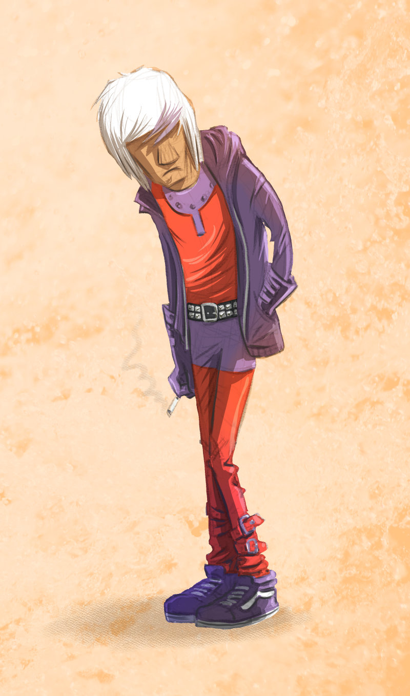
One of the many concepts discussed on a recent Rachel and Miles X-Plain the X-Men podcast was that of “MagnEmo”–Magneto when he’s moody or emotional. Despite being just an offhand gag that was mentioned once then quickly forgotten on the show, it struck me as hilarious… so I had to do a visual interpretation. So, here he is: MagnEmo, Earth’s most powerful–and moody–supervillain.
May 18 2015
Care and Feeding of the Leroy Lettering Set
Background
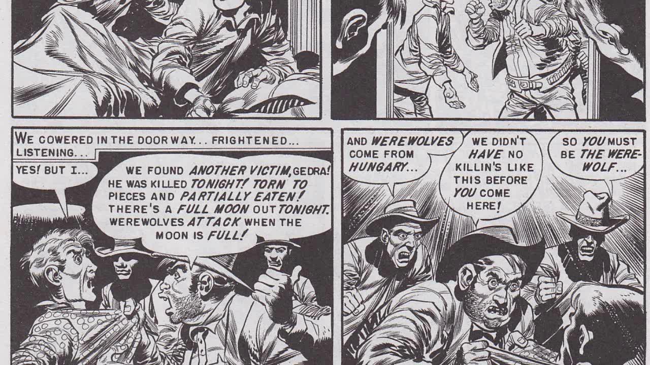
You may not know exactly what a Leroy Lettering Set is, but if you’re interested in comics, I’ll bet you’ve seen the results of one in action. Leroy lettering was used most notably by publisher EC Comics in books like Tales From the Crypt and Vault of Horror. (Harvey Kurtzman’s EC war stories in books like Frontline Combat and Two Fisted Tales were the exception and were hand lettered by the great Ben Oda.)
You may also have seen a Leroy Lettering Set in action in the early Wonder Woman comics. Here’re a few (cough, cough) typical WW panels from the William Moulton Marston era:


You’ll stumble on this lettering here and there in old comics printed up until the early 60s or so. Interestingly, most of it was done by one couple, Jim and Margaret Wroten, who you can read about here.
Despite its clunky mechanical look that (objectively, anyway) doesn’t go very well with hand-drawn comics art, I’ve always had a strange fascination with Leroy lettering. There’s a free font based on Leroy lettering that I’ve used in a few odd projects, but I was curious about how the actual lettering set worked. I was surprised to find that the sets are not rare and they can usually be had for between $35 and $50 on Ebay. I bid on and won a complete set for $35.00. Here it is:

And here are a couple of the lettering templates:

How Does it Work?
The Leroy Lettering Set is basically a pantograph. One end of it traces the letters off the template, moving the other end of it which has a pen attached. More specifically, the key to its operation is this component, called the scriber:

Here’s how it works:
- This is the tracer pin. You stick this down into the grooved letter forms on the template.
- This is a little clamp (tightens with that black rear-facing knob) that holds the drawing implement.
- This knob is a little adjustable “leg” that supports the drawing portion of the scriber–the part that’s over the paper/holding the pen.
- It’s hard to see in this picture, but there’s a dial here that changes the slant of the letters. This is how you make italic letters–as in the Wonder Woman samples, or the bold words in the EC sample.
- This is the tail pin. It just stays in the bottom groove of the template like a train track, keeping everything aligned correctly.
- These little hash marks correspond to the size of the letters on the template, allowing you to pencil in rough letters. Obviously, you have to fudge things for letters like “I” and “J” that are thinner.
- Each template has a pen size. The numbers correspond to the Leroy pen tips that come with the kit… which are identical to the same-sized Rapidograph tech pen numbers.
Drawing implements:
The kit comes with its own refillable ink pen tips, but it’s a whole lot easier to just use a tech pen. As far as I can tell, only actual tech pens will fit into the clamp. I tried mine with Rapidographs and with Staedtler MarsMatic tech pens and they both worked fine because they have this “barrel” for the clamp to grab onto:
 Other pens I tried, most notably Microns, don’t have anywhere like this for the clamp to grab, so they didn’t work.
None of the mechanical pencils I had around would work with the scriber’s clamp, but Leroy made special mechanical pencils/lead hodlers specifically for the set. The set I have recommends a “22” model, but there were several different types made that would accommodate the scriber’s clamp.

Here it is in action. As you can clearly see, I’m still getting the hang of using it. Getting it placed correctly so the letters are properly spaced is pretty tricky, as is picking it up without leaving an ink smudge on the letter you’ve just completed.
The Verdict
I’m sure things go faster once you’ve put in some hours getting used to lettering with the Leroy set, but I’m pretty stunned that people would do whole comics with this thing. I can’t imagine any scenario where this actually takes less time than hand-lettering a comic. I’m glad I bought it, though, and I’m going to continue to practice with it. The free font I linked to above is probably sufficient for anyone who wants to get the look of old-style Leroy lettering.
Feel free to ask me any questions you might have in the comments.
Recent Comments