Review: Tristan & Yseult by Agnès Maupré and Singeon

I don’t usually review books–mainly because for any given comic there’re probably several reviews out there by actual comics critics, who have far more of an idea what they’re doing than I do. In this case, though, I’m making an exception because the book I want to discuss, Tristan & Yseult by Agnès Maupré and Singeon, is a French-language comic that I’m guessing probably hasn’t been reviewed in English. 


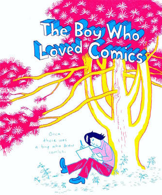
I purchased this book when I was on a recent visit to Québec City, at an amazing bookstore called Librairie Pantoute. I’d not heard of the book itself nor either of the creative team; I grabbed it off the shelf because of its cover, which as you can see is quite striking:

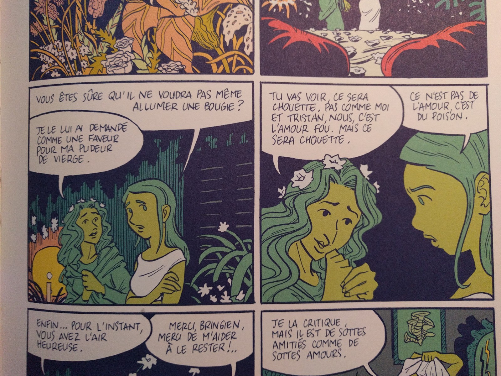
What sold me on the book (figuratively and literally) was the coloring. If you know me via this blog or on twitter, you know I’m a sucker for coloring that’s (1) flat, with little to no rendering, and (b) non-literal. And that’s exactly the way this book is colored. Here’re a few examples:

As you can see, this coloring is exactly up my alley: nary a gradient to be found and the artist’s color choices are as much to convey mood (and maybe just for pure aesthetic interest) as to describe the objects represented on the page. Not atypical of French comics, it’s actually pretty difficult to figure out who colored the book. French comics often don’t specifically credit the colorist, so if one’s not listed it could be that the artist colored the book themselves or that an (uncredited) outside colorist was used. In this case, it seems that the artist, Singeon, (what’s with the single-name thing, French cartoonists?) did the coloring here. 

While I eventually warmed to the cartooning itself, I have to admit that at first glance I found it a bit looser than the type of cartooning that I usually gravitate towards. As I read the book, however, I began to really appreciate Singeon’s cartooning. He’s, for example, really great with conveying subtle facial expressions–something I personally struggle with and always appreciate when I see real masters pull off well (see: Raina Telgemeier, Lynn Johnson). You can see this in the last image above, for example. Even without the dialog there you can get an excellent read on what’s going on in the minds of the two characters. Here’re a few more:

He’s also great at drawing vegetation. The second panel in those color examples is a perfect illustration of this, as are these:

His page layouts tend to largely stick to a basic grid–something I also tend to like in comics. Full-page spreads are used sparingly but when they are, the results are pretty stunning:

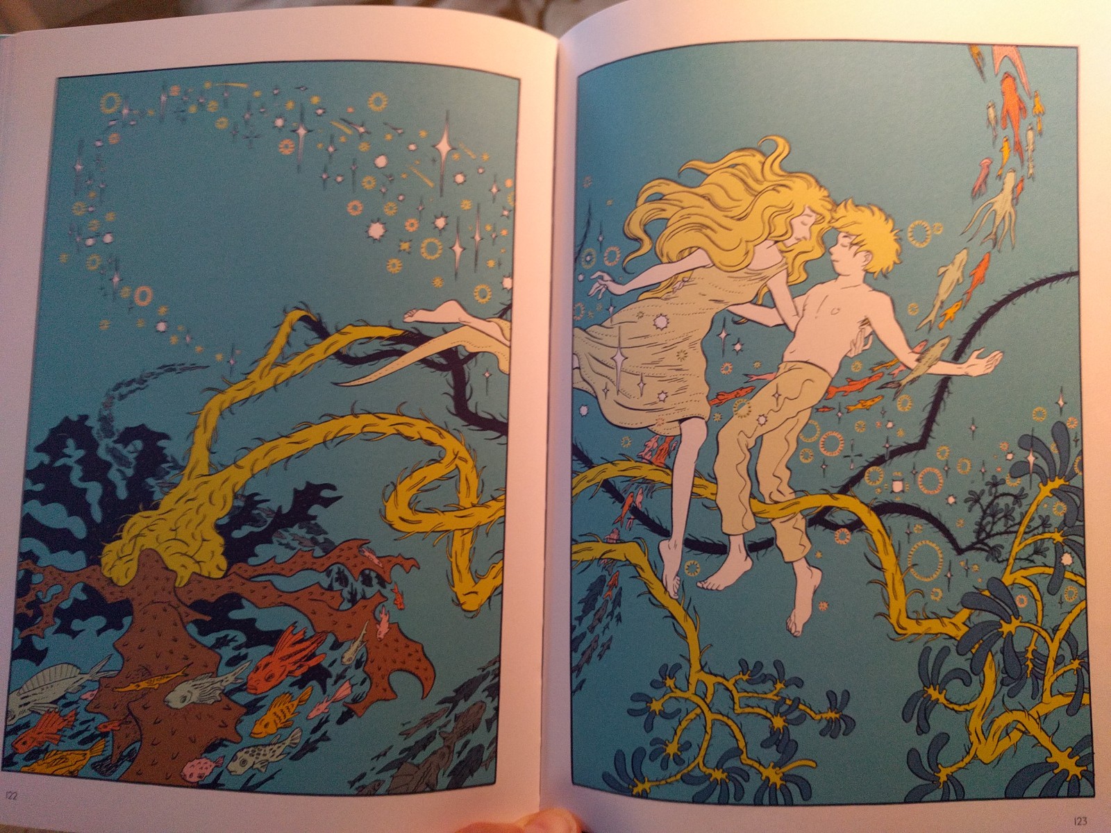
I absolutely love how the fish in the top example flow from the bottom panel on the left-facing page into the right-facing splash page.

Beyond any of the particulars of Singeon’s cartooning, though, here’s an interesting thing about Tristan & Yseult aesthetically: it’s one of the very few examples I’ve ever seen of a French comic that appears to be highly influenced by American indie comics, rather than the other way around.  You can see the influence generally in the format of the book: it’s smaller than the traditional European album at just 10.5 x 7.5-ish inches. That smaller trim size necessitates a three tier grid, as usually seen in American comics, rather than the four tier grid that’s common in European albums.

Beyond that, though, the actual drawing in the book isn’t typical of what we in North America generally associate with the European cartooning tradition. Singeon’s thin-ish linework and avoidance of spot black for high contrast shading jibes with the ligne claire tradition in Franco-Belgian cartooning, but that style of linework has also been pervasive in modern American indie comics as well for years via influences like Moebius (and via manga artists like Katsuhiro Otomo for that matter). Curiously, what Singeon’s cartooning most reminds me of influence-wise is David Mazzucchelli.

And that’s odd because I’m hard pressed to think of many artists–even here in the U.S.–who are overtly influenced by Mazzucchelli. There’s maybe Dash Shaw in the indie corner and David Aja on the more superheroish end of things? Yet, Mazzucchelli is a rare figure who’s respected across a broad array of cartoonists–among superhero folks for his amazing work on things like Year One and Daredevil, but also among indie folks for stuff like Rubber Blanket and Asterios Polyp. I may be completely off-base in my Mazzucchelli comparison–god knows I’ve been pegged as being  influenced by people I’ve literally never heard of–but, in Tristan & Yseult we seem to have a rare example of just such an overt Mazzucchelli influence–and, in this case, an influence coming from his lesser known post-superhero work. 

In particular, the drawing style reminds me of some of Mazzucchelli’s all ages comics, such as this one from the Little Lit series:

I see some of his unique color sense throughout Tristan & Yseult as well:

Whether or not I’m correct with the Mazzucchelli influence in particular, there definitely seems to be an aesthetic influence here coming from North American indie comics. As a North American indie cartoonist interested in–and influenced by–the Franco-Belgian tradition it’s fascinating to see the results of these same influences flowing in the opposite direction.

And what about the story? I’ve somehow managed to graduate from a respectable liberal arts college without reading any permutation of Tristan and Iseult, so I can’t say with a ton of authority what elements of the story are traditional and what are coming from Agnès Maupré. The only notable element of the comic’s narrative that I couldn’t find mention of in the Wikipedia entry on Tristan and Iseult nor the Wagner opera adaptation of it was some interesting thematic elements about vegetarianism. In the comic, King Mark is a staunch vegetarian who nonetheless has to lead his court on hunting parties. At the climax of the book, Tristan is mortally wounded during a hunt–again, not something I could find mention of online. 

One thing I really liked about the story was that it didn’t feel the need–as so many stories do–to explain every. single. thing. Yseult’s mother and Yseult herself seem to have some sort of magic powers. Her mother is the one who creates the love potion. And later we seen Yseult compulsively licking blood off her hands. But these elements are simply put there and not explained. Similarly, King Mark has donkey ears that he keeps hidden beneath his hat. You can google to find an explanation for that one, but again, there’s no need to go into it in this story and thankfully Maupré doesn’t.

Tristan & Yseult is a beautifully-drawn (and colored!) adaptation of a classic tale from literature so you’d think it’d stand a good chance of being translated into English and sold domestically. I wouldn’t hold your breath waiting for this to happen, though. Because of our peculiar American attitudes about sex, nudity, etc. this book is probably off-limits for most U.S. publishers who otherwise might give it a shot–I’m thinking of entities like First Second here. (If it “only” had a lot of graphic violence, that of course would be no problem at all here in the good ol’ USA.) So, I’m glad that I took the effort to struggle through in French.

And speaking of French, a few notes on language for anyone considering reading this: My French, such as it is, is pretty bad (a generous assessment). I have to have a French dictionary at hand and Google Translate open on my phone to get through much of anything. That said, the French in Tristan & Yseult isn’t too complex. As you can see in the sample panels I posted, the volume of text  per panel is reasonable (aside from one big splash page toward the end that’s all text). There are also relatively few weird idomatic expressions in the book–and the ones that were there I was able to figure out relatively easy via Google or by asking about it on Twitter. There are a few instances of wordplay–such as when some courtesans are making cow/animal allusions about Yseult–that I struggled with a bit, but generally most of the French can be popped into Translate as a last resort and will yield something vaguely coherent. Oh, and also: for some reason they talk a lot about butts in the book, so you’ll learn two or three different French words for butts, butt cheeks, etc. Bonus!


Hergé Exposition at the Musées de la civilisation, Québec City


I recently had the good fortune to visit Québec City to see the massive retrospective on Hergé (Georges Remi), the cartoonist known for creating the iconic character Tintin and crafting the twenty-three volumes of his adventures. This exhibition began in Paris in 2016, then traveled to Geneva and London. Guessing that this stop at at the Musées de la civilisation would be its only North American appearance, I jumped at the chance to see it in a location at least relatively nearby. My verdict: despite a few misgivings I had with the way the exhibit is set up, if you’re at all a fan of Hergé’s work, you should absolutely make the trip to see the show while it’s making what I’m guessing will be its only North American appearance.

IMG_20170908_170125~3(My Uber driver in Québec City had a Snowy/Milou key-chain because of course he did.)

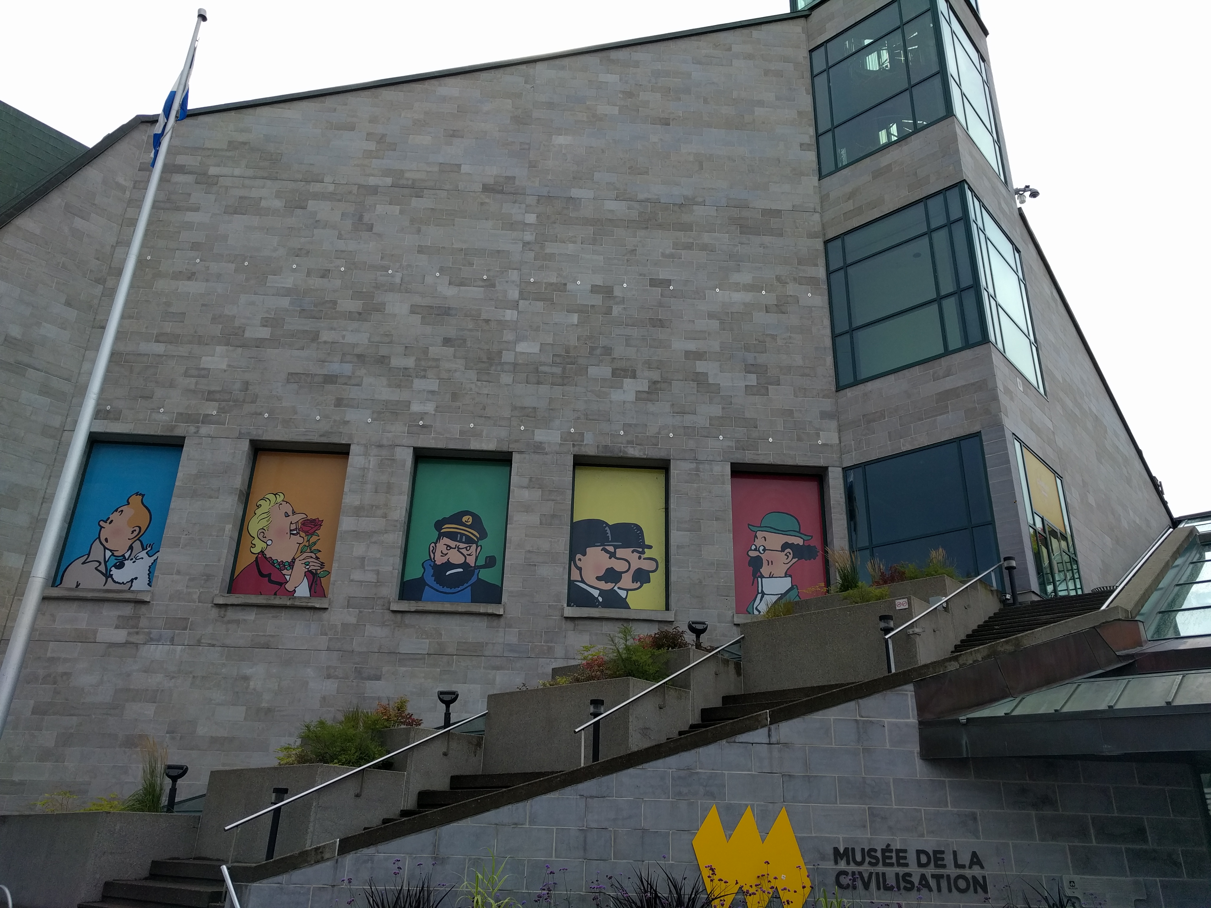
The Hergé exhibit was at the Musées de la civilisation, which is a short walk from the Old Town/historic district. It’s hard to miss, as you can see:

IMG_20170909_140221

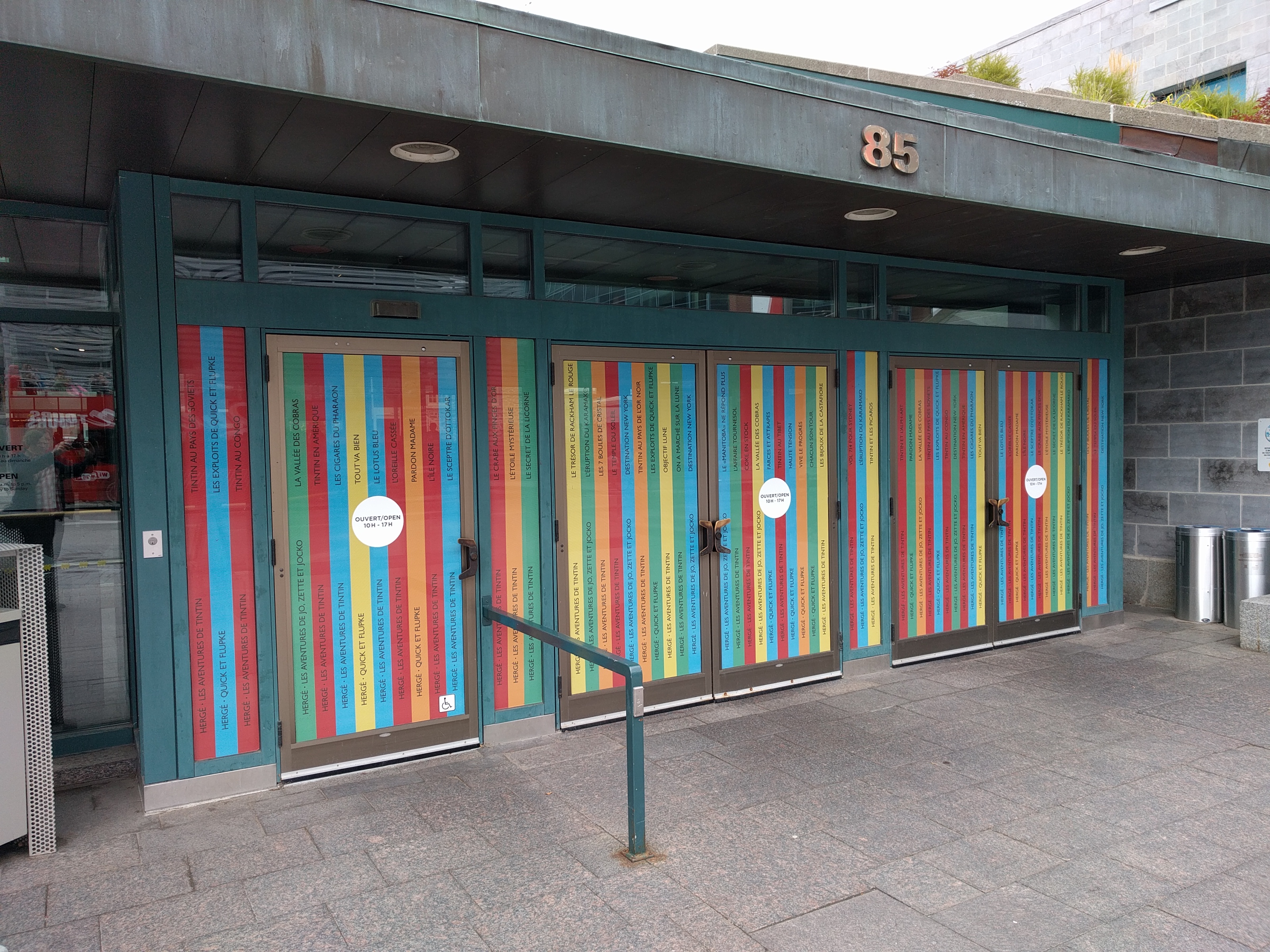
The entryway to the museum was done up with the spines of various Tintin books.

IMG_20170909_105955

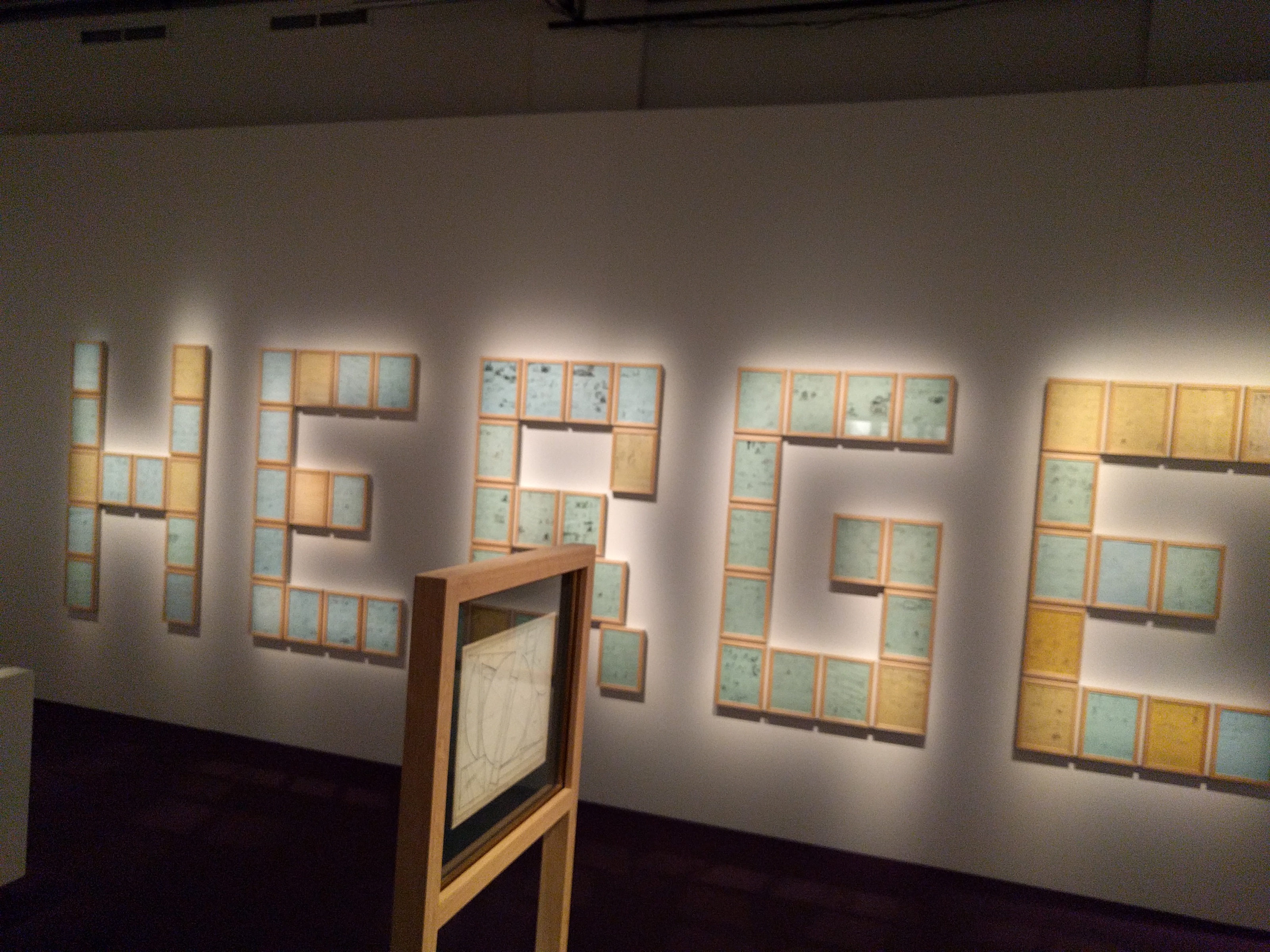
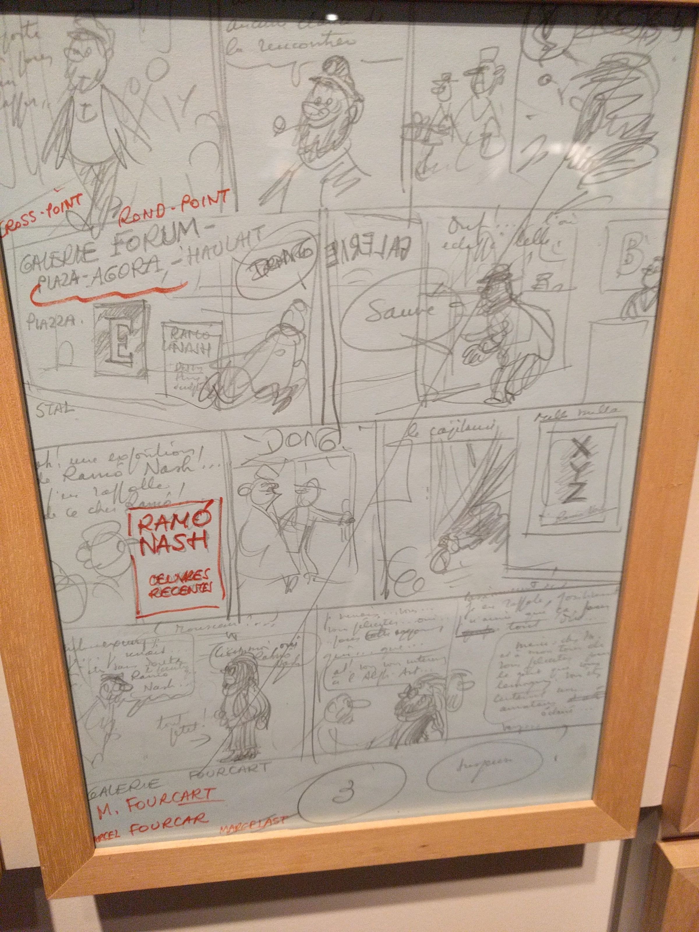
The exhibit itself begins in two small anterooms that unfortunately showcase both of the things that I found a bit problematic about the way this exhibit was set up. The rooms contain, oddly, a combination of Hergé’s late-era attempts at modern art, a few other pieces of modern art (some or all are from Hergé’s collection I think), and framed thumbnails from his unfinished final Tintin book, Tintin and Alph-Art.

IMG_20170909_111907

IMG_20170909_111711

The larger of the two issues in evidence here is that the exhibit seems be be trying desperately to find some sort of tie-in to connect Hergé to “real art” rather than simply acknowledging that Hergé’s cartooning work is what he’s recognized and celebrated for and focusing on that right from the get-go. Among the non-Hergé works on display was a Roy Lichtenstein piece. There’s no lazier and more tired choice for a “bridge” between comics and fine art than Roy fuckin’ Lichtenstein.

The second issue is one that’s less of a concern to people well-versed in Tintin, but worth mentioning: chronology. As you can probably surmise from the fact that the exhibit opens with work from his unfinished final book, there’s no real consideration of chronology here. A page from Black Island might appear next to a page from Land of the Soviets…which in turn might abut a Destination Moon page. If you know the order of the books, you can see how his work evolves, but if you’re not familiar with the order I imagine it would be difficult to get much of a sense of how Hergé and Tintin grew and developed over time.

Now, for the good stuff: pretty much everything else about the exhibit is great–and especially: all the original art. Via some Twitter-sleuthing I got word that there were ten originals at the exhibit, which seemed a bit slight. More concerning was that the London exhibit apparently just had facsimiles of original art. Thankfully the show in Québec City had actual originals–and a heck of a lot more than ten of them!

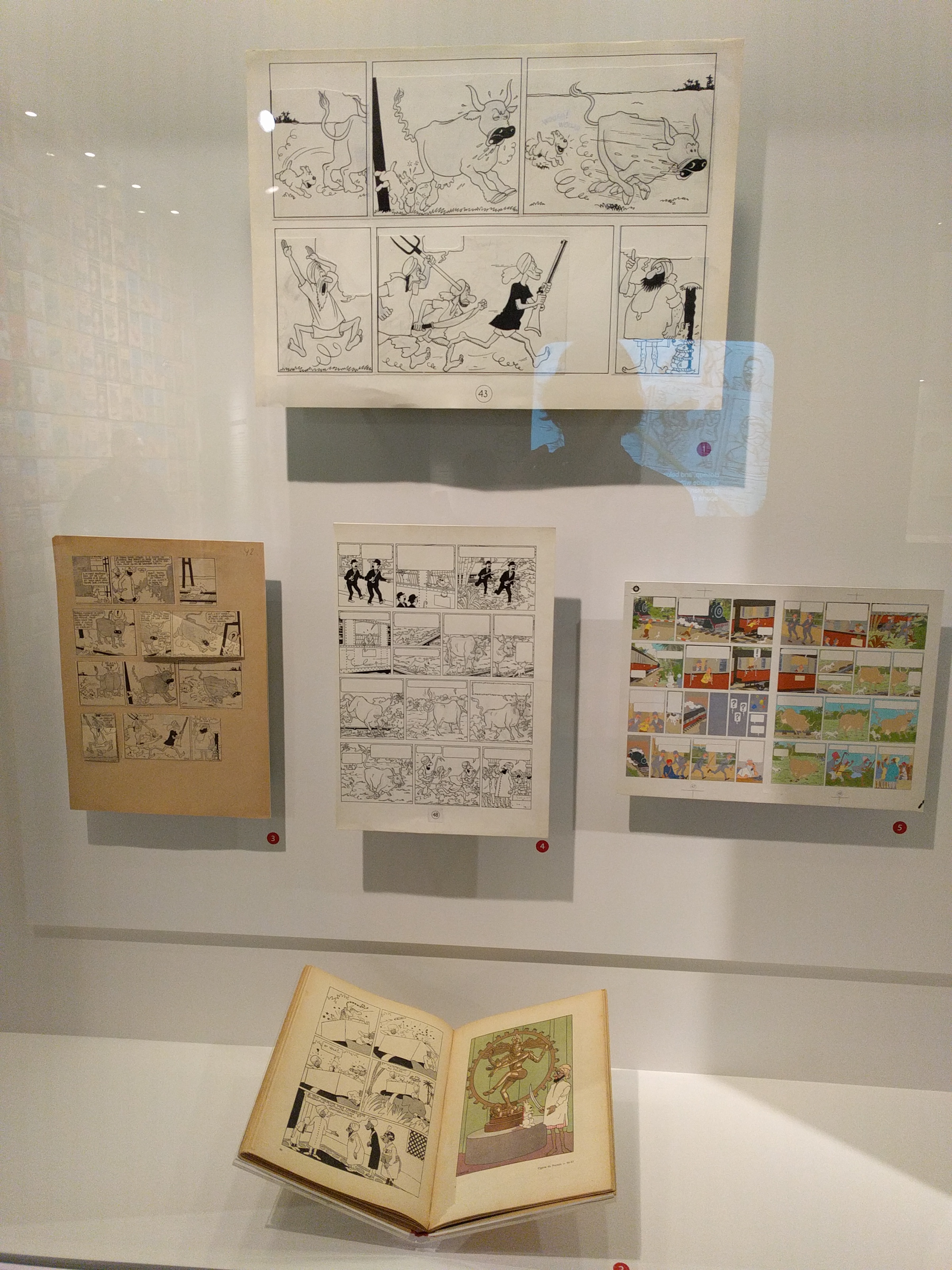
Early Tintin works have a complex publication history. The were usually serialized first in a newspaper supplement, then reformatted into books, and then sometimes reformatted yet again for color. And at any stage of this process Hergé (or, in the case of later printings, his assistants) would redraw things, add panels, remove panels, etc. The exhibit does a great job of showing you how these changes played out in the various publications. Here, for example, is a display focusing on one sequence from The Black Island:

IMG_20170909_112928

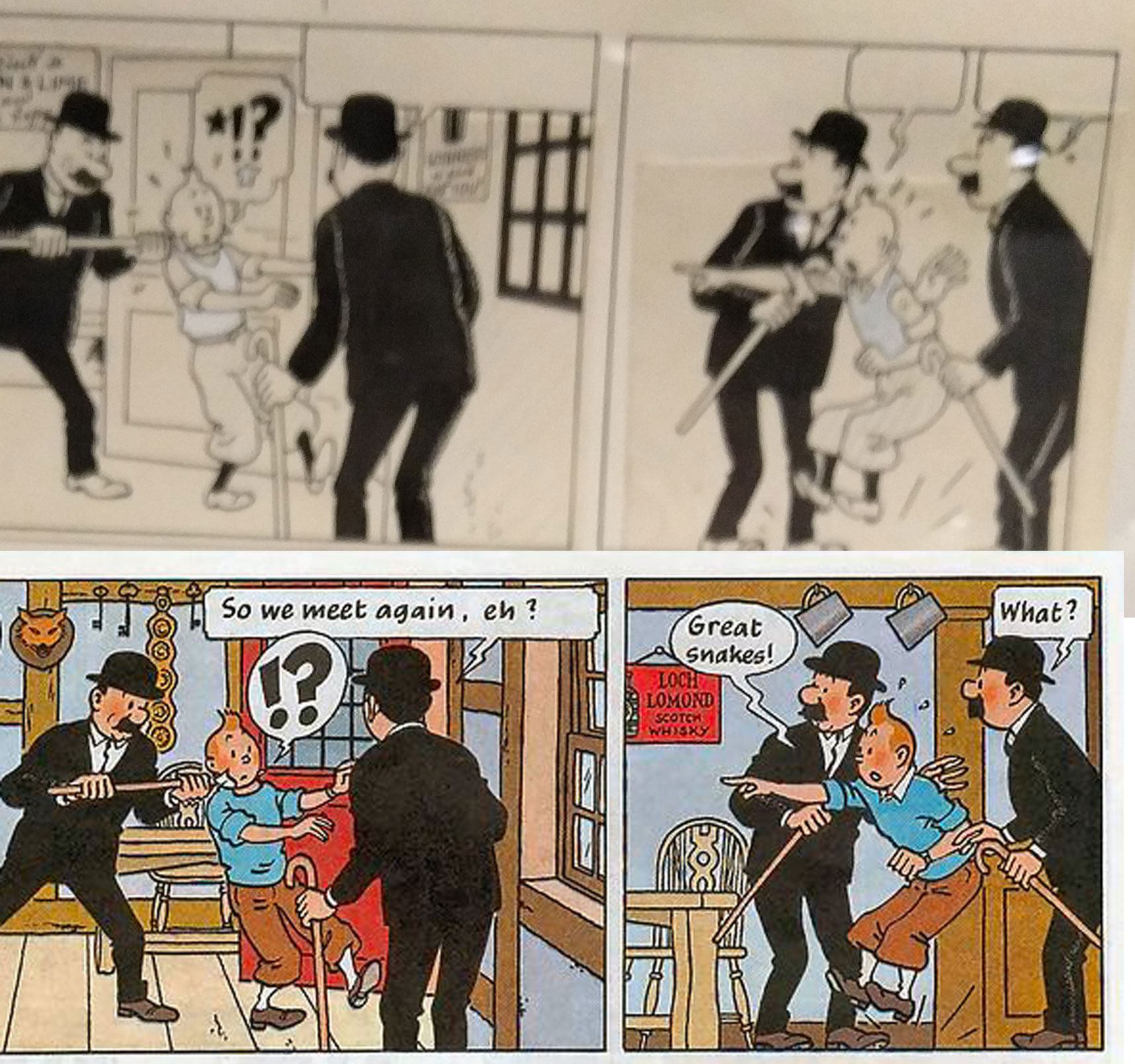
Check out how different the original is from the modern published version of even this one corner of a page:

Untitled-1

Tintin is of course now wearing his standard outfit, but also his face has been redrawn, eliminating the old-style close-spaced eyes. The backgrounds have been entirely redrawn–and in the case of the second panel, a new background has been added where there was none before. Note also that Hergé has become much more confident in his use of large areas of black. The hatched “ghost outlines” on the Thompsons’ suits are mostly eliminated.

In this detail from another Black Island page you can see that Hergé’s “building” a book-format page by cutting up panels (presumably from the original art for the newspaper version of the story), gluing them to the new board, and then expanding the panels by extending the pre-existing artwork.

Untitled-1

Hergé–and the Ligne claire style he originated–is known for an almost “dead” line, but that’s not a wholly accurate notion, especially not when you’re able to see the linework close up. Check the beautiful linework in this panel of Snowy (and note the trademark Hergé “motion squiggle” with the spider):

Untitled-1

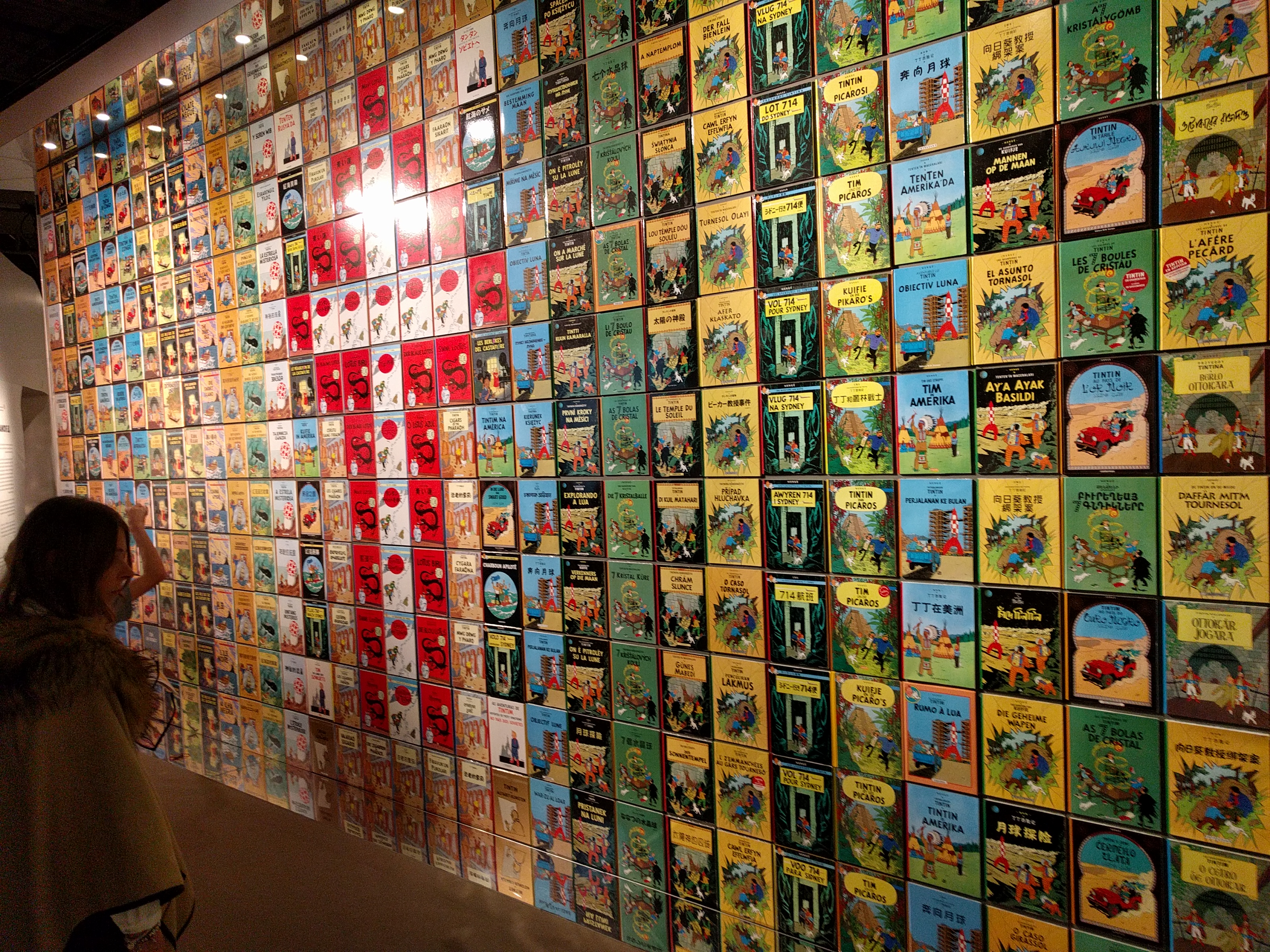
The room that held these originals got super-crowded later in the day. I was glad I got to the museum right when it opened so I was able to get up close and snap some high-res images of these originals. The back wall of this room was a huge display of Tintin book covers in various languages. Interestingly one language not represented was English. I kind of wondered if this was a bit of subtle shade-throwing by the museum in (French-speaking) Québec City. If so, well played!

IMG_20170909_113654

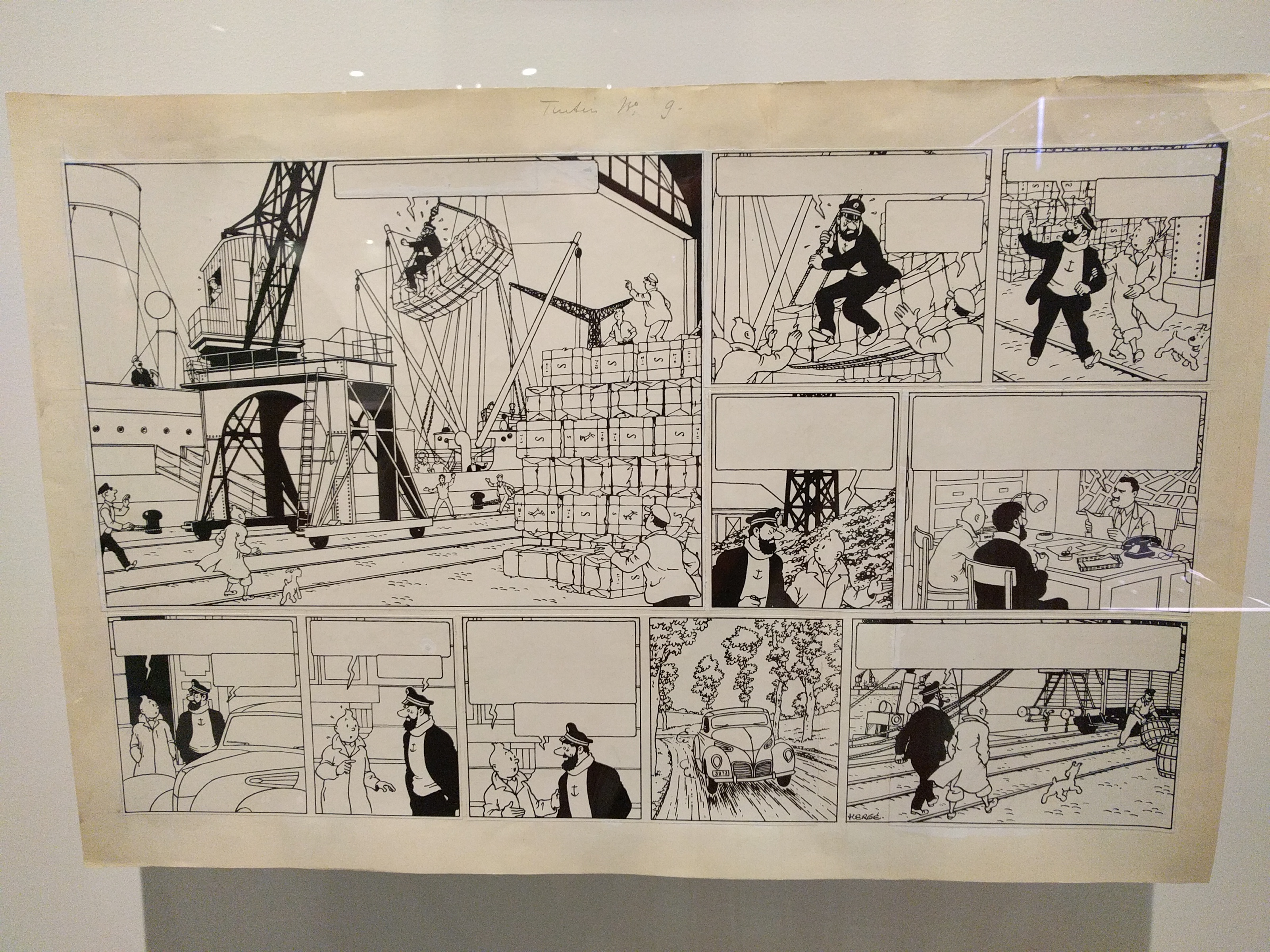
Back to the originals, though! It was truly stunning to see pages like this up close:

IMG_20170909_113608

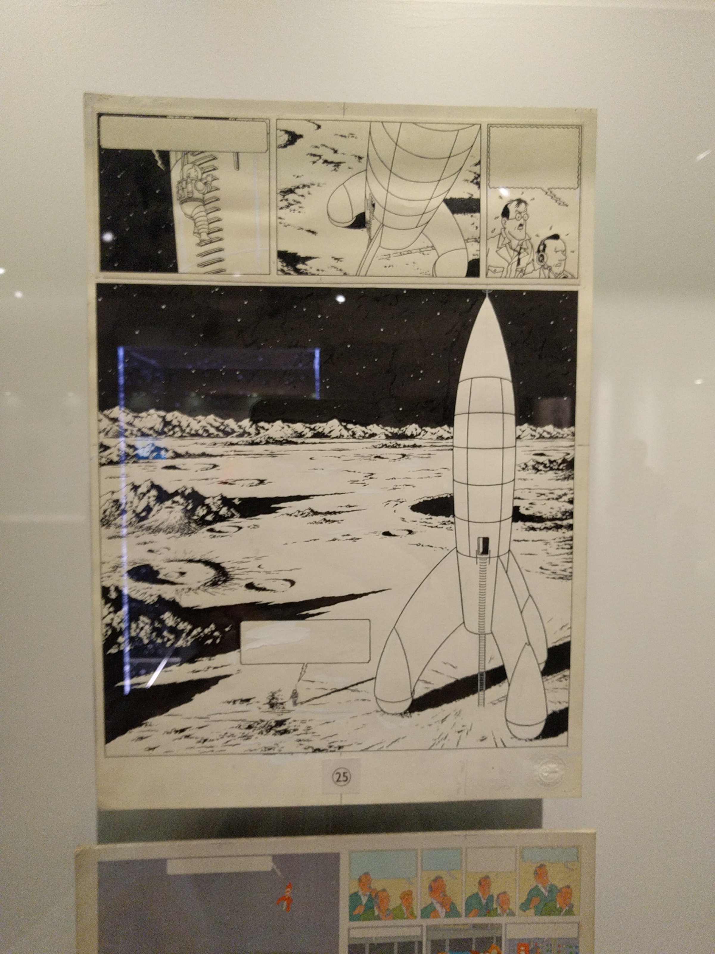
They had one of my all-time Tintin pages on display–this one from Destination Moon:

IMG_20170909_113920

Here’s something that really struck me though when seeing this page: The exhibit had virtually no mention at all of Bob de Moor. De Moor was one of Hergé’s assistants at Studios Hergé and he was in charge of drawing things like machinery, backgrounds, landscapes, etc. So in this image, for example, a pretty big chunk of it was presumably drawn not by Hergé himself but by de Moor. Yet, the only mention of de Moor I recall was something about him being dispatched to take some photo-reference images for a book at some point. This is a pretty egregious oversight–if it is indeed just an oversight.

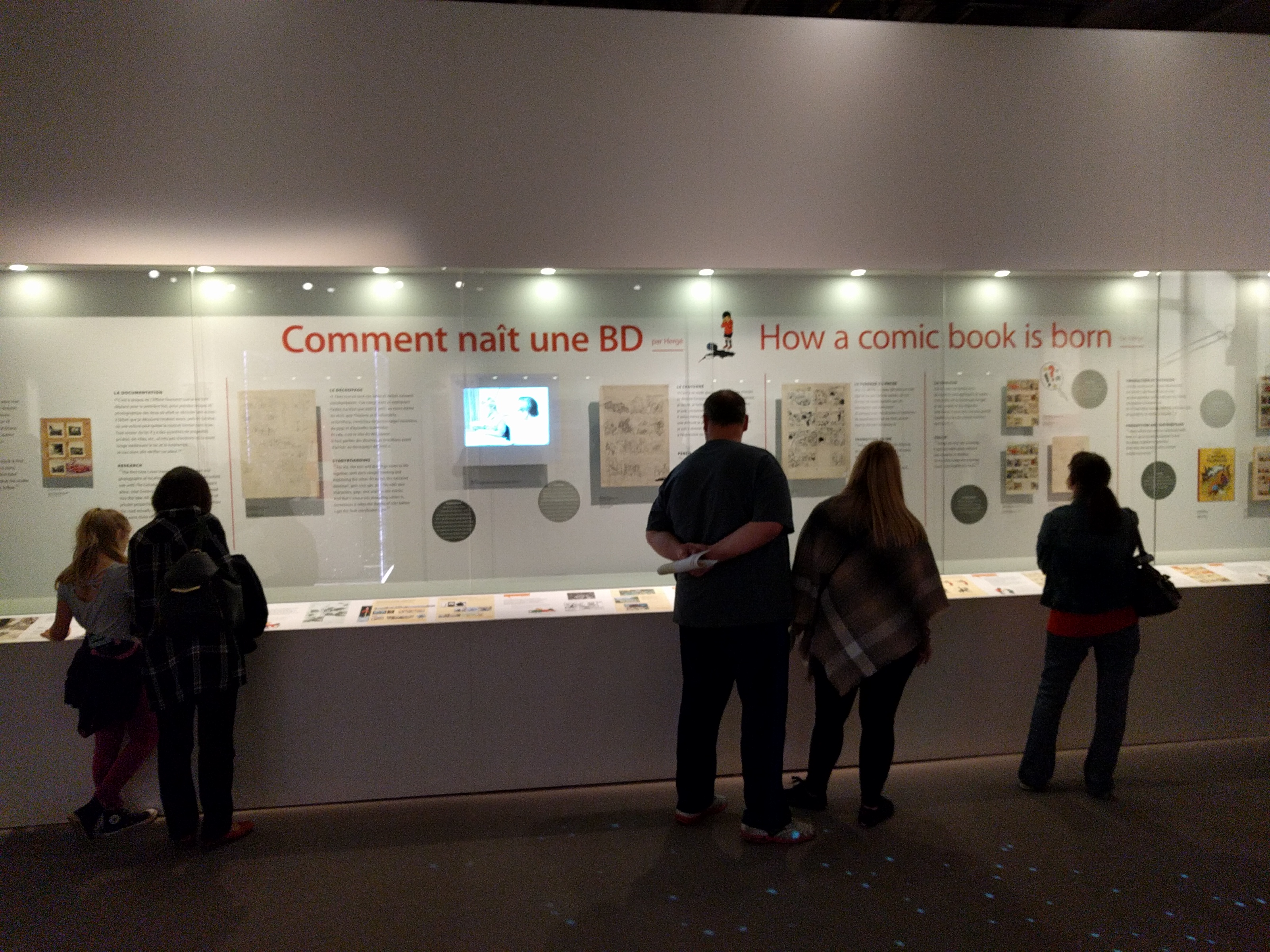
With one odd exception (I’ll get to that next) the exhibit did a good job of explaining the process behind the production of a Tintin book. Here’s a wall-long display showing a page from thumbnails through to colored, printed book:

IMG_20170909_115851

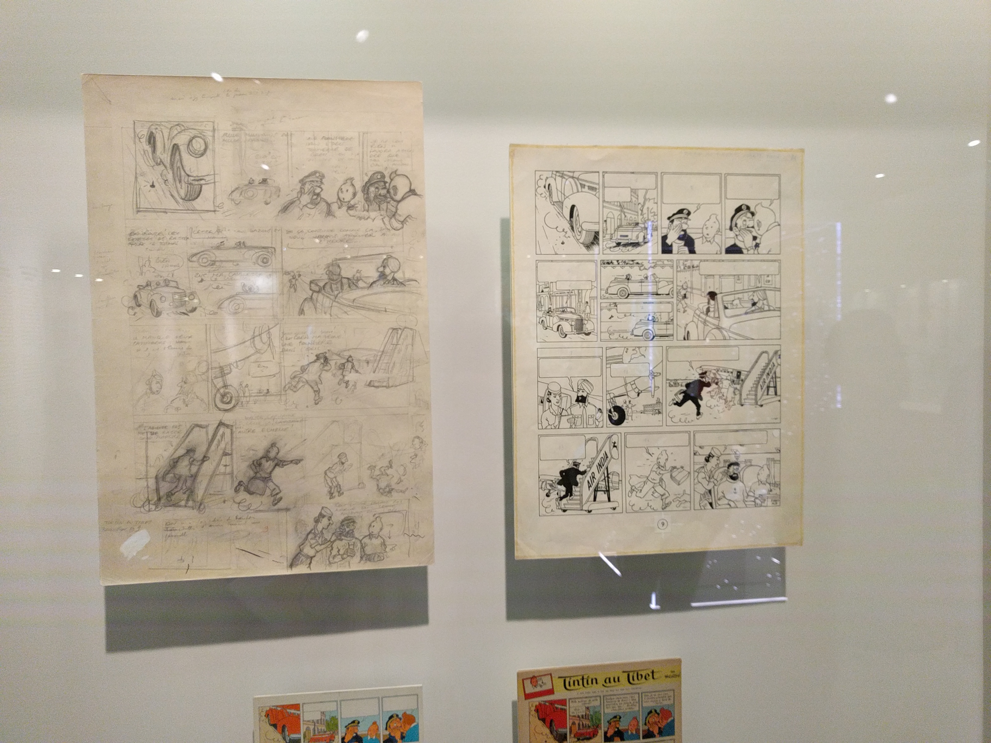
The one exception? I’m not sure how obvious this is to lay people, but I was really surprised there was no explanation offered within the exhibit for displays like this, which show both the penciled and inked versions of a given page:

IMG_20170909_114154

In most comics production the inks are of course applied over the pencils. You’d wind up with just one page: the inked page with the pencils now erased from underneath. The exhibit, in fact, had an entire room showing just Hergé’s penciled pages–without any explanation for why they still exist un-inked. Maybe this isn’t something that occurs to non-comics making people? Whatever the case, the explanation is that Hergé would pencil each page, then trace it onto a fresh sheet of paper (presumably with a light box) and then that page would be inked–hence, you wind up with two pages: one of the original pencils, one of the finished inks.

Hergé would sometimes make changes between the pencils and inks. As you can see above, for example, where the final panel of the penciled page is Haddock pratfalling off the airplane gangway–a panel that’s not in the finished page. Below that panel, though, in the lower margin of the page Hergé has drawn the panel that would replace it: Haddock in the plane being attended to by a stewardess.

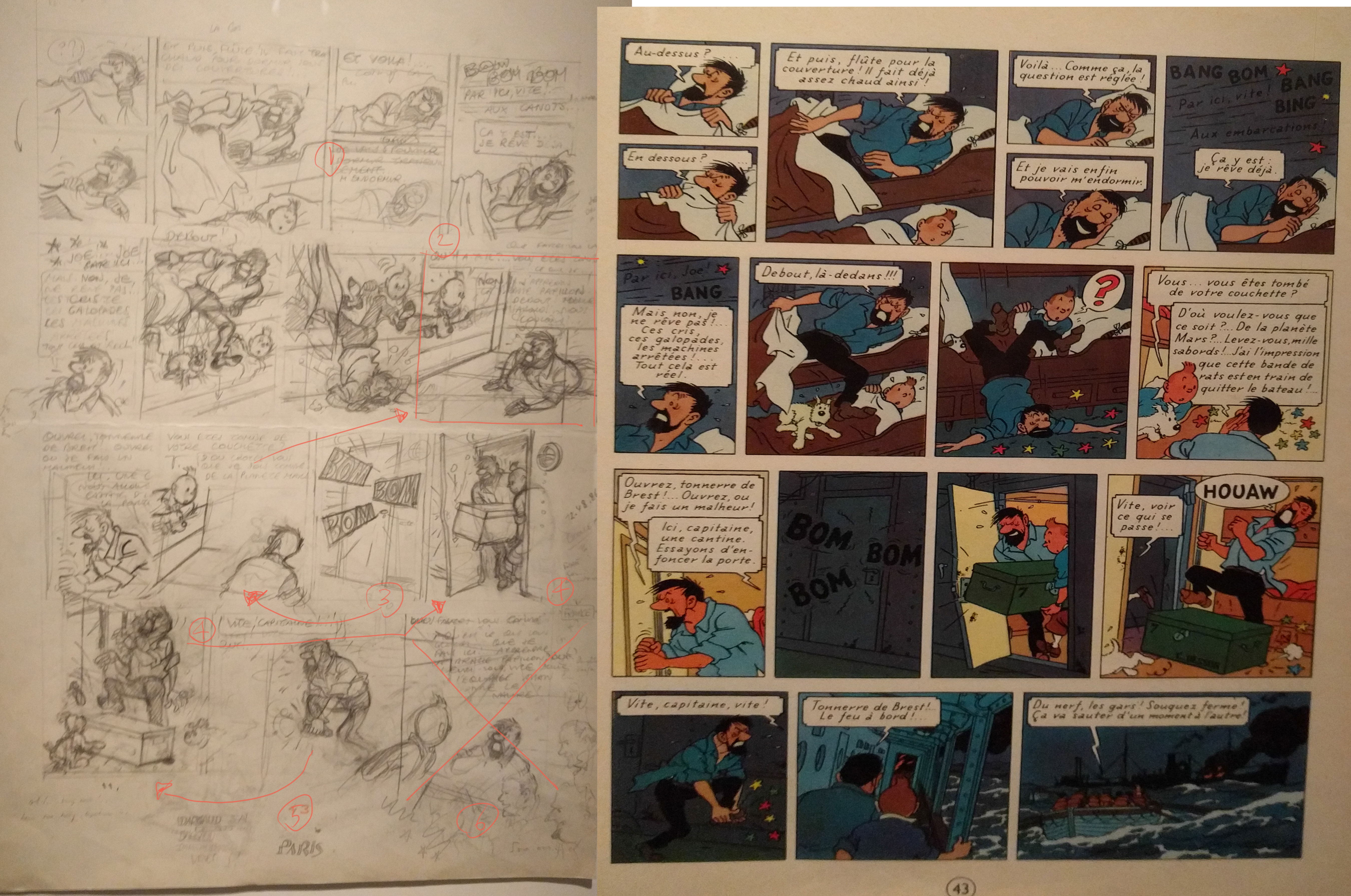
Another one. Notice how much of this page has been changed.

IMG_20170909_142551

(Arrows and numbers added by me.) At (1) the bottom panel here is left at pretty much thumbnail state. I’m guessing that’s because it’s essentially a closer view of the top panel and could be achieved mainly via enlarging it and then lightboxing. (2) This panel has been completely eliminated. The panel below has been moved up into its place. In the place of that panel we get the (3) Bom! Bom! Bom! panel. The panel at (4) has also been eliminated and replaced by the one below. With the last panel on the penciled page gone as well, there’s now enough room for those two new panels–including that pretty spectacular ocean scene. There’s very little in the way of backgrounds in most of the penciled pages, presumably because de Moor or one of Hergé’s other assistants would add those.

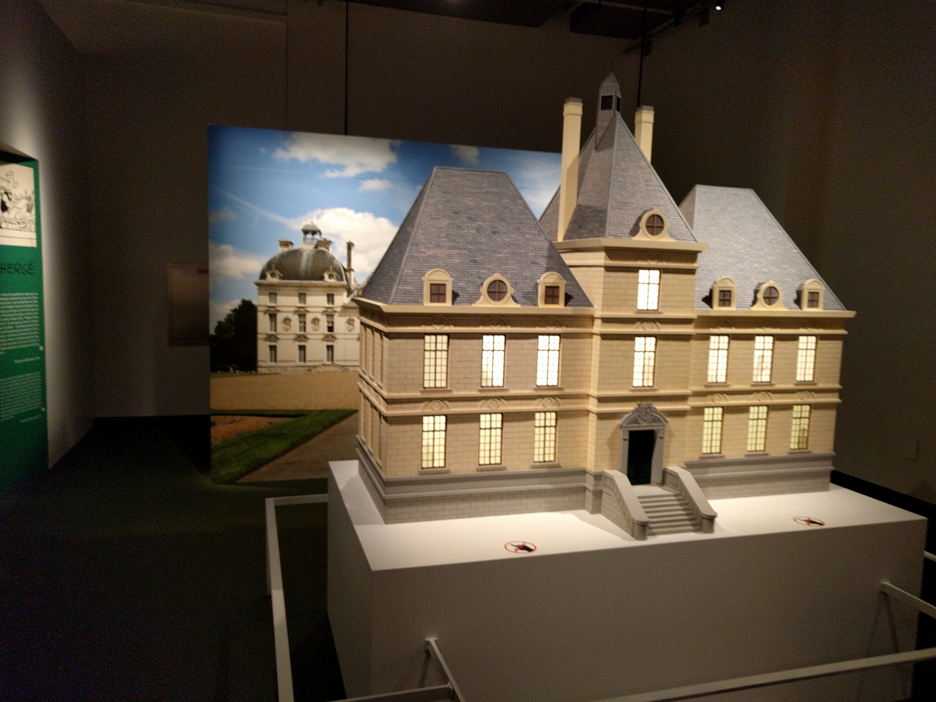
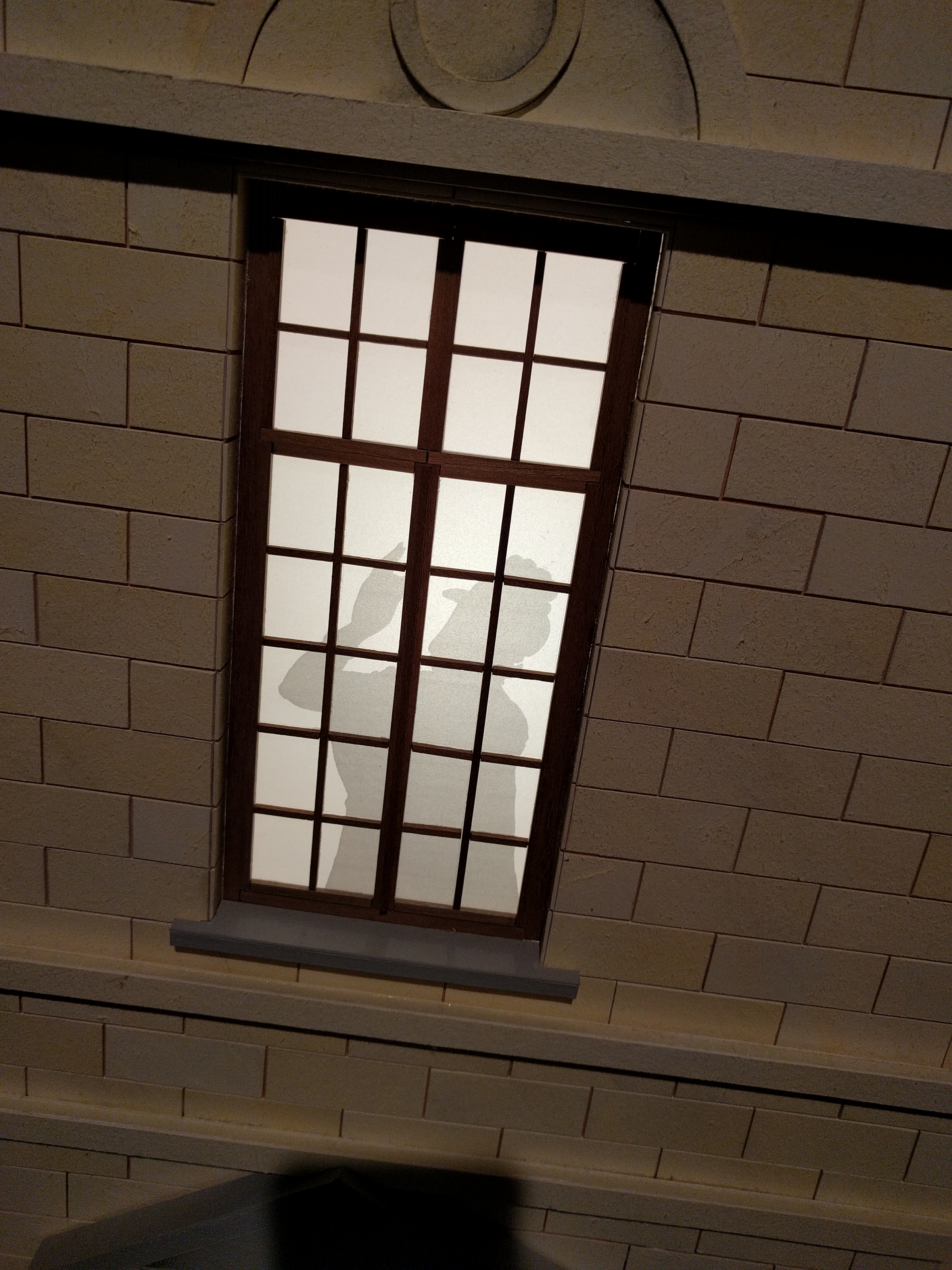
The Pencils room also contained a big replica of Marlinspike Hall that if nothing else was kind of fun. Various characters were silhouetted in the windows. Here’s Madame Castafiore.

IMG_20170909_120738

IMG_20170909_121245

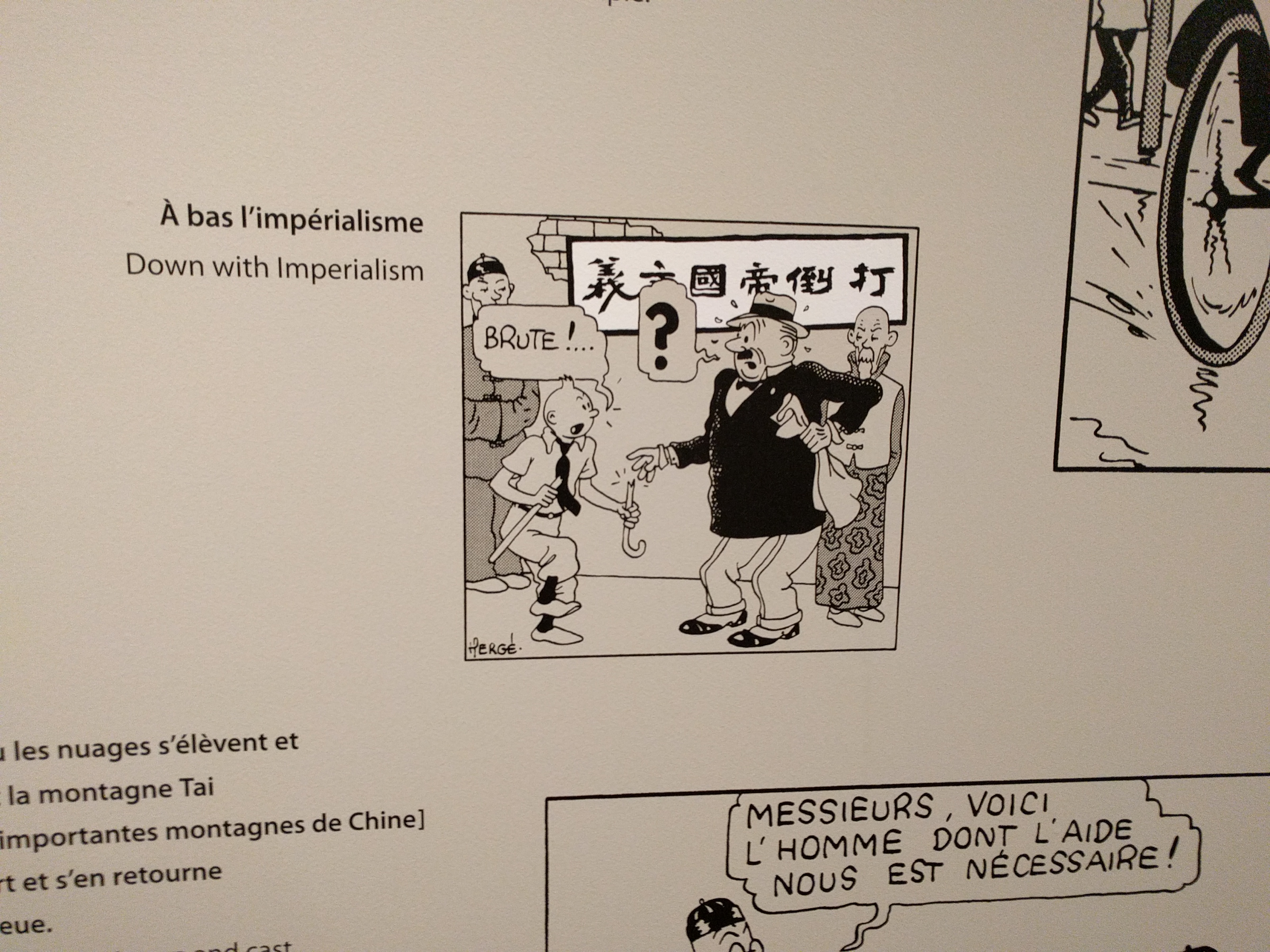
Interestingly the exhibit featured an entire room devoted to Hergé’s/Tintin’s ties to Asia. Several of the Tintin books take place in Asia and one of Hergé’s closest friends was the Chinese artist Zhang Chongren. In addition to some beautiful original pages from The Blue Lotus,  this room also had a wall showing the translations of some of the text from The Blue Lotus. The events of the book take place around the time of the Japanese invasion of Manchuria and Zhang, who supplied the Chinese writing for the book, used the opportunity to sneak in some anti-Japanese slogans. These didn’t go wholly unnoticed, as Japan made a formal complaint to the Belgian government after the book was published.

IMG_20170909_121753

The final room of the exhibit was devoted to Hergé’s influences and while there were some interesting items here, it seemed more like a catch-all room for odd and ends owned by the Hergé Museum. I enjoyed seeing stuff like an original Bringing up Father page, but I’d have hands-down preferred to see more original Hergé art.

There were plenty of other things that I’ve glossed over here–a wall of beautiful Petit Vingtième covers, various video interviews with Hergé, originals of some of his non-Tintin comics work, etc. But the main attraction for me was just a chance to ruminate on the many amazing original Hergé pages on display.  I visited the exhibit in the morning, left and had lunch, then returned again for really soak in the art. The exhibit runs through October. If you’re anywhere near Québec City–or if, like me, you can score a good deal on a flight–I highly recommend catching this exhibit. Id’ be delighted if it appeared at another venue in North America… but I wouldn’t bet on it!

Note: I visited a pretty great bookstore in Québec City and bought a handful of French comics there. I’ll do a separate post on that soon.

HeroesCon 2017 Mega-Panel!

heroes 2017 flyer_HR

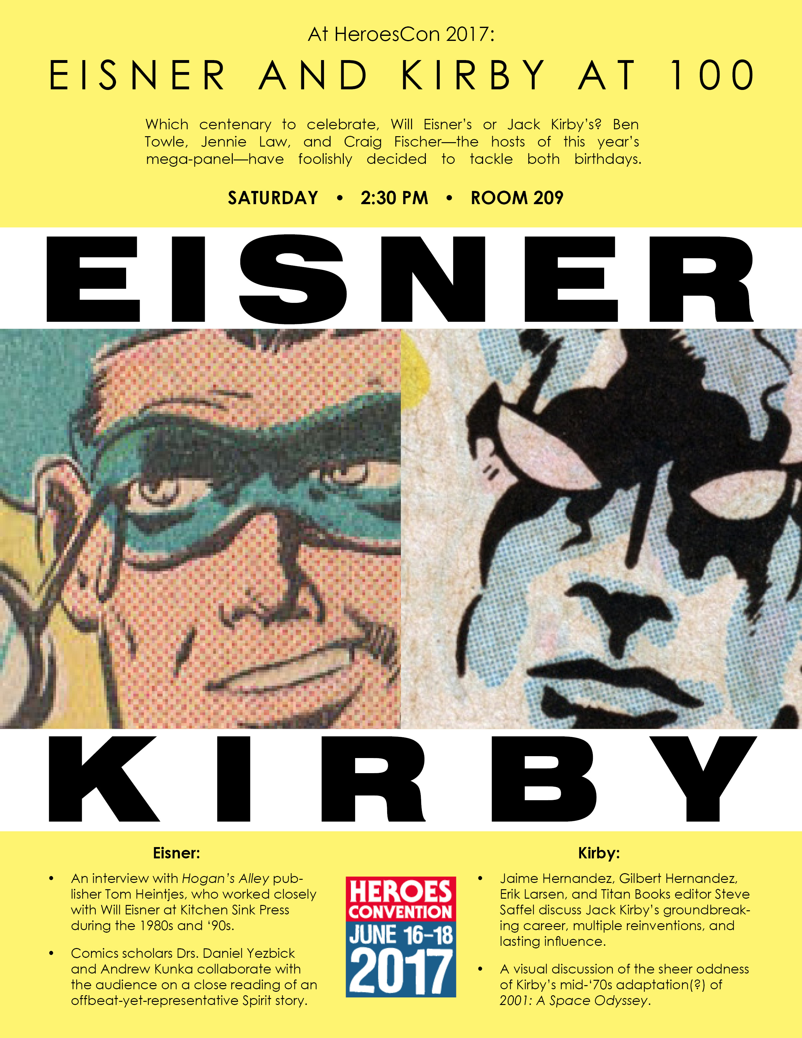
Here’s the skinny on the 2017 HeroesCon Mega-Panel. It’s Saturday at 2:30 in room 209. Full HeroesCon programming is available on their website.

EISNER AND KIRBY AT 100

Which centenary to celebrate, Will Eisner’s or Jack Kirby’s? Ben Towle, Jennie Law, and Craig Fischer—the hosts of this year’s mega-panel—have foolishly decided to tackle both birthdays.

First is Eisner: Ben will interview Hogan’s Alley publisher Tom Heintjes, who worked closely with Will at Kitchen Sink Press during the 1980s and ‘90s, particularly on a monthly column that appeared in Kitchen Sink’s comic-book-sized Spirit reprints. Expect insights into both Eisner the artist and Eisner the man. Craig will follow by inviting two razor-sharp comics scholars, Drs. Daniel Yezbick and Andrew Kunka (himself one-half of the Comics Alternative podcast team), to collaborate with the audience on a close reading of an offbeat-yet-representative Spirit story.

Then Kirby: Jennie will guide a panel of super-fans—cartoonists Jaime Hernandez, Gilbert Hernandez, and Erik Larsen, and Titan Books editor Steve Saffel—through a free-wheeling discussion about King Kirby’s groundbreaking career, multiple reinventions, and lasting influence. Finally, Ben will discuss the sheer oddness of Kirby’s mid-‘70s riff on 2001: A Space Odyssey—a fitting place to end, since Eisner and Kirby were monoliths that pushed comics to higher evolutionary achievements.

London: 40 Years of 2000 AD Exhibit/Paris: Les Super Héros

Over the past spring break, my family and I took a trip to London and then to Paris. Since it was our family vacation I mostly managed to kept my comics-centric interests in check during the trip, but I couldn’t help but make a couple of detours to check out comics-related things. So, here are a few thoughts:

London:

Our visit to London overlapped with the tail end of the Future Shock: 40 Years of 2000 AD exhibit at the Cartoon Museum. I would never have known about London’s Cartoon Museum if I’d not been specifically searching for comics exhibitions pre-London visit. And that’s too bad, because the museum itself is great and this particular exhibit was truly amazing.

The museum is, though, definitely off the beaten path. You really have to be aware of the place’s existence and be actively seeking it out in order to find it. It’s at 35 Little Russell St, Bloomsbury, London, which is a narrow street that tees into a pedestrians-only throughway, so it’s not somewhere you’d likely just happen upon.

Capture

The exhibit itself was great, though. As an American growing up in the ’80s, my exposure to 2000 AD was mostly through the Eagle Comics reprints of Judge Dredd and other 2000 AD stories. The USA-specific Brian Bolland covers of those Eagle reprints made me a fan for life of his work and it was a real treat to see some Bolland originals at the exhibit. I’ve also always been a huge fan of Carlos Ezquerra, who remains to this day my favorite Dredd artist, and there was plenty of Ezquerra on display as well.

Backing up, though… here’s what the general layout of the exhibit looked like:

IMG_20170411_103628 IMG_20170411_105903

In addition to the copious amounts of original art on the walls, there were a few odds and ends like this case full of 2000 AD issues:

IMG_20170411_104742

BUT, back to that copious original art! I took a handful of pictures of the artwork before I saw a sign admonishing people not to take pictures of anything other than the general layout of exhibits. But, at that point I’d already snapped a bunch of pictures–and, hey, I figure I’m safe from Comics Museum Interpol now that I’m back in the People’s Republic of Trumpistan. So, here’re a few pics I took. First, a bunch of amazing art by Massimo Belardinelli, Gary Leach, and Dave Gibbons:

IMG_20170411_103802 IMG_20170411_103810 IMG_20170411_103829

Check out this fantastic McMahon Scorched Earth spread… and to the right of it some original Carlos Ezquerra Stainless Steel Rat pages:

IMG_20170411_104241

Second only to Ezquerra in my book is Brian Bolland, He would eventually pretty much retire from doing interior pages at all, so it was especially great to see a bunch of his Dredd pages on display here–alas, though, not the one featuring the most iconic Dredd image of all, Bolland’s “Gaze into the fist of Dredd” panel.

Seeing Bolland inking up close is pretty stunning. It’s not surprising that he’d eventually focus solely on covers, given the amount of time it must take to crank out pages like this.

IMG_20170411_105340
IMG_20170411_105038

It was interesting that pretty much all the artwork had balloons/lettering added on vellum, as you can see in that top close-up. The artwork beneath shows through, but I guess that’s something that wouldn’t pick up in a photostat? There were tons and tons more 2000 AD art on display–all sectioned by character–but I stopped taking pictures when I realized it wasn’t allowed.

The Cartoon Museum also has an upstairs gallery that houses what I’m assuming are pieces from its permanent collection. I visited literally just an hour or so before I had to catch the train to Paris, so I only did a quick walk-around, but here’s the general layout:

IMG_20170411_110936Among the pieces up there was the original cover painting for the V for Vendetta collection. You can also spot here a Miracleman cover and a Kevin O’Neill LOEG page. Bonus points for the Rupert in the stairwell!

IMG_20170411_111239

The exhibit overall was really, really amazing and I feel really lucky to have been (completely coincidentally) in London when it was going on. Bonus: I bought some Moomin greeting cards at the museum gift shop:

IMG_20170412_093342

One final London note. While touring the city via bus, I noted this storefront with some sort of Beano display. I have no idea what this is, but wish I’d had time to investigate.

IMG_20170410_120009

Paris:

I was a little surprised that there wasn’t much going on in Paris as far a comics exhibitions go while we were there. Before leaving, I did though turn up this Joann Sfar show at the Dalí museum. Here’s a big ad for the same show I spotted at several Paris Metro stations:

IMG_20170411_195027If we’d had an extra day, I’d probably have gone to it, but from what I read in advance it didn’t seem like there would be much actual original comics art there, so I didn’t prioritize it. Before I move on to the one comics thing I did get to, I’ve got to throw out this one generally art-related anecdote:

While in Marais we decided to wander into a department store, Le BHV, just for fun. We mostly looked at clothes and toys, but out of the corner of my eye I spotted an arts and crafts section. My jaw literally dropped when I saw the art supplies they had on-hand. BHV seemed like a higher-end department store–maybe equivalent to something like Bloomingdale’s here–but the arts and crafts section (do U.S. department stores even carry art supplies?) was better than 90% of the dedicated art supply stores I’ve been into in the U.S. This is maybe a third of the section:

IMG_20170412_122719 IMG_20170412_122726 IMG_20170412_122741 IMG_20170412_122818On to comics, though! I’d gotten some great recommendations from a Parisian friend for comics shops to visit. The one he recommended near Notre Dame, Un Regard Moderne, had odd hours and didn’t open until the afternoon, so sadly we missed it. He also, though, highly recommended Les Super Héros, which was near the Pompidou Center, which we were visiting anyway. And it is an amazing store. Here’re a few pictures that say more about the place than I could:

I wish I’d had had room for more books in my luggage (Delta lost our luggage at Heathrow, we bought more clothes, luggage found/returned, had to haul new & old clothes back, etc.) but sadly I bought just three books: a recent Winshluss book, a limited edition black and white edition of the new Christophe Blain Gus book, and a Toppi reissue.

Winshluss’s Pinocchio from a few years was one of my favorite books of that year (2011?). The art in Smart Monkey is quite different from that in Pinocchio, however. Most noticeably, it’s all black and white (which is unusual for French comics in general). The first three quarters or so of the story is wordless, with dialog only in the epilogue. It comes with a small minicomic which reprints a short story featuring the same monkey character which appeared in a Top Shelf collection a while back.

The Blain book is a limited black and white edition of the newest Gus book, Happy Clem, the fourth in the series. The Toppi book is Momotaro, an adventure set in medieval Japan. Boom has been publishing some English translations of Sergio Toppi books here in the U.S., but I don’t think this is one of them. I can’t read Italian at all (Toppi’s native tongue) but I can kinda muddle through French, so this is better than nothing!

A week is hardly enough time to take in amazing cities like London and Paris, so I hope to return soon to one or both of them–and when I do, I’ll surely be able to spend more time exploring each city’s comics culture. Maybe I’ll even make it to Angoulême eventually…


Chuck Berry RIP – Some Chuck Berry Songs You May Not Know

Years ago I decided to focus my blog writing exclusively on comics-centric subjects. With the recent death of Chuck Berry, though, I’m making an exception.

If you knew me in my pre-comics days, you know that I spent some time as a musician–and more to the point: I’ve always been passionate about music. Like everyone interested in music I’ve had fluctuating musical interests. My tastes have grown and matured over the years. When I look (or, more accurately, listen) back on things I liked when I was younger, I often cringe. There are, though, a few musicians I have loved unequivocally my whole life. One of them is Chuck Berry.

I was first introduced to Chuck Berry’s music by my mother–albeit in a sideways fashion. My mom’s a huge Beatles fan and so we had Beatles records around the house when I was growing up.  My favorite songs on these records were tracks like “Rock and Roll Music,” Honey Don’t,” “Everybody’s Trying to be my Baby,” “Matchbox,” and “Roll Over Beethoven.” Only years later did I realize these weren’t Beatles tunes at all, but covers.

Digging into the sources of these recordings, I wound up purchasing The Great Twenty-Eight, a best of Chuck Berry record. It’s (as best as I can recall) the first record I bought with my own money and (for sure) one I still own and listen to today some thirty years later.

My appreciation of Chuck Berry only deepened as I delved more intensely into music in my 20s while playing in bands in the 1990s. I’m fairly certain my old band, Come on Thunderchild, played more than one Chuck Berry cover, but the only one I can specifically remember now is “Round and Round.” I got this tattoo around this time:

chuckChuck Berry died a few weeks ago on March 18th, and Sound Opinions–the great public radio music review/criticism show out of Chicago–did a fantastic appreciation of Chuck Berry’s life and legacy, along with a top ten list of his best songs. Their list is hard to argue with, but it’s definitely skewed toward his best-known and most recognizable tunes: Maybelline, Johnny B. Goode, You Never Can Tell, etc. I’d like to, though, post my own quick list here–as kind of an addendum to that list–of a few great Chuck Berry songs that aren’t necessarily the ones you may be most familiar with:


The Things I Used to Do

Chuck Berry didn’t do a ton of straight blues songs, but when he did–as here with his version of Guitar Slim’s “The Things I Used to Do”–the results could be pretty great. The studio version of this song appeared on his 1964 LP St. Louis to Liverpool (my personal pick for best single Chuck Berry LP) and it’s a great recording. This version, filmed for Belgian TV in 1965, is maybe even better. Check out both of the jaw-dropping guitar solos here. (Check also “The Love I Lost,” another great Chuck Berry straight blues performance.)


Oh Louisana

If you gave credence to most of the appreciations of Chuck Berry that appeared after his death, you’d get the impression he stopped writing original music in 1964. His original output post 60s was for sure pretty hit-or-miss, but there are absolutely some amazing Chuck Berry songs from the 70s if you’re willing to dig for them. By far my favorite post-60s Chuck Berry tune is this one, “Oh Louisiana,” from his 1971 record, San Francisco Dues. It’s part blues, kinda funky, and has a great vocal from Berry.


Reelin’ and Rockin’ (American Hot Wax version)

So, “Reelin’ and Rockin'” is of course one of Chuck Berry’s biggest hits and you’ve probably heard it a million times. This version, though, is from the 1978 Alan Freed biopic, American Hot Wax. In addition to featuring more explicitly lurid lyrics than the recorded version, it’s a pretty great live performance by Berry who at this point is in his early 50s.


I Love Her, I Love Her

This great track is from the hard-to-find 1968 LP From St. Louie to Frisco. It’s got a fantastic, grinding groove and big Stax-style horns. Check out those piano riffs at the end, courtesy of August “Augie” Meyers of the Sir Douglas Quintet.


Brown Eyed Handsome Man (Mercury version)

Here’s another Chuck Berry song you’ve heard a million times before… but not this particular version. Berry left Chess Records and recorded for Mercury between ’66 and ’69. One of the oddest moves during this period was the ’67 Mercury release Chuck Berry’s Golden Hits, which consisted mostly of newly-recorded versions of the original Chess hits. These recordings are contentious among Chuck Berry fans, but I think there’re some interesting nuggets here. My favorite is this re-recorded version of “Brown Eyed Handsome Man.” Unlike most of the other Mercury versions which are sped up, this one’s maybe even slowed down a bit? I loses a bit of its “chugga chugga” rhythm in favor of a mellower grove. I love all the great Johnnie Johnson organ and electric piano.


Drifting Heart

“Drifting Heart” is an early Chuck Berry (1956) oddity. It was the flip side of “Roll Over Beethoven” and later was the last track on the LP After School Session. Here Berry’s squarely in ballad mode with perennial secret weapon Johnnie Johnson supplying a simple pentatonic piano figure that–along with a snakey tenor sax–gives the track a vaguely mid-eastern vibe. This is Chuck Berry at his most Nat Cole.


Fish and Chips

“Fish and Chips” appeared on the 1970 LP Back Home, Chuck Berry’s first record after he left Mercury and returned to Chess. This great little tune has an almost country-ish vibe (not surprising from the guy who wrote “Maybelline”) that’s accentuated by an accompanying harmonica part from “Boogie Bob” Baldori.