Mike Mignola Exhibit at Society of Illustrators… and Some Other Comics-Centric Stuff in NYC


So, I recently had the good fortune to find myself in New York… and by “good fortune,” I mean: I set some travel alerts on Hopper and wound up getting a ridiculously low price on a one day to-and-from flight to NYC. While there, I checked out a few things likely of interest to comics folk, culminating with the the exhibit, The Art of Mike Mignola: Hellboy and Other Curious Objects, on display at the Society of Illustrators.

I started my visit, though, with a stop at Kinokuniya, the great Japanese book store off Bryant Park in Manhattan. This is a three-story book store that’s full of amazing stuff. The bottom floor is mostly Japanese stationary, toys, and tchotchkes; the ground floor is all Japanese language prose books; and the glorious top floor is all manga and art books–some in English, some in Japanese. In order to get to the top floor, though, you have to walk past a display of whatever these horrifying things are <shudder>.

Once there, you’ll be amongst the most manga you’ll likely ever see in one place. The shelving is divided into two sections: Japanese language manga, and translated stuff. They also have a selection of American comics that’s as good as most small book stores, as well as a ton of art/coffee table books.

I could easily have spent a mint in this place, but fortunately(?) I didn’t have that option. I did, though, buy this neat little Taschen book that’s an alphabetical run-down of important figures in manga:

Since I was already in Foreign Language Bookstore Mode, I next hit Albertine, the French-language bookstore that’s located in the French consulate building off Central Park. In what’s maybe a positive sign of the increasing amount of French-language comics being translated into English these days, I didn’t find much of interest to buy here. I wound up purchasing only this French edition of a Jiro Taniguchi book, one of many of his works that are as-of-yet unavailable in English:

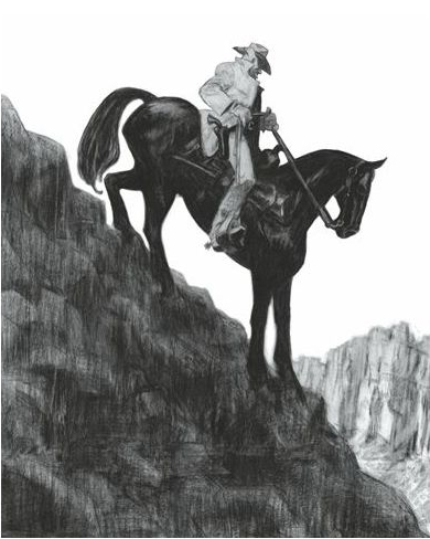
On my way out of the city, though, I visited my main comics-related NYC objective: The Art of Mike Mignola: Hellboy and Other Curious Objects, the big show of original Mike Mignola originals up at the Society of Illustrators.

Before I begin gushing about the show, let me get the one negative thing I have to say out of the way: this show was in a terrible space. The Society of illustrators has three floors dedicated to gallery space (and a fourth floor that’s a restaurant with art displayed on the walls). The lower two of these three floors are fantastic gallery spaces–big, open, white walls, well-lit. The Mignola show was not on these floors. This third floor–where the show was–is basically a long, narrow hallway with poor lighting, no windows, and bright red walls. There was a huge exhibit of March originals (a pretty spectacular thing to see in and of itself) that had just opened on the first two floors and I’d guess that maybe the Mignola show was originally down there, but then got bumped up to the third floor? Whatever the case, I’m not gonna complain about getting to see a ton of Mignola originals, but it was an odd, cramped space. Maybe they just need a bigger building? Real estate in Manhattan is pretty cheap, right? 

Anyway, before I do a big image dump of original Mignola art, a few quick observations:

  • Mignola’s most recent work has been paintings and the ones on display here were gorgeous. I hope these wind up being published in something sometime soon. 
  • There’re almost no corrections on Mignola’s originals and–more stunningly–the white detailing isn’t done with opaque white; he’s inked around(!) even the smallest parts he wants to remain white.
  • I noticed that he uses a really washy, gray-ish ink that I immediately pegged for Higgins Black Magic (the “black” should be in quotes). He verified via Twitter that this is correct. 
  • There was a ton of stuff from The Amazing Screw-On Head on display. I think he’s cited this as one of his favorite things he’s done, so that makes sense. 

Behold! 

Addendum: In the gallery/restaurant on the fourth floor, there was a display of art by Argentinian cartoonist Ricardo “Liniers” Siri, including a some art from his comic strip, Macanudo.  Not too long after I got back from the show, I noticed the strip had been picked up by King Features for syndication in US newspapers. See here

Bonus: There’s an original Ian Falconer portrait of Olivia the pig at the top of the stairs.

Character Design: High Eyeline is Now a Thing

Or, more to the point: high eyeline is now A Thing in character design and we olds need to just get used to it.

The Natural Proportions of the Head

If you look at a human head, you’ll see the eyeline is halfway down the head–exactly in the center between the top of the head and the bottom of the chin. Indeed, if you look up tutorials on drawing the head, often this is the very first proportional relationship they mention: “The eyes are halfway down the head.” You can see that shown here in these heads from (I believe) Burne Hogarth’s book, Drawing the Human Head.

Interestingly, though, a very very common proportional mistake that you see people make–especially beginners, students, etc.–is placing the eyeline far too high. Or, put another way: making the face way too big relative to the overall size of the head. This is such a common error that Betty Edwards devotes a section of her text Drawing on the Right Side of the Brain to the phenomenon under the heading, “The mystery of the chopped-off skull.” Here’s a student example from the text (L) and a version that she’s corrected (R).

As many people have pointed out, it’s a tendency that makes a lot of sense. Humans naturally ascribe a lot of importance to the face–it’s how we identify people, how we know what they’re thinking, etc.–so we tend to make it bigger in our drawings than it actually is. There’s a similar tendency (for similar reasons, one assumes) to diminish the area of the head behind the facial features as well. Edwards demonstrates these errors and corrects them here:

High Eyeline as a Deliberate Choice

If you look at the Edwards examples above, they clearly look “wrong.” That is: the artist was attempting to capture the naturalistic proportions of the human head but failed to do so because they placed the eyeline too high (or, again, put another way: they made the face proportionally too large relative to the overall size of the head). Indeed when I, as a teacher, would see student work that looked like this I would talk to the student about the basic proportions of the head, placing the eyeline half-way down, making sure to place the ear correctly and have sufficient mass behind it, etc. 

Several years ago, however, I began seeing a lot of student-drawn characters with high eyeline placement that was clearly not the result of mistake but part of the the overall character design idiom the student was interested in. If you look around at character designs in current North American cartooning you can see examples of this by highly accomplished artists. These aren’t errors; the eyeline is placed high deliberately. For example, here’s a character from Britt Sabo’s webcomic All Night:

Obviously the artist here is a highly accomplished cartoonist. These design choices are deliberate. Here’s another example (I can’t remember where I found this. My apologies to the artist):


Again, the proportions of the head here are deliberate design choices.

These examples of course may look odd to you if you’re mostly accustomed to the neo-realistic character designs of a lot of North American superhero books. Here, for example, is an Olivier Coipel drawing of Spider-Man. Note the placement of the eyeline and the generally naturalistic proportions of the head:

Even with superhero books, though, if you look a little bit out on the fringes you start to see some high eyeline creeping in. Here’s a panel from Javier Pulido’s run on She-Hulk:

It’s not radical in this case, but it’s there. Maybe not incidentally, but there was a very vocal subset of fans who absolutely hated Pulido’s art on this series. (I vehemently disagree. It’s amazing stuff.) 

It’s not as if no artist has ever fooled around with where to put the eyeline. It’s pretty common in cartoonier, more abstracted designs and of course in things like caricature. Here’re examples by Bruce Timm and Tom Richmond:

In both of these cases, the eyeline has been placed high in order to emphasize the mass of the chin/jaw. And, obviously, both cases are far less naturalistic than something like the Coipel drawing.

This kind of manipulation of eyeline placement has been around forever, but what I was curious about was the seemingly more recent integration of the high eyeline into otherwise more naturalistic character designs. Where was this coming from style-wise?

Origins of the Modern High Eyeline Design?

So, this is purely speculation, but I’ve got two candidates for the possible origins of the high eyeline style that seems to be gaining some traction among newer/younger cartoonists.

First: North American animation–specifically North American film animation of from 1999/2000. To give credit where it’s due, irascible animator John Kricfalusi seems to have been first to spot the “’99 eyeline.” Mid-way through this post on drawing women’s hair, he delves into “short foreheads and carved off craniums,” citing designs from The Iron Giant and The Road to El Dorado

I’d throw another 1999 film into the mix as well–one that was far more widely seen than either of those two (at the time anyway), Tarzan.

Also, though: manga.  You can see the high eyeline in evidence in some popular manga of around the same period. Someone far more knowledgeable about Manga than I will probably be able to cite an earlier origin point, but the artist who comes immediately to mind for me is Kaoru Mori–and specifically her series Emma from 2002. Do I even need to draw the parallel lines on this one?

You can see this design choice still in her most recent work A Bride’s Story (an absolutely amazing series, by the way. Highly recommended!). If anything, it’s become even more pronounced here with the face expanding horizontally as well:

I recently reread the first volume of Planetes and noted that Makoto Yukimura’s characters also have the high eyeline thing:

So, maybe this was part of some overall trend going on in manga at the time… and the animation stuff in North America was just a case of “parallel evolution.” Who knows?

So What of It?

If you think about it, diminishing the areas above and behind the face makes a lot of sense. We cartoonists are always on about “simplification and abstraction” and making every line convey information, right? Well, those non-face areas are pretty much dead weight when it comes to actually conveying information about the character. We include those areas in our characters so they look “right,” but what looks “right” to us is in a large part a function of what we’re exposed to–and how well the artist integrates things like exaggeration and playing with proportions into the overall character designs.

There are for sure examples I’ve seen where losing mass above and behind the face just looks weird. For example, this panel in Providence definitely stood out enough to me that I stopped reading and took note of it:

But when integrated into a character as a part of a well thought-through character design, it works beautifully. Here’s an example by the great Naoki Urasawa:

And if this looks “weird” to you… well, like I said, you may just have to get used to it!  

Recent Reads – February 2018

Here are a few quick thoughts on some comics I’ve recently read:


Neonomicon by Alan Moore and  Jacen Burrows

If you read this blog and/or follow me on Twitter, you know I’m a big fan of the recent series Providence by this same team. Providence is the last of three works by them that focus on things H.P. Lovecraft-related, with Neonomicon being the second and The Courtyard (also included in this collection, but inexplicably not really noted as such anywhere in the trade dress) the first. Given how much I enjoyed Providence, I was really looking forward to Neonomicon. Unfortunately, though, Neonomicon (and The Courtyard for that matter) are far lesser works than Providence. They’re both slight works that function mostly as gross-out cop stories layered over some Lovecraft pastiche. If anything, reading these has further cemented my belief that one major flaw of Providence is that it’s not a stand-alone work–the characters from these early stories appear toward the end of Providence and are a bit baffling if you’ve not read the earlier stuff. Also: Neonomicon is hard to get through because of Moore’s (by now expected) inclusion of rape. While I’d argue that the one instance of sexual violence in Providence ties in with the narrative and character in a way that serves some overall purpose, the rape element here is portrayed gratuitously and is just kinda gross. 


Real Friends by Shannon Hale and LeUyen Pham

I’d been looking forward to reading this book for a lot of reasons: a) Scholastic was seriously hyping it at the most recent school book fair, b) LeUyen Pham is one of the absolute best cartoonist/illustrators working in kids lit today, c) ditto Shannon Hale but for writing, and d) my daughter read it and said it was good. Well, it is good–really good. What I wasn’t expecting, though, was for it to be so gut-wrenchingly, trenchantly brutal in its depiction of how cruel children can be to one another. If I had to compare it to another book, it reminds me a bit of the prose novel Cat’s Eye by Margaret Atwood. Well, it’s for sure not that bleak, but it pulls surprisingly few punches–and it’s apparently autobiographical. Pham’s cartooning, as usual, is spectacular, particularly her ability to draw children–their expressions, gestures, even clothes. 


The Little Red Wolf by Amélie Fléchais

This is isn’t a comic–although Amélie Fléchais does comics as well–but, rather, a picture book. I noticed this book last year when I saw a review of it on an Italian-language comics review site and had intended to eventually buy a French edition.  I never did and luckily there’s now an English translation. When I initially started reading, though, and realized that the story was a riff on Little Red Riding Hood but with a wolf as the main character I immediately became dubious. I truly loathe most of those swapped protagonist-type premises. (“It’s Moby Dick, but from the whale’s point of view!” Ugh.) Thankfully, that’s not what’s going on here at all. Without giving any plot away, I’ll just say that–somewhat like True Friends–this (children’s) book addresses some pretty heavy emotional topics in a surprisingly engaging way that doesn’t shy away from the darker/scarier side of things. I’m not sure what to make of the fact that of the three books on this list so far, the two that are ostensibly for children are the ones exploring difficult emotions and scary situations in a way that’s not shallow or gratuitous.  

Oh, I should also probably mention that the artwork here is just gobsmackingly gorgeous


Diana’s Electric Tongue by Carolyn Nowak

This book–which won an Ignatz award last year–packs a ton of thematic punch for its size–meaning both its relatively small trim size and its modest page count. Diana’s Electric Tongue employs SF for what it’s best at: taking a futuristic concept (in this case, companion and/or lover androids as high-end consumer goods) and using it to explore a down-to-earth topic (loss, separation, failed relationships). This makes the story sound heavier than it is, though. In other hands this could have been a depressing slog, but Nowak’s often hilariously true-to-life dialog and her beautiful cartooning (check out the colors as well as several great isometric cut-away panels of house interiors) keep things chipper enough that when there is an emotional punch (that ending!) it hits hard, as it needs to.  


Gus Tome 4: Happy Clem by Christophe Blain

Admittedly, I’m coming at this one having missed the previous volume (I read the collected, translated volumes one and two from First Second, but got a hold of volume four, not volume three, next) but Happy Clem seems quite different tone-wise than the first two volumes. That’s not necessarily a bad thing, just different. Happy Clem is less madcap and less goofy than the first two volumes–and, as hinted at by the title, it focuses almost entirely on Clem, not Gus. Clem’s settled down into domesticity in San Francisco running a hardware store… but as you can guess, this state of calm doesn’t last long. I wasn’t sure what to make of the numerous “guest appearances” by figures from American Western films–people like DeForest Kelley, Sam Huston, Gene Wilder, etc.–that were rendered expertly but also somewhat distracting. (Total respect, though, for including the distinctive Star Trek site from Arena where Kirk fights The Gorn!) Speaking of expert rendering, this book is 100% worth buying just to look at the art. Every panel is a miniature masterpiece. If there was ever any doubt that Christophe Blain is the greatest living cartoonist working today, this book should settle it. A word of caution though: the French in this book was way beyond my meager skill level and you’ll likely struggle unless you’re a much more accomplished French reader. There’s tons of text in nearly every panel and the language is peppered with odd colloquial expressions (not to mention a lot of cussing) that took some digging for me to translate.  


My Faves of 2017

Here are some of my favorite things from the past year. As with all my previous year-end lists: (1) these are my personal favorite things, not “the best,” and (2) they’re things I enjoyed in 2017, not necessarily things that were new in 2017.


The Junji Ito episode of Manben [Japanese TV show, fansubbed – link]

Fansubs of seasons three and four of the Japanese TV manga documentary Manben have been slow in coming, but thankfully this season four episode which follows horror master Junji Ito jumped the gun and showed up in 2017. In addition to seeing Ito work on the as of yet untranslated story Layers of Fear, we also get to witness his elaborate and giant cat tree.


The Hergé Exposition at the Musées de la civilisation, Québec City [museum exhibit]

I’ve written a big post about this show, but in a nutshell: this was an amazing exhibition and getting to see it (especially given that I’m guessing this will be its only North American stop) was absolutely one of the highlights of my 2017.


Wacom MobileStudio Pro [drawing tablet/computer – link

I received one of these in 2017 on “extended loan” from a friend and was of course delighted to get to try out such a high-end piece of gear. I didn’t really get a chance to put it to the test, though, until year’s-end when we were doing holiday travelling and I took it along for work purposes. It can get hot with heavy use and the battery’s nothing to write home about, but the screen/stylus combo is amazing–far better than my studio Yiynovia–and having a machine with a full OS that runs “real” Clip Studio is a must-have for me. 


Nightlights by Lorena Alvarez [All-ages GN – link]

This all-ages GN from Nobrow is gobsmackingly gorgeous and has a great story as well: definitely kid-focused but not cloying–and even a little bit dark and scary in places. I loved it and so did my nine year-old daughter. 


The MNT [Patreon-based monthly comics newsletter – link]

The MNT is a new magazine of comics reviews/criticism that’s using Patreon as a publishing platform. The minimum pledge is a dollar a month and for that modest amount you get a really well put-together magazine featuring a ton of great writers. They cover a wide range of topics, including: mainstream Marvel/DC stuff, indie releases and indie cartoonists, industry/sales news, personal essays, even obituaries of prominent comics figures.  


Tristan & Yseult by Agnès Maupré and Singeon [French language GN – link]

I wrote an extensive review of this book just recently, so you can read more about it there if you’re interested. But, in short, this is a wonderful adaptation of the traditional tale of Tristan and Isolde, beautifully-drawn, and featuring some of the most interesting comics coloring I’ve seen of late. 


Pope Hats #5 by Ethan Rilly [comic book – link]

The fifth issue of Ethan Rilly’s (AKA Hartley Lin) Pope Hats wraps up the series’s one continuing story–the Frances/law firm bit–and wraps it up in a pretty satisfying way. Just as much a selling point, though, is Lin’s amazing artwork. Pretty much nobody in the indie crowd these days has the sheer drawing prowess–and in particular the brush inking chops–that this guy does. There’s a collection of the Frances storyline coming out in 2018, but I recommend getting the individual issues as there’s a ton of great non-Frances stuff in the earlier issues. 


Under the Hood [comics podcast – link]

Under the Hood is a new “minutiae podcast” about Alan Moore and Dave Gibbons’s Watchmen. The hosts, Hassan Otsmane-Elhaou and Kieran Shiach, are going through Watchmen and discussing one page per episode. There are few comics that have been as thoroughly planned and thought-through as Watchmen has and that could bear this kind of small-scale analysis. I’ve read Watchmen half a dozen times and there’re still things brought up in this podcast that I’ve not noticed before. 


Valerian and the City of a Thousand Planets [film – link]

Yeah, I know: everyone hated this movie. Maybe I’m just too much of a fan of the source material to evaluate it objectively, but I really enjoyed it. Yeah, the lead guy is kind of jerky and it’s over-long, but it’s also visually absolutely amazing. Just from a design standpoint it’s got more interesting stuff going on in the first ten minutes than any of those Marvel movies do in their entire run-times. Despite its flaws, Valerian is a rare big-budget genre movie that very obviously was made not via some corporate mandate, but because someone was actually passionate about making it–and you can tell. 


Providence by Alan Moore and Jacen Burrows – [comic book series – link]

Alan Moore and  Jacen Burrows’s Providence wrapped up this past year. Why this wasn’t a bigger deal is a mystery to me. In addition to likely being Moore’s comics industry swan song, Providence seems to me to be a good candidate for status as Moore’s late-era masterpiece.  Do yourself a favor and go read Craig Fischer’s excellent essay over at TCJ on the ending of Providence


Critical Chips 2 [magazine of comics criticism – link]

If anything, this second volume of Critical Chips is even better than the first volume, which I had on my 2016 faves list. I’m only about half-way through it, but I’d put it on my list solely for things like  Douglas Wolk’s essay on romance comics set at Woodstock and J.A. Micheline’s writing on Ghost in the Shell


David Mazzucchelli originals [photoset – link]

I’m not sure why this Flickr set of Mazzucchelli originals from a 2009 exhibition suddenly surfaced and started making the rounds in ’17, but I’m sure glad it did. I could stare at this stuff for hours. And it’s all high-res! Do yourself a favor and use Flickr’s handy “download the entire set” feature to get yourself a copy of this absolutely amazing stuff. 

Krazy: George Herriman, A Life in Black and White by Michael Tisserand [prose biography – link]

Comics has long-needed a thorough biography of one of its most important figures, George Herriman, and now we’ve finally got one. Michael Tisserand’s biography of the Krazy Kat artist is well-researched but never gets bogged down in minutiae–and, most important, it’s a blast to read. Now, when are we gonna get a Gooseberry Sprig collection?  

Review: Tristan & Yseult by Agnès Maupré and Singeon

I don’t usually review books–mainly because for any given comic there’re probably several reviews out there by actual comics critics, who have far more of an idea what they’re doing than I do. In this case, though, I’m making an exception because the book I want to discuss, Tristan & Yseult by Agnès Maupré and Singeon, is a French-language comic that I’m guessing probably hasn’t been reviewed in English. 


I purchased this book when I was on a recent visit to Québec City, at an amazing bookstore called Librairie Pantoute. I’d not heard of the book itself nor either of the creative team; I grabbed it off the shelf because of its cover, which as you can see is quite striking:

What sold me on the book (figuratively and literally) was the coloring. If you know me via this blog or on twitter, you know I’m a sucker for coloring that’s (1) flat, with little to no rendering, and (b) non-literal. And that’s exactly the way this book is colored. Here’re a few examples:

As you can see, this coloring is exactly up my alley: nary a gradient to be found and the artist’s color choices are as much to convey mood (and maybe just for pure aesthetic interest) as to describe the objects represented on the page. Not atypical of French comics, it’s actually pretty difficult to figure out who colored the book. French comics often don’t specifically credit the colorist, so if one’s not listed it could be that the artist colored the book themselves or that an (uncredited) outside colorist was used. In this case, it seems that the artist, Singeon, (what’s with the single-name thing, French cartoonists?) did the coloring here. 

While I eventually warmed to the cartooning itself, I have to admit that at first glance I found it a bit looser than the type of cartooning that I usually gravitate towards. As I read the book, however, I began to really appreciate Singeon’s cartooning. He’s, for example, really great with conveying subtle facial expressions–something I personally struggle with and always appreciate when I see real masters pull off well (see: Raina Telgemeier, Lynn Johnson). You can see this in the last image above, for example. Even without the dialog there you can get an excellent read on what’s going on in the minds of the two characters. Here’re a few more:

He’s also great at drawing vegetation. The second panel in those color examples is a perfect illustration of this, as are these:

His page layouts tend to largely stick to a basic grid–something I also tend to like in comics. Full-page spreads are used sparingly but when they are, the results are pretty stunning:

I absolutely love how the fish in the top example flow from the bottom panel on the left-facing page into the right-facing splash page.

Beyond any of the particulars of Singeon’s cartooning, though, here’s an interesting thing about Tristan & Yseult aesthetically: it’s one of the very few examples I’ve ever seen of a French comic that appears to be highly influenced by American indie comics, rather than the other way around.  You can see the influence generally in the format of the book: it’s smaller than the traditional European album at just 10.5 x 7.5-ish inches. That smaller trim size necessitates a three tier grid, as usually seen in American comics, rather than the four tier grid that’s common in European albums.

Beyond that, though, the actual drawing in the book isn’t typical of what we in North America generally associate with the European cartooning tradition. Singeon’s thin-ish linework and avoidance of spot black for high contrast shading jibes with the ligne claire tradition in Franco-Belgian cartooning, but that style of linework has also been pervasive in modern American indie comics as well for years via influences like Moebius (and via manga artists like Katsuhiro Otomo for that matter). Curiously, what Singeon’s cartooning most reminds me of influence-wise is David Mazzucchelli.

And that’s odd because I’m hard pressed to think of many artists–even here in the U.S.–who are overtly influenced by Mazzucchelli. There’s maybe Dash Shaw in the indie corner and David Aja on the more superheroish end of things? Yet, Mazzucchelli is a rare figure who’s respected across a broad array of cartoonists–among superhero folks for his amazing work on things like Year One and Daredevil, but also among indie folks for stuff like Rubber Blanket and Asterios Polyp. I may be completely off-base in my Mazzucchelli comparison–god knows I’ve been pegged as being  influenced by people I’ve literally never heard of–but, in Tristan & Yseult we seem to have a rare example of just such an overt Mazzucchelli influence–and, in this case, an influence coming from his lesser known post-superhero work. 

In particular, the drawing style reminds me of some of Mazzucchelli’s all ages comics, such as this one from the Little Lit series:

I see some of his unique color sense throughout Tristan & Yseult as well:

Whether or not I’m correct with the Mazzucchelli influence in particular, there definitely seems to be an aesthetic influence here coming from North American indie comics. As a North American indie cartoonist interested in–and influenced by–the Franco-Belgian tradition it’s fascinating to see the results of these same influences flowing in the opposite direction.

And what about the story? I’ve somehow managed to graduate from a respectable liberal arts college without reading any permutation of Tristan and Iseult, so I can’t say with a ton of authority what elements of the story are traditional and what are coming from Agnès Maupré. The only notable element of the comic’s narrative that I couldn’t find mention of in the Wikipedia entry on Tristan and Iseult nor the Wagner opera adaptation of it was some interesting thematic elements about vegetarianism. In the comic, King Mark is a staunch vegetarian who nonetheless has to lead his court on hunting parties. At the climax of the book, Tristan is mortally wounded during a hunt–again, not something I could find mention of online. 

One thing I really liked about the story was that it didn’t feel the need–as so many stories do–to explain every. single. thing. Yseult’s mother and Yseult herself seem to have some sort of magic powers. Her mother is the one who creates the love potion. And later we seen Yseult compulsively licking blood off her hands. But these elements are simply put there and not explained. Similarly, King Mark has donkey ears that he keeps hidden beneath his hat. You can google to find an explanation for that one, but again, there’s no need to go into it in this story and thankfully Maupré doesn’t.

Tristan & Yseult is a beautifully-drawn (and colored!) adaptation of a classic tale from literature so you’d think it’d stand a good chance of being translated into English and sold domestically. I wouldn’t hold your breath waiting for this to happen, though. Because of our peculiar American attitudes about sex, nudity, etc. this book is probably off-limits for most U.S. publishers who otherwise might give it a shot–I’m thinking of entities like First Second here. (If it “only” had a lot of graphic violence, that of course would be no problem at all here in the good ol’ USA.) So, I’m glad that I took the effort to struggle through in French.

And speaking of French, a few notes on language for anyone considering reading this: My French, such as it is, is pretty bad (a generous assessment). I have to have a French dictionary at hand and Google Translate open on my phone to get through much of anything. That said, the French in Tristan & Yseult isn’t too complex. As you can see in the sample panels I posted, the volume of text  per panel is reasonable (aside from one big splash page toward the end that’s all text). There are also relatively few weird idomatic expressions in the book–and the ones that were there I was able to figure out relatively easy via Google or by asking about it on Twitter. There are a few instances of wordplay–such as when some courtesans are making cow/animal allusions about Yseult–that I struggled with a bit, but generally most of the French can be popped into Translate as a last resort and will yield something vaguely coherent. Oh, and also: for some reason they talk a lot about butts in the book, so you’ll learn two or three different French words for butts, butt cheeks, etc. Bonus!