I admit, there’s not much point to this post other than, “These things look cool,” but hey, they do look pretty cool.
I’m lucky enough be be the recipient of a slow trickle of old family books, mostly from the part of my family that originates in the Lancaster, PA area. I did a post a while back about the fantastic full set of My Bookhouse volumes I received, but since then I’ve gotten my hands on two other items.
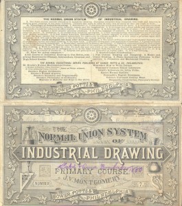
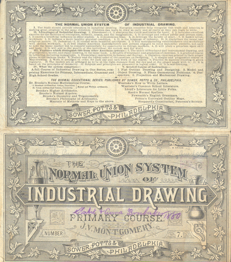
The first is a workbook from something called “The Normal Union System of Industrial Drawing.” A Google search for this turns up a big nothing. It appears though, to be a workbook for students of basic mechanical drafting (entities since replaced by CAD software). It’s filled with areas for students to construct mechanical shapes via elliptical curves, angles, etc. Looking at the beautiful cover of this thing, fans of Chris Ware’s work (and I’m one of them) will immediately recognize the aesthetic kinship between his work and this era of commercial illustration.
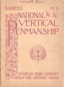
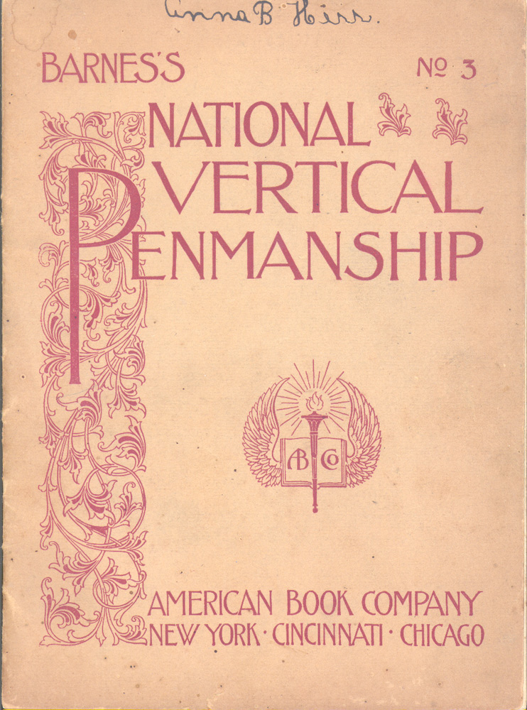
 The other book, as you can see, is a workbook for a penmanship course. If the word “penmanship” seems archaic, it’s because it is; handwriting and handwriting instruction have been on the decline in this keyboard-centric age. The less-cluttered Art Nouveau-ish cover design of this workbook is really beautiful I think. The typefaces and typesetting alone are worth noting. I love how the “E”s are not consistent. The X-height of the “E” in “vertical” is different from the X-height of the one in “penmanship.” All the kerning here looks like it was eyeballed–albeit expertly eyeballed–and gives the lettering a non-computery, organic look.
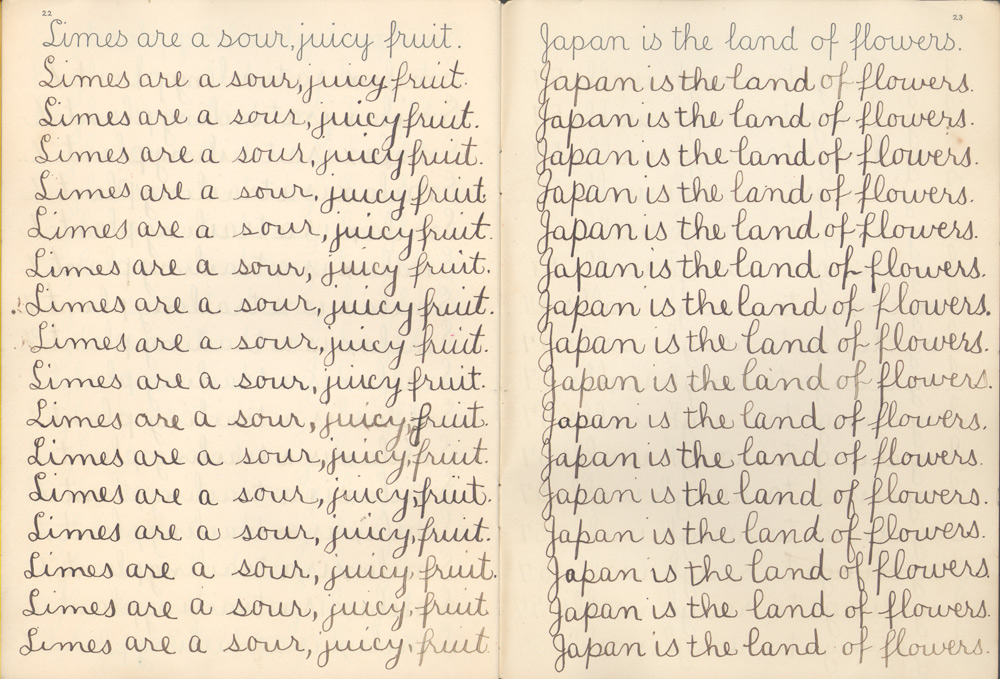
Here’s a sample of some of the writing inside, done when my great great aunt Anna Herr was learning handwriting in 1898:
 There’s something really beautiful and captivating about seeing those lines and lines of type repeated like that. (And it of course reminds me of the opening sequence of The Simpsons.) I remember as recently (?) as the mid-90s a friend of mine taking a class in typesetting that involved learning how to hand-draw basic serif and sans serif fonts. I also remember seeing in my mom’s college art portfolio a piece she did for a typesetting class where she’d hand-drawn the lyrics to The Doors’ Crystal Ship in big four or five-inch serif lettering. (Now that I think about it, I’d love to have that framed in my house.) I know that no one actually has to do this kind of stuff anymore, but it’s something I’d love to be able to do and I think I’d learn a lot about typefaces and typesetting in the process–both things I don’t know much about.
Anyway, end rambling post. Hope you enjoy these dusty old books.



Recent Comments