Is the Cover of Detective Comics #1029 Derived from a Series of Fan Commissions?

I may be wrong–and please correct me in the comments if I am–but I believe this recent cover, the cover for Detective Comics #1029, is the first time a fan commission has (kind of) made it to the cover of an actual, published Marvel or DC book.

So, re. “kind of,” some caveats: first, the cover itself isn’t a fan commission, but the basic premise–a villain seated in front of a “trophy wall” of his vanquished adversaries–is. And that basic setup isn’t just from a single fan commissioned piece, it’s derived from a well-known original comics art collector’s very impressive themed collection of “trophy wall” commissions. 

The other caveat: yeah, it’s possible this is a total coincidence… but that seems unlikely. 

So, what about this themed collection? The owner and instigator of this collection is Chris C (I know his last name, but that’s how he appears on ComicArtFans.com, so that’s how I’ll refer to him) and you can see the very first such commission–by none other than Brian Bolland–from 2005 here on his ComicArtFans page. 

From the description on the page, it sounds like Chris came up with the idea and submitted it to Bolland along with a bunch of other possibilities, but that it was Bolland who ultimately chose the trophy wall premise from among those submitted.

I gave Brian a host of ideas for this piece and he picked the most “out-there” and graphic of them all. I was concerned that he would think it too macabre but he took to it like a fish to water. When you have a living legend of an artist who gets excited about a piece he is working on this is what you get….I am beside myself.

A Bolland original is amazing enough in its own right, but Chris C then apparently began commissioning pieces with the same basic setup from tons of artists. If you go to Chris’s ComicArtFans main page and scroll down to the bottom you’ll see that he’s currently got six pages full of them! It looks like there are about a hundred currently listed.


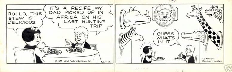
Chris has even purchased an original Ernie Bushmiller Nancy strip that features an a trophy wall gag:

Interestingly, the cover artist for Detective #1029, Kenneth Rocafort, doesn’t appear in Chris’s list of trophy wall commissions. I wondered if maybe he’d done one for Chris and then reused the concept for the Detective cover.

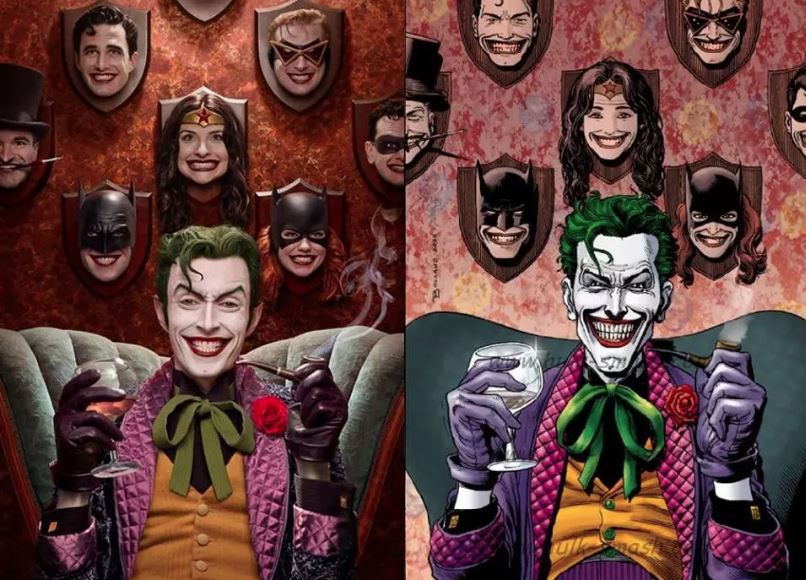
Back to the Joker commission… if it seems vaguely familiar to you, it might be from seeing this amazing cosplay of the image that was making the rounds a few years back. That’s all the same guy, just photo-collaged together. (I have no idea who colored the original commission image on the right or where that came from.)

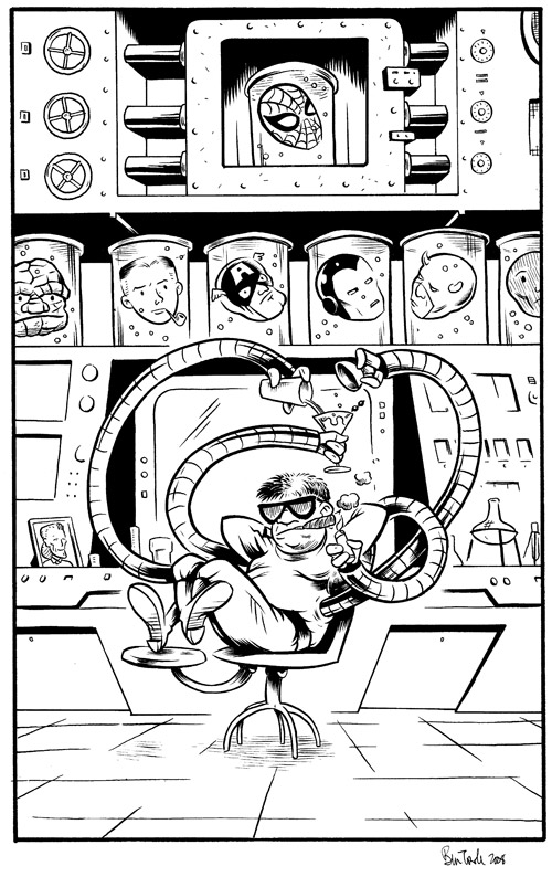
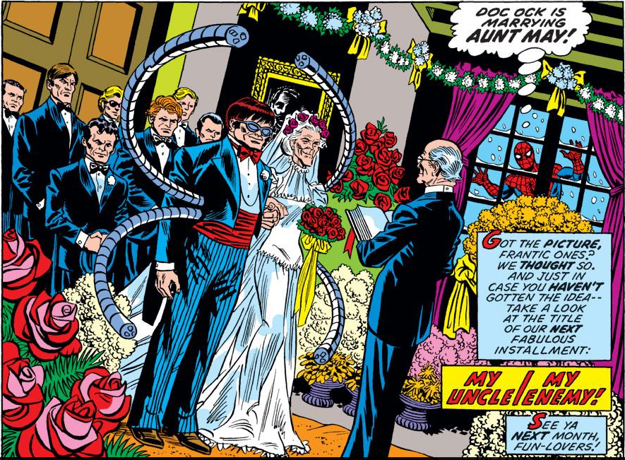
You may be wondering: why the heck do I know all this back-story about trophy wall commissions, etc.? Well, it’s because I’ve done one. Here’s mine. The artists are given some leeway in their choice of villains to focus on and if I’m remembering correctly, I started off trying to work up an image with The Owl, who’s one of my fave Marvel villains. For reasons that I can’t remember now, that didn’t work out, so I went with another personal fave: Dr. Octopus! 

And you may notice, true believer, that Doc Ock’s still got a thing for Aunt May. 

(The perspective on that framed picture is wrong and it’s bugged me for twelve years!)

As for how Chris C’s venerable “trophy wall” theme made it to the cover of a major DC title: my guess would be via the fairly well-known Bolland piece, but who knows exactly? 

UPDATE #1:

Twitter user Ken Raining pointed out that a somewhat similar premise had been used by John Byrne for a cover of Namor The Submariner… in 1990! This is, though, to my mind only really a surface similarity. The villain here is The Headhunter and the heads here not heroes that are her now-slain adversaries, but just regular ol’ victims–and actually alive with just their heads protruding through the wall apparently. Obviously, we’ve also not got the trademark casually-seated-in-a-chair pose. I’d personally chalk this one up to coincidence rather than there being any real connection between this cover and the Bolland piece that latter appears. Still, though, maybe it’s possible that Chris or Bolland had seen this and it was in the back of their minds when the original commission came together.

(And is that Craftint on that Byrne cover? Be still, my heart!)

UPDATE #2:

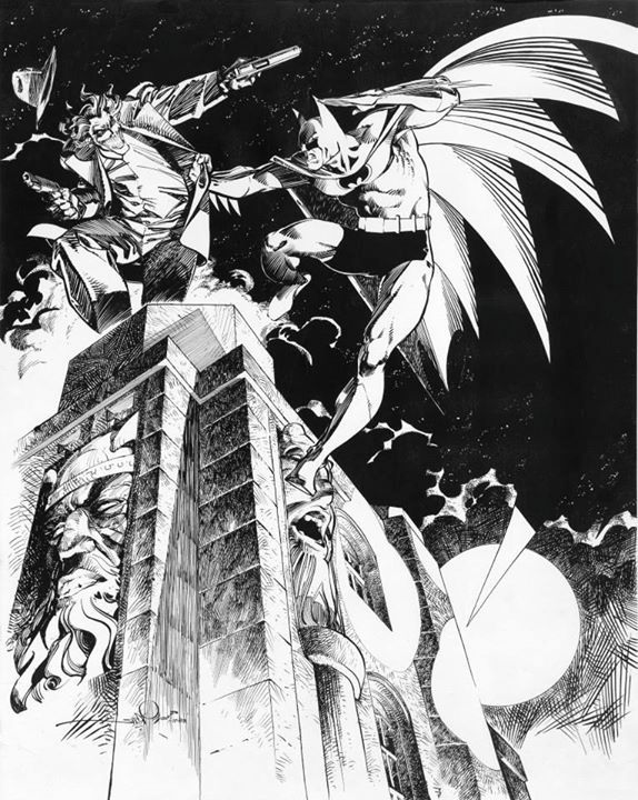
Joe Grunewald (of The Beat) has made me aware of this interesting tidbit, that’d I’d never heard about before. (Surprising, since I’m a tremendous Walter Simonson fan!). Apparently the cover to Batman #366 was originally a piece that Walter Simonson had done as a sort of thank-you gift, but which wound up being used as a cover at the insistence of editor Len Wein back in 1984. So, not exactly a fan commission, if we want to get nit-pickey, but definitely an earlier instance of something pretty similar to the “trophy wall” scenario. You can read more about it here.

Here’s the original piece and the cover as it appeared:

Anatomy of this Year’s CXC Poster

Cartoon Crossroads Columbus (CXC) is one of my favorite comics festivals–and that was the case well before I was a Columbus resident–so it was a real honor to be asked to do this year’s poster. The event just officially released the poster along with a preliminary guest list, all of which you can find on their site here. 

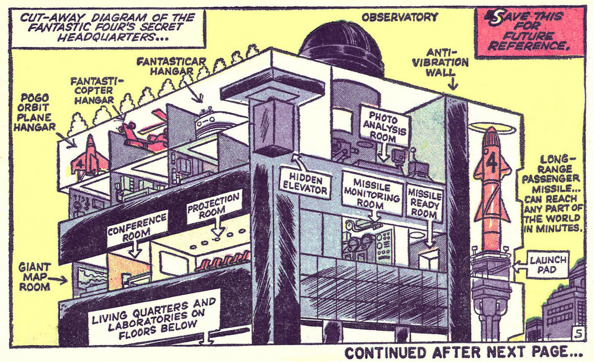
I noodled around initially with a number of different concepts for the poster and was leaning toward just doing a scene of the show floor with everyone as anthro/animal characters, but at the time I was brainstorming I was also setting up a unit for one of my classes on cut-away illustrations, something I’ve always had a soft spot for. Here’s an example: 

It dawned on me as I was putting my class presentation together that I should figure out a way to incorporate a cutaway into this year’s poster design, and thus I immediately switched gears and begin working up a design based on some kind of cutaway. I would think back to this moment many times as I spent hours and hours painstakingly rendering miniature interior spaces on the poster–“Why didn’t I just do the damn animal thing?!” Anyway, this was a great excuse to take a deep dive into comics’ wealth of amazing cutaway drawings. I rounded up tons of them, but here’s one of my favorites: The Fantastic Four’s Baxter Building:

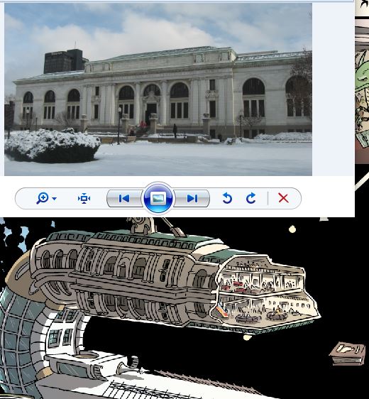
And of course I’d be remiss if I didn’t post maybe my fave cutaway illustration of all time, this Richard Scarry ship, which I’ve written about previously:

Given that the festival takes place at multiple locations (or did take place pre-COVID. Obviously the poster concept seems somewhat bittersweet in retrospect, since the event’s wisely gone virtual) it’d only be fair to try to do cutaways of all of the man locales. I can’t recall exactly what possessed me to do a space-themed image, but I guess in a bid to make things as complex as possible for myself I decided I’d combine the locations not just into a space station, but into a space station that spells out “CXC.” Here’s my initial rough:

And, obviously, if there’s a space theme, there should be aliens and astronauts–as you indeed see in the final poster. There were a lot of steps, obviously, between my little rough sketch above and the finished image, and a lot of design choices going on–some just referencing the various Columbus festival locations and others relating to the overall SF theme. So here, just for fun, is a “dissection” of the various visual elements in the final design:


Columbus Locations

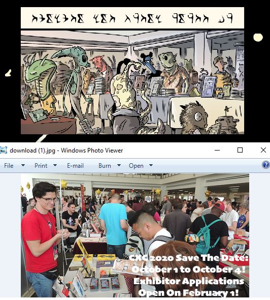
Starting from the top… This section is the Columbus Metropolitan Library, where the sales portion of the show is usually held:

The cutaway inset is the upstairs gallery where the tables are set up. Incidentally, this is a beautiful space. One of the things I really like about CXC is that it’s in a bright well-lit space, unlike a lot of cons which are in convention centers or hotels which can often have windowless, bunker-like areas for events.

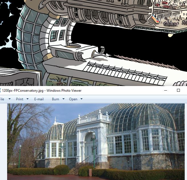
I needed some elements for the curve of the upper  “C” and grabbed them from the Franklin Park Conservatory–a location totally unrelated to the show, but it’s a cool building! 

Again, not a location that’s associated with CXC, but I threw in a bit (upside-down) of Columbus’s amazing downtown Topiary Garden:

The main “X” element is the Billy Ireland Cartoon Library & Museum. Have I mentioned that the Billy Ireland, right here in Columbus, houses the world’s largest collection of original comics art? 

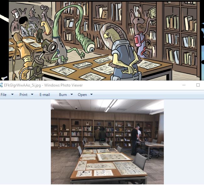
… and its cutaway view is the Billy Ireland’s reading room where you can look at any of their 300K-ish originals, as these folks in the poster are doing:

Moving into the lower “C” now, this section is the Wexner Center at OSU.

I couldn’t find a picture of the auditorium or a screening room, so its inset is just kinda freestyled it, but I did have the audience watching Tezuka’s Simba the White Lion. 

The tail end of the last “C” is a building at CCAD. That’s actually a dorm, not a classroom building, but hey, I wanted a building that wasn’t that tan concrete color. Aesthetics over accuracy, I say!

I just kinda made up the CCAD classroom in the inset, but needless to say, I’m familiar enough with the inside of CCAD classrooms that this wasn’t a problem for me.


Space Elements:

The space itself is, of course, “Kirby Krackle,” which at this point–along with stuff like Ben Oda-style war sound effects, and Stan Sakai’s skull/death emanatta–has just kinda become part of comics’s visual language. For what it’s worth, when doing krackle digitally (the whole poster is digital/Clip Studio Paint) I start with a “base coat” from a custom Kirby Krackle brush in black, then go over by hand adding in black dots… then erasing out some white ones. Just using the straight brush doesn’t look right. 


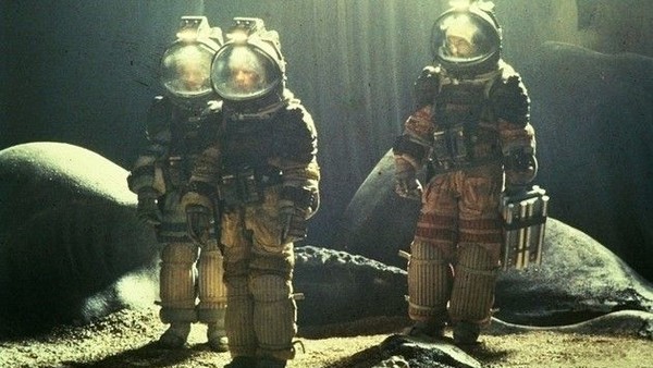
The biggest space design element is of course the astronaut–who is being used by him/her-self for things like a custom bookplate, sand-alone logo, etc. For the suit design, I went to two of my all time favorite movies: Alien and 2001: A Space Odyssey. (I’m a SF nerd.) You can see I’ve grabbed a number of design elements from the 2001 suits, most obviously the great orange color. I’ve always loved the bold colors of these suits.

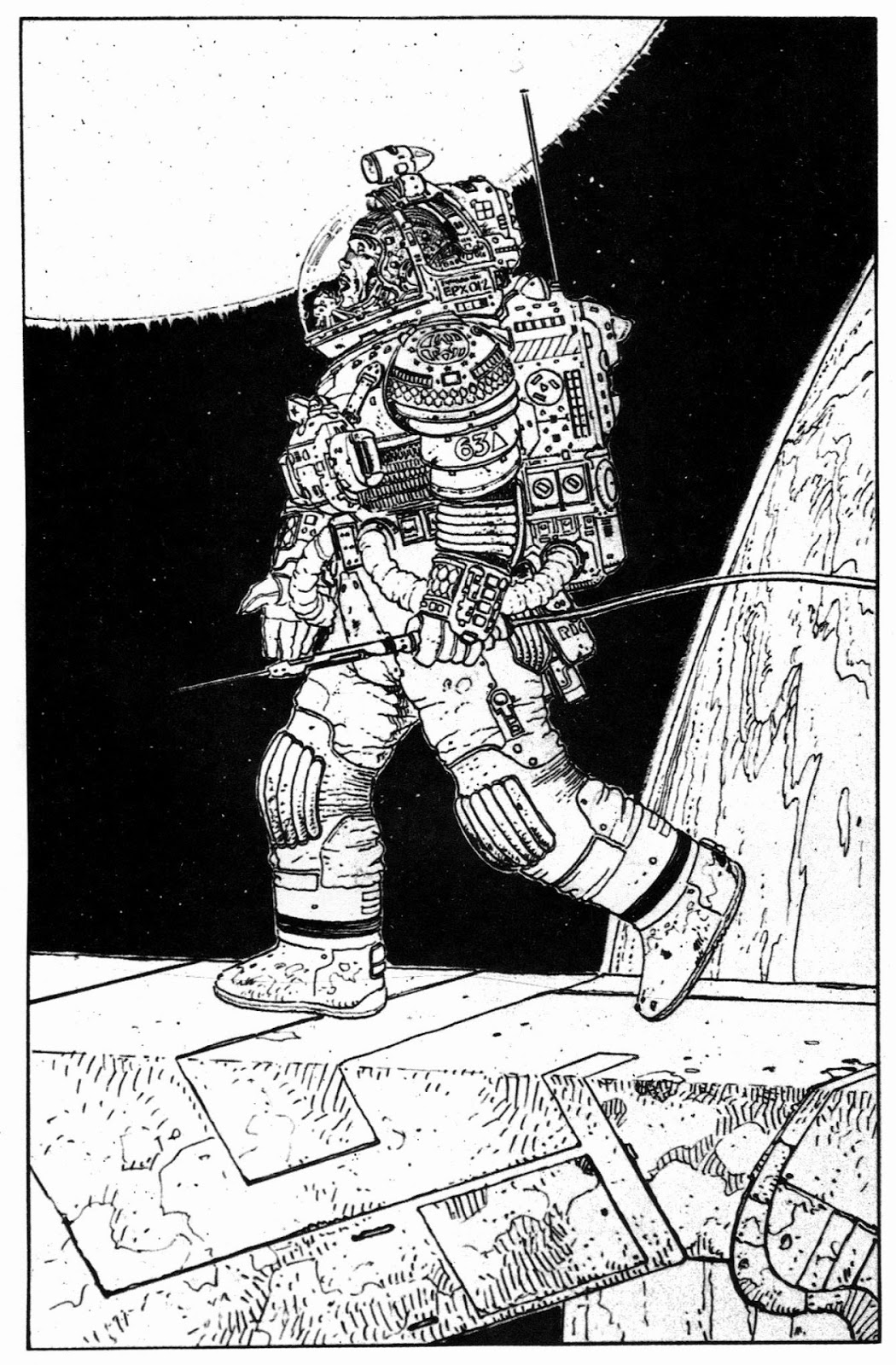
I’m also grabbing elements from the beautiful deep sea diver-inspired suits from Alien. Comics connection! These suits were partially designed by the great French cartoonist, Moebius:


Typography

Speaking of SF movies, pretty much all the typography in the poster is done in Eurostile Bold, which has become the go-to for pretty much any SF typography. The great Typeset in the Future blog did a massive post on this typeface.

The typeface at the very bottom is OCR-A, a typeface developed for optical character recognition (duh) and which looks like an old monotone CRT monitor display, as you see in lots of old SF movies. In fact, once the guests to the show are announced, they’ll appear in green type on a black background to emulate exactly that. (Guest names here are–obviously–placeholders. As if!)

The alien typeface is this “alien” font, which the designer was kind enough to let me use for the poster:

It’s not typography per se, but if you’re a fan of Alien, you probably recognize the little checkerboard symbol in the bottom right:

That’s part of  “Semiotic Standard,” a set of symbols developed by designer Ron Cobb that you see all over the Nostromo in the film. Here’s the full set:

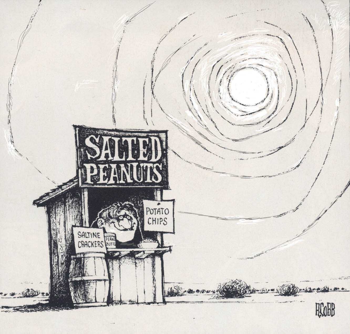
Cobb says the “hazzard/danger” symbol (the checkerboard) was deliberately made to look like the logo for pet food brand Purina because the Nostromo‘s crew were “alien chow.” Incidentally, Ron Cobb is another comics-connected element to the poster: in addition to his well-known work on films like Alien, Total Recall, etc. he’s a pretty good cartoonist, too!

Over 280 of Ron cobb’s Cartoons


And finally…

Just for fun, I threw in the cover to one of my favorite comics. In the lower right corner of the library/show floor inset you can see a little furry alien with a copy of Eightball #13 in his mitts!


Back From the Old School: Showing Motion via Repeated figures in a Single Panel

Lately, I’ve been noting a lot of panels like this in the comics I read and it’s made me wonder about what exactly this technique is, how how it works, and where it came from:

What it is:

This is from Cyril Pedrosa’s recent (and amazing) book L’age d’or, which is now out in English as The Golden Age. What’s going on here formally (and the dialog isn’t really important to it, so you don’t need to be able to read it) is that each set of horses and riders in this image is are the same horses and riders; they’re just progressing through time over a static background. It’s not a technique you see a ton in comics, but once you’re aware of it you’ll find it cropping up more often than you’d suspect in your reading. 

So, what are we actually seeing here formally? Repeated images (usually characters) in comics, moving through time and space over a single background, without the use of gutters/panels to create sequence or explicitly dictate reading order.  

It’s worth noting that Paul Gravett has a great post on a lot of the same general subject matter here–although he doesn’t draw fine distinctions between what could be seen as a few different varieties of repeated image techniques. In Gravett’s article–which appears to be written in 2008–he’s springboarding his discussion off of Gianni De Luca’s (he’ll be mentioned below) extensive use of this technique in his adaptation of Hamlet. Toward the end of the article Gravett has this to say:

While it would be possible to catalogue still more cases of this effect, no doubt in Chris Ware’s output or in manga, from what I have found so far they amount to little more than certain special panels or pages – fascinating efforts, experiments or oddities – but mostly they bear no comparison for me to De Luca’s huge skill and sustained use, not only in Hamlet but also Romeo and Juliet and The Tempest.

This statement may still be true. I wonder, though, if the extensive use of this technique in L’age d’or wouldn’t put it at least in the same ballpark as Ge Luca’s work far as cartoonists really digging in and exploring how this technique can be applied? It’s used pretty extensively throughout L’age d’or and its sustained and repeated use by Pedrosa there is certainly unlike any recent comic that I’m aware of. It’s part of the meat of the story and how it functions–certainly not one-off oddities. 

What it isn’t:

There are several formal devices in comics that look a lot like this technique on the surface. Some function similarly in a formal sense, and some just resemble it superficially but function differently. Here are three formal devices that bear some resemblance to what’s going on in the above image, but aren’t exactly the same thing:

1) Repeated image to represent speed – This is probably the most common sort of repeated image you see in comics. In this Carmine Infantino Flash panel, for example, we understand that there are not actually five identical people here; it’s an image of a single person moving very quickly. And, much like that L’age d’or panel, that character is moving through space and there’re no panel borders breaking up this motion. 

So, why don’t I think this is the same thing? Scott McCloud gets to the root of it in his discussion of this device in Understanding Comics:


“Photographic.” “Film.” This is a device that’s mimicking the effect of a camera. It’s primarily optical rather than diagrammatic.

I think this idea is supported by the (as far as I can tell) total absence of this sort of device in any kind of visual art until after the invention of the camera. (I’d love to be proved wrong, though. If you can find one, let me know on the comments!)

Further, I think supporting the idea that this is different from what we see in that L’age d’or panel is looking at how it’s used. This type of repeated image–the type that emulates a “motion blur” is pretty much always used as a visual indicator of speed. It’s not a coincidence that you see this employed a ton in comics like, well, The Flash. In contrast, I think it’s pretty clear that that L’age d’or panel is not supposed to indicate that the characters are moving quickly; if anything, it evokes a languid  conversation that’s happening over an extended time as the characters meander through their environment. 

Linguist Neal Cohn refers to comics effects where images are repeated to indicate speed or motion as “partial reduplication” (“partial” because only the moving parts of the objects are duplicated visually),  as seen here in this slide he shared with me via Twitter:

My gut feeling here is that, of those images above, the left two are somewhat different formally than the right two. The right ones are pretty clearly mimicking a photographic effect; the left two seem to me to be maybe an extension of this photpgraphy-based language that’s mixed in more with comics’s native diagrammatic abilities. But, that’s a bit of hair-splitting for some other time, perhaps! 

2) The polyptych – I’ve seen several different terms for this particular device, but “polyptych” is what McCloud calls them and that’s what seems to have stuck. The polyptych is kind of a catch-all comics term for any time a single background/location is subdivided into multiple panels. Sometimes a polyptych is simply this–a setting divided into panels–as in this panel from Master of Kung-Fu. There’s nothing moving here, no repeated figures:

Other times, there’s a repeated figure included, which brings it very, very close to our original L’age d’or example, as here in this Gasoline Alley strip:

Unlike the L’age d’or panel, though, we have the added element of division by panels/gutters. The figure is repeated once in each panel. You read it left to right, top to bottom, with the grid dictating your reading movement. 

You can find a great decade-by-decade index of these things online here.

3) Transformation – This, again, has some superficial resemblance to our original panel, but to my mind is pretty different functionally. The classic image of this is a character transforming from one state to another, like The Hulk, as we see here in this slide from Neil Cohn:

We’ve for sure got a repeated character in this kind of thing, but not the sense of a lot of time passing, as we get with the L’age d’or panel. The backgrounds (such as they are) are singular, but there’s no sense of motion being communicated here–the character is not moving through the background space. 

Where did it come from?

So, one thing that interests me about this thing that we see in that L’age d’or panel is how it’s simultaneously comics-y and not comics-y.

It’s very comics-y in that it’s using two-dimensional art to show the passage of time and it’s doing so in a way that’s diagrammatic rather than completely mimetic. It’s not comics-y, though, in that it’s more primitive(?) in a way, since it doesn’t utilize one of comics’s main formal tools: panels. Despite how esoteric discussion of this device may seem at first glance, there’s a common almost-version of this technique that I’m betting even non-comics people know pretty well: the famous “map” comics of The Family Circus.

In this case, though, we don’t get the repeated character as he moves throughout the background–just an indication of where he’s been on his journey.

And <shocker… it may not even be a map at all, according to Bill Keane. Mind blown!

So, back to the origin of this thing… here’s another example of it, from Vincent Vanoli:

I don’t think it’s just coincidence that both the Pedrosa image and this one are from comics that take place in a Medieval-type setting. In both cases, I’d bet the artists were lifting this particular technique from what is, as far as I can tell, its true origin: Renaissance and Medieval art.

Here’s The Tribute Money, from the 1420’s by the painter Masaccio:

Note that this is not just a crowd of people; it’s a story with the same characters repeated as they move both physically through the background/space and through time.  First, at the center of the painting, a tax collector is demanding money; then, off to the left where Peter and Jesus are pointing, we see Peter getting some money out of a fish (The Bible is weird, y’all!); then, finally on the far right of the painting, Peter pays the tax collector.

Similar deal here in The Journey and Meeting of Saint Anthony with Saint Paul the Hermit by the Master of the Osservanza from the early 1400’s:

Some more of these things:

As mentioned, once you’ve seen a few of these, you start to keep an eye out for them. Here’re a few that I’ve noted over the past few months: 

This is from Javier Pulido’s great run on She-Hulk a while back. One neat thing about this one is how you’re moved through the scene in a back-and-forth way that takes you all the way to the rightmost side of the two-page spread, then back to the left-facing page to continue reading.

This is an example from Gianni De Luca, who–as noted by Gravett–uses this technique a ton.

Here’s a beautiful spread from Hicotea: A Nightlights Story by Lorena Alvarez. The reading order of this one threw me for a bit initially because you have to start at the bottom. You then go up the stairs, then “fall” down to the floor on the right.

Yeah, it’s yet another one from L’age d’or, but I had to throw this one in since it’s an example where each individual long panel is a self-contained example of this technique, with them all functioning as a sequence showing the character moving through three different environments. 

I’m throwing this spread from Kyoko Ariyoshi’s manga, Swan, into the mix here as an interesting example that I think kinda-is and kinda-isn’t what I’m talking about. It satisfies the base requirements: repeated figure, moving through a single static background, no panel borders, not a visual shortcut to connote speed. But, it seems to be so overly photography based–and the background so non-essential to how it works–that I’d probably not fully characterize it as being exactly the same thing as the examples above. Like most attempts to put formal comics techniques into strict categories, there’s always a fair amount of wiggle room. Some of De Luca’s work, particularly in Hamlet, seems to skate this fine line as well. 

This is very definitely not the same thing as what’s under discussion, but I wanted to point it out because it’s such an interesting (and early for comics) example of the Flash-style “ghost image to connote speed” thing. The three figures here seem to be used much like the Infantino Flash image above, but the two trailing images here are actually other boxers who have previously trained at this same location–and run on this same stretch of road presumably. 

What the heck do we call these things? 

You may have noticed that amidst all the discussion of this thing, I’ve been conspicuously avoiding actually referring to it by name. That’s mainly because it doesn’t seem to have a fully settled-upon name–and the ones that are used are kind of awkward. But there is some writing on this type of comics device and obviously, in those writings it has to be referred to by some name.

Neil Cohn uses the term “reduplication” to generally refer to any of these devices that involves repeated drawing of the same thing. I like this term, partly because it’s fairly simple and straightforward, but also because of what it means. As Neil explains, “[reduplication] in language is repeating a form to create added meaning. ‘I’ll have the salad-salad, not the potato salad.'” In the case of these comics, this makes a lot of sense: that second (and third, and fourth, etc.) drawing of the figures in, say, that She-Hulk panel create added meaning. He refers to the kind of thing I’m discussing here specifically as “polymorphic reduplication,” although he also seems to use this term for instances in which reduplication is used to show motion. So, this seems to include both the thing I’m discussing, but also more broadly includes something like that Flash panel.

In that Paul Gravett article I mentioned way back at the beginning of this, he goes through and catalogs a few different terms people have used for this technique. Among the labels he turns up is “continuous narrative,” which comes from a book not specifically about comics, but about Renaissance art: Story and Space in Renaissance Art: The Rebirth of Continuous Narrative by Lew Andrews. (A book I’m now going to investigate for sure.)

Charles Hatfield used the terms “undivided polyptych” and “synchronistic” in his book Alternative Comics: An Emerging Literature for these sorts of panels. “Undivided polyptych” has a straight-ahead appeal, since “polyptych” is already a term in comics that people know. “Polyptych,” though is a bit problematic in itself since it’s been appropriated from the world of non-comics art where it’s used to refer to artworks that consist of several individual physical frames/panels stuck together–which may or may not have any narrative content, may or may not even have a continuous image, and don’t seem to ever be used to connote motion:

Whatever these things are called, I’ve become (obviously) fascinated with them. Part of their appeal to me is for sure just my attraction to any sort of  formal experimentation that pushes comics’ conventional “toolkit” of techniques. Beyond that, though, I think the reason I’m drawn to this very specific type of use of repeated image (rather than the “motion blur”/photography-derived technique, or even the slightly more comics-y Gasoline Alley-type polyptych) is that it so clearly shows that two of the main things that we comics people are specifically very concerned with–visual narrative and using two-dimensional space to show the passage of time–are things that, in fact, have been concerning artists in general for centuries.  


The Vasquez Rocks of Comics

Even if you don’t recognize the name “Vasquez Rocks,” you’ve likely seen the rocks themselves. The Vasquez Rocks are a group of distinctively-shaped rock formations outside of Los Angles that have appeared in many, many T.V. shows and movies–from Westerns like Bonanza (and Blazing Saddles!) through to relatively modern films like Little Miss Sunshine and Jay and Silent Bob Strike Back. If, though, like me, you’re a Star Trek fan, you’ll know these rocks from many, many appearances in the franchise–both in its film and T.V. versions–beginning with the TOS episode, Arena, in which Kirk famously fights the Gorn:

So, do we have a Vazquez Rocks of comics?

Now, when I say, “the Vasquez Rocks of comics,” I’m not meaning literal appearances of the Vasquez Rocks in comics–although, that has happened. Here, for example, French cartoonist Christophe Blain has inserted them in his most recent Gus adventure. The rocks are only one of many, many references in the book to old American Westerns–including, coincidentally, a cameo by Star Trek’s DeForest Kelley (who was also in numerous Westerns).

No, when I say “Vasquez Rocks of comics,” what I’m getting at are locations that appear in different comics repeatedly because of the ubiquity of a particular reference image that turns up in images searches! I first noticed this phenomenon when working on the very first story in Four-Fisted Tales, a story that takes place during the battle of Verdun in WWI. Here’s a panel from the story:

Months after drawing that panel, though, I happened upon a review of this comic–which also deals with the battle of Verdun:

I knew immediately what the story here was. If you do a Google image search for “battle of Verdun” this will appear on about the eighth or ninth row in the results:

This artist and I had both done the same Google image search and both decided to incorporate the same image into our comics (for obvious reasons–it’s a pretty striking image). Once this phenomenon came to my attention, though, I started keeping an eye out for it.

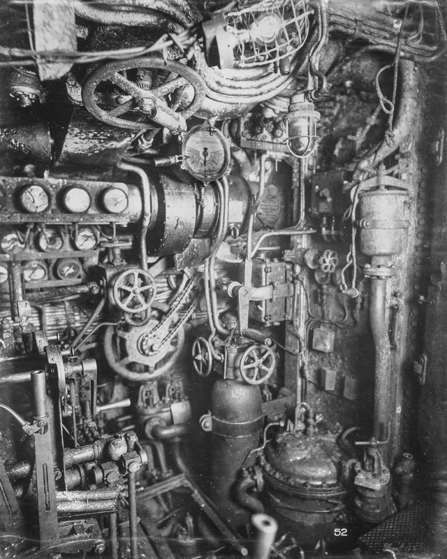
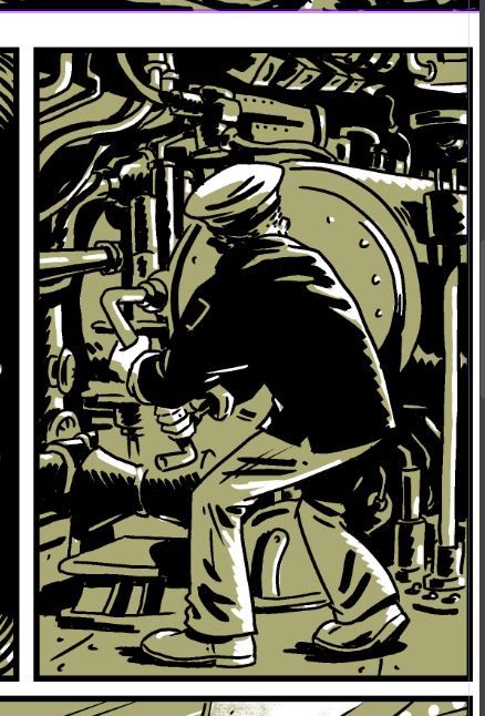
Here’s another one. This image is from Trench Dogs (another coincidence: it’s published by Dead Reckoning, who also will be publishing Four-Fisted Tales). It’s the interior of a submarine. 

When I saw this page, it looked familiar… because I’d seen the photo ref image that I’m certain it was based on. It turned up via Google image search both when I was researching subs for my previous book, Oyster War, and for a story with a submarine in Four-Fisted Tales. While not nabbed quite as whole-hog as the Verdun example, you can see elements of the photo incorporated into the Trench Dogs page–even down to the wheel/chain thing in the very last panel. 


I did a similar thing with it in Four-Fisted Tales: just grabbed elements here and there (although, most of this image is based on a more modern bit of photo ref, since it’s a WWII sub):

So, I hereby decree that henceforth, this phenomenon of cartoonists swiping from the same photo ref image be referred to as “Vasquez rocking.” 

Note: I will update this post as I catalog more images of comics Vasquez rocking… and of course, if you spot any such Vasquez rocking out in the wild, leave a comment or hit me up on twitter!

From the Sketchbook: Dogfighting Dogs!

I’m certainly the five billionth person to do drawings of dog pilots (when they “dogfight” they’re literally dogs!! Get it?!) but for whatever reason, I recently wound up doing a batch of quick watercolors of dogs in WWII-era pilot gear. Well, “for whatever reason” isn’t entirely accurate; the reason is at least partially that I had just watched the recent documentary, Spitfire, about the WWII fighter plane of the same name. (Streaming on Amazon Prime btw. Watch it!)

So, here’re a few dogs:

But, hey, when I went to get pictures of these from my sketchbook, I remembered I’d done a couple of cats too! So, here they are:

If your first thought on seeing those was, “Hey, that’s kinda like MAUS, where the various factions are depicted as different animals,” that was pretty much a thought I had as well–except what came to mind was one of my fave “funny animal” comics, Apocalypse Meow (or Cat Shit One, as it’s known in Japan). Sadly out of print for ages here in the U.S., it’s a war comic with antro characters set in Vietnam. 

Anyway, I like those cat and dog WWII characters, but I doubt I’ll ever do anything with them. I’m in the middle of a military/war book at the moment (Four-Fisted Tales) and when that’s done, I’m going to jump back on my antro animals book (In the Weeds), so I’ve kinda got both the “military” and the “animal characters” bit on the roster already.

Incidentally, those images were done with a materials combination I just recently started fooling with and very much like: watercolor, then finished with carbon pencil (and a bit of gouache for highlights). Here, for example, is a recent drawing of an alien I did using the same technique: