D is for Danny

I’m almost a day late–my first late entry in all the alpha-series!–but, finally, here’s my “D” entry:

D is for Danny – From Tortilla Flat by John Steinbeck

This week was a tough choice for me character-wise, since two of my absolute favorite books have strong “D” characters. So far my roster of characters for this project is short on females, so I was thinking I’d try a drawing of Daily Alice Drinkwater from John Crowley’s Little, Big. My initial sketch of her wasn’t really promising, though, so I went with Danny from one of my other absolute favorite books, Tortilla Flat by John Steinbeck. (He’s just referred to as “Danny” throughout; I don’t believe a last name is ever given.)

There’s very little description in the book of Danny’s physical attributes–only, “Danny was small and dark and intent. At twenty-five his legs were bent to the exact curves of a horse’s sides.” (He’s a recently discharged WWI mule skinner.) With his pose, though, I tried to capture as best I could a bit of his character. While he’s certainly a wine-sotted slacker, he’s also the King Arthur analog in the book (more on that below), so I tried to give him a regal gait and expression.

Tortilla Flat gets a bit of a bad rap these days for its decidedly non-P.C. depiction of its Mexican-American characters, who are–shall we say–not known for their work ethic. Much as with Apu, from The Simpsons, though,  I think the larger point is that the Paisanos in the book–for all their boozing and lounging about–are ultimately portrayed very positively: in the midst of the Depression they stick together, look out for one another, and are ultimately happier and to my mind more honorable folk than the more “upstanding” white folk they likely would be compared to at the time.

(Curiously, I also read some criticism of the way the characters speak in the novel as being “inauthentic.” The book is so obviously a riff on/homage to the King Arthur fables that I’m truly stunned anyone couldn’t figure out that their “inauthentic” language is pretty much cribbed right out of the Thomas Mallory King Arthur stuff.)

The opening two paragraphs of Tortilla Flat are among my favorite introductory paragraphs of any book:

THIS is the story of Danny and of Danny’s friends and of Danny’s house. It is a story of how these three became one thing, so that in Tortilla Flat if you speak of Danny’s house you do not mean a structure of wood flaked with old whitewash, overgrown with an ancient untrimmed rose of Castile. No, when you speak of Danny’s house you are understood to mean a unit of which the parts are men, from which came sweetness and joy, philanthropy and, in the end, a mystic sorrow. For Danny’s house was not unlike the Round Table, and Danny’s friends were not unlike the knights of it. And this is the story of how that group came into being, of how it flourished and grew to be an organization beautiful and wise. This story deals with the adventuring of Danny’s friends, with the good they did, with their thoughts and their endeavors. In the end, this story tells how the talisman was lost and how the group disintegrated.

In Monterey, that old city on the coast of California,these things are well known, and they are repeated and sometimes elaborated. It is well that this cycle be put down on paper so that in a future time scholars, hearing the legends, may not say as they say of Arthur and of Roland and of Robin Hood “There was no Danny nor any group of Danny’s friends, nor any house. Danny is a nature god and his friends primitive symbols of the wind, the sky, the sun.” This history is designed now and ever to keep the sneers from the lips of sour scholars.

Next week: “E”…

You can find all the AlphaBooks entries to-date at the AlphaBooks tumblr: http://alphabooks.tumblr.com. You can also follow many of the entries as they’re posted in real-time by following the #AlphaBooks hashtag on Twitter on Mondays.

C is for Conan the Cimmerian

This week’s AlphaBooks drawing came out pretty well, I think. I’m having some misgivings about the semi-dopey “old newsprint” effect that I’ve been doing with these, but I guess for consistency’s sake, I’ll stick with it. I can always post an alternate gallery of the unaltered images once the series is done.

C is for Conan The Cimmerian – From Conan The Conqueror by Robert E. Howard

I’m not sure where the common pop culture “always shirtless Conan” came from, but in the Robert E. Howard books, Conan is usually clothed. This particular image is loosely based on Conan from Conan The Conqueror, during which Conan is the King of Aquilonia. Here’s a description of him from the book:

… a tall man, mightily shouldered and deep of chest, with a massive corded neck and heavily muscled limbs. He was clad in silk and velvet, with the royal lions of Aquilonia worked in gold upon his rich jupon, and the crown of Aquilonia shone on his square-cut black mane; but the great sword at his side seemed more natural to him than the regal accoutrements.

I took a bit of “artist’s license” here and made the lions on his jupon inverse blue and green, rather than the gold described in the text.

Process-wise, this drawing (thankfully!) went a whole lot smoother than last week’s Brienne. I began with a quick sketch in a few iterations of colored pencil (desaturated here via Photoshop):I then brought that into Sketchbook pro for “penciling.” I like Sketchbook Pro a lot, but I don’t use it much because turning on the “allow canvas to rotate” option causes it to grind to a near-halt. I’ve been meaning to shell out for a new, decent graphics card. Maybe I’ll see if that helps. Anyhoo, here it is.  The layer that has the original sketch from above has been turned off, but you can see one layer that I did in blue first, then the final orange layer on top:I then “inked” the image with Digital Manga Studio and colored it in Photoshop. Here’s a close-up of the un-color halfoned image. If pressed, I could point out a few obviously digital strokes here, but this is looking to me pretty close to my hand-inked work.

Next week… “D”.

You can find all the AlphaBooks entries to-date at the AlphaBooks tumblr: http://alphabooks.tumblr.com. You can also follow many of the entries as they’re posted in real-time by following the #AlphaBooks hashtag on Twitter on Mondays.

B is for Brienne, Maid of Tarth

I spent about three times as long on this week’s entry as I did on last week’s Ahab, and I’m about half as happy with it. But, here she is:

B is for Brienne, Maid of Tarth – From A Song of Ice and Fire by George R. R. Martin

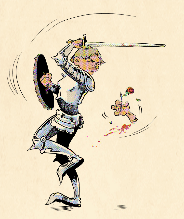
In the book, Brienne relates being mocked by a group of knights who would present her with roses, ostensibly to woo her. She never actually lops off one of their hands–but she probably should have. While Googling to find passages from the books that describe her, I was pretty stunned to find that the actress who plays her on the TV show is a model. There’s obviously a lot of room for interpretation when it comes to visualizing a character from the book, but there are two things that are 100% part of Brienne’s deal: she’s big and she’s ugly.

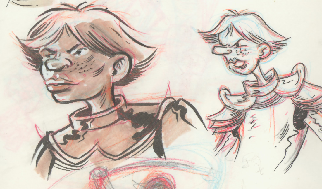
I’m wanting to use AlphaBooks as a way to really push my character designs and part of my disappointment with this drawing is that it’s pretty squarely in my character design “comfort zone.” I initially explored a more Olive Oyl-esque design (right, below), but sort of naturally drifted back to more familiar territory:

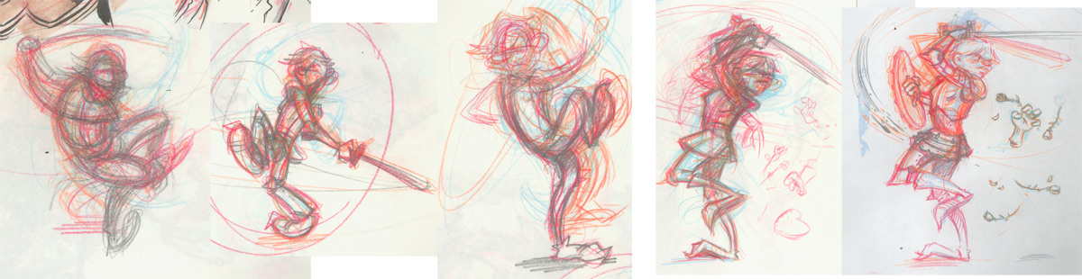
I also am wanting to use AlphaBooks to work on exaggerating pose and gesture. This pose isn’t terrible, but it’s still a bit stiff. I managed to get the shoulders and hips at opposing angles–which is a “must have” for most good, dynamic poses–but she’s got a pretty stiff spine which lends her a fairly static “line of action.” I struggled a lot with this gesture for sure, as you can see here (progressing left-to-right):

Additionally, I had to tackle chainmail, which I’ve never really dealt with (well, other than goofy childhood D&D drawings anyway). I found this great tutorial online which helped a lot. Curiously, the most successful chainmail in this drawing is my very first whack at it, under her arm:

It was a really good learning experience, though. If I have to draw chainmail again I’m going to (1) have the rows be wider, (2) rough in folds first, then have the mail rows follow the contours of the folds, and (3) use a different, stiffer pen for the circles–maybe a technical pen type thing.

Anyway, onward to “C.”

Brienne was drawn with graphite and colored pencils, digitally inked and screen-toned in Digital Manga Studio, and colored in Photoshop.

A is for Ahab

And it begins…

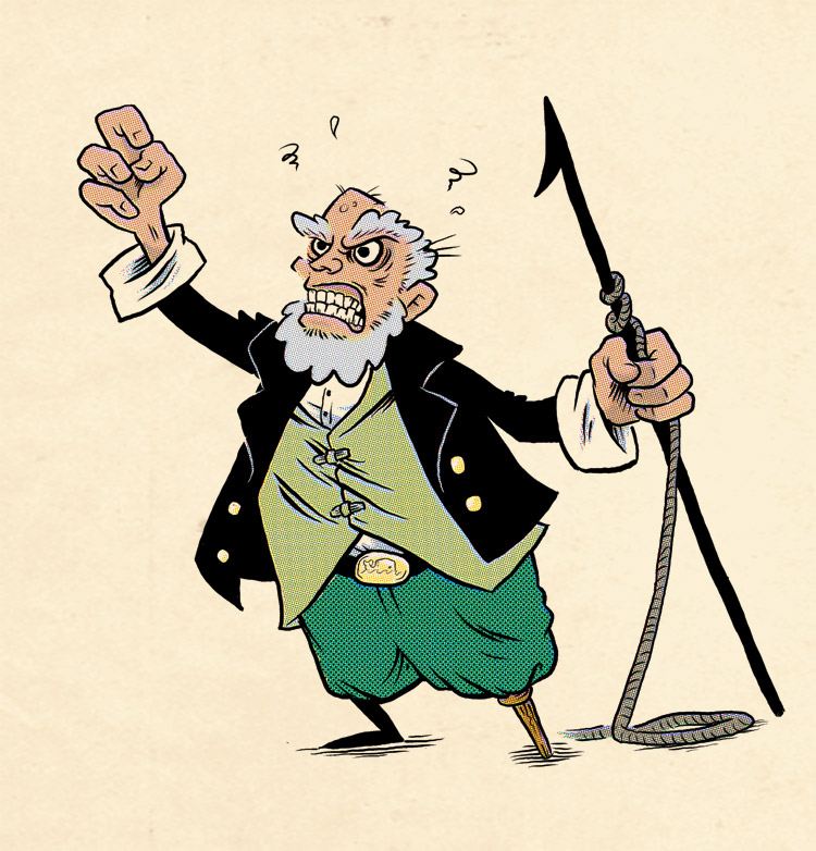
A is for Ahab – from Moby Dick by Herman Melville

I’m glad I escaped high school without some teacher forcing me to read Moby Dick at age seventeen. I’m sure I would have hated it and never touched it again. In fact, I first read Moby Dick in my early 30s and it immediately became one of my all-time favorite books. I’ve re-read it once since then and it’s for sure on my short list of books that I’ll probably continue to re-read every so often for the rest of my life. There are a lot of passages in the book that I really, really love, but Ahab here has a line that’s maybe my favorite sentence in the English language:

The path to my fixed purpose is laid with iron rails, whereon my soul is grooved to run.

This–the conclusion of Chapter 58–is also one of the greatest passages ever written:

Consider the subtleness of the sea; how its most dreaded creatures glide under water, unapparent for the most part, and treacherously hidden beneath the loveliest tints of azure. Consider also the devilish brilliance and beauty of many of its most remorseless tribes, as the dainty embellished shape of many species of sharks. Consider, once more, the universal cannibalism of the sea; all whose creatures prey upon each other, carrying on eternal war since the world began.

Consider all this; and then turn to this green, gentle, and most docile earth; consider them both, the sea and the land; and do you not find a strange analogy to something in yourself? For as this appalling ocean surrounds the verdant land, so in the soul of man there lies one insular Tahiti, full of peace and joy, but encompassed by all the horrors of the half known life.

The illustration was penciled by hand, inked digitally in Manga Studio, and colored in Photoshop. You can find info on the color halftone/off-register effect I’m using here at the JohnnyCrossbones website.

Superhero Commission: The Flash

If’n you’re interested in commissioning a little superhero drawing like this one, you can do so at my store here.