
As I’ve been doing for the last few years, here’s a list of comics and comics-related things that I read in the past year–with some scattered commentary as I see fit!
Catwoman: Lonely City – Cliff Chiang

I mentioned this book in a “so, what are you reading?” conversation with a friend at one point and I got a “I didn’t know you were down with superhero stuff” reply. I guess, looking over the rest of this year’s list, that I shouldn’t really be surprised by that perception of my comics taste… but, for what it’s worth, I used to read plenty of superhero stuff. The reason I don’t so much these days isn’t that I’m some artsy-comics snob, but rather that I just don’t have the time and energy to keep up with continuing, serialized, monthly books. And that’s why, when something like Catwoman: Lonely City comes out–a self-contained superhero book with a beginning, middle, and end by a good artist–I’m usually game to check it out.
Catwoman: Lonely City is Cliff Chiang’s “one last heist” Catwoman story and it’s thoroughly enjoyable. It wears its influences on its sleeve–Darwyn Cooke’s New Frontier and Catwoman, Batman: Year One, and The Dark Knight Returns most notably, Chiang is an incredible draftsperson and he’s too precise and exacting to pull of the Mazzucchelli “dumb line” look that some of this material seems to consciously reference–but that’s fine; if I want Mazzucchelli, I’ll read Mazzucchelli. If there were more superhero stories like these–done by top-notch cartoonists with a singular, distinctive aesthetic, and consumable as a stand-alone story, I’d read a lot more “capes and tights” stuff.
Asadora vol 1, 2, 3, 4, 5, 6 – Naoki Urasawa

As I type this, I have Volume 7 of this most recent Naoki Urasawa series on hold at the library–so, maybe I’ll squeeze in one more volume of this in 2023!
I don’t think I’m going out on a limb in saying that Naoki Urasawa is one of–if not the–most revered manga-ka working today… which is why I’m kind of surprised that there’s not more buzz about this book in comics and manga circles, You’d think Naoki Urasawa doing a (spolier alert!) kaiju story would be a hell of a lot bigger deal! The story’s a bit of a slow build and very occasionally elements involving the title character border on saccharine, but I was 100% sold after the first volume. It should go without saying, but Urasawa’s artwork is gobsmackingly-great. In this one you get plenty of hardware (including some flashbacks featuring WWII planes and warships) as well as his always-stunning mastery of character design and facial expressions. Get onboard, y’all!
Fusion – Moebius
Judge Dredd Brian Bolland Apex Edition – Brian Bolland
Witch Hat Atelier vol 5, 6 – Kamome Shirahama
Scribbles – Kaoru Mori
The History of Hentai Manga: an Expressionist Examination of Eromanga – Kimi Rito

If you’ve been waiting patiently for a 400+ page scholarly (you can tell it’s scholarly because there’s the obligatory colon in the title) volume that examines, analyzes, and catalogs phenomena specifically related to hentai–AKA Japanese porn comics–then your wait is over! This volume is divided into six initial chapters that examine formal and/or drawing techniques that are specific to hentai (“The Spread of the Nipple Afterimage,” “Reinventing the Tentacle,” etc.), then two chapters on historical issues related to hentai publication and production (censorship, translation), then a final catch-all chapter for any other formal/drawing stuff that didn’t merit a full chapter at the beginning.
While I may sound a little glib (I mean, given the subject matter…) this is actually a very interesting and thorough look at a subset of comics that we in the west don’t get a ton of exposure to–and I’m always fascinated by areas of comics that develop their own unique formal visual language. In the case of hentai examined here, it’s particularly interesting since much of this formal language has arisen as a way to circumvent Japan’s sometimes stringent/sometimes less-so (but always in flux) censorship laws.
Batman Year One Absolute Edition – Frank Miller, David Mazzuccheli, Richmond Lewis
King-Cat Comix & Stories #82 – John Porcellino
Malgré tout (FR) – Jordi Lafebre

Thankfully now out in English as Always Never via Dark Horse, Malgré Tout was hands-down one of my favorite books of 2023. If you follow me on any social media (or have read my past yearly “what I read in…” posts) you know I think Jordi Lafebre is one of the very, very best working cartoonists right now. His pure cartooning chops–especially his mastery of pose, gesture, and facial expressions–are pretty much unmatched by anyone currently in the field. (Hey, here’s a baller move: a cover that’s an illustration of your story’s main characters’ upside-down reflection in a rain puddle.)
This book is, I think, the first I’ve read with Lafebre as the writer and artist, and it’s a banger: a beautifully-drawn (literally and figuratively) story of a couple who have been madly in love for years, but whose lives went on radically different trajectories. The narrative is brilliantly-structured in reverse chronology. As the book progresses, we move farther back in each character’s life, seeing how they’ve somehow missed each other at various key points, then, finally to their initial meeting and falling in love. It’s not, though, a story of regret and missed opportunities, but rather, a beautiful, brilliant meditation on fate and persistence.
Les Cahiers de la BD #21 (FR) – ed. Vincent Bernière
Manga! Manga!: The World of Japanese Comics – Frederik L. Schodt
Marvel Comics in the 1970s – Eliot Borenstein
Bubbles #1, 3, 11, 12 – ed. Brian Baynes
Boys Run the Riot vol 1 – Keito Gaku
One Beautiful Spring Day – Jim Woodring
The Other 1980s: Reframing Comics’ Crucial Decade – ed. Brannon Costello & Brian Cremins

If–like me–your formative comics reading took place in the 1980’s, but was not focused mainly on superhero comics, and specifically not on the oft-cited “comics aren’t just for kids anymore” trio of Watchmen, The Dark Knight Returns, and MAUS, you’ll most certainly find plenty of interest in this collection of essays. The editors here assemble a strong slate of material focusing on some of the lesser-discussed, but arguably just as important, comics works from the 80’s. My favorites were, predictably, those essays that discussed work that was formative for me during this period: The Flaming Carrot, Neil the Horse, The ‘ Nam, Shuriken, etc. The latter half of the book focuses more on retroactively examining 80’s comics through the lens of modern understandings of social issues rather than sticking largely to comics history as in the first half–but that’s to be expected, given that most of the authors are academics. I’d love to see a similar collection of essays that picks up where this one leaves off: examining small press and off-the-beaten-path comics from the early ’90s.
The Bulidings are Barking: Diane Noomin in Memormiam – Bill Griffith
Popeye (Giant Comic Album) – Bud Sagendorf
The Forgotten Velvet – Luke Geddis

I’m a sucker for Chick Tract homages/parodies and I’m also a sucker for comics about music–so this little Chick Tract format comic about later-era Velvet Underground memeber Doug Yule was 100% my jam. Often people who do tract-format comics just borrow the trim size and cover design, but don’t do much in the way of matching Chick’s (or Fred Carter’s) art style. And very few even attempt to craft a Chick-style proselytizing narrative. The Forgotten Velvet does all of the above–and does it well! Bonus: I was “converted” by the track’s argument. I was remided that my favorite VU records–The Velvet Underground and Loaded–are both Yule joints.
Dwellings #1 – Jay Stephens
Tiki: A Very Ruff Year by David Azencot and Fred Leclerc
Three Rocks: The Story of Ernie Bushmiller: The Man Who Created Nancy – Bill Griffith
All Tomorrow’s Parties: The Velvet Underground Story- Koren Shadmi
Monica – Dan Clowes

The highest compliment I can pay a book is this–which is absolutely the case with Monica: The minute I was done reading it I wanted to re-read it. This is not a book that one can evaluate on a single reading, but I’m pretty confident in saying that this is the best thing he’s done since Ice Haven. A deep dive re-read is definitely in my future.
Les Sauvages Animaux (FR) – Johan De Moor and Stephen Desberg
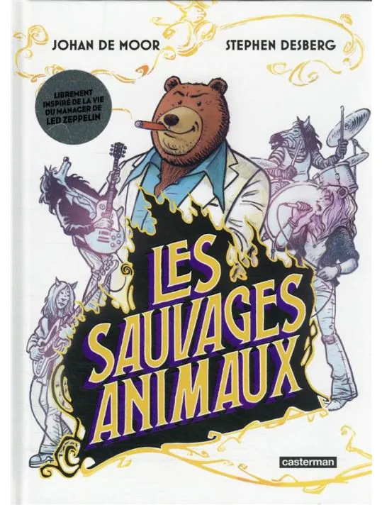
As mentioned re. The Forgotten Velvet, I love comics about music. I’m also interested in “funny animal” comics–and currently working on a music-related funny animal comic myself, In the Weeds. So, when I saw this French-language comic with animal characters that was about Led Zeppelin manager Peter Grant, I had to pick it up.
It’s… not exactly what you’d expect from the cover. Somewhat oddly, the only characters in the story who are anthropomorphic animals are Grant and the band; everyone else is human. Even more oddly (or maybe not?) they are animals in-world. Meaning: the human characters often comment on/refer to their being animals, Grant is addicted to honey rather than alcohol, etc. That said, once you get past this odd formal setup it’s a really fun ride. It’s beautifully-drawn and if you’re an afficianado of classic rock, you can spot a lot of deliberate homages to well-known photos of the band.
Dédales – Vols 1,2,3 (FR) – Charles Burns

Frustratingly, Charles Burns’s new series, Dédales, has not had an English release at all and has, instead, been coming out as a series of three album format books in French (and other languages). Supposedly, Abrams Comics Art has an English version in the works now that the French version has completed. I’m a huge Charles Burns fan, though, and there’s no way I was going to wait around for this thing go get translated, so I slogged through all three of them in French.
First off–as with Clowes/Monica–it’s increadibly heartening and impressive to see a mature cartoonist at this point in his carreer doing his absolute best work! It’s also amazing to see that he’s continuing to grow and expand with his drawing techniques. He’s doing a lot of interesting stuff here that I’ve never seen before–in particular experimenting with color holds and also using 0/0/0/100 blacks (rather than “rich blacks”) to differentiate between the main narrative and in-world films.
This is Burns’s most down-to-earth long story. Sure, there’s a lot of dream imagery, etc., but no one’s got a mouth growing on their neck, etc. It’s mostly a very personal story about a bunch of twenty-something kids and their personal and creative dynamic.


Recent Comments