Finished Penciled Pages for a GN: The Weigh-In

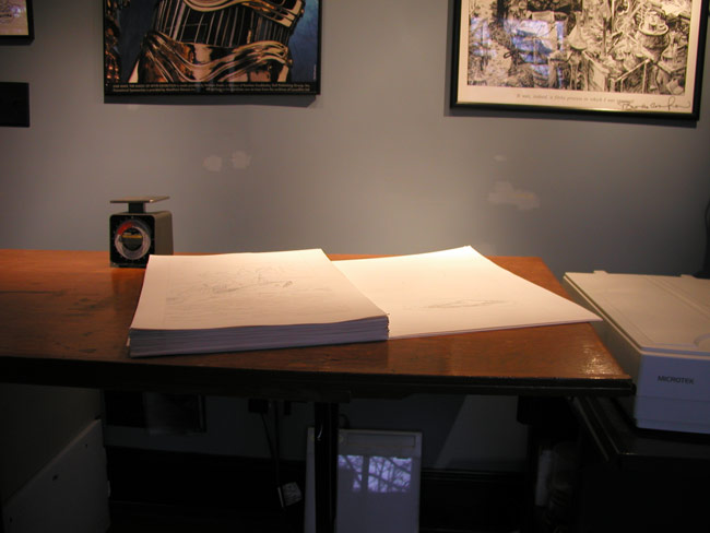
One thing most folks who aren’t cartoonists probably don’t consider much is the sheer mass of  the many, many pages of finished artwork cartoonists wind up with.  I’ve got tons of pages lying around my studio, and I only manage to produce a book every few years.  I can’t imagine what artists who, say, pencil a monthly book for DC do with all this stuff.  Out of curiosity, I thought I’d get some “stats” on the now-fully penciled pages (yay!) for Amelia: This Broad Ocean, my current project (with Jason Lutes and Sarah Stewart Taylor, of course–doing layouts and writing, respectively).  So here’s the completed heap:
amelia_stack1

The pages on the bottom there that are sticking out are two-page spreads that I’ve done on single sheets of 23″ x 29″ sheets of bristol.  (The other single-page art is on the same sheets of bristol, but cut in half.)  Out of curiosity, I decided to weigh the whole lot.  Although the stack was far more than my little postal scale could handle, I loaded them on there in smaller stacks and it looks like they weigh in at just under ten pounds.  Similarly, it looks like the stack’s measuring in at just under an inch and a half:
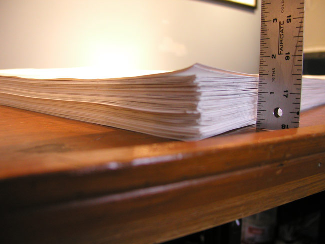
amelia_stack2

I’m not actually even sure how many pages there are at this point, since the numbering is somewhat off, owing to a number of scenes being inserted later between previously existing pages.  Like the other Hyperion GNs, I think this one will be 80 pages total, but that includes various non-art elements like title pages and study material in the back.  My guess is maybe 70 pages or artwork total.

I’m also not really sure why I’ve bothered to weigh and measure these pages… Maybe it’s just borne of lugging pages for sale around to conventions, or having to find places to store this stuff in my studio.  Or maybe I’m just hoping that I’m making good progress toward doing my two thousand pages of bad art that, according to Dave Sim, I need to get out of the way before I start producing anything good.
Sketchbook 11/29/08

sketch_112908

Sketchbook 11/28/08

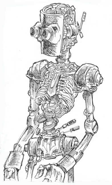
Lately I’ve been doing a ton of either life drawing or drawing of hands and drapery from photographs, but spending too much time drawing from life to the detriment of drawing from imagination should be avoided just as much as the (more common) opposite situation.

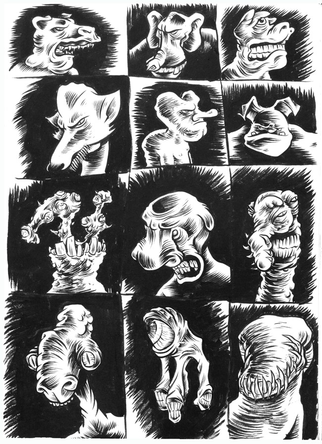
So… I decided to do another “grid” page in my sketchbook as I do every once in a while.  In this case, I divided the page up, did a quick “contour scribble” in each panel in non-photo blue pencil, and then with ink tried to coax some sort of creature form out of each.  The bulk of these are pretty uninsipered, but I do like the rightmost creature in the third row.

sketch_112808

The Jhonen Vasquez Comics Journal Interview… or Not

I just finished reading issue #292 of The Comics Journal–which features a fantastic interview with one of my favorite cartoonists, Kim Deitch–and noticed in the upcoming issues section that a scheduled interview with SLG’s Jhonen Vasquez appears to have disappeared without a trace.

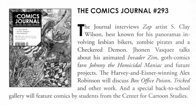
From issue #291:

tcj_1

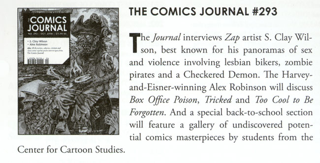
Now, from issue #292:

tcj_2

I guess if it’s been cancelled it may be a good thing.  I’m no theologian but I’m pretty sure that a Jhonen Vasquez interview in The Comics Journal is one of the seven signs of the apocalypse.

On the other hand, if it’s just been bumped to a later issue (which is most likely, I imagine) I guess we can assume–based on Jhonen’s quote below from an older Suicide Girls interview–that he’s finally completed his autobiographical GN about making a sandwich:

DRE: … It’s not like The Comics Journal ever talked about you.
JV: No those people would never come near me. They’d come near me if I was unknown, doing terribly and writing a very matter of fact series about my true life experiences making a sandwich.

A Proposal: No More “Obama as F.D.R” Images, Please

The comparisons between Barack Obama and F.D.R. are obvious: a president taking office during a severe finanacial crisis who will likely institute a large government infrastructure-building program as part of the way out.  So, you can’t really blame folks for capitalizing on this visually.   On the other hand, these images seem to be nearing the “post-9/11 crying eagle” saturation point–and they’re, well, obvious; there’s really nothing to this visual metaphor other than that one point of comparison .  Maybe it’s time to move on…

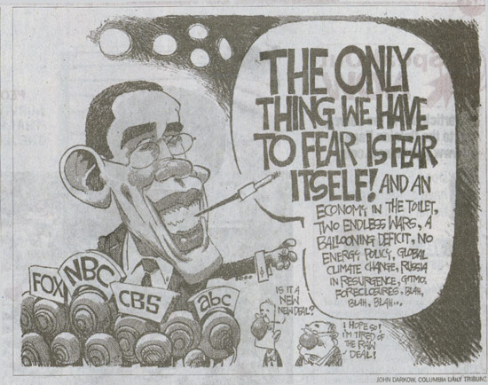
Here are just a few exmples, culled just from stuff I had in my recycling bin:

fdr_1

fdr_2

fdr_3

Now, that’s not to say nothing good has come from all this.  That last image by Richard Thompson (and published in the New Yorker) is beautiful.