Craft: Full Page Aerial View Spread

Well, my old friend from a few weeks back, the aerial view of L.A. from Amelia, has returned.  This page has come up previously on this blog in a discussion of layouts vs. finishes, and I’m once again working on it.  No, not just inking that same page… but, before I get into that, here’s an anecdote:

I used to work in a restaurant–the kitchen of a country club–and at one point the chef in charge of the Sunday buffet asked me if I knew how to carve a steamship round (that’s a cut of beef often served on a buffet line), and if not, whether I wanted to learn.  After agreeing to learn how to it was done, another kitchen worker took me aside and advised, “Be careful what you learn how to do.  Once they know you can do it, you’ll be doing it every Sunday.”  Sure enough, I was carving those damn steamship rounds for the following bajillion Sundays.

So what does this “be careful what you let on you can do” business have to do with comics?  Well, the topic of my original post on the Amelia page I linked to above was the middle panel depicting an aerial view of downtown Los Angeles.  Since pencilling that page, though, Jason and I had some back and forths about the subject of spreads and bleeds.

In my first book, Farewell, Georgia, I avoided such things entirely, sticking to a strtict nine panel grid.  But in Midnight Sun I started to make occasional use of bleeds–pages where the printed image goes all the way to the edge of the page–to highlight the vast expanses of ice depicted in the book.  Jason’s layouts for Amelia, as thumbnailed, contained a number of spreads (sets of two facing pages that comprise a single image, spread across the two pages), but I decided to go ahead and plan for possible bleeds in all of these cases by drawing them all on single large sheets of paper, with the image drawn outside the normal page space to accommodate a possible bleed.

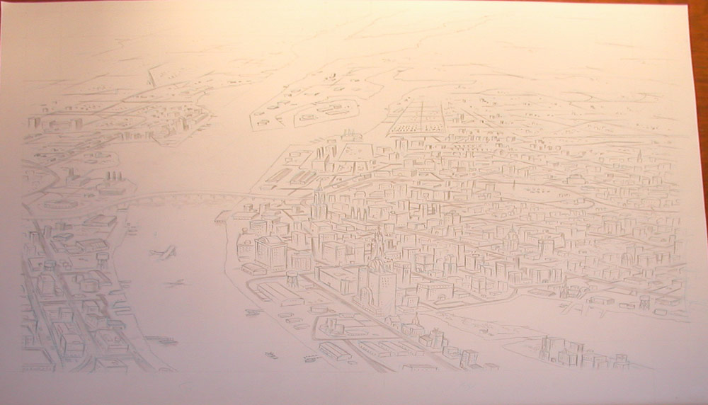
Once I started inking, though, it was time to decide which of these, if any, should really be bleeds, and which should simply be spreads.  If you look through issues of Jason’s series, Berlin, you’ll note nary a bleed, so I wasn’t even sure any of them would wind up being bleeds.  As it turns out, though, that middle panel of the L.A. cityscape provided the answer.  It was decided that until that point in the story, all the two page spreads would just be regular old spreads–but that, as Amelia looks down and sees the city below on her first time up in a plane, we’d use this as the first of several full bleed two page spreads…. meaning specifically that the page in question would be rejiggered so that the L.A. cityscape wouldn’t be a panel, but rather the first two page full bleed spread.  So here it is in action, from blue pencil (sorry it’s so hard to see, but that’s exactly the point of NP blue pencil, right?) to pencils, to inks–with gray toning to follow soon.
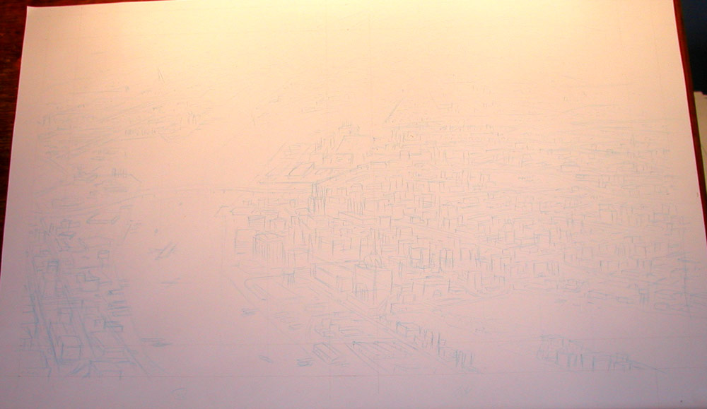
city_blue

city_pencils

42_43_spread

I’m a bit ashamed to admit, being someone who’s taught an occasional perspective class, that I completely “eyeballed” this drawing.  With so many objects at various angles, and no horizon visible it’s actually pretty easy to get things looking okay by eye.  I see a few bits of wanky perspective here in the final product, but nothing too offensive.

So, be careful what you let on you can draw–you might wind up having to draw it a whole lot bigger.
Pre-Eisner Judging Reading (or, “Why Haven’t You Been Posting Anything?”

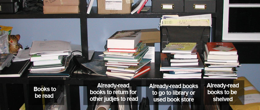
book_stacks

Just when I’d gotten into the habit of cranking out one substantive post every week or so, I’ve now pretty much ground to a halt.  Why?  Because, as some of you might know, the deadline for submissions to the 2009 Eisner Awards was a couple of days ago… which means that Eisner nomination time is looming near and now, with every book in, the pressure is really on for us judges to get up to speed reading-wise.  Of late, my studio shelves, which are usually at least semi-organized, have become a massive “in/out” box for reading material from 2008 and any time I get the inclination to do a little writing on something of interest, a little voice in my head starts with, “The SHELF, think of the SHELF!”

The photo above is just a small sampling of the constantly-rotating stock of comics and graphic novels I’ve been making my way through.  (A note on the books that are headed for the library or my own personal collection: stuff that’s submitted to the Eisners of course stays with the Eisner folks after reading, but some publishers will also send comps to individual judges–and it’s these that one’s free to do whatever with, once they’ve been read.  I’ll be passing what ones I can on to the public library.)

Sketchbook 03/15

sketchbook_031509

Interesting Word Balloon Use in Today’s ‘Cul de Sac’

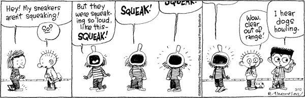
Today’s Cul de Sac features an interesting formal use of word balloons that I’ve not seen before.  The basic setup here is that Alice has a new pair of shoes that she’s been enjoying mainly for their incessant squeaking, which has now ceased.  In the strip, she’s imitating the squeaking and the placement of the balloons gets ever higher within the panel to indicate the increasing pitch of her squeaking.  Finally, the “squeak”‘s being all the way out of the panel is used to indicate that Alice’s squeaking is now so high-pitched that it’s out of human hearing range.  Not seeing = not hearing.

cul

CNN Reports on Real Tintin Submarine

When I saw this article on CNN.com about “winged luxury submarines,” the first thing I thought of was that awesome shark submarine from the Tintin book, Red Rackham’s Treasure:

tintin

I was surprised to note that the article did in fact mention Tintin.  I was really surprised, though, to note that the Tintin book mentioned was one I’d never heard of: Tintin and the Lake of Sharks.  This is because apparently this Tintin book is not one penned by Hergé, but rather a book made to look like stills from an animated Tintin movie written by Belgian cartoonist “Greg” (Michel Regnier), a friend of Hergé.  Out of curiosity, I tracked down some sample pages from Lake of Sharks and although I was disappointed to find that the submarine in question is actually just the same shark sub from Red Rackham, it’s kind of interesting to see Tintn art done in a style designed to ape the look of animation:

tintin1

The Hergé-drawn Tintin exhibits a differential between the way the figures and the way the background are drawn (much discussed in Understanding Comics), but stylistically they cohere quite well.  In the animation-style page above though, this disconnect is, to my eye, just too great and produces an odd effect.

I gotta wonder about the reference to Lake of Sharks in the original article.  Was the author a hardcore Tintin fan who used this opportunity to show off his knowledge of obscure Tintin books… of maybe someone who knew nothing at all about Tintin and just maybe got Lake of Sharks from an errant google search?