
Second in a series. Today’s topic is short and sweet:
What the Hell Happened to Kilian Plunkett?
OK, so here’s the short answer: he went on to draw a bunch of Star Wars comics and character designs for animation.
But, before that he illustrated the Aliens: Labyrinth series, written by Jim Woodring. (Yeah, you read that right, Jim Woodring of Frank and Jim.) But before that, though, he did a book called The 8th Wonder for Dark Horse and when I ran across this going through my old comics, I remembered really liking it. The story was originally serialized, I think, in Dark Horse Presents starting in maybe ’94 and then, once the series was complete, it was issued as a 24-page one-shot.
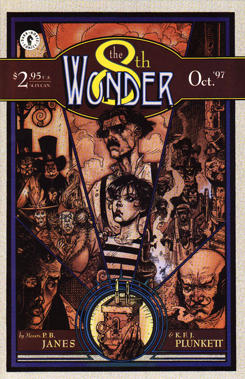
If The 8th Wonder had come out a few years later, it would certainly have been labeled “steampunk.” In ’94, though, just four years after The Difference Engine came out, this wasn’t a term known to most folks other than SF enthusiasts. Maybe I’m way off-base here, but I can’t think of an earlier example in comics of something that one could accurately call steampunk before 8th Wonder. The hyper-detailed but largely unreadable comics series Steampunk would appear a few years later in 2000 and of course The League of Extraordinary Gentlemen thereafter.
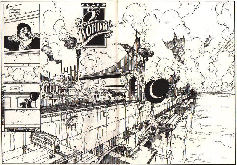
What neither of the above books, though, had was a visual style that really matched the feel of the story, and that’s part of what makes 8th Wonder such a good read. Â This early incarnation of Plunkett, done just in black and white, shows a lighter, more fragile line, with spotted blacks applied mainly as color/design choice rather than as shading–both of which, when combined with some well-placed stippling, yield a very European “clear line” look that gives the book just the right combination of fragility and grit.
4 comments
Skip to comment form
I’ll concur that the Steampunk series is highly unreadable. I’d stand a better chance at filling out a Japanese tax form than reading those comics.
Author
Indeed… As I recall–and this was obviously a while back–it was unreadable in the worst way: not only was the plot unnecessarily convoluted, but the panel-to-panel storytelling didn’t make a whole lot of sense. I didn’t read more than the first issue, though…
That 8th Wonder spread looks like one of Winsor McCay’s futurist editorials – the perspective, subject matter, even the line.
Author
“That 8th Wonder spread looks like one of Winsor McCay’s futurist editorials – the perspective, subject matter, even the line.”
Wow, I’ve never heard or seen any such stuff from McCay–I’ll keep my eyes open for reprints of that stuff… but, yeah, I can definitely see their being similar stylistically.