
These sample pages for The Count of Monte Cristo are still coming along, albeit somewhat slowly. One thing I really like about small projects like this five-pager is that they give me the opportunity to try out new process tricks that I’d not really be willing to commit to for a bigger project without some testing. In this case, since my “roughs” were actually pretty tight, what I wound up doing was: changing the roughs to non-photo blue (~15% cyan), resizing the pages to 10 x 13.5 inches, and setting them up as a PDF. I then trimmed down some big sheets of 500 series Strathmore bristol (which is what I usually work on) and took the sheets and the PDF to my local FedEx/Kinkos. I suspect that most Kinkos folk would balk at this sort of thing, but luckily I know one of the managers at my local shop and he’s used to (and surprisingly accommodating of) the oddball jobs like this that I often send their way.
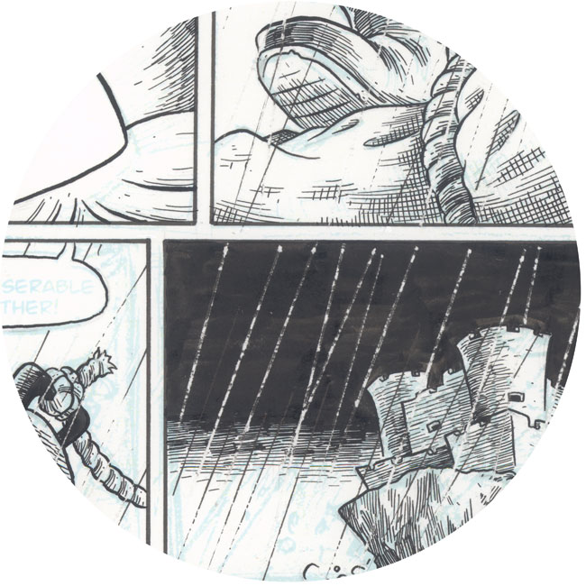
So, they ran the Strathmore board through the color copier and printed my roughs on them in NP blue. You can see it here beneath the ink:
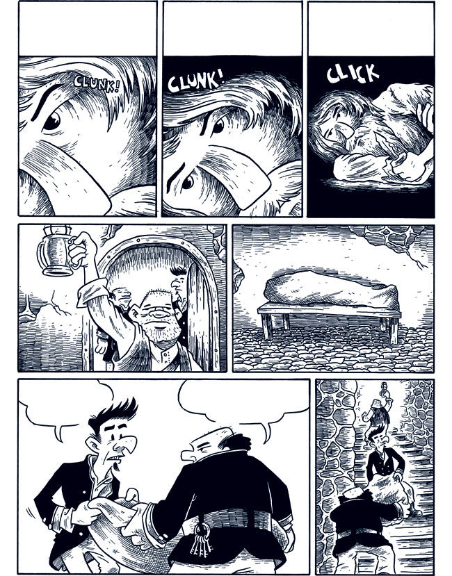
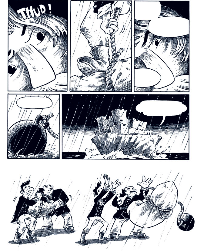
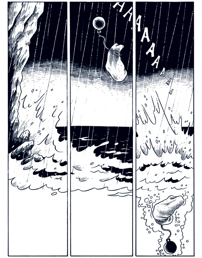
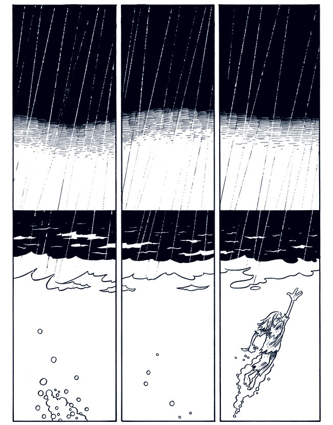
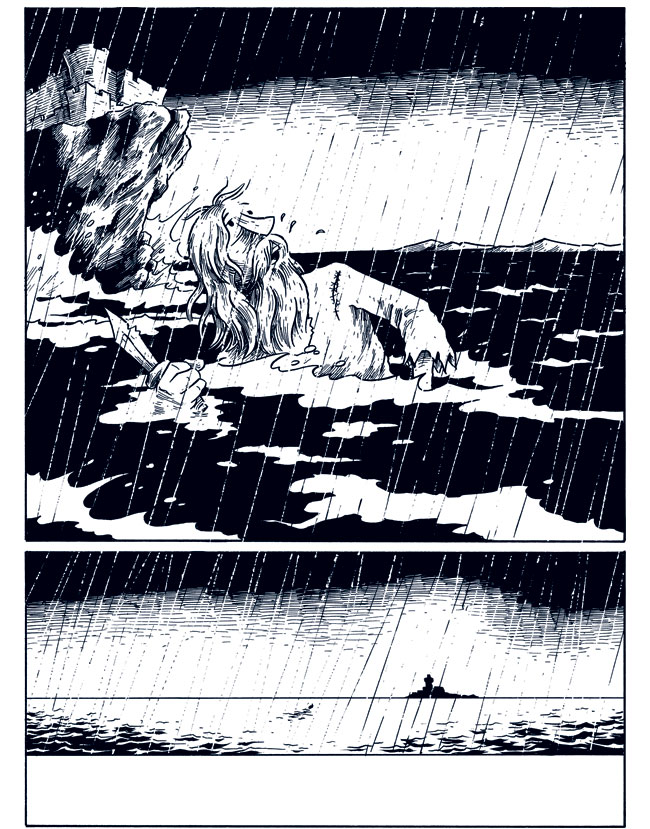
This worked out really well, actually, and I was able to reduce the penciling stage to just doing some pretty quick tightening up of things. I made the prison look more like the real Chateau d’if–although I really exaggerated the rocky island it’s on because I wanted to emphasize the falling scene. Other than that, there weren’t really a whole lot of major, major changes. Anyway, here’re the inks. Next stop: color!
![]() The original art for this is for sale here.
The original art for this is for sale here.
2 comments
These are all beautiful, but the spalshdown page is by far my favorite.
Author
Thanks, Chris! Assuming I don’t screw things up too badly in the coloring phase, I’m thinking that 2-page spread should look pretty sharp. We’ll see, though…