
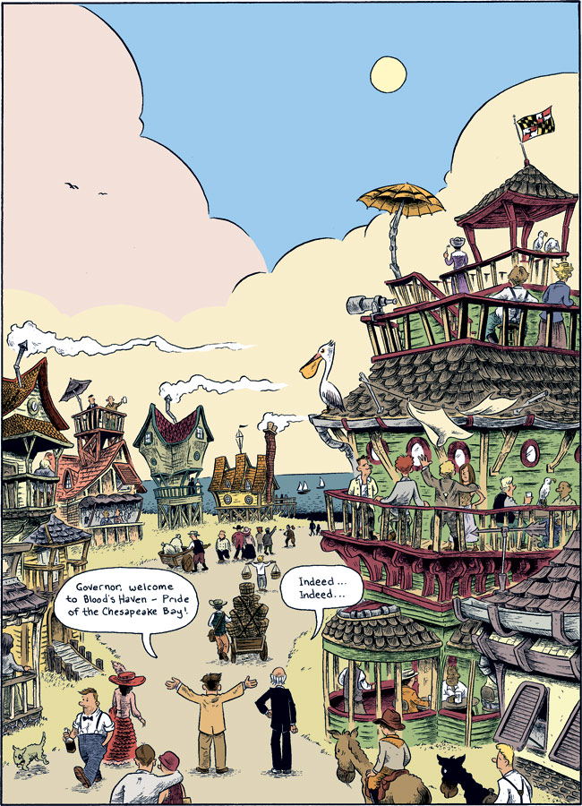
So here’s the final iteration of the splash page from Oyster War I’ve been posting periodically. Despite having a fairly subdued, moody color palette (as mentioned last post) I found the urge to use bright pastel colors just irresistible. I think it’s something about the beach environment depicted that seemed to call for the sun-drenched, chalky colors that I associate with hanging out at beaches. Also pulling me this direction was the architectural style I chose for Blood’s Haven–equal parts Gaudí, Victorian “painted lady” and modern beach cottage.
4 comments
2 pings
Skip to comment form
Ben, that’s gorgeous. It really looks like one of those French books by Blain or Sfar. Nicely colored!
Amazing. Can’t wait for more…
Author
Thanks, all… I’m still muddling my way through this color thing, but so far so good.
Put me down for one copy. This looks just fantastic.
[…] he’s been sharing artwork for the splash page, ending with the colored version you see above (and here). Go check out his blog for more sketches and process pieces related to the new book, which can’t […]
[…] – Since this page is being linked to from The Beat, here’s a link to my post with the completed splash page used with The Beat’s […]