
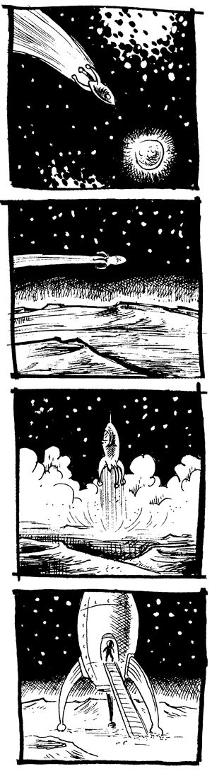
The in-class exercise for week three is the “wrong planet” assignment here. We’re doing the assignment collaboratively, with each student tackling one section of the story. My section is #2, “lands on the moon…”
This assignment has been around since well before this book came out, and has been posted over at teachingcomics.org for a while. It’s from that site that I got the assignment when I tried it out in a classroom environment the last time I taught a comics class and, while the assignment looks fairly straight ahead, it’s actually pretty tricky. Part of the challenge is that it’s not worded very clearly: specifically, it’s not made clear whether the moon was the wrong destination… or whether he’s returned to the wrong “home planet” after visiting the moon.
I assumed the latter when I did this exercise in class, but that creates a storytelling problem in figuring out how the astronaut couldn’t realize that he’s on the wrong planet until he’s actually on the ground. I’ve been tempted to think that maybe what’s really intended is the former interpretation–that he was meant to go somewhere other than the moon–but the assignment very specifically mentions a wrong planet… and given that the only planet in the whole scenario is the home planet, I guess that’s the “wrong” planet in question. Very confusing….
Anyway, fortunately for me, since I’m dealing with part two of the story, I don’t really have to tackle that confusion head-on. Here’s what I’ve got:
2 comments
Ben Towle,
This is an unrelated technical question. In the past I was asking you about your book, “Midnight Sun,” and how you went about toning it. And you were extremely helpful in your response. So I have another question: I’m in the process of working on my own little book and was curious about printing costs related to the choice of medium. My main concern is having a grey tone like you pulled off in “Midnight Sun.” ( Because I think it adds so much more to the book visually.) I was wondering if instead of using photoshop for the the grey tone, if I could paint the grey tone using watercolor or gouache. I know the grey tone would not be as clean and there might be varying degrees of grey within it depending on the application. That’s not my may concern. My concern is: would the cost to print increase if I used watercolor or gouache washes opposed to making the grey tones in photoshop? Thanks again!
Author
As long as you’re printing it in black and white, your print costs should be the same tone or no tone, as well as whether you do your grays in PS or watercolor. Stuff printed with grays like that is still (usually) “one color” printing, that color being black. The grays appear gray, but are actually “halftoned.” If you look closely, you’ll see that they’re made up of tiny dots of black that appear gray at a distance.
The only real consideration I can think of to doing the tones with a natural media like watercolor of gouache, is just that you may lose a tiny bit of the subtlety of it in the scanning and printing process…. but not a huge deal. That photoshoped gray isn’t nearly as pretty as hand-done stuff, but on the other hand, it’s pretty much “idiot proof” as far as the printing goes.
Price-wise, though, there’s really no difference.
Hope that helps.
-B.