A while back I did a post showing a step-by-step of how I did a pinup of the Marvel character Razorback and it garnered a few responses, so I figured I’d do the same for this next pinup I’ve been working on: a commission I got at this year’s Heroes Con, of the early ’90s Jim Lee-era X-men. This was a really fun piece to do mainly because it allowed me to learn a little bit about an era of comics that I pretty much missed entirely. I was an avid comics reader as a kid, but by the end of high school (late ’80s) I’d pretty much moved on to other things and I didn’t really wind up getting back into comics until the mid ’90s–or even a bit later. So I missed the whole “Image era” of comics and I never really had first-hand experience of fan favorite artists like Jim Lee, Rob Liefeld, and folks of that ilk. (This “blind spot” in my comics reading became especially apparent after my first book was published by SLG and people would always ask me about Jhonen Vasquez–a cartoonist I knew absolutely nothing about at the time.)
Anyway, here’s where things started: the cover to the big nineties relaunch of the X-Men by Claremont and Jim Lee:

I’d never seen (or really been aware of) the full wrap-around cover of this book, but I did a little research and the concept I came up with was to do a riff on this basic cover layout, but use just the “blue team” of X-Men and have them actually fighting Magneto, instead of what we’ve got here which is Magneto facing front so that quarter of the image will work by itself as a cover image. At this point, I started moving things around in Photoshop to come up with a composition to work from. I was just worrying about the X-Men at this point, not Magneto.

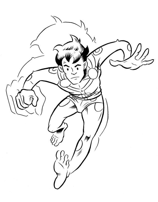
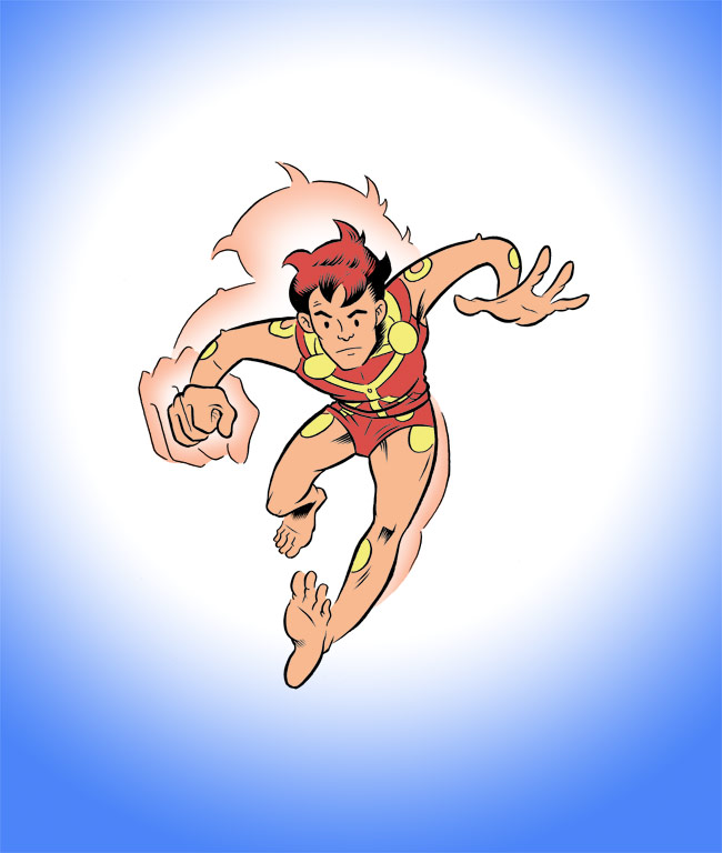
Then, with the magic of Photoshop, I turned the whole thing to 15% Cyan, printed it out, and began working in my own “spaghetti arm” versions of the X-Men over the originals. While working at this stage really got a chance to scrutinize the original image. One thing that became apparent pretty quick was how damn “fisty” the thing is. Pretty much everybody has his or her hands clinched up in a tight fist. I’d initially thought I’d loosen up some of the characters and give them some other hand gestures, but I eventually decided that fistyness was a defining aesthetic property of the era and I’d best not mess with it. There are also some peculiar anatomy-related things going on in the original image that I wound up addressing. For one, everyone’s head is really, really small. This just doesn’t work right with my natural drawing style so I changed that. I did, though, leave the peculiar high-waisted hips on the female characters. Cyclops’s left leg is doing something crazy (imagine how he would look without Wolverine in front of him) so I tried to correct for that a little bit as well. Here’s what I wound up with. The first image is just a straight scan; the second is one with all the “under-drawing” colors removed:


I then tweaked the characters’ arrangement a bit. I’m always in a bit of a bind about pinups compositionally. Part of me wants each character to be totally separate from the others and non-overlapping, so he or she is completely visible–but on the other hand this makes for a composition without much sense of depth. In this case I’ve just moved things around to get some more overlapping with the left-hand characters. Rogue will be a bit diminished as a result, but I can live with that. Here’s the result, with Magneto added in and an indication of where I’ll add some rocks and stuff, just as in the original cover (but I’m not going to run the rock all the way to the top of the page–I think that was done just so the “X-Men” masthead would work).

And so with a few minor adjustments–the scale of a few figures, moving Magneto back behind his “sheild”–here’s the finished piece:

I figure if I keep doing these character pinups, the folks at Marvel will eventually notice. Should it ever occur, that notice will likely come in the form of either (a) some work on a Marvel “indie” book or all-ages book, or (b) a law suit.


Recent Comments