I’m about to start coloring the introductory pages of Oyster War. I generally don’t work in color, but when I do, I usually start by seeking inspiration from other comics that have color that I find especially nicely-done. These days the very top of my list of beautifully-colored comics are those of the French cartoonist Christophe Blain (who is himself one of my all-time favorite cartoonists). Curiously, as spectacular as the coloring is in Blain’s work, in most English editions of his work the colorist is uncredited–and this leads to a lot of confusion as to who actually colored what books. For an example of such coloring confusion run amok, see the comments section of this “Best of” post from last year by Dustin Harbin.
So who does color Blain’s work?
I actually emailed Gina at First Second (who publish the American edition of Gus and his Gang) and she assured me all the work in that book was by a colorist named Clémence–although one of the commenters in Dustin’s post says otherwise. The internets, however indicate that Clémence colored only the third volume of Gus, with “Walter” doing colors on the first two volumes. The only way to reconcile these two statements would be if the First Second edition was actually reprinting the material from the third French volume, but using the cover of the first French volume–which seems unlikely, especially since the sample image from the French vol. 1 on that website is, in fact, included in the First Second edition. (And what’s with the “first name only” policy for colorists in France?) And speaking of Walter (a.k.a.: Walter Pezzali), there seems at least to be relative agreement that he, along with Yuka (again with just the one name!) did the coloring on all the Isaac the Pirate books.
My hunch, having just looked through both U.S. editions of Isaac and the Gus book from First Second, is that these were all colored by the same people–or at the very least, if they were from different colorists, perhaps Blain’s creative input is so significant that they appear to be by the same persons. While the two series have radically different color palettes, they seem to employ color in very similar ways and I’d be surprised if two sets of people, left largely to their own devices, would produce results that bear such strong formal similarity to one another. At any rate, they’re both beautifully-colored works and why the colorists aren’t credited in these U.S. editions is beyond me.
As mentioned, Isaac and Gus have very different color palettes and while Gus is the more striking and unusual-looking of the two, I thought that the more muted, less saturated colors of the Isaac series would be a good starting point for the coloring in Oyster War. So–as I often do with particular books when I set out coloring–I started by generating a basic palette of colors based on the colors in Isaac. I’ll add to and expand on this set as I color, but for what it’s worth, here’s the basic swatch set:
Photoshop color swatches based in Isaac the Pirate
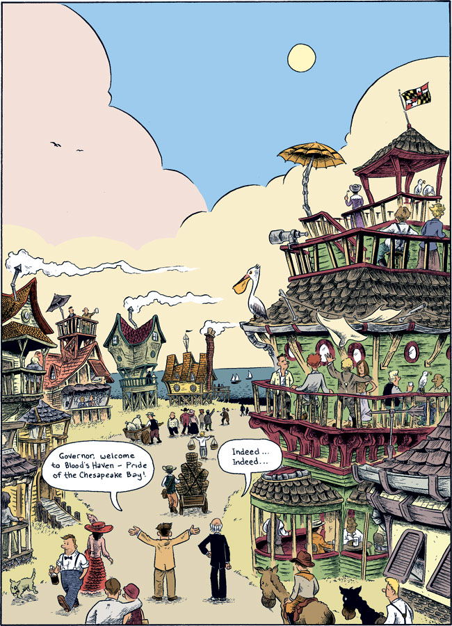
Once I’ve got that splash page of Blood’s Haven that I’ve been posting progress of colored, I’ll post it for folks to check out.
In preparation, though, for coloring I made some notes about some of the things that make the coloring in Gus so great–and so unusual when compared to most full-color comics in the U.S.–and I thought they’d make for an interesting post. Here goes:
1) The color palette itself
Even with just a cursory glance through Gus, you’ll be struck by the unusual colors employed. The book is full of rich super-saturated reds and magentas, pale but vibrant pea greens, and rich bright blues and purples. It’s a far cry from not just your standard American super-hero book, but it’s also strikingly different from most of the muted Chris Ware-ish color schemes that inform a lot of modern “alternative” comics. My hunch is that this color scheme is in part a homage to the Belgian old west comic series Lucky Luke, by yet another one-named European cartoonist, Morris. Here’s a sample page exhibiting some color choices that look to me to be similar to those in Gus–which is of course also a western, so a deliberate homage would make some sense.

2) Using a restricted color palette to indicate flashbacks
This actually goes on a lot more in Isaac, wherein flashbacks are usually indicated color-wise by dropping down to just two or three colors. Generally this is just an example of the one thing that I think 99% of all the comics coloring I see lacks: color that serves some narrative purpose; it’s not just window dressing. Anyway, this goes on in Gus also, as in this example of a flashback panel where the background is left entirely white with only the figures colored in.

And in a similar vein…
3) Solid-colored backgrounds – only figures in full color
Here from the same page is a great example where the color, again, communicates rather than decorates. In the last three panels here we focus on the couple having a conversation in part because the background is so effectively downplayed color-wise. There’s really no need to do literal color for all the stuff in that room.

Here’re a few more examples of similar things:


4) Colored “voice” balloon shows the contents of a letter that’s the same color
This is just really nicely done from a formal perspective and something I’ve not seen anywhere else. I often see balloons that have been colored in for no apparent reason, but here it’s (again) serving a narrative purpose.

5) Weird non-literal colors
Not a huge point here, but it’s just nice to see color employed for its own aesthetic sake, rather than simply to “describe” objects in an “it’s an apple therefore I’ll color it red” way. A few examples (and note the similarity between this first example and panel five of that Lucky Luke page above):


6) Color indicating emotions
You can see a good example of this in the last sequence under #3 above where Gus’s anger over losing track of the woman he’s pursuing is indicated with him becoming literally red in the face. Here’s another great one where a bar suddenly erupts into a full-on brawl.

7) Beautiful use of white
Just because it’s being printed in color is no reason to color every damn inch of artwork with some color or other.


And, finally…
8) Indicating change by breaking from a scene’s established color palette
A bit similar to #6 above, but I really like how in this scene, when Gus’s “beer goggles” wear off and he realizes the woman he’s picked up is a bit haggard, the colorist breaks the monochromatic blue scheme with that bright, vibrant green.


Recent Comments