

I recently had the good fortune to visit Québec City to see the massive retrospective on Hergé (Georges Remi), the cartoonist known for creating the iconic character Tintin and crafting the twenty-three volumes of his adventures. This exhibition began in Paris in 2016, then traveled to Geneva and London. Guessing that this stop at at the Musées de la civilisation would be its only North American appearance, I jumped at the chance to see it in a location at least relatively nearby. My verdict: despite a few misgivings I had with the way the exhibit is set up, if you’re at all a fan of Hergé’s work, you should absolutely make the trip to see the show while it’s making what I’m guessing will be its only North American appearance.
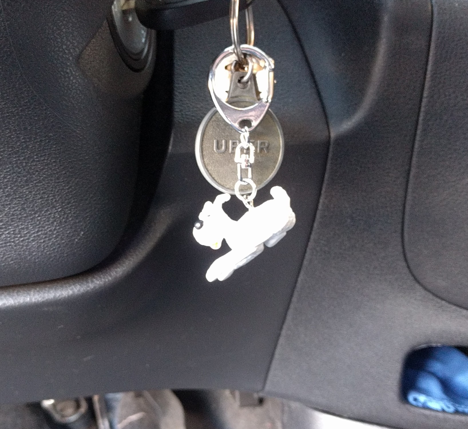 (My Uber driver in Québec City had a Snowy/Milou key-chain because of course he did.)
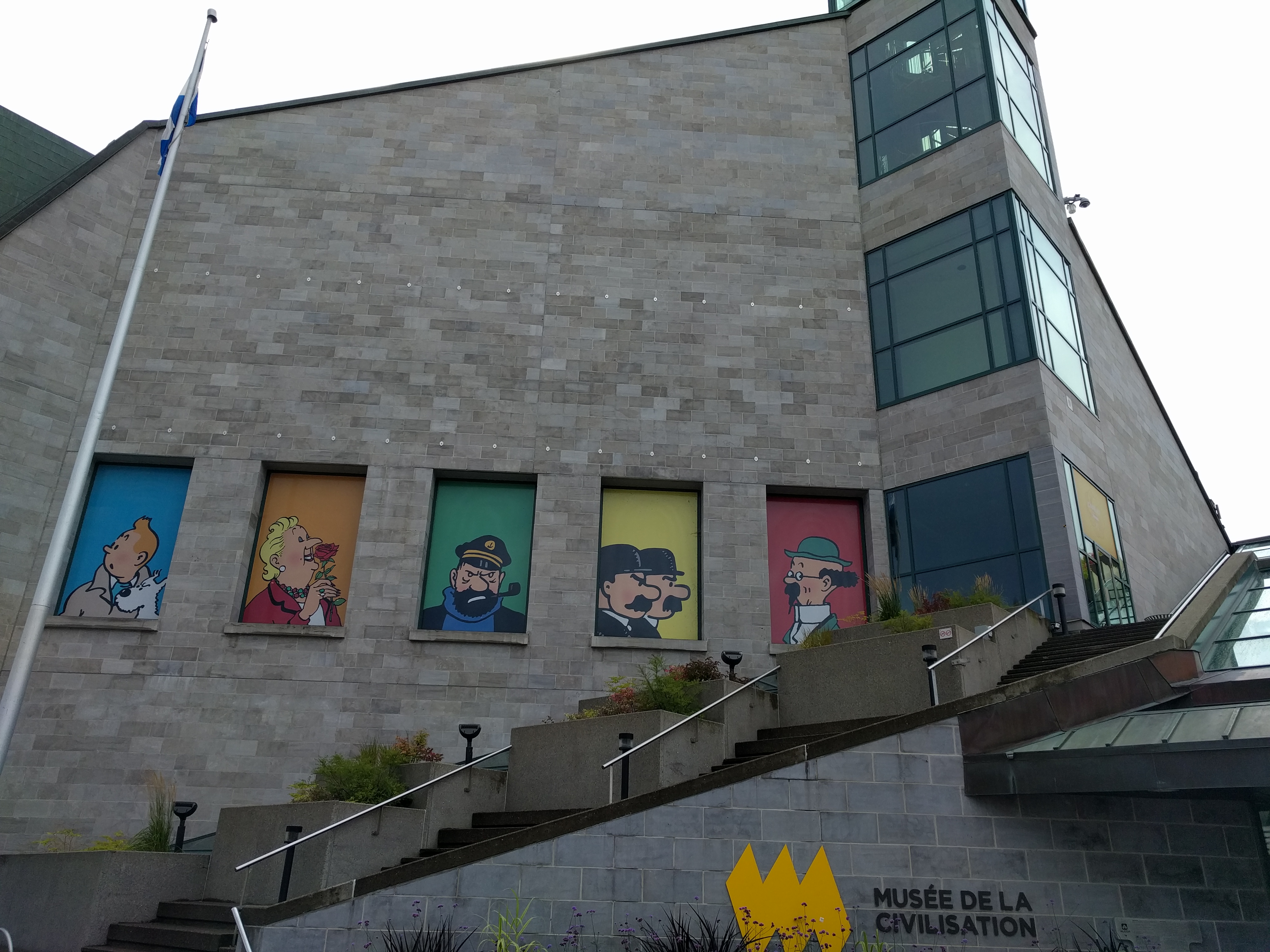
The Hergé exhibit was at the Musées de la civilisation, which is a short walk from the Old Town/historic district. It’s hard to miss, as you can see:
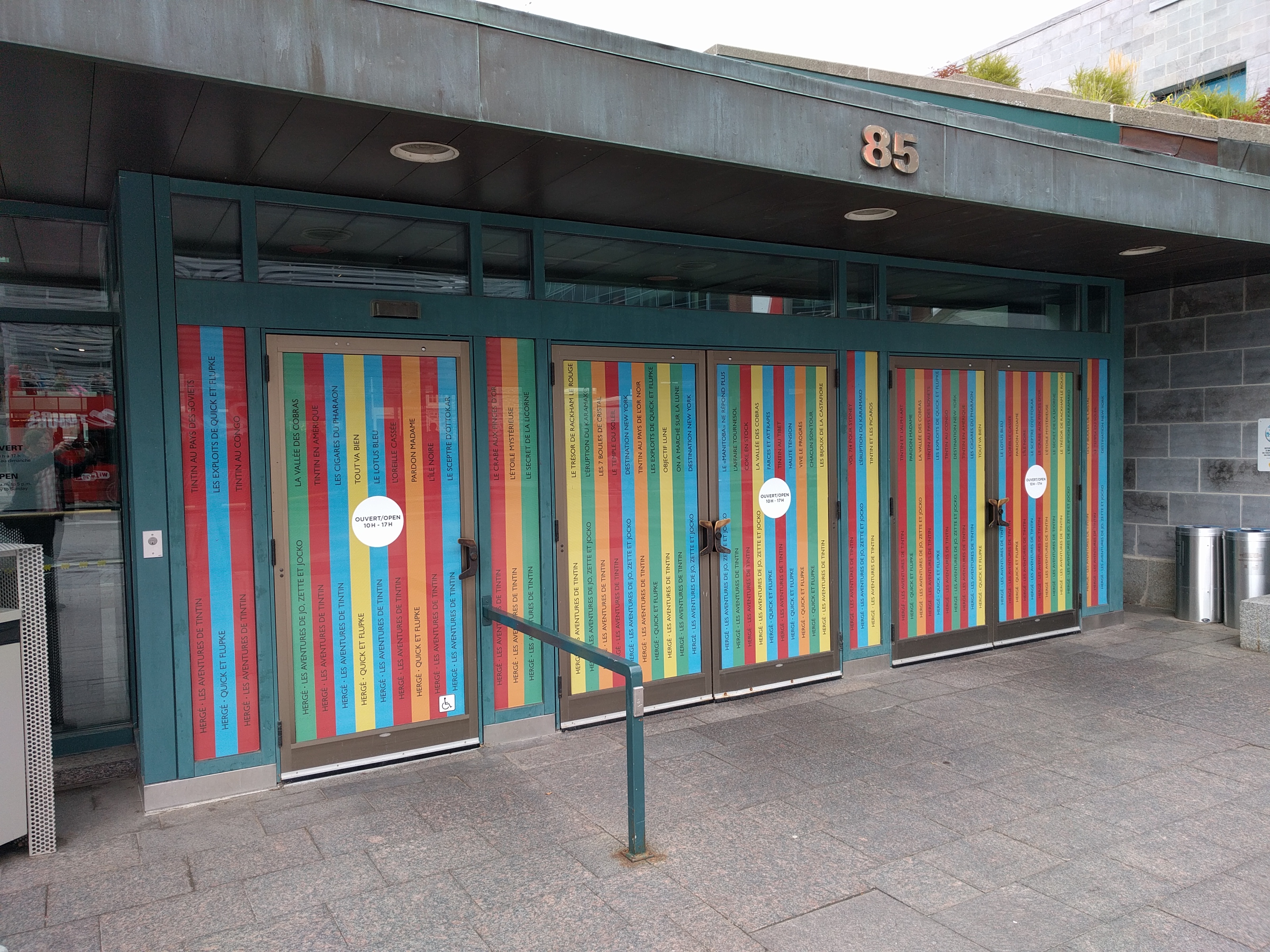
The entryway to the museum was done up with the spines of various Tintin books.
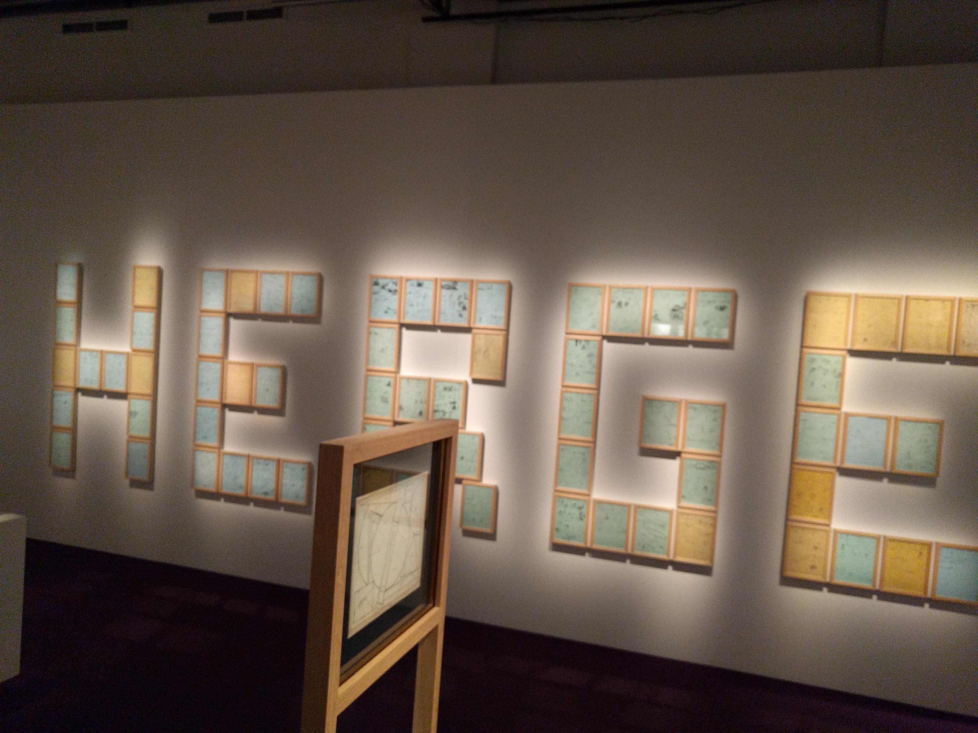
The exhibit itself begins in two small anterooms that unfortunately showcase both of the things that I found a bit problematic about the way this exhibit was set up. The rooms contain, oddly, a combination of Hergé’s late-era attempts at modern art, a few other pieces of modern art (some or all are from Hergé’s collection I think), and framed thumbnails from his unfinished final Tintin book, Tintin and Alph-Art.
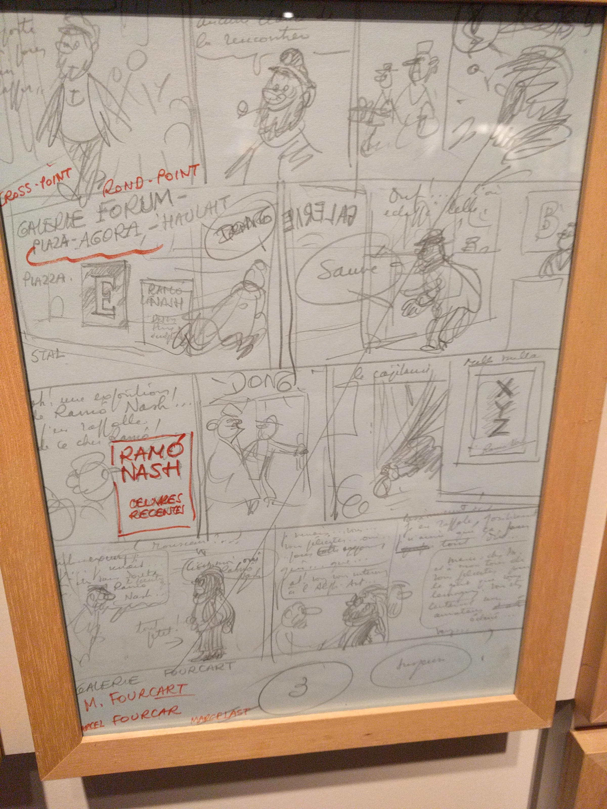
The larger of the two issues in evidence here is that the exhibit seems be be trying desperately to find some sort of tie-in to connect Hergé to “real art” rather than simply acknowledging that Hergé’s cartooning work is what he’s recognized and celebrated for and focusing on that right from the get-go. Among the non-Hergé works on display was a Roy Lichtenstein piece. There’s no lazier and more tired choice for a “bridge” between comics and fine art than Roy fuckin’ Lichtenstein.
The second issue is one that’s less of a concern to people well-versed in Tintin, but worth mentioning: chronology. As you can probably surmise from the fact that the exhibit opens with work from his unfinished final book, there’s no real consideration of chronology here. A page from Black Island might appear next to a page from Land of the Soviets…which in turn might abut a Destination Moon page. If you know the order of the books, you can see how his work evolves, but if you’re not familiar with the order I imagine it would be difficult to get much of a sense of how Hergé and Tintin grew and developed over time.
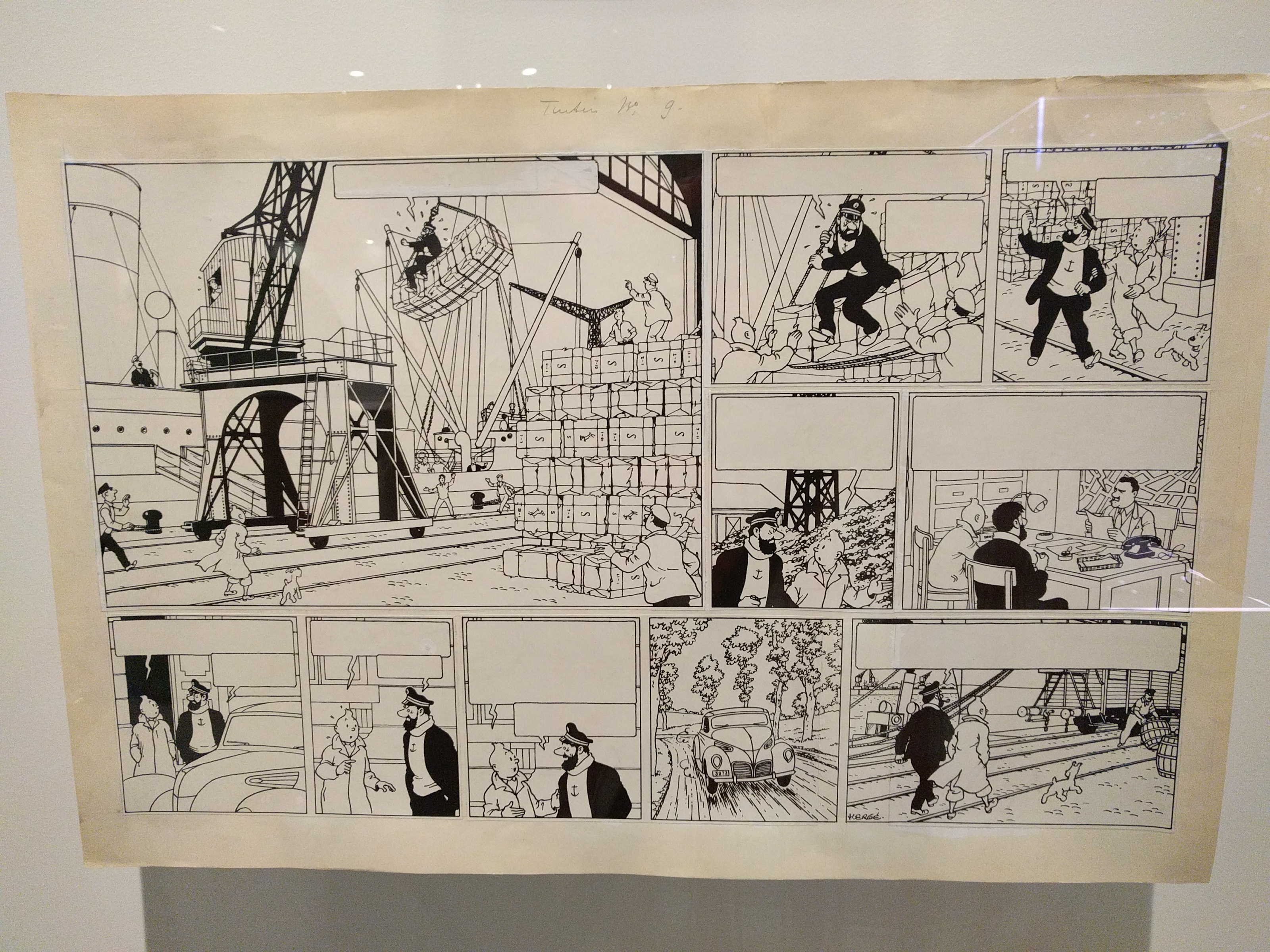
Now, for the good stuff: pretty much everything else about the exhibit is great–and especially: all the original art. Via some Twitter-sleuthing I got word that there were ten originals at the exhibit, which seemed a bit slight. More concerning was that the London exhibit apparently just had facsimiles of original art. Thankfully the show in Québec City had actual originals–and a heck of a lot more than ten of them!
Early Tintin works have a complex publication history. The were usually serialized first in a newspaper supplement, then reformatted into books, and then sometimes reformatted yet again for color. And at any stage of this process Hergé (or, in the case of later printings, his assistants) would redraw things, add panels, remove panels, etc. The exhibit does a great job of showing you how these changes played out in the various publications. Here, for example, is a display focusing on one sequence from The Black Island:
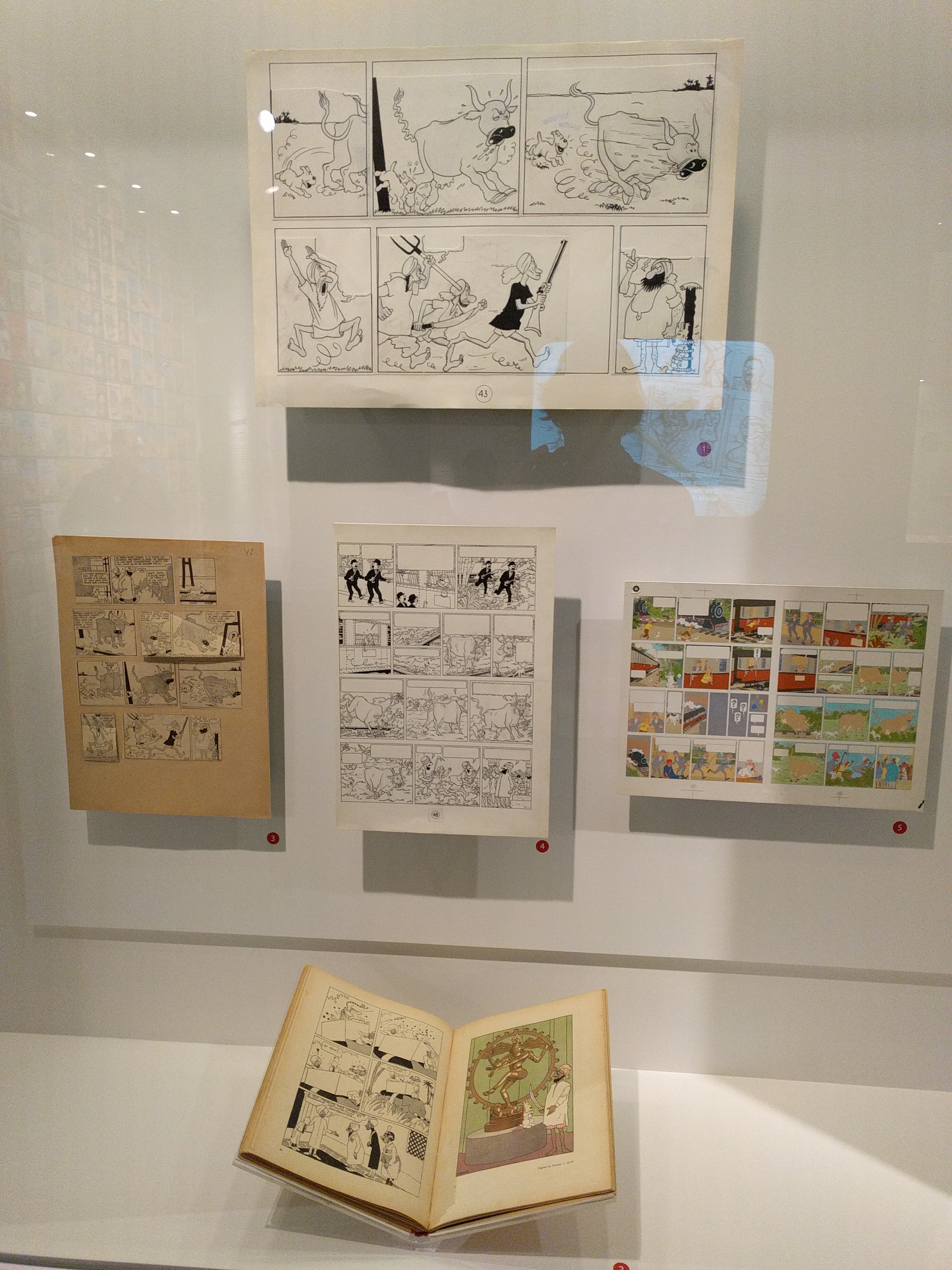
Check out how different the original is from the modern published version of even this one corner of a page:
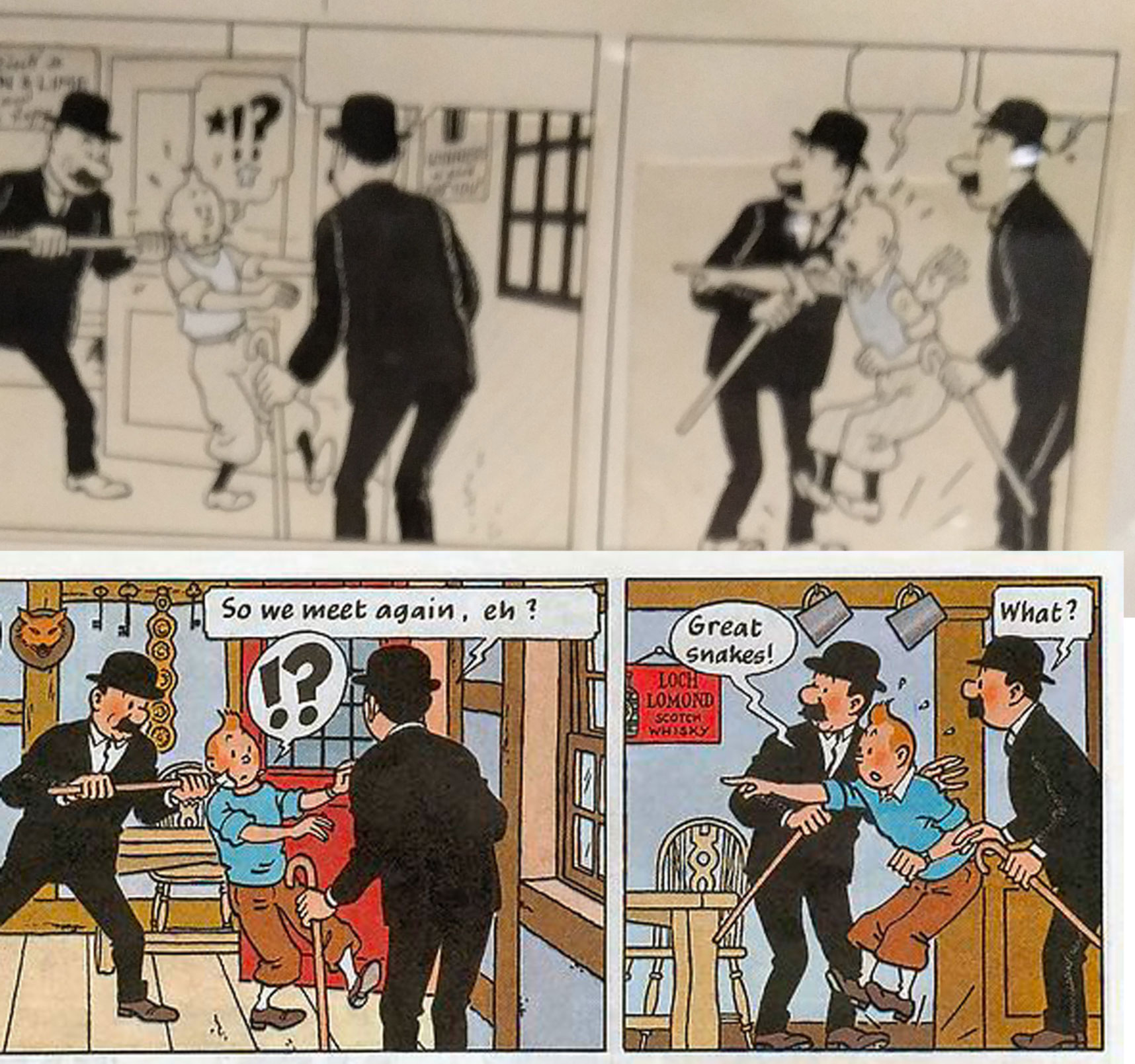
Tintin is of course now wearing his standard outfit, but also his face has been redrawn, eliminating the old-style close-spaced eyes. The backgrounds have been entirely redrawn–and in the case of the second panel, a new background has been added where there was none before. Note also that Hergé has become much more confident in his use of large areas of black. The hatched “ghost outlines” on the Thompsons’ suits are mostly eliminated.
In this detail from another Black Island page you can see that Hergé’s “building” a book-format page by cutting up panels (presumably from the original art for the newspaper version of the story), gluing them to the new board, and then expanding the panels by extending the pre-existing artwork.

Hergé–and the Ligne claire style he originated–is known for an almost “dead” line, but that’s not a wholly accurate notion, especially not when you’re able to see the linework close up. Check the beautiful linework in this panel of Snowy (and note the trademark Hergé “motion squiggle” with the spider):

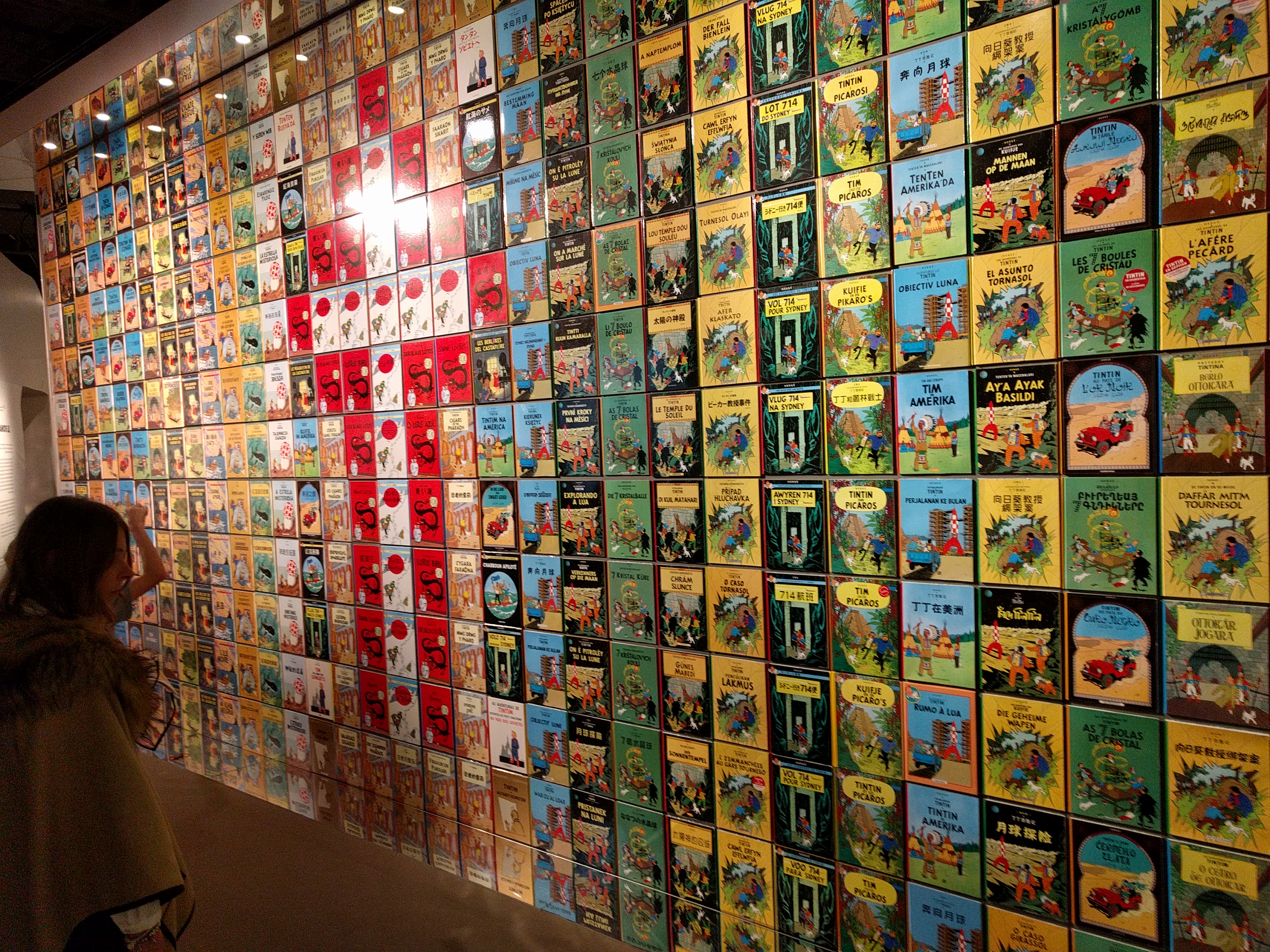
The room that held these originals got super-crowded later in the day. I was glad I got to the museum right when it opened so I was able to get up close and snap some high-res images of these originals. The back wall of this room was a huge display of Tintin book covers in various languages. Interestingly one language not represented was English. I kind of wondered if this was a bit of subtle shade-throwing by the museum in (French-speaking) Québec City. If so, well played!
Back to the originals, though! It was truly stunning to see pages like this up close:
They had one of my all-time Tintin pages on display–this one from Destination Moon:
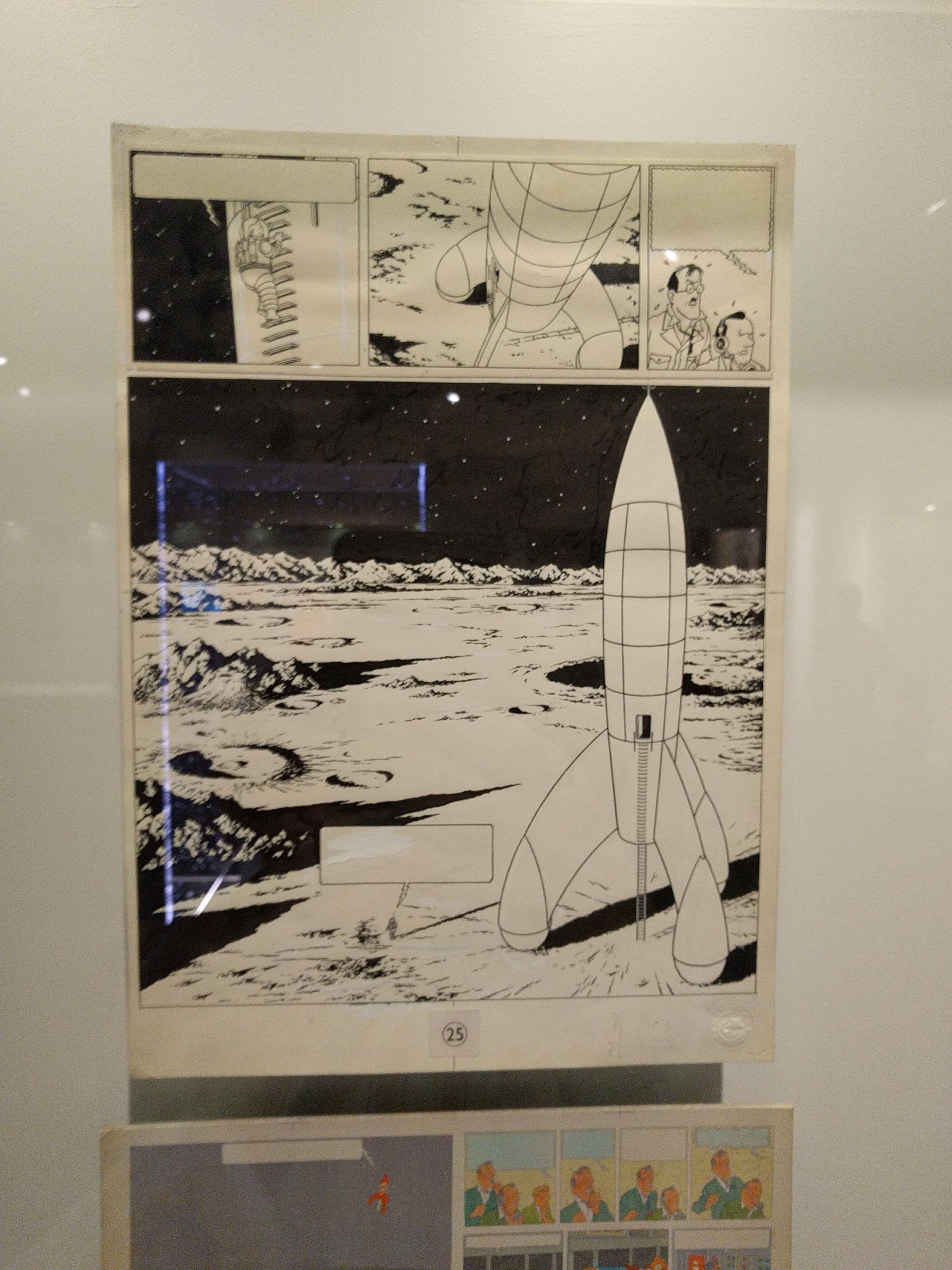
Here’s something that really struck me though when seeing this page: The exhibit had virtually no mention at all of Bob de Moor. De Moor was one of Hergé’s assistants at Studios Hergé and he was in charge of drawing things like machinery, backgrounds, landscapes, etc. So in this image, for example, a pretty big chunk of it was presumably drawn not by Hergé himself but by de Moor. Yet, the only mention of de Moor I recall was something about him being dispatched to take some photo-reference images for a book at some point. This is a pretty egregious oversight–if it is indeed just an oversight.
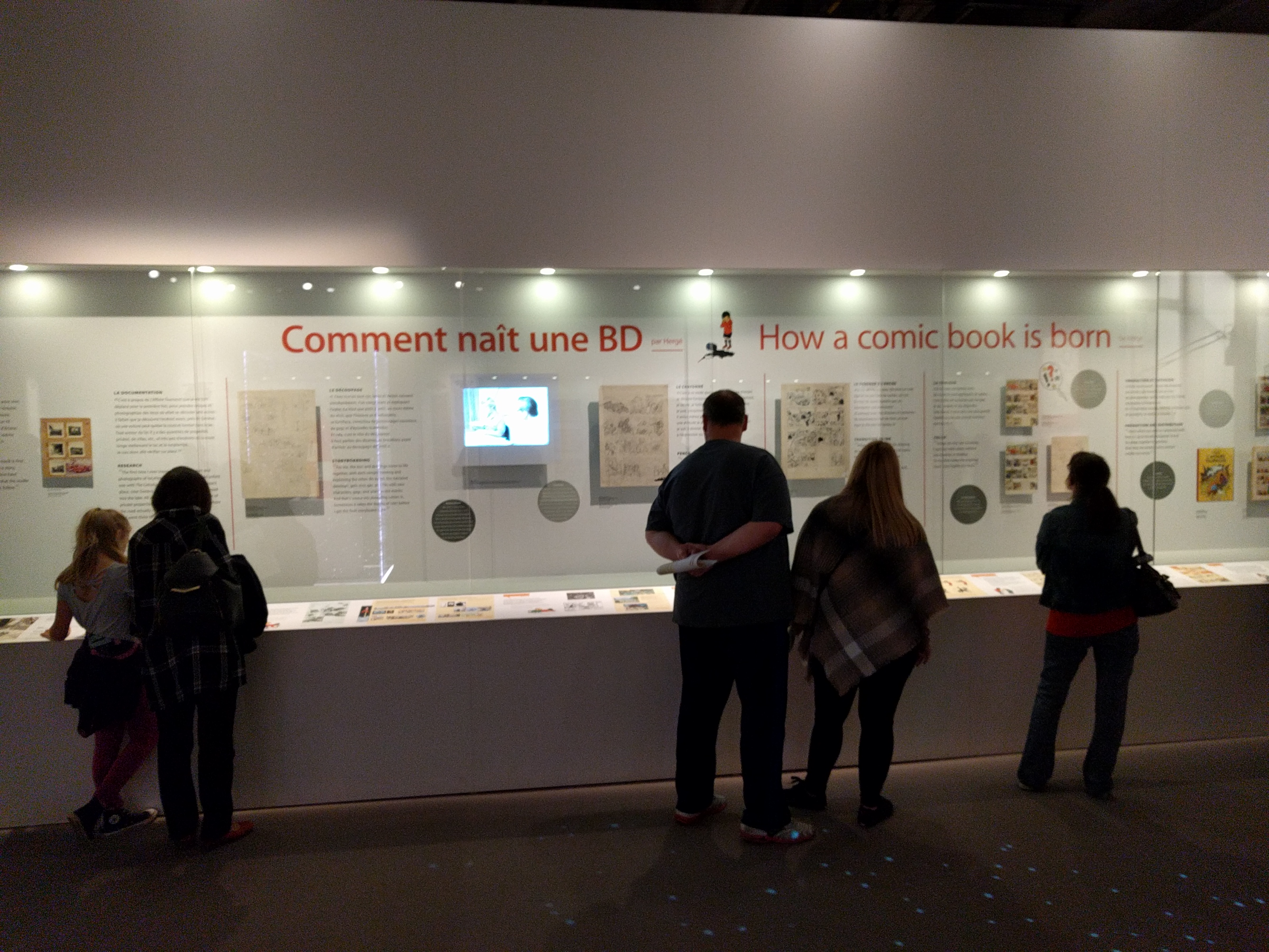
With one odd exception (I’ll get to that next) the exhibit did a good job of explaining the process behind the production of a Tintin book. Here’s a wall-long display showing a page from thumbnails through to colored, printed book:
The one exception? I’m not sure how obvious this is to lay people, but I was really surprised there was no explanation offered within the exhibit for displays like this, which show both the penciled and inked versions of a given page:
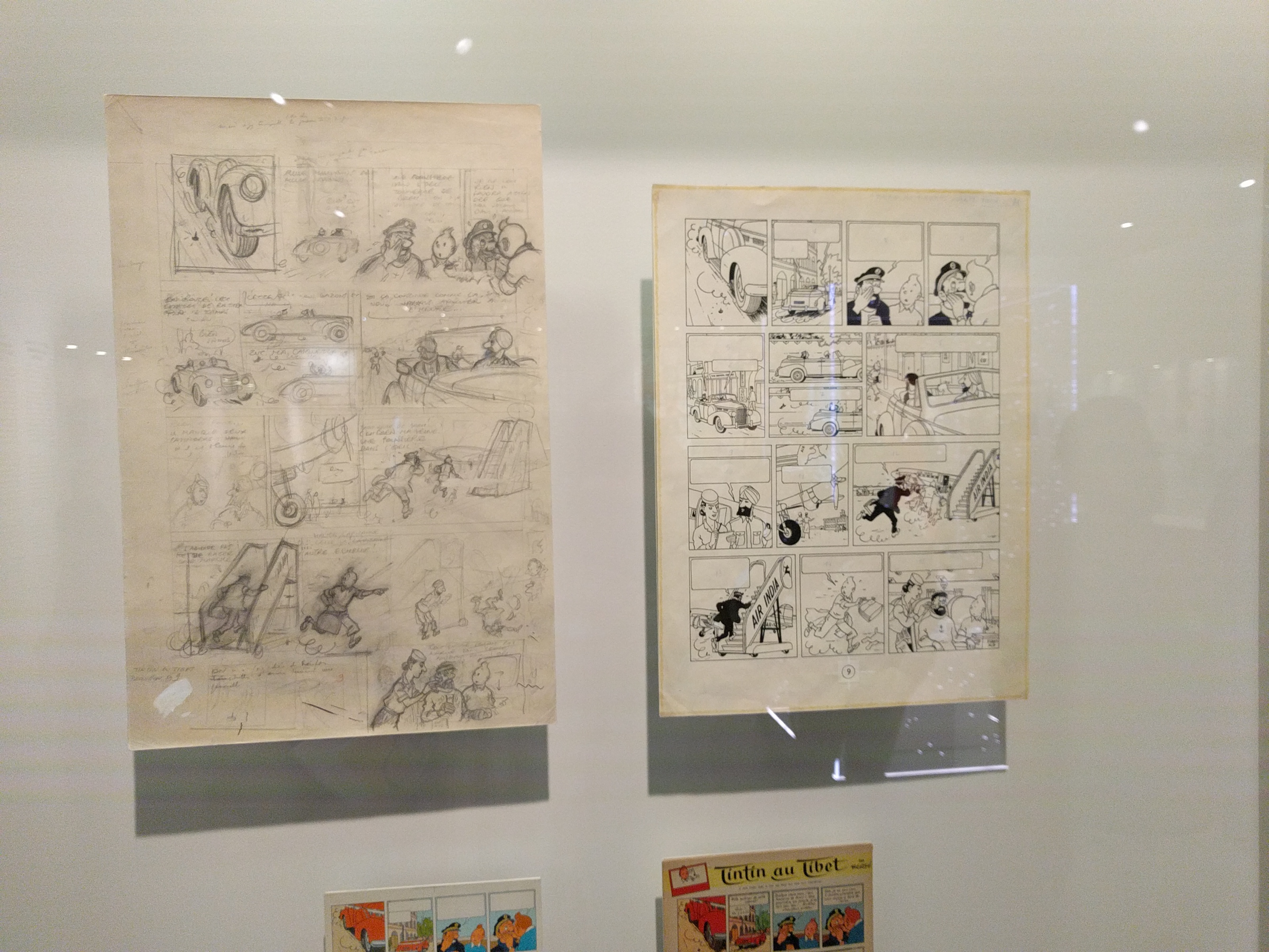
In most comics production the inks are of course applied over the pencils. You’d wind up with just one page: the inked page with the pencils now erased from underneath. The exhibit, in fact, had an entire room showing just Hergé’s penciled pages–without any explanation for why they still exist un-inked. Maybe this isn’t something that occurs to non-comics making people? Whatever the case, the explanation is that Hergé would pencil each page, then trace it onto a fresh sheet of paper (presumably with a light box) and then that page would be inked–hence, you wind up with two pages: one of the original pencils, one of the finished inks.
Hergé would sometimes make changes between the pencils and inks. As you can see above, for example, where the final panel of the penciled page is Haddock pratfalling off the airplane gangway–a panel that’s not in the finished page. Below that panel, though, in the lower margin of the page Hergé has drawn the panel that would replace it: Haddock in the plane being attended to by a stewardess.
Another one. Notice how much of this page has been changed.
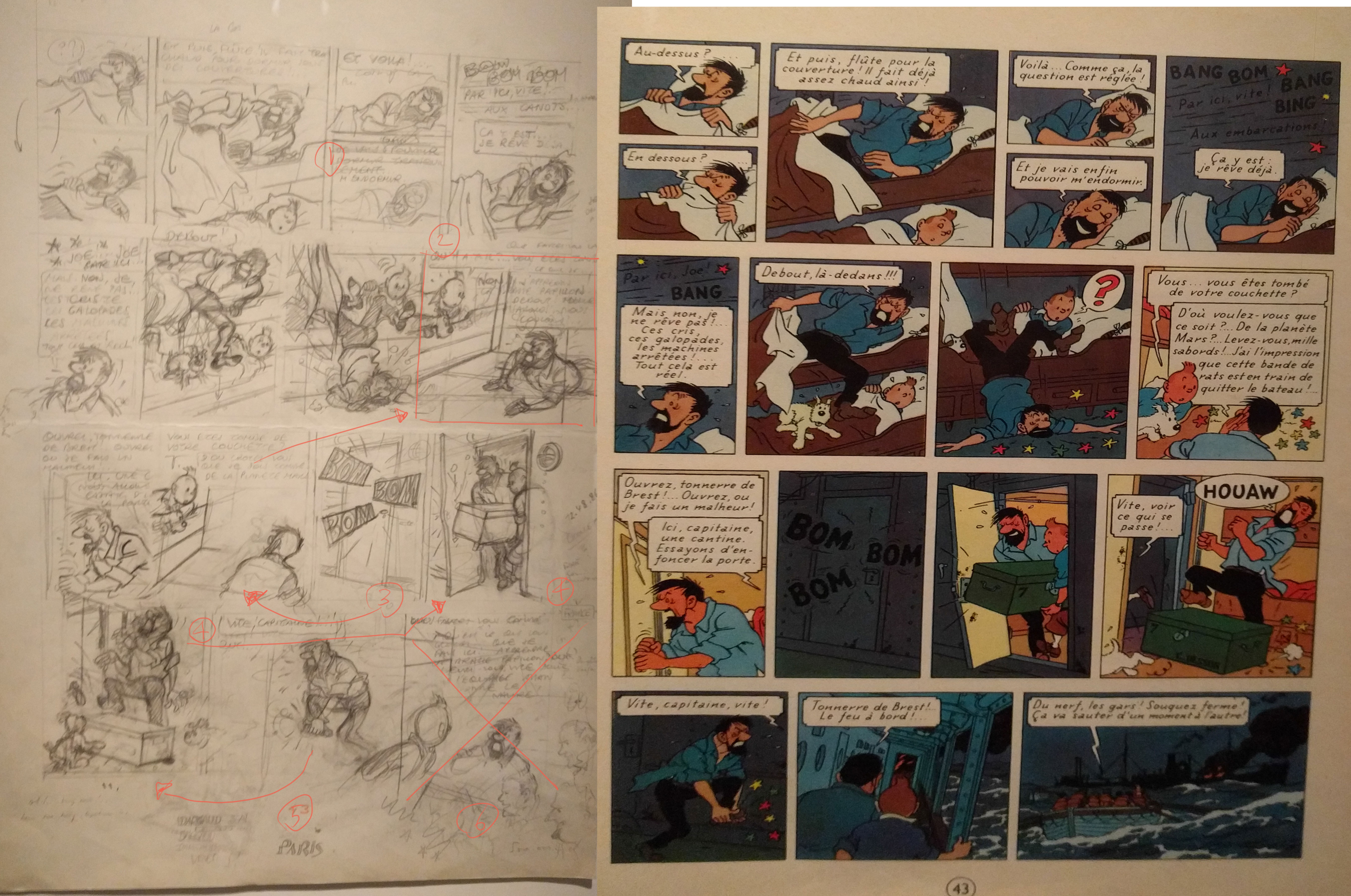
(Arrows and numbers added by me.) At (1) the bottom panel here is left at pretty much thumbnail state. I’m guessing that’s because it’s essentially a closer view of the top panel and could be achieved mainly via enlarging it and then lightboxing. (2) This panel has been completely eliminated. The panel below has been moved up into its place. In the place of that panel we get the (3) Bom! Bom! Bom! panel. The panel at (4) has also been eliminated and replaced by the one below. With the last panel on the penciled page gone as well, there’s now enough room for those two new panels–including that pretty spectacular ocean scene. There’s very little in the way of backgrounds in most of the penciled pages, presumably because de Moor or one of Hergé’s other assistants would add those.
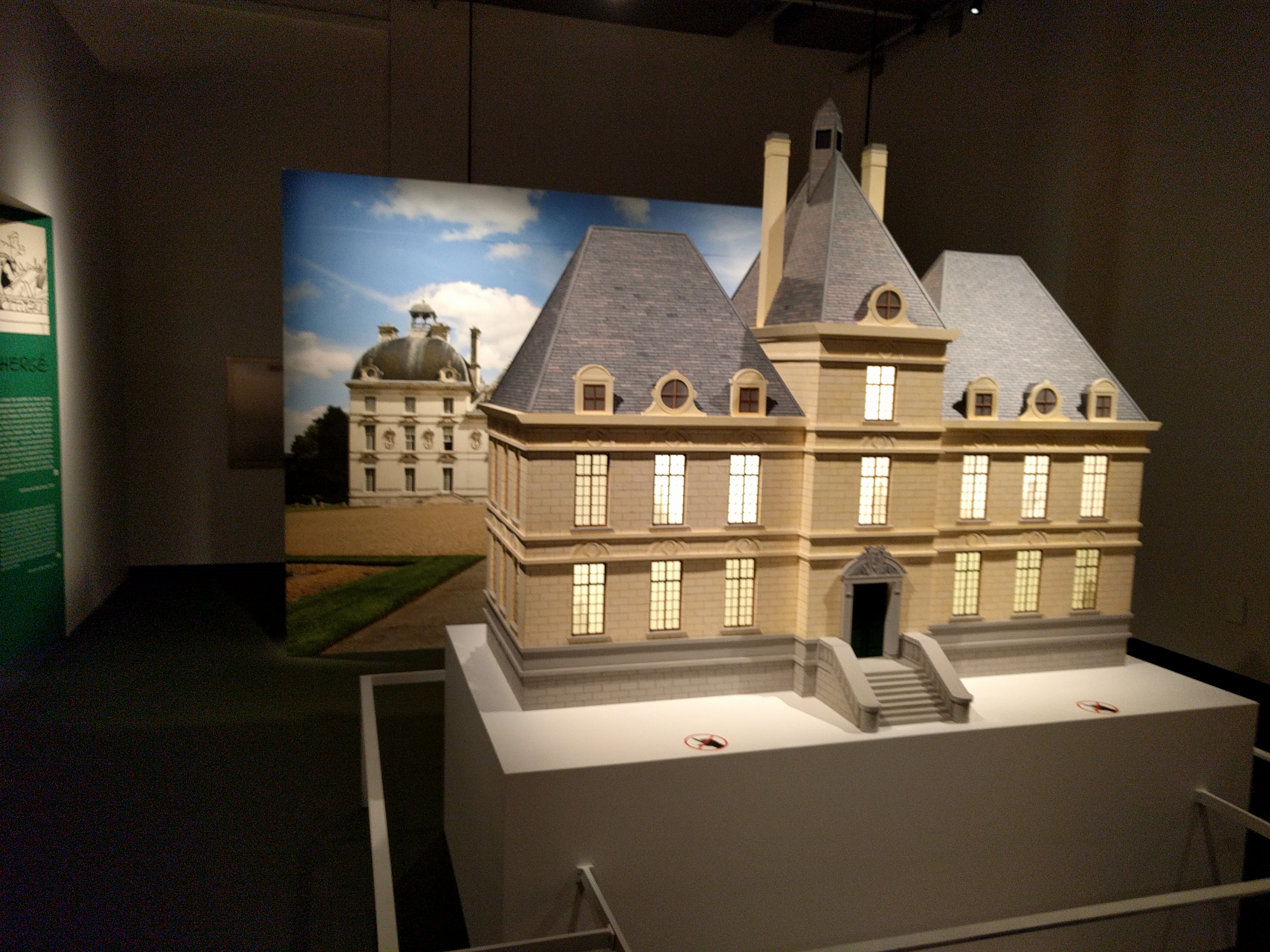
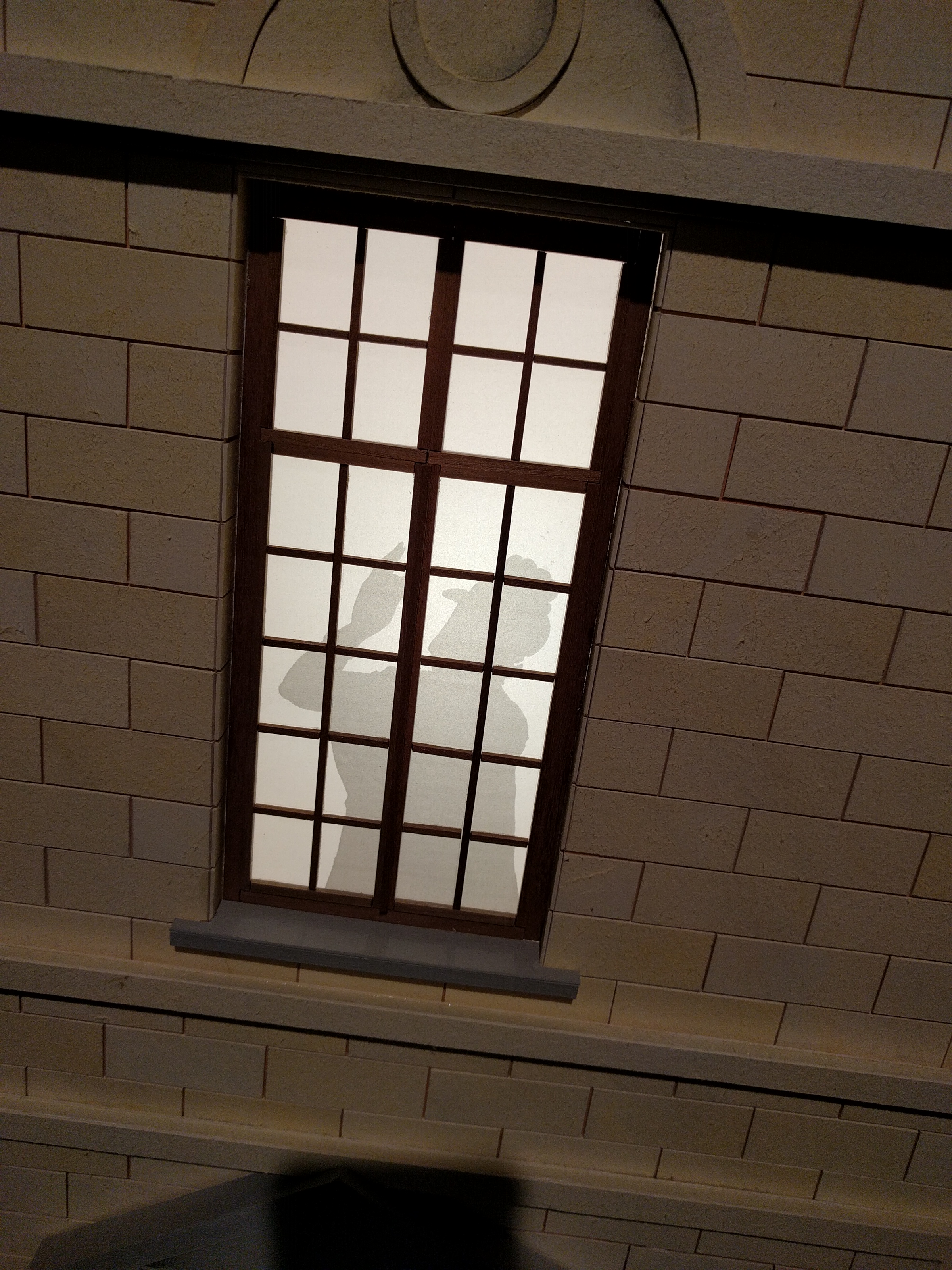
The Pencils room also contained a big replica of Marlinspike Hall that if nothing else was kind of fun. Various characters were silhouetted in the windows. Here’s Madame Castafiore.
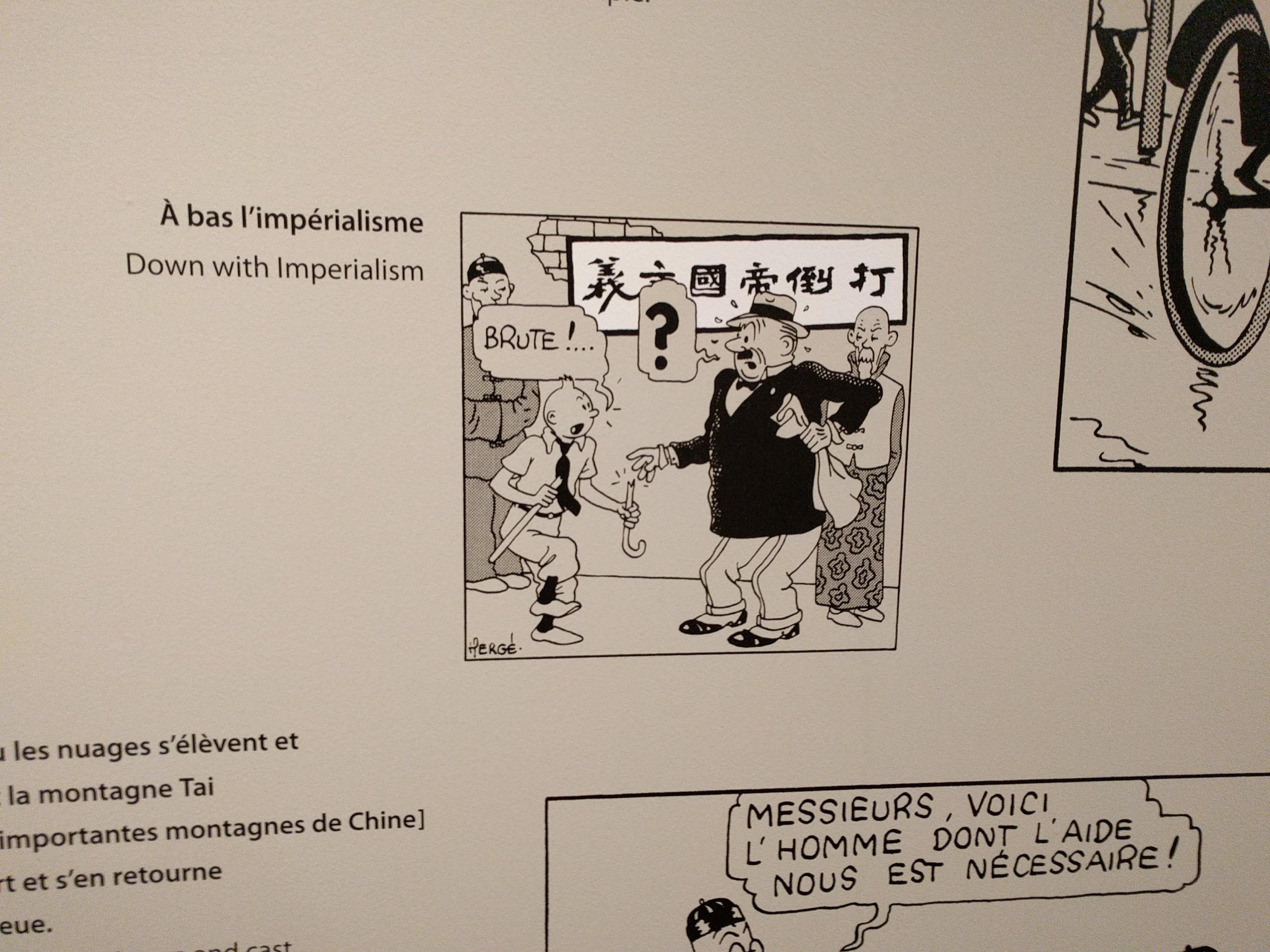
Interestingly the exhibit featured an entire room devoted to Hergé’s/Tintin’s ties to Asia. Several of the Tintin books take place in Asia and one of Hergé’s closest friends was the Chinese artist Zhang Chongren. In addition to some beautiful original pages from The Blue Lotus, this room also had a wall showing the translations of some of the text from The Blue Lotus. The events of the book take place around the time of the Japanese invasion of Manchuria and Zhang, who supplied the Chinese writing for the book, used the opportunity to sneak in some anti-Japanese slogans. These didn’t go wholly unnoticed, as Japan made a formal complaint to the Belgian government after the book was published.
The final room of the exhibit was devoted to Hergé’s influences and while there were some interesting items here, it seemed more like a catch-all room for odd and ends owned by the Hergé Museum. I enjoyed seeing stuff like an original Bringing up Father page, but I’d have hands-down preferred to see more original Hergé art.
There were plenty of other things that I’ve glossed over here–a wall of beautiful Petit Vingtième covers, various video interviews with Hergé, originals of some of his non-Tintin comics work, etc. But the main attraction for me was just a chance to ruminate on the many amazing original Hergé pages on display. I visited the exhibit in the morning, left and had lunch, then returned again for really soak in the art. The exhibit runs through October. If you’re anywhere near Québec City–or if, like me, you can score a good deal on a flight–I highly recommend catching this exhibit. Id’ be delighted if it appeared at another venue in North America… but I wouldn’t bet on it!
Note: I visited a pretty great bookstore in Québec City and bought a handful of French comics there. I’ll do a separate post on that soon.


Recent Comments