
Our local independent theater, a/perture Cinema is doing a yearlong film series in which local artists pick films to be screened each month and design posters to accompany them. Of the five films I submitted for consideration, Star Trek II: The Wrath of Khan was selected. (My other four were The Road Warrior, Kung Fu Hustle, Yojimbo, and The Great Escape). My Khan design went on sale at the screening last week and is now available via Etsy:
The prints turned out really nicely. These are big (24″ x 18″) two-color screenprinted posters on heavy acid-free stock. The run was limed to 50 prints and they’re all signed by me. They’re $25 each.
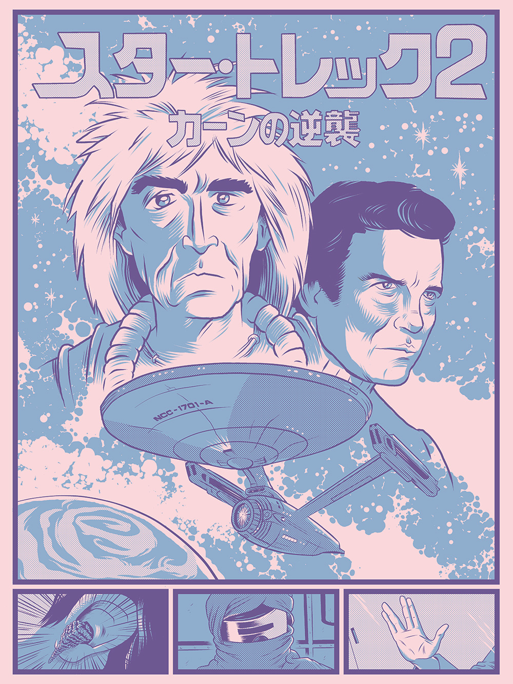
The colors in the Esty image are kinda weird looking. Here’s a more accurate version.
 And here’s a pic of the actual poster (banana for scale):
 If you’re in Winston-Salem you can also buy them from Delurk Gallery on 6th Street.
Process
My first thought about possible poster designs for Khan was to do something that visually referenced Das Boot–since one of the three big ingredients of the film is the chase scene at the end which is basically a WWII submarine chase. (Since no one asked, I’d put “Moby Dick in space,” and “character-driven growing old/friendship story” as the other two main ingredients.)

The more I thought about the big face in the Das Boot poster, though, the more I was reminded of manga artist Leiji Matsumoto‘s pinup images for his space opera manga/anime series like Space Battleship Yamato:
 Ultimately, I wound up preserving only the blue color scheme from the Das Boot image and going with a more Matsumoto-like layout. I started by fooling around with photo reference images:

The lettering is from the Japanese movie poster. The Enterprise image here is responsible for my including the extraneous “-A” in the ship’s hull number (alas, caught only after the image had been sent to the printer). I then worked up a very rough sketch of the poster, just to get the layout and color scheme more finalized:
 At some point in the process I decided to add Kirk in. I did the piece in Manga Studio and the “Kirby Krackle” is from specialized Kirby Krackle brush I got from, well, somewhere. I can’t remember where exactly. Here’re the pencils. You can see that I’ve added the little panels along the bottom at this point:

I’m much happier with how Khan turned out than Kirk. I Kirk’s case, I think I sacrificed too much “manga-ness” in favor of likeness. The Kirk in the pencil version doesn’t look a whole heck of a lot like William Shatner, but I think he matches the overall style of the image better. William Shatner, incidentally, I found to be really really difficult to draw. I Googled up caricatures of him and there were very few that were any good. Not surprisingly Al Hirschfeld and Tom Richmond both did great young Shatner drawings. Most folks either didn’t capture his likeness well or went with the older Shatener, who’s a lot easier to draw because you can trade on things like his puffy cheeks, wrinkles, hairline, etc.
 As mentioned, the entire image was done in Manga Studio. One feature of the program that I really dug into for this drawing was the rulers. They were extremely helpful for doing things like the Japanese lettering and the saucer section of the Enterprise. I could basically trace out the forms that I wanted with rulers and then use an inking nib to go over them. The rulers impart the required precision, but I still got the variability of a nib line instead of the sterile uniform line I’d have gotten if I’d used, for example, the draw ellipse tool for the saucer shapes.
Big thanks to a/perture for asking me to do this project–and thanks to everyone who came out to the screening, especially folks that came in uniform! The actual screenprinting was handled by Vahalla Studios and they did a fantastic job.
Recent Comments