
Actually, I kind of like how that turned out… maybe I’ll ink it.

May 01 2010

If you read my blog, you already know that Jabberwacky is the Free Comic Book Day online comic from Wide Awake Press and you already know who’s in it. So…. now that it’s actually Free Comic Book Day, you can go and dowload it either as a PDF or CBZ–or you can just read it online:
http://jabberwacky.wideawakepress.com
Enjoy!
Apr 26 2010
I did a post a while back about the Wide Awake Press Free Comic Book Day offering for this year, Jabberwacky!, but with FCBD nearly upon us, I thought I’d post a few additional items before the digital comic itself becomes available. First off is this video “trailer” for the book, set to psychedelic rock version of Greig’s Hall of the Mountain King:
Additionally, a full list of contributors is now out:
Andrew Barton
Sally Bloodbath
Dan Boyd
Michael Bresnahan
J Chris Campbell
Gregory Dickens
Andrew Davis
Justin Gammon
Bernie Gonzalez
Brad Mcgintiy
Jason Horn
Dustin Harbin
Van Jensen
Mike LaRiccia
Josh Latta
Pat Lewis
Ben Towle
Rob Ullman
Jeff Zwirek
I’ll do a quick post on FCBD Saturday (May 1st) when you can go to the Jaberwacky site and download the book for free (naturally!) as a PDF or CBZ–or just read the whole thing online.
Apr 25 2010
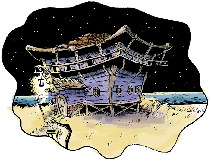
Here’s a design for an out-of-the-way watermen’s hangout I’m working on for Oyster War–with ink and some quick watercolor applied. I’m feeling like I’m maybe getting stuck in a bit of an architectural rut of late. I want Blood’s Haven (the setting for Oyster War) to have a cohesive look, but this design is looking so similar to some of the other structures I’ve drawn so far that I’m afraid things are going to get homogeneous. I’ve been looking at structure designs mainly from things like Dr. Seuss books and the set design for the “Popeye Village” from the Altman film from 1980. Maybe I need to branch out…
Apr 21 2010
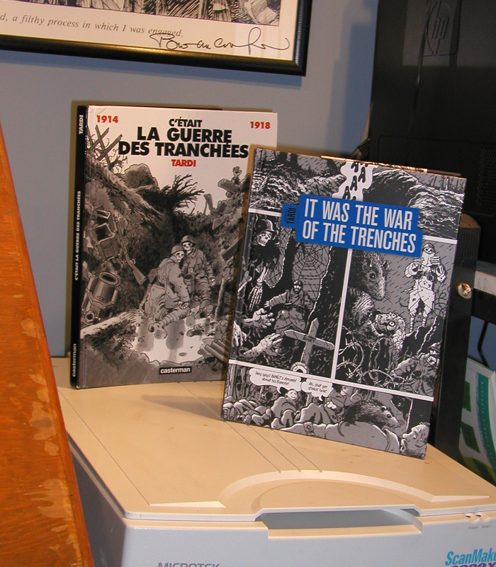
I had a big Jacques Tardi “phase” a while back–and in particular, I was really enamored of the bits and pieces of C’était la Guerre des Tranchées that had appeared in various anthologies up to that point. In fact, the “duotone” style of drawing that I’ve been using in most of my longer work (Farewell, Georgia, Midnight Sun, and Amelia Earhart – This Broad Ocean) is derived directly from my interest at the time in Tardi and the American strip cartoonist Roy Crane, who used duoshade board to get a gray tone effect much like Tardi’s. So I was of course really excited to hear that Fantagraphics was doing a series of translated Tardi books, including C’était la Guerre des Tranchées–now titled It was the War of the Trenches. I’ve had the French Casterman edition for a while, but I got my new Fantagraphics copy last week and just for fun I thought I’d take a look at the two side by side.
The first thing I noticed was the covers, of course. I think on a purely aesthetic level, I prefer the Casterman cover, but after my grousing a week or two back about publishers not keeping their series designs consistent, I’m sure not going to complain about the cover; it looks fantastic next to the other books in the series to-date, West Coast Blues and You are There.
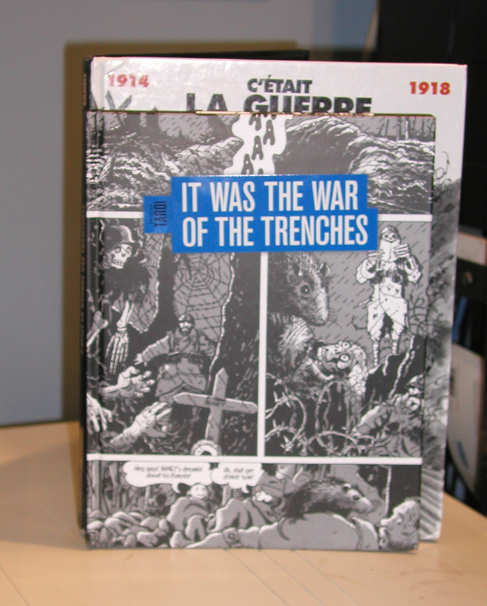
The trim size is somewhat smaller as well. I’m sure there’s some reason for this that probably has to do with the retail book trade in Europe vs. in the U.S., but it’s a not a huge reduction in page size. The French edition is 9 x 12 inches, whereas the Fanta edition is 8 1/4 by 10 3/4. It’s slightly smaller, but thankfully not Gus and his Gang smaller.
Interestingly, the Fanta edition is printed on matte, rather than glossy, paper. I generally prefer matte paper stocks to glossy stocks and this isn’t really a noticeable change here other than the blacks being a little less black, something that just comes with the turf when printing on matte paper as far as I can tell.
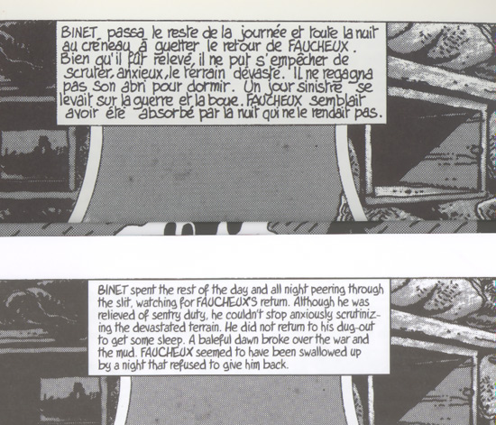
My French language skills are barely “caveman level,” so I can’t really make any comment on the translation (and also, I haven’t actually read it yet), but the Tardi font that they’ve made for the book looks fantastic. Here’s a sample where you can see Tardi’s original hand lettering side-by-side with the font used for the Fanta edition. You can also see the size difference between the two editions and even see a bit of the difference between the way the blacks appear in each.
The most curious difference between the two editions is their weight. They’re presumably both the same length as far as page count goes, and they’re just about the same size, but the French edition seems like it weighs a ton compared to the Fanta edition. I put them both on my postal scale and indeed the French edition weighs nearly a half pound more. I guess maybe glossy paper weighs more per-sheet than uncoated matte paper? (You’d think the American would be the one overweight, haw haw haw!)
Anyway, this is a great-looking edition of this book and I’m really looking forward to reading it for the first time complete, in English, start to finish. This Fantagraphics series is maybe the third–or even fourth–time that a U.S. publisher has tried to get Tardi’s work to “stick” with an American audience. I hope they’re successful.
Recent Comments