

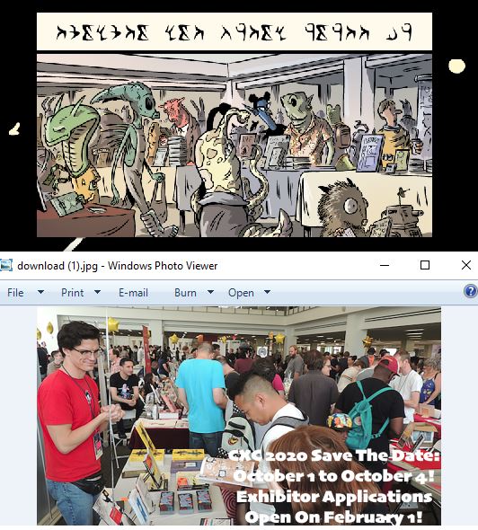
Cartoon Crossroads Columbus (CXC) is one of my favorite comics festivals–and that was the case well before I was a Columbus resident–so it was a real honor to be asked to do this year’s poster. The event just officially released the poster along with a preliminary guest list, all of which you can find on their site here.
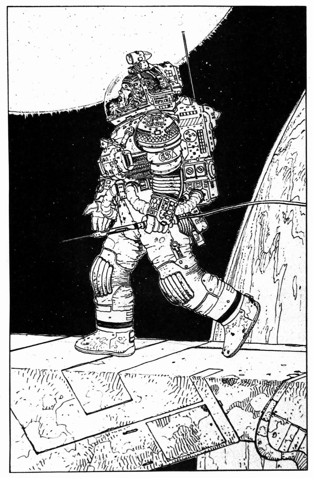
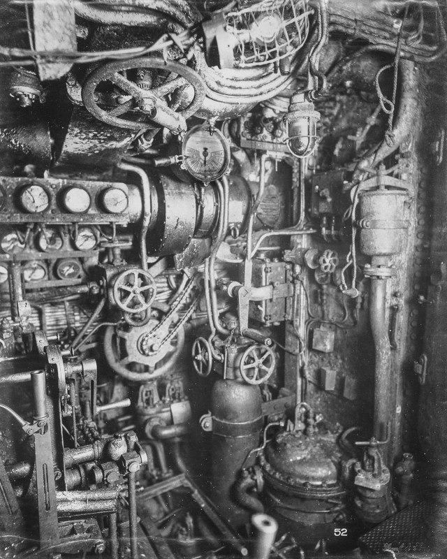
I noodled around initially with a number of different concepts for the poster and was leaning toward just doing a scene of the show floor with everyone as anthro/animal characters, but at the time I was brainstorming I was also setting up a unit for one of my classes on cut-away illustrations, something I’ve always had a soft spot for. Here’s an example:

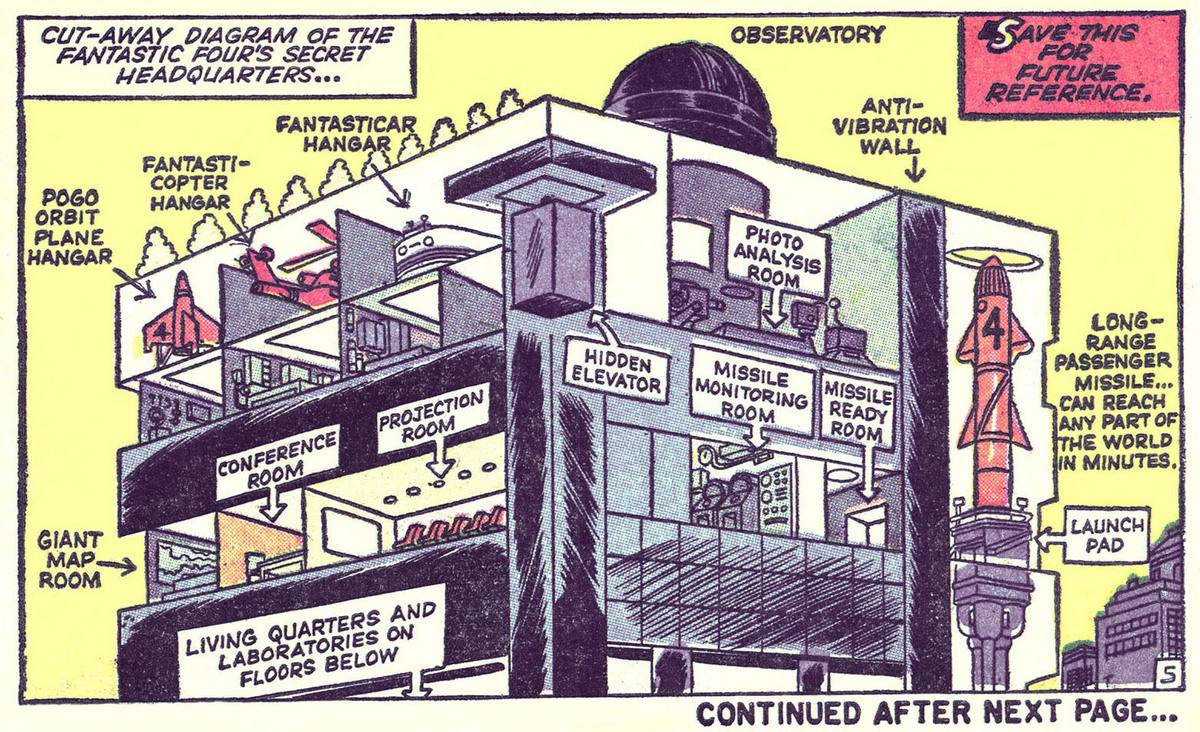
It dawned on me as I was putting my class presentation together that I should figure out a way to incorporate a cutaway into this year’s poster design, and thus I immediately switched gears and begin working up a design based on some kind of cutaway. I would think back to this moment many times as I spent hours and hours painstakingly rendering miniature interior spaces on the poster–“Why didn’t I just do the damn animal thing?!” Anyway, this was a great excuse to take a deep dive into comics’ wealth of amazing cutaway drawings. I rounded up tons of them, but here’s one of my favorites: The Fantastic Four’s Baxter Building:
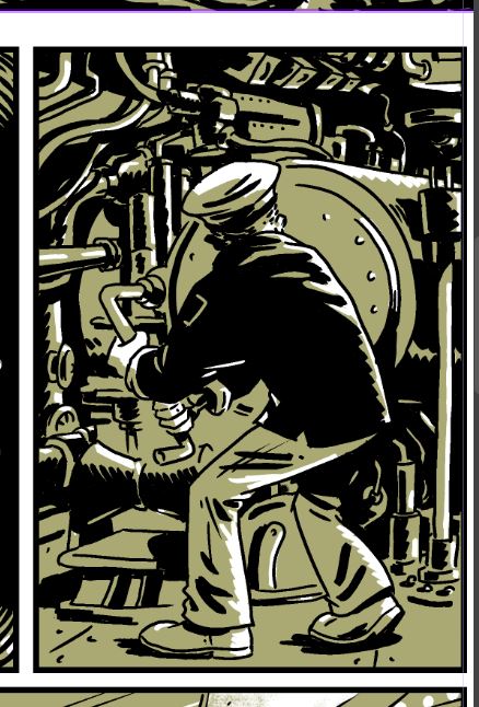
And of course I’d be remiss if I didn’t post maybe my fave cutaway illustration of all time, this Richard Scarry ship, which I’ve written about previously:

Given that the festival takes place at multiple locations (or did take place pre-COVID. Obviously the poster concept seems somewhat bittersweet in retrospect, since the event’s wisely gone virtual) it’d only be fair to try to do cutaways of all of the man locales. I can’t recall exactly what possessed me to do a space-themed image, but I guess in a bid to make things as complex as possible for myself I decided I’d combine the locations not just into a space station, but into a space station that spells out “CXC.” Here’s my initial rough:

And, obviously, if there’s a space theme, there should be aliens and astronauts–as you indeed see in the final poster. There were a lot of steps, obviously, between my little rough sketch above and the finished image, and a lot of design choices going on–some just referencing the various Columbus festival locations and others relating to the overall SF theme. So here, just for fun, is a “dissection” of the various visual elements in the final design:
Columbus Locations
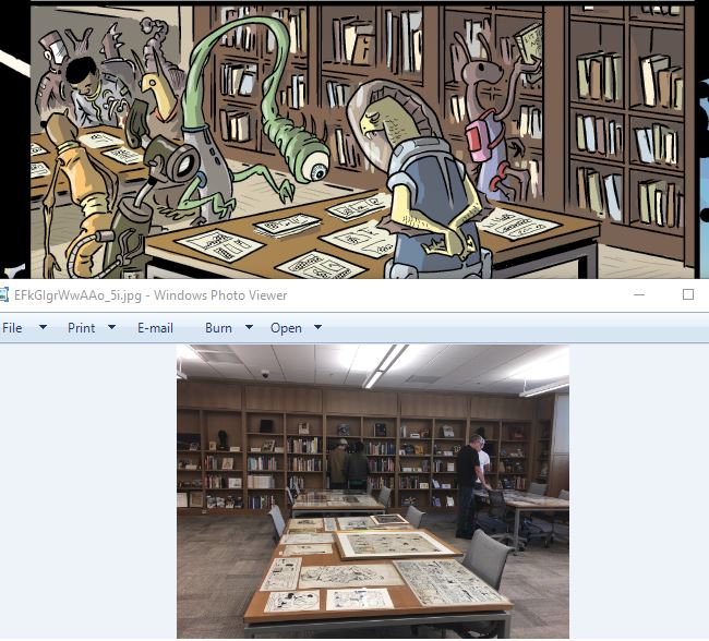
Starting from the top… This section is the Columbus Metropolitan Library, where the sales portion of the show is usually held:
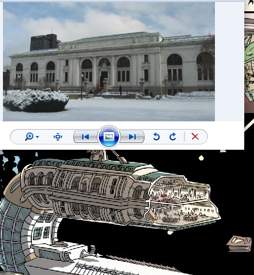
The cutaway inset is the upstairs gallery where the tables are set up. Incidentally, this is a beautiful space. One of the things I really like about CXC is that it’s in a bright well-lit space, unlike a lot of cons which are in convention centers or hotels which can often have windowless, bunker-like areas for events.
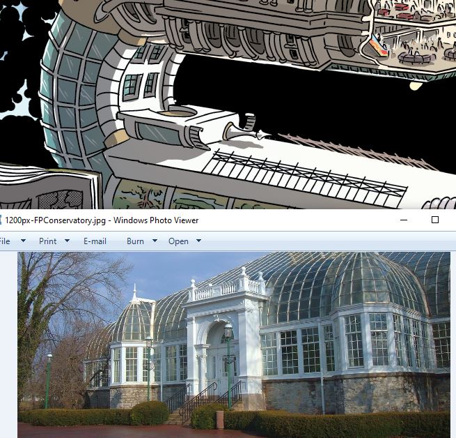
I needed some elements for the curve of the upper “C” and grabbed them from the Franklin Park Conservatory–a location totally unrelated to the show, but it’s a cool building!
Again, not a location that’s associated with CXC, but I threw in a bit (upside-down) of Columbus’s amazing downtown Topiary Garden:

The main “X” element is the Billy Ireland Cartoon Library & Museum. Have I mentioned that the Billy Ireland, right here in Columbus, houses the world’s largest collection of original comics art?

… and its cutaway view is the Billy Ireland’s reading room where you can look at any of their 300K-ish originals, as these folks in the poster are doing:
Moving into the lower “C” now, this section is the Wexner Center at OSU.

I couldn’t find a picture of the auditorium or a screening room, so its inset is just kinda freestyled it, but I did have the audience watching Tezuka’s Simba the White Lion.

The tail end of the last “C” is a building at CCAD. That’s actually a dorm, not a classroom building, but hey, I wanted a building that wasn’t that tan concrete color. Aesthetics over accuracy, I say!

I just kinda made up the CCAD classroom in the inset, but needless to say, I’m familiar enough with the inside of CCAD classrooms that this wasn’t a problem for me.
Space Elements:
The space itself is, of course, “Kirby Krackle,” which at this point–along with stuff like Ben Oda-style war sound effects, and Stan Sakai’s skull/death emanatta–has just kinda become part of comics’s visual language. For what it’s worth, when doing krackle digitally (the whole poster is digital/Clip Studio Paint) I start with a “base coat” from a custom Kirby Krackle brush in black, then go over by hand adding in black dots… then erasing out some white ones. Just using the straight brush doesn’t look right.

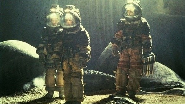
The biggest space design element is of course the astronaut–who is being used by him/her-self for things like a custom bookplate, sand-alone logo, etc. For the suit design, I went to two of my all time favorite movies: Alien and 2001: A Space Odyssey. (I’m a SF nerd.) You can see I’ve grabbed a number of design elements from the 2001 suits, most obviously the great orange color. I’ve always loved the bold colors of these suits.


I’m also grabbing elements from the beautiful deep sea diver-inspired suits from Alien. Comics connection! These suits were partially designed by the great French cartoonist, Moebius:
Typography
Speaking of SF movies, pretty much all the typography in the poster is done in Eurostile Bold, which has become the go-to for pretty much any SF typography. The great Typeset in the Future blog did a massive post on this typeface.
The typeface at the very bottom is OCR-A, a typeface developed for optical character recognition (duh) and which looks like an old monotone CRT monitor display, as you see in lots of old SF movies. In fact, once the guests to the show are announced, they’ll appear in green type on a black background to emulate exactly that. (Guest names here are–obviously–placeholders. As if!)

The alien typeface is this “alien” font, which the designer was kind enough to let me use for the poster:

It’s not typography per se, but if you’re a fan of Alien, you probably recognize the little checkerboard symbol in the bottom right:

That’s part of “Semiotic Standard,” a set of symbols developed by designer Ron Cobb that you see all over the Nostromo in the film. Here’s the full set:

Cobb says the “hazzard/danger” symbol (the checkerboard) was deliberately made to look like the logo for pet food brand Purina because the Nostromo‘s crew were “alien chow.” Incidentally, Ron Cobb is another comics-connected element to the poster: in addition to his well-known work on films like Alien, Total Recall, etc. he’s a pretty good cartoonist, too!
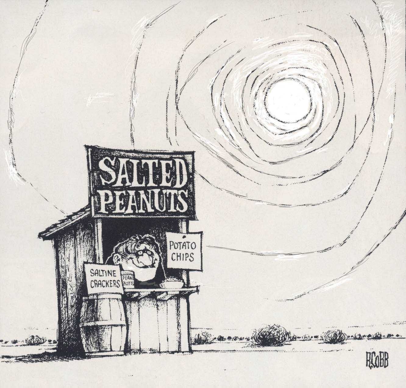
Over 280 of Ron cobb’s Cartoons
And finally…
Just for fun, I threw in the cover to one of my favorite comics. In the lower right corner of the library/show floor inset you can see a little furry alien with a copy of Eightball #13 in his mitts!


Recent Comments