
If you follow my comics ranting on Twitter, you probably know that one of my oft-ground axes is the horrible nature of most comics recoloring efforts. Given that, it probably won’t surprise you that I raised an eyebrow when I noted that the new (and excellent) Fantagraphics collection of Harvey Kurtzman EC war comics, Corpse on the Imjin, featured a cover gallery that was not the original E.C. covers from the 1950’s, but rather the recolored versions of those covers from the Russ Cochran Complete EC Library.
Frank Stack’s essay on the Kurtzman covers notes that Fantagraphics was, “dissatisfied by the quality of the original printings,” and used the 80s versions which were apparently shot from the original art and recolored by the original colorist, Marie Severin. And, yeah, looking at the cover gallery in the book, the artwork is really great-looking–the linework in particular is quite crisp. (And, wow, it’s amazing that the original art for all these was around and available.)
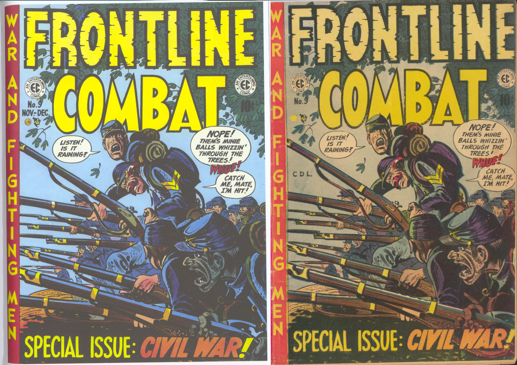
I did, though, pull out a few of the old comics that I own and compare them to the more recent “recreated” versions (recolored on left/original on right throughout). Here’s one that I thought was interesting. Subtle changes can make a big, perceptible difference.
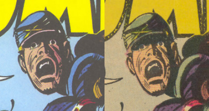
 The first thing that’s notable to me is what’s not there: there’s almost none of the usual egregious “dodge and burn” and gradient effects that get added to art in many recoloring situations. There’s nothing inherently wrong with that stuff, but older artwork wasn’t designed for it. In pre-digital comics, the light/dark gradations are meant to be handled pretty much by the inks via hatching, feathering, etc. You can see a tiny bit of color rendering that’s been added to the flesh tones here, but it’s fairly subtle, thankfully.
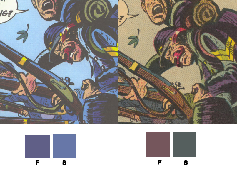
The other thing, though, that’s immediately noticeable and is unfortunately detrimental to the overall design is the substantial change in the background color. The more saturated, higher value blue in the modern version has severely diminished the visual contrast between figure and ground and is flattening out the image. Note how–despite the crisper, blacker inks on the newer version–the figures in the originally colored version seem to “pop.” They’re clearly on a different visual plane than the background.
Contributing to this same problem, unfortunately is another seemingly trivial color choice that has a fairly powerful effect on the overall image: that slight change to the blue hue of the soldiers’ uniforms. If you look closely at the original coloring, you’ll see that the blue used in the uniforms is a fairly warm hue–almost a purple. Warmer colors tend to come forward visually in an image and that’s exactly what’s happening here.
In the recolored image, though, that blue’s been changed to a significantly cooler hue. This, again, adds to the visual flattening of the image, as the cooler hue of this blue tends to recede rather than advance visually.
A similar change has been made to the rifles, which are significantly warmer in the original version.
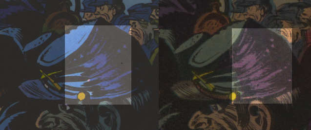
Another minor change that subtly affects the apparent depth of field is how the soldiers in the background are treated. In the original, those soldiers were colored with a less saturated blue than the soldiers in the foreground and middle ground; in the recolored version, they’re far nearer the saturation level of the rest of the soldiers. Note how desaturated the color is on the original image. Here’s background and foreground sampled colors from both versions:
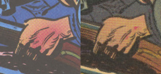
I found it interesting that the soldier in the bottom right corner had been so significantly altered. He’s had his previously natural skin tone changed to a cool blue. This is more a matter of personal preference, but I again prefer the original version. In it, the repeated tones work as continuation and help unify the composition.
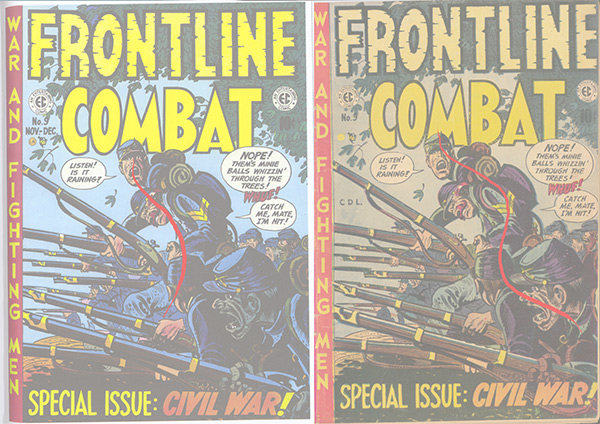
One interesting thing I noted that’s unrelated to coloring was how much extra art there is on the right hand side of the image. In my printed comic, you can’t see any of that soldier in the lower right’s arm and you only get a small bit of his bedroll. I’m assuming that the what we’re seeing in the newer version is material from the “trim” area–the sort of safety zone area that has to be included with any sort of art that’s intended to go all the way to the edge of the page.
Anyway, my point with all this coloring talk isn’t that the recoloring here is terrible. In fact, these 80s E.C. recolorings are probably some of the most tasteful and subtle I’ve seen. Rather, my point is that even the smallest of changes to a color scheme can have significant effects on the overall image.


Recent Comments