On Comics Sound Effects

I–along with writer/cartoonist Ryan North and visual linguist Neil Cohn–was recently interviewed by Greg Uyeno for Slate‘s Lexicon Valley  language blog. The subject of the article was how sounds and sound effects work in comics. You can read the whole article here:

KATCHOW! How to Write Sounds in Comics

Greg wound up highlighting parts of our discussion relating to choices about sound effects in my own comics, but  I got permission from Greg (and Slate) to post here the full email interview we conducted, which covers more general territory.


1) Let’s start with a warm-up: Do you have a favorite comics sound effect? (What is it?)

I don’t have a single favorite sound effect, but I certainly have some particular comics sequences and artists that I favor in the sound effects department. Walt Simonson and John Workman’s sound effects in their run on Thor in the mid-80s are really a high-point for graphic sound effects in comics. What makes this material so notable in my mind is how seamlessly and organically the effects lettering blends in with the other artwork. That’s something you don’t see much these days since sound effects lettering (and all lettering, in fact) tends to be dropped in digitally after the fact. There’re sensible pragmatic reasons for doing this, but to my eye it creates an odd effect where the sound effect words seem to be floating on a plane over top of the other art, rather than being part of an integrated whole on the page.

img_54e254f8e69ddsim02

I’m also generally a fan of sound effects that aren’t actually sound effects at all–things like when a character enters a room accompanied by a “BARGE!”. That’s obviously not intended to evoke an actual sound, but I love how it appropriates some of the formal language of comics in a hilarious way. Here’s an example from Peter Bagge:

barge
2) How do you use sound in your comics? Are you hoping to visualize sound in a way that the reader can “hear” the sound you intended, or is there a different aesthetic?

Designing your sound effects lettering so that the reader “hears” the sound when reading seems like a logical approach–and I’m sure that’s the intent behind a lot of the most commonly used sounds in comics–but I’m not positive that’s how they actually function. I know I for sure don’t really hear sounds in my head as I read comics. I think they work more just as a “this thing is making a noise” indicator–in the same way that a curvy word balloon indicates, “this is something a character is thinking.” I’m thinking, for example, about sound effects like “SHATTER!” That’s not so much an actual connotation of a particular sound, but rather an indication that something has broken and is making a sound in the process.

So, I usually try to throw in something visually that’s not simply imitating or evoking a sound. So, take this sequence:

owknife

 In panel one, I’m aligning the words with the direction those knives are moving as the character pulls them out. They’re evoking a sound, but also reinforcing the directional indicators. The second panel’s pretty straight-forward, but still, I’m hopefully reinforcing the directional movement of the bullet with both the placement of the word and the slight color gradient. With the final panel I’m hoping the downward lilt of the lettering and the shape and placement of the balloon tail will pull the reader’s eyes downward, mirroring the character as he falls to the ground. I went with the “dripping” balloon in an attempt to evoke liquid, blood, gurgling, etc.

3) What are some of the techniques you use to visually represent qualities of sound in your art? I know that two basics are text size = volume, and repetition of letters = duration.

Those are the biggies of course. There’re other techniques as well, like having the lettering suggest objects or materials, as I’m doing here with the bubbly, rounded lettering that mimics the splashing water:

OWdown

I sometimes also use a particular sound effect to link two spatially disparate scenes together chronologically. Here, for example, we see a character falling off a peak and down into the water below:

owseal01

Then, on a later page, we see a different character who’s below the peak as the first character lands in the water behind him:

owseal02

I’ve used the same lettering and coloring for that sound effect to connect the two events. The reader doesn’t necessarily need this to follow what’s going on in the narrative, but I think it helps.

4) There are some standardized sound words, some of them specific to comics. <POW!> <whoosh> etc. When do you use these? What do you do when you need something different?

I do sometimes fall back on the “old standards.” Flipping through Oyster War, I’m seeing a lot of “BAM”s and “KABLAM”s, but I think cartoonists often avoid using those sorts of sound effect words in a large part because of the tired “Blam! Boom! Pow! Comics are whatever…” headlines that have been plaguing us since the mid 80s. I try for words that evoke sounds, but I also take into account that those words create a rhythm when read on a page. I try to establish a nice sequence of varying words, typefaces, colors, and sizes whenever I can. It’s particularly important, I think, in pages that are all sound effects, as here:

owfinal

Even totally leaving out a sound effect in an otherwise obvious spot–as in panel nine here–is a conscious decision on my part. I’m trying to create a little “breather” at the end before the end of the sequence, where all of this character’s fighting prowess ultimately winds up not saving the day.

5) For non-standard sound words, how do you decide on a spelling?

That’s easy! I just make up something that looks and reads well. Or, I throw the question out on Twitter. There’s more than a few sound effect words in Oyster War that were suggested by folks on Twitter. Kind of appropriate for a social media service that’s itself a sound effect word, eh?


Faves of 2014

I don’t really have the time  available to do as extensive a “best of” list as I’ve done in some past years, but just for fun here are a few of my favorite comics- and drawing-related things from last year. Note that I’m listing my favorite things, not the best things; these are just things that I happened to enjoy this past year. Some of these are things that appeared in 2014. Other are old things that I just discovered or re-discovered in 2014.


Webcomic – The Creepy Casefiles of Margo Maloo by Drew Weing 

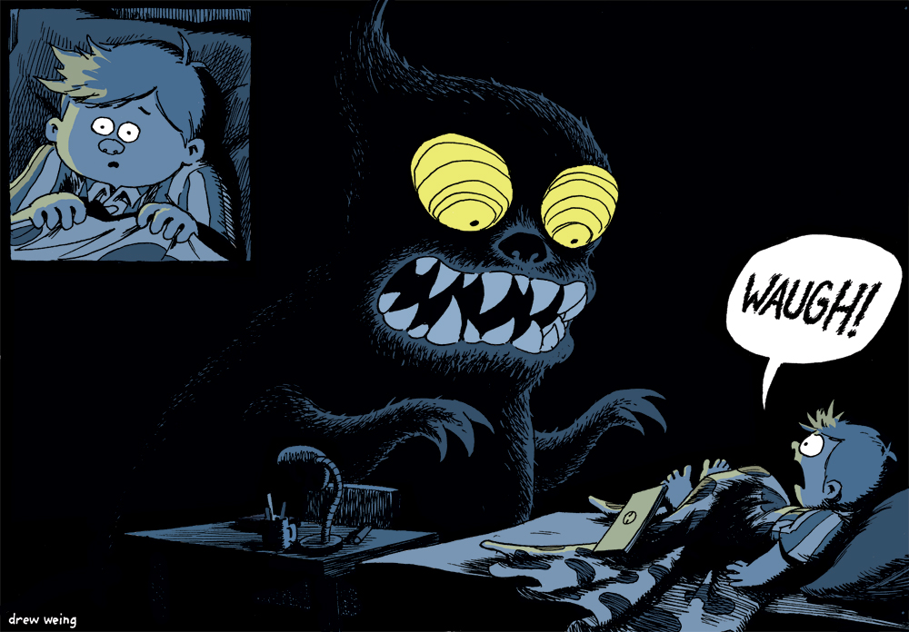
It was great to see a new comic from Drew Weing in 2014.  This is a wonderful all-ages comic about a kids, monsters, and “paranormal investigator” Margo Maloo. The drawing’s beautiful and the story is a ton of fun. I’ve read it twice so far–once on my own and once to my daughter–and we both loved it.

Find it here.

Podcast – Rachel and Miles X-Plain the X-Men

This podcast launched in the spring and I’ve been a loyal weekly listener ever since. The hosts of the show, Rachel and Miles, are X-Men fanatics. They’ve been going through the series (and some of its offshoots, mini-series, etc.) in roughly chronological order and discussing them in exhausting–and often hilarious–detail. I’ve read only a small fraction of the material they discuss, but it’s a blast to listen to anyway.

Find it here.

Reread – X-Men: The Dark Phoenix Saga – by Chris Claremont and John Byrne

Speaking of the X-Men… The X-Plain the X-Men two-part episode on the “Dark Phoenix Saga” prompted me to go back and re-read the collection. I hadn’t read any of this stuff since it came out in the 80s and it was a ton of fun to re-read. Other than maybe God Loves, Man Kills, this is the definitive X-Men story arc–and I think I’ll always favor it over God Loves just because it’s the classic Claremont/Byrne combo.

On Comixology here.

Tumblr – Fabien Mense

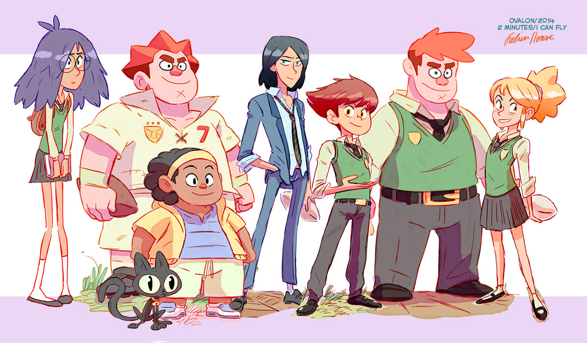
Fabien Mense is a French cartoonist who’s pretty much at the top of my “why is no one translating this person’s work into English?” list. Even if you can’t read French, it’s worth picking up his series, Agito Cosmos, from Comixology just to look at the beautiful artwork. You can find his work in a lot of different places online, but his tumblr is a great place to start. Check out some of his amazing (and befuddling) process videos to find and subscribe to his YouTube channel.

On Tumblr here.

YouTube – Croquis Café

Like a lot of us, I really need to do more figure drawing. That can be a tall order, though, depending on your schedule, location, and finances. While it’s not a perfect substitute for in-person life drawing, the Croquis Café is pretty darned close. It’s a fantastic resource. I favor the longer videos, which are about 20 minutes long usually and start with very short poses that gradually increase to a final five-minute pose. I’m mainly interested in working on gesture and line of action, so this format is perfect for me.

Find it on YouTube.

All Ages GN – Jim Curious: A Voyage to the Heart of the Sea by Matthias Picard

The cover is one of the few images I could post for this book, since the majority of its pages are in glorious 3-D. Put on one of the two pairs of included 3-D glasses and be immediately blown away by this cartoonist’s gorgeous,  intricate undersea landscapes. The narrative is charming as well; it’s not so much a story as a visual exploration.  Tone-wise it reminded me a bit of Crockett Johnson’s children’s books. Every person I’ve shown this book to has been completely floored by it.

Buy it here.

GN – Doctor Strange and Doctor Doom: Triumph and Torment – Roger Stern, Mike Mignola, and Mark Badger

This Marvel stand-alone graphic novel came out in 1989, but I’d not heard about it until just this year. Dr. Strange and Dr. Doom team up and go (literally) to Hell to fight demons in a story written by Roger Stern, penciled by Mike Mignola, and inked/colored by Mark Badger? Sold! This book’s a ton of fun and stars Marvel’s two best occult characters. The old-school coloring by Badger is absolutely gorgeous and it’s really interesting to see Mignola finding his style pre-Hellboy. This book was out of print for a long time, but is now available again.

Buy it here.

GoComics Account – Origins of the Sunday Comics – Curated by Peter Maresca

There are several interesting historical accounts currently running on GoComics, most notably Peanuts and Little Nemo running chronologically from the beginning, but this one is my absolute favorite. The account updates a few times a week with early (late 1800’s – early 1900’s) Sunday newspaper strips. Some are things you can find collected elsewhere, like the currently running Kin-der-Kids, but the bulk of the material is more obscure, including a lot of early work by cartoonists who would later become giants in the medium–George Herriman, George McManus, etc. I love seeing comics from this highly creative period before the “rules” were solidified.

At GoComics here.

Art Book – Gus Bofa – L’enchanteur désenchanté – by Emmanuel Pollaud-Dulian

This one’s a bit tricky/expensive to get a hold of in the U.S., but it’s well worth tracking down. Bofa was a WWI-era French illustrator who was a big stylistic influence on later generations of French cartoonists–most notably Jacques Tardi. This book seems to be part of a current Bofa rediscovery/renaissance going on, coming out just a year or so after a big Bofa retrospective at Angoulême. His influence aside, Bofa’s a flat-out amazing illustrator and this 550 page book is full of beautiful illustrations in a variety of media and styles. The text is in French, but the artwork alone makes this one of my favorites of 2014.

Get it here.

Non-fiction Book – Comics: A Global History, 1968 to the Present – by Dan Mazur and Alexander Danner

I’ve already written about this book in a post, but in a nutshell: This is a much-needed history of modern comics stretching from the late 60s to the present and–most important–covering a considerable swath of the globe. There’s some material here about North American comics that you probably already know well, but the bulk of this book covers comics developments in France, Belgium, Japan, Spain, Mexico, and more–all areas we hear precious little about state-side.

Buy it here.

Online Reviews – Minicomic Minute by Jon Chad

FESTIVAL

There’s a lot of interesting content at the new-ish comics website, Festival Season, but my favorite feature by far is Minicomic Minute. The writer/host is Jon Chad (himself the maker of some great minicomics) and in each installment he picks a notable minicomic and does a short 2-3 minute video review of it, showing off pages, production features, etc. It just started running in December, so there are only a few reviews posted as of yet, but I’m really looking forward to seeing this continue into 2015.

Collected here.

Comic Books – Detective Comics #35 and #36 – by Benjamin Percy and John Paul Leon

We don’t get to see nearly enough interior art by the amazing John Paul Leon. I dig his covers for The Massive as much as the next guy, but I was really excited to see that he would be doing interior art for a self-contained two part Detective Comics story. The story itself is a solid Batman story of the sort you’d expect to see in Detective (a mysterious occurrence, Batman susses out the solution, culminates in a fight) , but the art is what really sold this in my book. Leon’s got a loose lively line and an amazing mastery of spot blacks. Check these issues out if you like Year One-era Mazzucchelli or Jorge Zaffino.

Get them here and here.

Comic Books – The ‘Nam #1-#12 – by  Doug Murray and Michael Golden

The'NAM01_05


I bought a few issues of The ‘Nam as a youngster back when it originally came out, but couldn’t make heads or tails of it. Michael Golden had been coming up in “shop talk” conversation a lot recently, though, and so I tracked down most of the first 12 issues that I was missing and finally read all of the Micheal Golden issues. It’s amazing in retrospect–remember, this was running concurrent to Marvel’s licensed GI JOE comics–that a gritty true to life Vietnam War comic like this ever got off the ground, much less continued on for 90-ish issues. The 12 issue run is largely great stuff, albeit with a few hiccups when Golden jumps off art here and there. The first issue, though, that’s penciled and colored by Golden with inks by Armando Gil has gotta be one of the best single issues of the 1908s.

Get them… well, by digging through dollar bins like I did, I guess. (There’s a collection, but I’d avoid it unless it’s done with the original coloring.)

GN – Beautiful Darkness by Fabien Vehlmann and Kerascoët

This is on tons of folks’ “Best of 2014” lists so I don’t have a whole lot to add here other than “I agree.” Beautifully drawn, psychologically complex, funny at times/highly disturbing at others–I read this when it came out in the Spring and I’m still thinking about it.

Get it here.

Documentary – Stripped – Directed by Dave Kellett and  Frederick Schroeder

I have a few qualms about how some of the latter webcomics-related portions of this documentary are handled, but that in no way mars the rest of this film, which is wonderful documentary about newspaper comic strips and the cartoonists who draw them. We comics folk devote a lot of energy to engaging comic books and graphic novels, but seem to forget that newspaper comics are not only still out there, but are the most read form of this art form we all love. The array of people interviewed here is stunning–and even Bill Watterson came out of his secret underground lair to chat.

Get it here.

Video Tutorial – Character Design by Drew Hill

One of my many drawing-related New Year’s resolutions is to really work on better character designs. I was digging around for tutorials on the subject and stumbled on this incredibly helpful process tutorial by character designer Drew Hill. He walks through the creation of a couple of characters from the idea phase to completed, rendered images. This video is packed with useful information.

Embedded above, or on Vimeo here.

Gallery of Pages From My Most Recent Sketchbook

I’m a firm believer that working regularly in a sketchbook is a really beneficial practice for artists. I know there are some really phenomenal cartoonists who pretty much only draw when they’re working on an actual project, but I’m just not at that level skill-wise. For me, that’d be like just showing up for the game, but never showing up for practice–and I for sure need all the practice I can get drawing-wise.

That said, I don’t get to work in my sketchbook nearly as much as I should ideally. I just ran out of pages in this particular sketchbook which I started at the end of June last year. It’s an 80 page book and I draw on both sides of the page, so that comes out to just a couple of pages a week. On the other hand, though, that’s all pure sketchbook noodling. I thumbnail my comics on loose printer paper.

Anyway, just for fun here’s a gallery of a handful of pages. You can see that in addition to my usual subjects of made-up faces, hands, and clothing/drapery, I’m trying to work on using black for shadows (AKA “spotting blacks”) and on getting better with the human figure/lines of action. Those are two areas that I’m definitely going to continue to work at in my newly-started sketchbook.


A Gallery of all my Aquarium Drunkard Musician/Band Drawings

One of my (many) trouble areas art-wise is facial likenesses. If you follow my work you probably recall that in 2011 I set about trying to improve in this arena via a weekly “portrait night” drawing–you can see the end results in a gallery here. After that concluded, though, I wanted to find a way to make myself draw facial likenesses on a regular basis, even if not as frequent as once a week.

As you can tell by the subjects of the original portrait night project, I really enjoy drawing musicians–so it seemed natural to devise something music related. So, I reached out to the folks behind one of my favorite music blogs, Aquarium Drunkard, and volunteered to do some illustrations for them. They have a regular feature called “The Lagniappe Sessions” in which bands/musicians do covers of some of their favorite songs by other artists and I began doing illustrations for this feature in mid-2012. I’ve gotten too busy at the moment to continue doing it, but I wanted to post a gallery of my drawings here since I haven’t really been posting them anywhere else.

Incidentally, if any artists/illustrators/cartoonists out there are interested in taking up the Lagniappe Sessions mantle, contact Aquarium Drunkard’s Justin Gage.  It’s not a paying gig, but it’s sure great practice!

As with any project of this sort, some turned out better than others. If I had to pick an absolute favorite, I’d probably go with Benjamin Booker. (Also: his self-titled record is fantastic and easily one of the best releases of 2014.) Here they are.

Books about Comics: Some Short Reviews

Comics: A Global History, 1968 to the Present by Dan Mazur and Alexander Danner

I’ve been pretty vocal on my Twitter about the lack of a solid English language history of Franco-Belgian comics, so I was delighted when I caught wind of this book. It actually bites off a significantly larger geographic chunk than just French language comics, though, and attempts to cover comics history in the US, Japan, Europe, Scandinavia, and more. A lot of this information will likely be new to U.S. readers (much of it sure was to me) and it’s fascinating stuff.

The book is obviously trying to cover a lot of ground and by its nature requires the authors to pick and choose what to include and what not to. If I were pressed on it, I’m sure I could come up with some nitpicking in that area, but nothing stood out to me as either a glaring omission or an unwarranted inclusion.

One of the book’s best attributes is the attention it pays to stylistic trends and visual analysis. One of the authors is a cartoonist himself and I’m betting that’s where a lot that attention to art and process is coming from.

My only real complaint about the book is that, because of the way it’s organized, I found it difficult to know what things were happening concurrently in the different regions that the book covers. The chapters are grouped into three sections by era (1968-1978, 1978-1990, 1999 Onward) and then divided by region within those. It’s a good way to organize a potentially overwhelming amount of information, but it would have been nice to have something like a visual timeline to see what events in different parts of the world were concurrent with one another beyond those three general groupings.

Buy at Amazon.com

The Princess of Tennis: The True Story of Working as a Mangaka’s Assistant in Japan by Jamie Lynn Lano

Untitled-1

This is–like the title says–the story of a westerner who winds up working as an assistant to a prominent mangaka in Japan’s manga studio system. The title of the book is a play on the title of the manga she worked on, Takeshi Konomi’s Prince of Tennis.

The book is self-published and it reads less like a finished memoir than a really, really long blog post (emoticons and all)–which is, in fact, basically what it is; The author chronicled her experiences first via LiveJournal before collecting them into an ebook.

I was far more interested in the bits and pieces of information included in the story about the actual process of manga production in the Japanese studio system than the author’s personal goings-on, romances, etc. I think the intended audience here is not so much people like myself who are interested specifically in manga, but more people who are immersed in J-culture in general. This book, though, should definitely be required reading for the throngs of western manga fans who think that they can just hop over the pond and land a job in Japan in the manga industry.

Buy at Sparkler or Amazon.

The Visual Language of Comics: Introduction to the Structure and Cognition of Sequential Images by Neil Cohn

While I found this book fascinating, I can only fully recommend it for the wonkiest of comics formalists. Despite being largely (thankfully) free of academic jargon, this is in fact an academic book, written by an academic. Cohn, a linguist, is setting out here to prove that comics is a visual language–and not “visual language” in the “yay, team comics!” way folks like me often throw around the term, but an actual language in the most technical of senses.

The author systematically goes about breaking down how comics work to tries to show that comics constitutes an actual language and that, like other languages, it operates via a hierarchical grammar that governs its structure. It’s definitely not intended as a how-to, book, but I found myself thinking a lot about how I structure my own comics as I read through this. It’s not for the casual reader, but if you’re interested in the underlying ways that images combine to create meaning in the comics medium it’s absolutely worth a read.

Buy at Amazon.com

Words for Pictures: The Art and Business of Writing Comics and Graphic Novels by Brian Michael Bendis

This book is probably a godsend for a person with a wholly different comics background than I, but I found myself skimming a lot of this book, hoping that I’d eventually get to a section that dealt with the actual craft of writing–story structure in particular. Bendis, though, focuses on things like script formatting, how much description to put in your scripts, dealing with editors, etc.

The middle section of the book is mostly round-table discussions where he’s asked groups of writers, groups of artists, and groups of editors a series of questions which they each respond to. There’s some valuable information here for sure–and some really great process information from the artists, including a full issue’s worth of David Aja Hawkeye thumbnails–but it seems to be assumed here that you already know the nuts and bolts of narrative.

Buy at Amazon.com

The Weirdest Sci-Fi Comic Ever Made: Understanding Jack Kirby’s 2001: A Space Odyssey by Julian Darius

Despite pretty much completely disagreeing with the author’s basic conclusion about Kirby’s work, I really enjoyed this book. The author goes through Kirby’s unfortunately difficult to track down 2001: A Space Odyssey adaptation issue-by-issue and evaluates it mainly on a basis of how well he feels Kirby’s version stays true to the film… which is, I think, a criterion that’s bound to make you not enjoy the comics.

70s Kirby is at its best when he’s going full throttle Kirby, and there’s almost no better example of that than 2001. One of Kirby’s most interesting traits as an artist is that everything he touches becomes “Kirby-fied” and, again, this is exactly what makes the 2001 comics so amazing. At one point the author complains that Kirby (I’m paraphrasing here), “Just uses the obelisks as an excuse to do any kind of story he feels like.” For me, that’s not a problem; it’s why the comics are great.

Kirby’s actual artwork receives surprisingly spare treatment here which is I think a symptom of trying to derive enjoyment from the wrong elements of Kirby’s 2001.

Despite the above, though, I enjoyed this analysis a great deal. It’s a must-read for any Kirby enthusiast.

Buy via Seqart.org