As Oyster War neared completion toward the end of last year, I wound up doing some soul-searching about where my current cartooning skill set was currently and where I’d like it to go in the future. While I could have compiled a pretty extensive list of deficient areas to address, I came up with three that I wanted to focus on in the coming year: better figure drawing/gestures, more interesting/advanced digital coloring, and really pushing my character designs. I tabled character design for the near-term but decided to apply for a local arts grant to address the other two, in the form of figure drawing sessions and an online digital panting class. I was quite lucky to have my grant request approved, and thanks to the Arts Council of Winston-Salem Forsyth County I began by enrolling in Introduction to Digital Painting with Andrew Hou at Schoolism.com.
Quick overview/review:
The class comes in either a self-directed version or a version with regular video feedback from the instructor. I did the latter. The class was structured with seven lessons that stretched over ten weeks. The weekly video lessons were quite extensive and were usually well over an hour each. For each lesson there was an associated assignment that was due before the next lesson began. For each turned-in assignment, I received extensive detailed feedback from the instructor. In most cases, he worked over my submitted work, sort of redoing it as if it were a piece he himself were executing. Most of his feedback (not surprisingly) was about painting/coloring techniques, but he had some really helpful advice about character design and other related areas. As I said, the feedback was always very thorough–anywhere from 20 to 40 minutes, depending on the piece. I was 100% happy with both the classroom material and the feedback I received from the instructor.
Projects:
The class started off with a basic introduction to Photoshop. I was fairly familiar with the nuts and bolts of Photoshop, but I was glad to see this included. Any class that has the word “Introduction” shouldn’t presume the students know anything about the subject at hand, in my opinion. That said, I picked up a lot of really useful tips and shortcuts for things that I already knew how to do in other ways. The lesson continued with some methods for sketching in Photoshop. While I do most of my drawing (as opposed to coloring) in Manga Studio, the methods shown here would work in either and it was fun to get the feel of sketching in Photoshop.
The assignments built on each other so I really don’t remember how things broke down lesson-by-lesson, but the first few assignments all dealt with a single character. The initial assignment was to do a rough digital sketch. Here’s mine:

Here’s a later iteration of the character that’s been revised based on feedback. It’s now got a lot more value laid in, a definite light source, and some adjustments to the overall design:

And here’s the character again, now with color added using only layers with various blending modes–almost no actual rendering with brushes:

He still looks a bit hazy and indistinct to me, though. If I were to dig back into the drawing, I’d probably go in and add some more dark/high contrast areas to define details more fully.
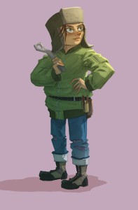
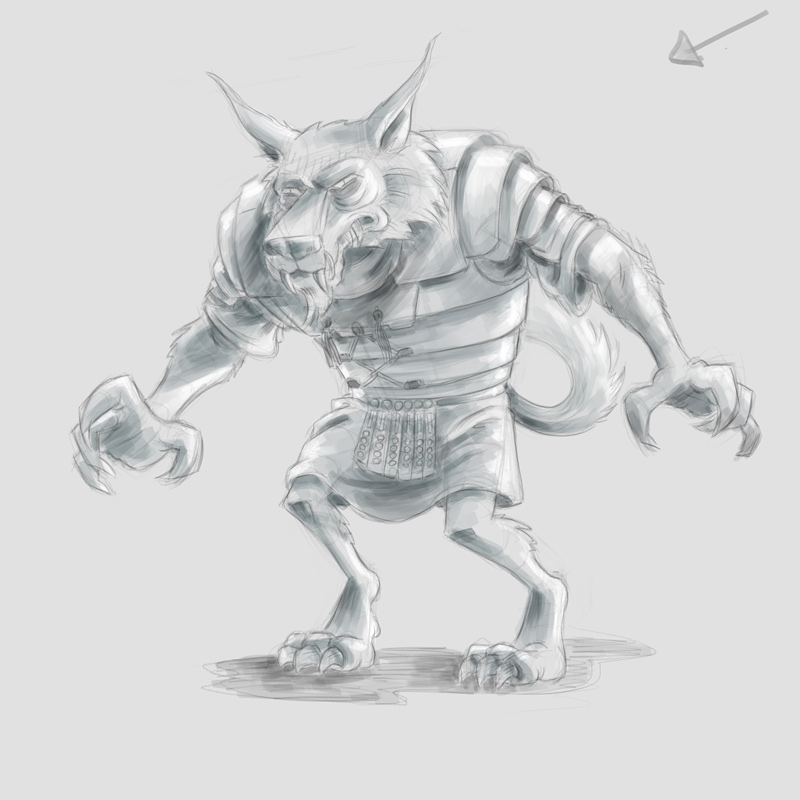
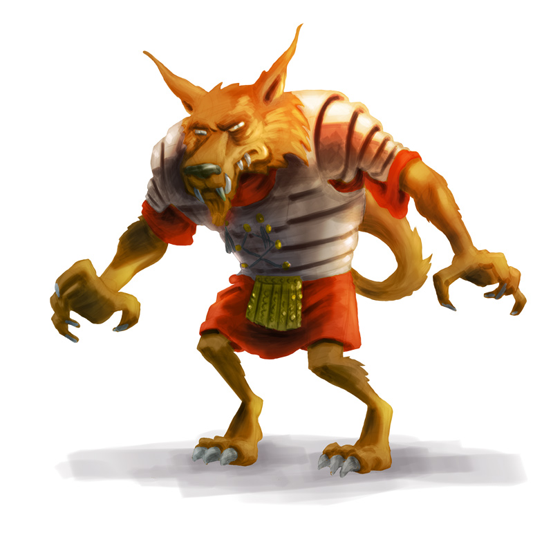
Cel shading was the next technique covered. This was the closest to home for me as far as my usual style of coloring. There’s no solid black ink outline, as with my usual comics work, but the actual application of color dealt more with solid planes of shadow than with any rendering:
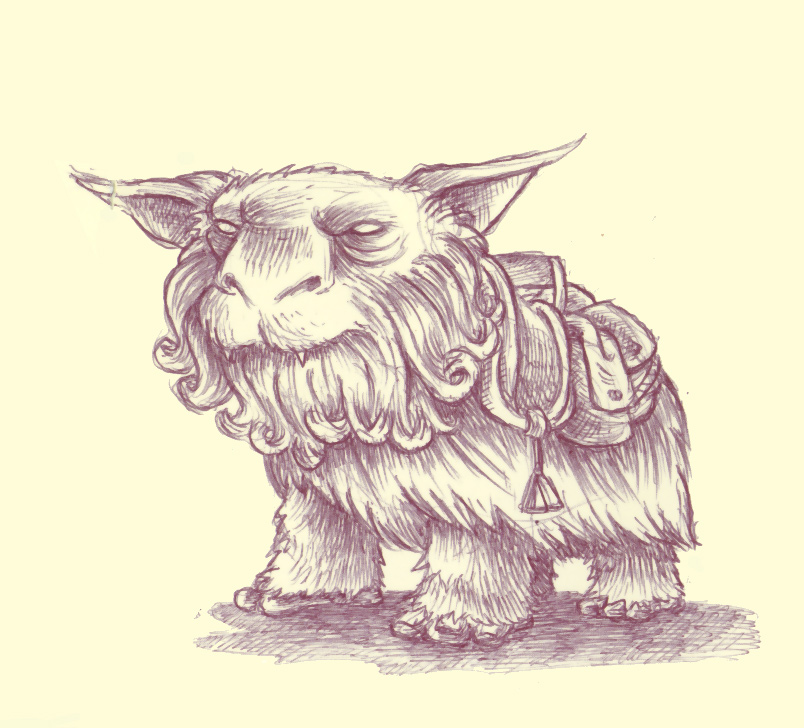
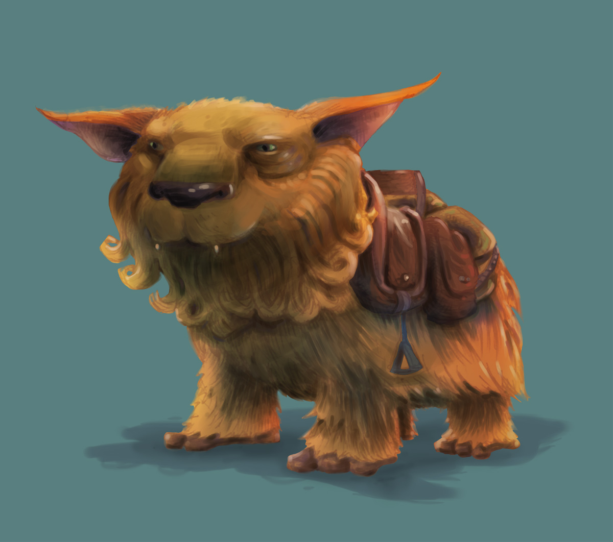
The next–and most difficult for me personally–assignment was doing a more traditional digital painting, rendering form with brushes rather than doing a detailed value drawing first and then applying layers with blending modes. I found this old ballpoint pen drawing of a fantasy battle beast/pack animal and did a painting based on that. Again, this is a version revised based on feedback from the instructor:


There’s obviously plenty of room for improvement here, but I have to admit I’m surprisingly encouraged by how this turned out, considering this is the first time I’ve really attempted anything like this.
The final assignment was a big two-part project doing a full scene–figure and background–using any of the three painting methods covered in the class. With the instructor’s permission, though, I modified this assignment a bit and used it as a way to develop the cover image for Oyster War. I wound up doing a traditional inked drawing (inked digitally in Manga Studio, unlike the rest of Oyster War, which was all drawn traditionally) but then used the cel shading techniques I learned in the second class assignment to color and light the characters. I’m really happy with the way the image turned out. It’s obviously a bit different-looking than my usual style of drawing, but I still think it’s still (hopefully!) not too radically different than the interior art. Here’s the final image, with all of the trade dress added by Oni’s designer, Elaine Lin:

Post-Class:
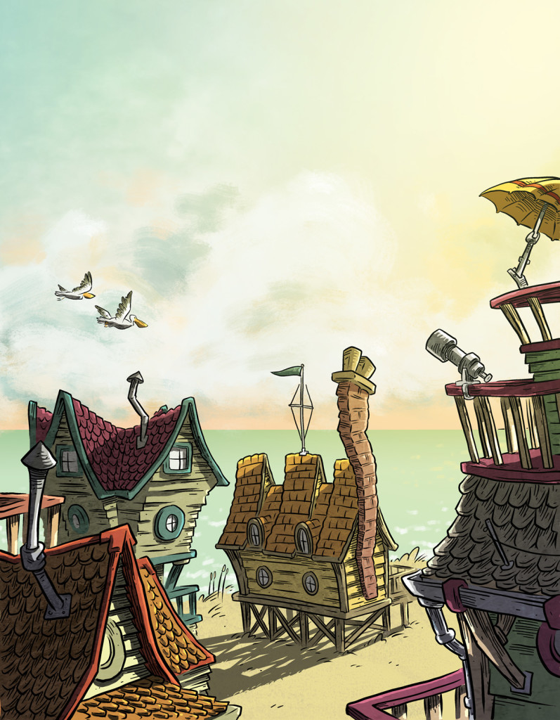
I’ve been incorporating some of the techniques I learned in class to my recent work. Here, for example, is the image that will be used for the back cover of Oyster War (The big empty sky area is there to accommodate some text blurbs):
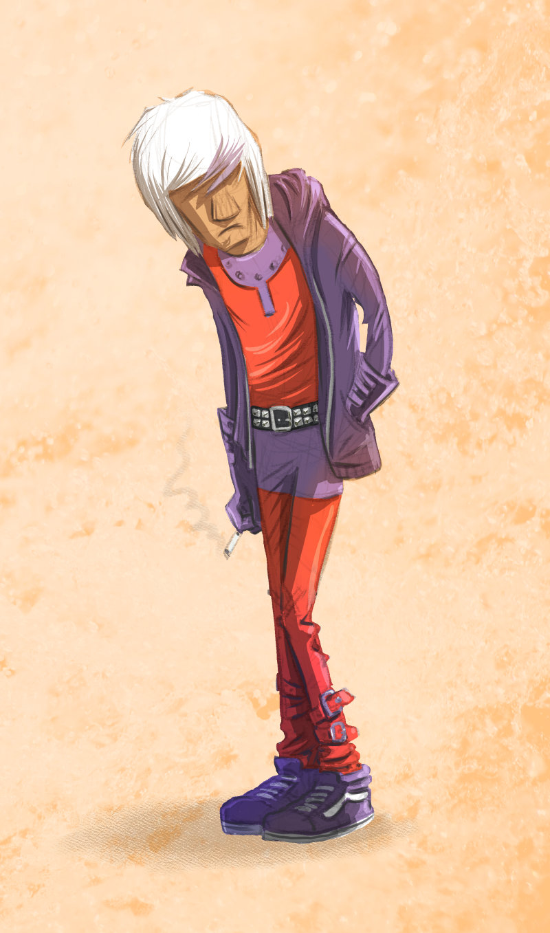
 And here’s a character design for a possible next comics project. This style–without any traditional black inking–would be a pretty huge departure for me.
 Finally, here’re just a few random post-class take-away thoughts:
- Always be learning – I’ve been drawing and making comics for a long, long time. I’ve been to art school. I teach at an art school. But there’s still real value for me in learning from someone else. I’d love to take another course of this sort soon.
- Custom brush obsession – I’m as guilty as anybody of getting overly worked-up about custom brushes for Photoshop and Manga Studio. The instructor for this class did nearly every painting demo and critique using Photoshop’s basic round (or sometimes square) brush with size pressure sensitivity turned off and his results were fantastic.
- The power of masks and layer blend modes – Before taking this class, I barely used masks for anything and the only blend mode I used was “multiply” on my ink layer. Seeing some of the instructor’s techniques in this class really opened my eyes to how powerful and useful masks and layer blend modes are–especially when combined.
- On flat color – I’d always been a big proponent of sticking with flat colors, rather than blending/rendering things and using lots of lighting effects. I still think that it’s much better to err in the direction of being too conservative with these sorts of techniques rather than overdoing them, but seeing some of this stuff in action has made me come around a bit to the idea that you can use some of these techniques (in moderation) and not have it necessarily “clash” with a line art drawing.
So… that’s about it. Feel free to ask me any questions you might have about the class in the comments!
And of course, my most sincere thanks again to the Arts Council of Winston-Salem Forsyth County who enabled me to have this wonderful learning experience!


Recent Comments