Post-Oyster War Project: In The Weeds

What’s Next?

I’ve still got a small handful of Oyster War promo appearances to do (DINK, TCAF, probably HeroesCon), but with that book now squarely behind me production-wise, I’ve been ruminating a bit on what to do next. Like most comics-drawing folks, there’s always a voice in the back of my head making me feel bad that my comics aren’t generating a more substantial share of my day to day income–and a few months back I wound up chatting with a fairly well-known comics agent about precisely this. In so many words, what this agent basically said to me was: “You make great comics, but if you want to make an actual living at this, do all ages/YA books. Look at what wins Eisners in the kids/YA comics categories and do stuff like that.” This is about as solid a bit of advice as you’re going to get about making a living in comics and I began putting together the bare bones story for an young adult GN that I’d been thinking about for a while.

Typical of me, however, the more I tried to dig into this YA story, the more I wound up thinking about an old script that I wrote well before I began drawing Oyster War: In the Weeds.

In the Weeds is a story about cooking and playing rock music that takes place in the mid 1990s. I’ve posted bits and pieces about it here before as far back as 2010. Unlike this (possible) all ages book, In the Weeds isn’t something that any big trade publisher is be likely to give me an advance for–in fact, I suspect that if I move forward with In the Weeds, I’ll wind up doing it the same way I did with Oyster War: just doing the book on my own time, at my own pace, putting it  online, and seeing if anyone wants to publish it when it’s done.

So, why In the Weeds, not the YA book? Because of what cartoonist Ron Wimberly says:

“It’s either HELL yeah. Or NO.”

— Ron Wimberly

In a nutshell: Life’s too short–and the wages of comics too minimal–to spend time making any comic other than exactly the one you want to be making right now. I’ll continue to work on my YA story as time allows (and I’ve got a bit of a story and some in-progress character designs), but for right now what’s interesting to me is In the Weeds, so that’s what I’ve been working on.

In the Weeds:

I started by re-reading my original script. Not surprisingly, I’ve begun by doing a pretty substantial overhaul of it. I’m rewriting a few of the male characters as females to get a more natural gender balance and I’m rewriting the main character a bit as well to make him more empathetic and less of an overt smart-ass. But generally, I’m happy with the overall story and structure–which for me is the hard part of the writing process.

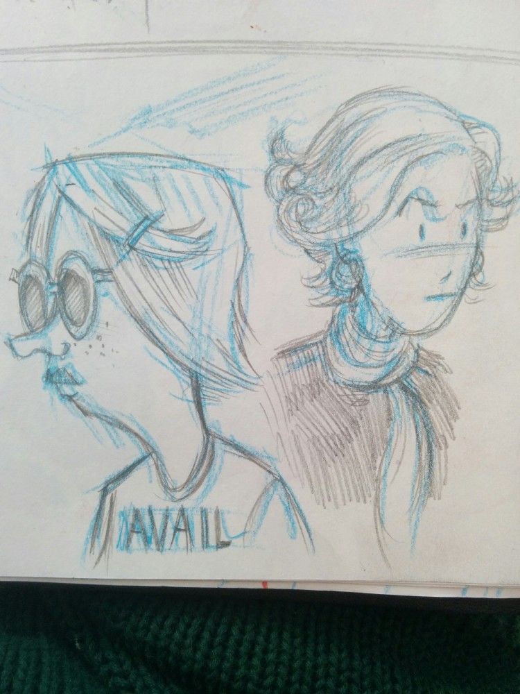
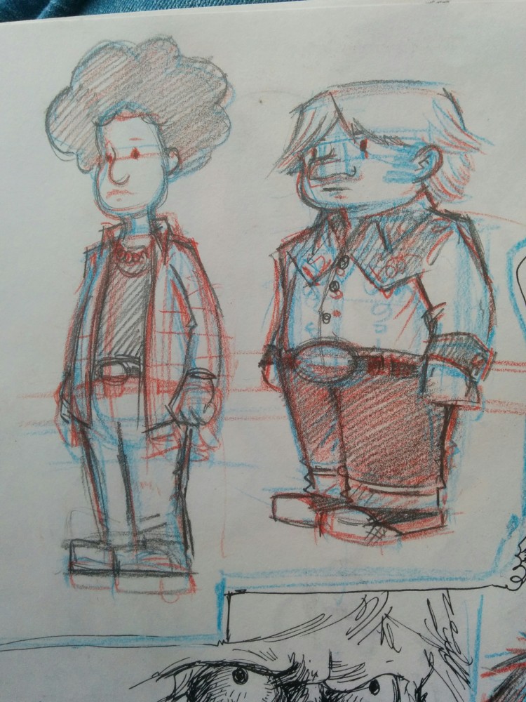
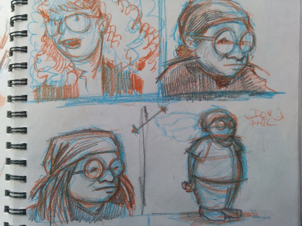
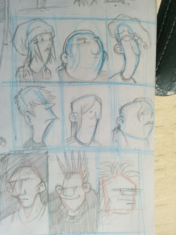
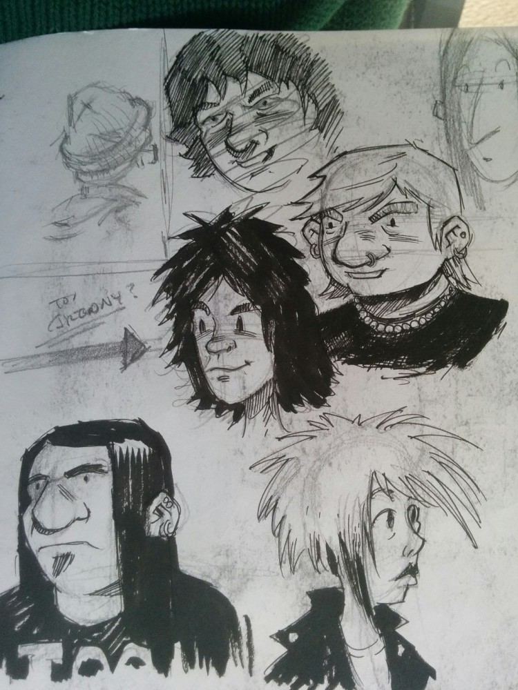
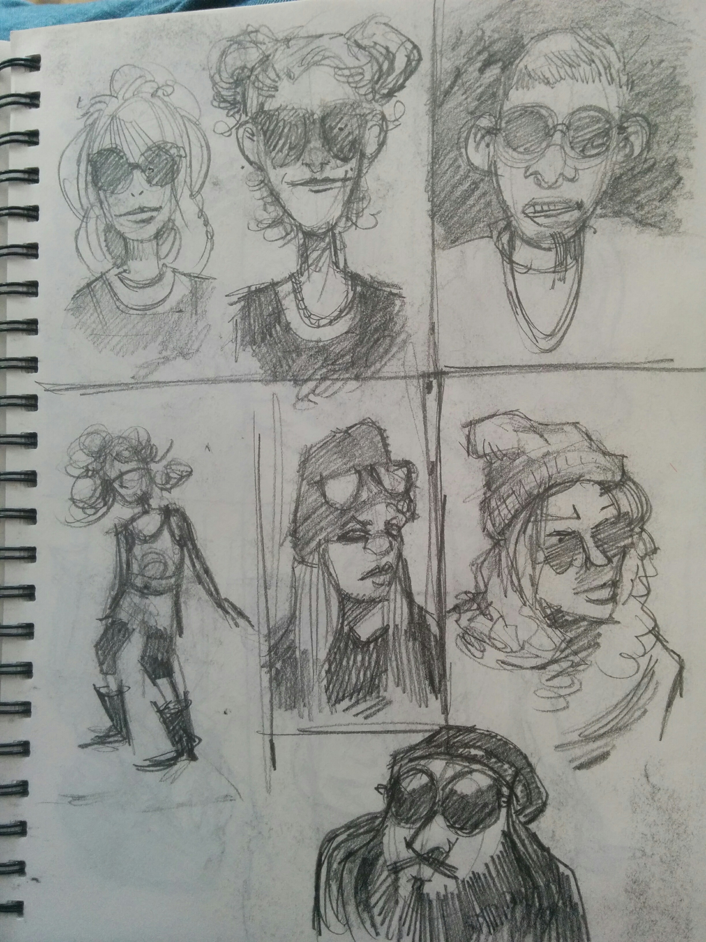
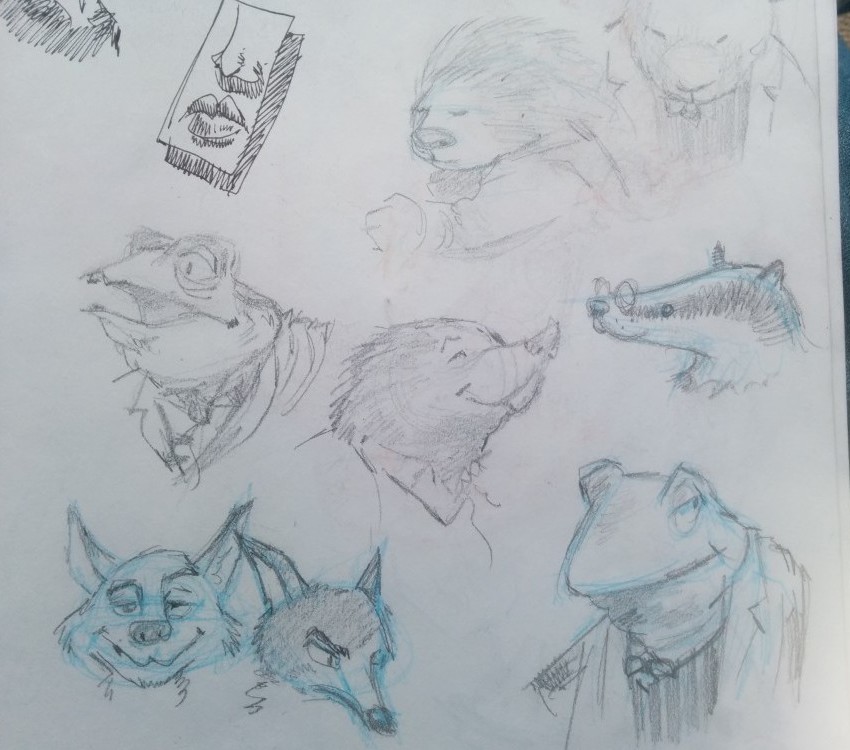
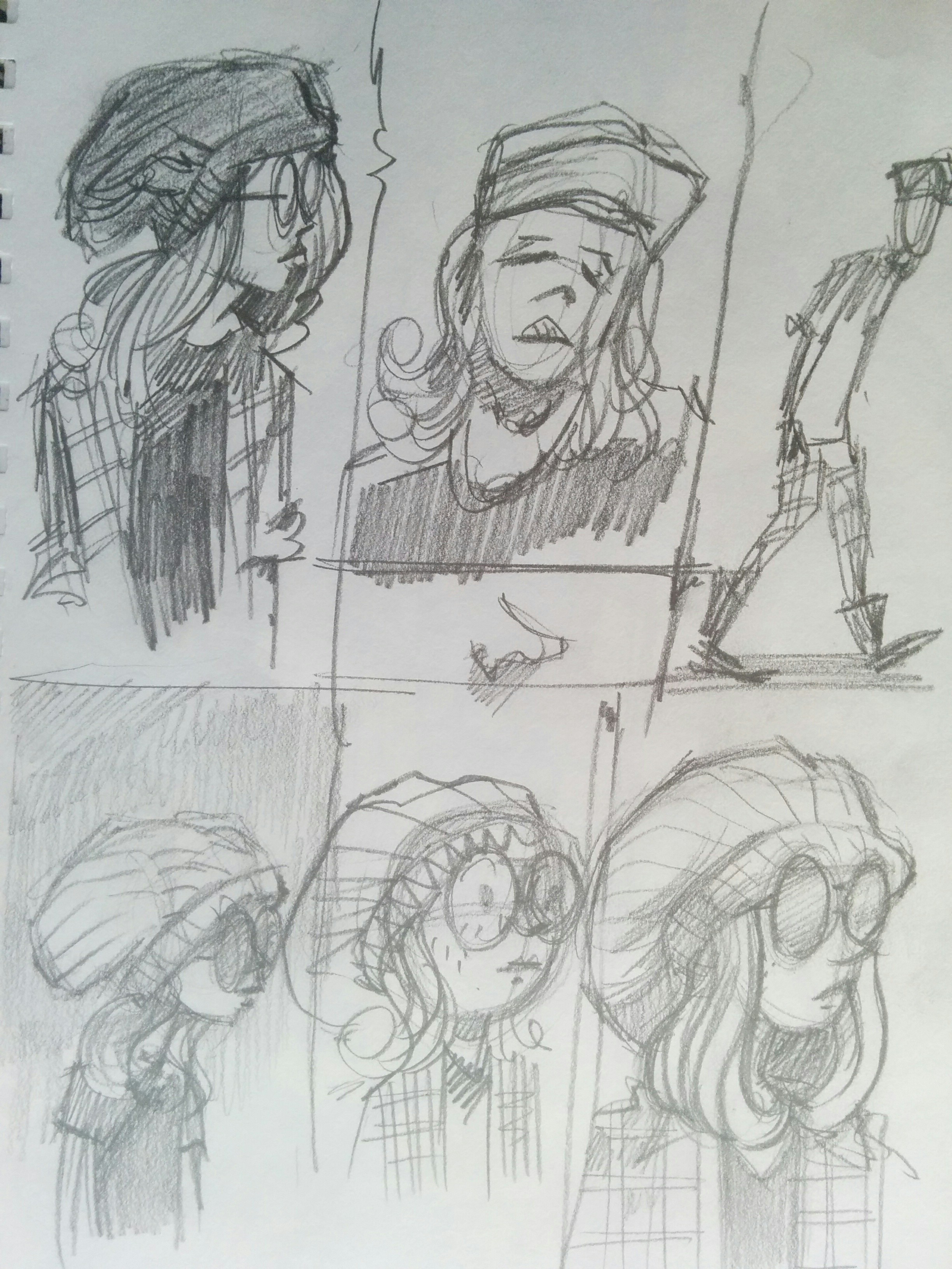
The character designs, though, had been really frustrating me. I didn’t like the few I’d done back in 2010, but even after a fair amount of sketchbook noodling over the last month or so, I still had a bunch of stuff that I didn’t like much. Here’re a few examples:


These aren’t terrible, but they weren’t really grabbing me–other than maybe a few of the ones in that fourth image grid. In the midst of all this I’d been reading the amazing French BD, District 14–an absolutely wonderful alternate history 1940’s noir comic featuring humans, aliens, and anthropomorphic animals. It occurred to me late one night that In the Weeds might work really well with…

Animal Characters!

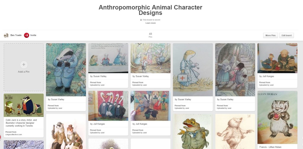
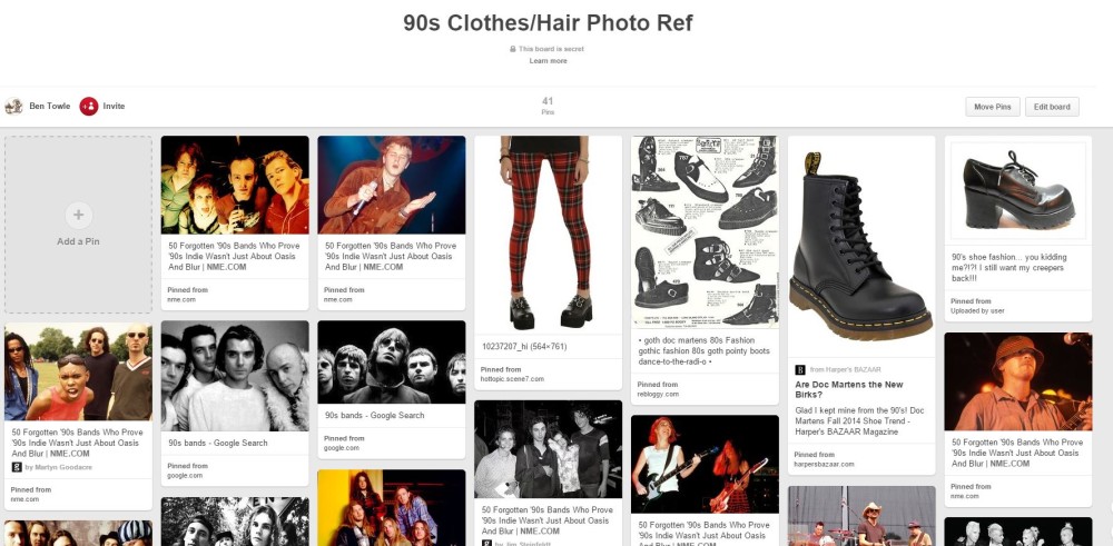
Before digging into some animal character designs, I did a bit of visual research. On a lark, I decided to resurrect my old Pinterest account for this purpose, which has actually worked out really well. The bulletin board layout of Pinterest is great for taking in a ton of visual information at a glance and the handy “pin it” widgets make it easy and quick to add any image you happen across to a reference board. I can also display a board on my Surface while I work from it in my sketchbook out in the living room, away from my studio in the evenings. So as to not flood my followers (not that I probably have many after a few years of inactivity) with a bunch of personal photo reference, I set up my In the Weeds boards as private boards. I created one board for period 90s clothes reference, one for examples of anthro character designs (mostly from children’s books), and several for particular animals.

Here’re screen caps of the first two I mention:

Capture

Capture02

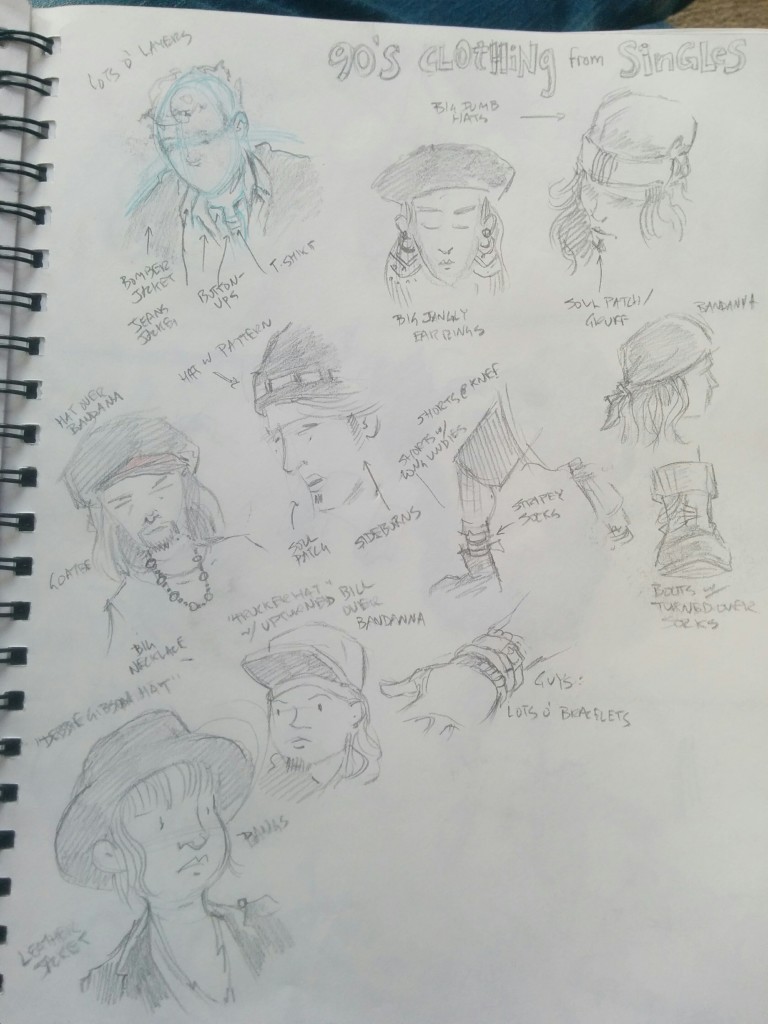
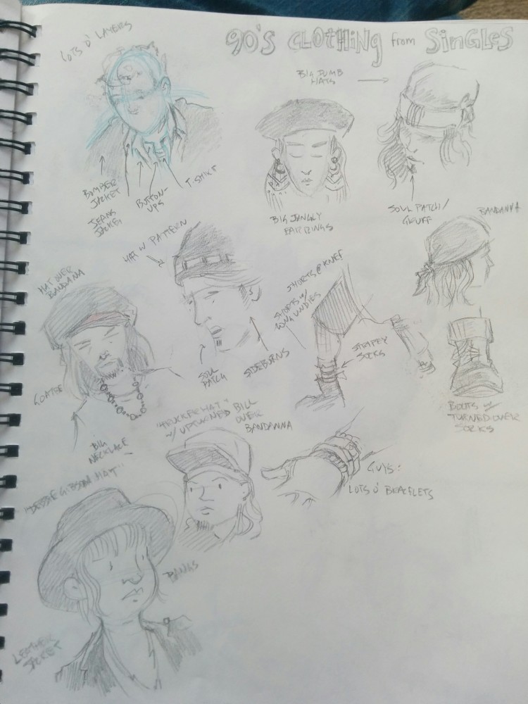
I’ve also been watching and sketching from then-contemporary movies from the mid 90s. Here’s a sketchbook page of stuff from Singles:

IMG_20160216_113401

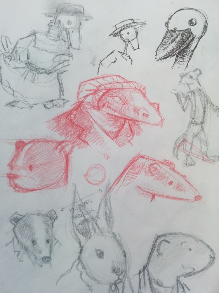
To get warmed up for some animal designs, I did a bunch of sketchbook drawing–some original designs and some drawn from examples on my Pinterest page:

I was still wanting a bit more practice with animal designs and I also wanted to work out a look and feel for the inking and coloring (or gray-toning as the case is here) so I decided to draw some of my favorite existing animal characters in period garb. I stated with some Richard Scarry characters:

Then I did a few from District 14:

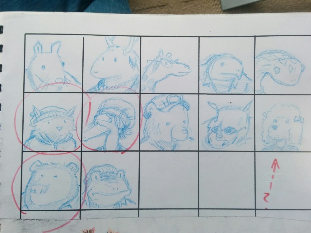
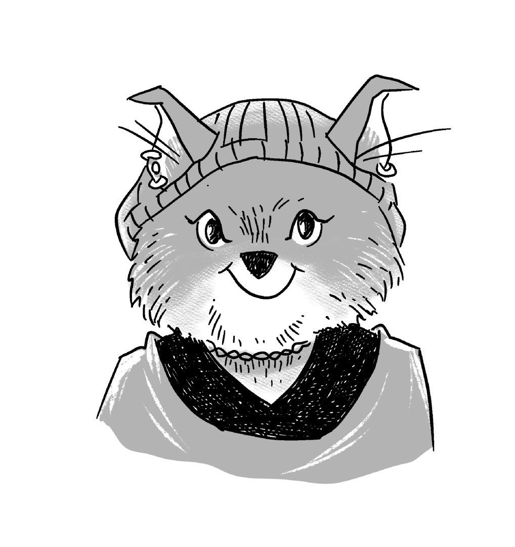
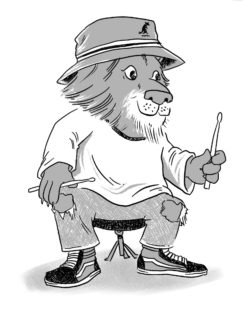
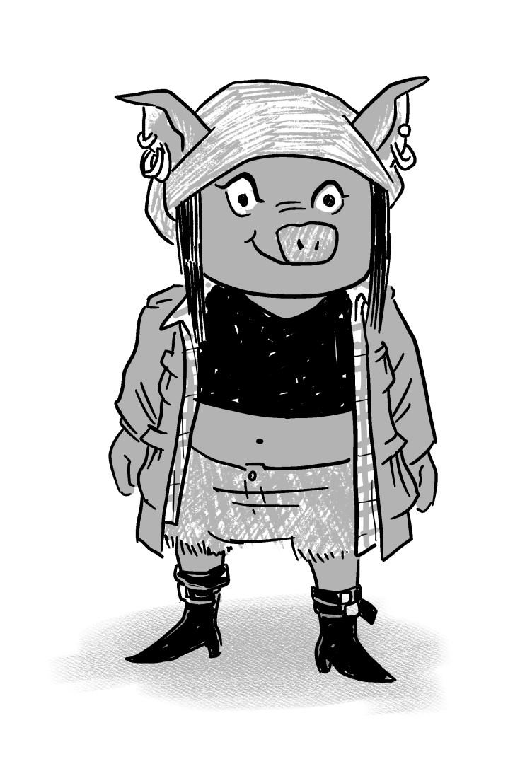
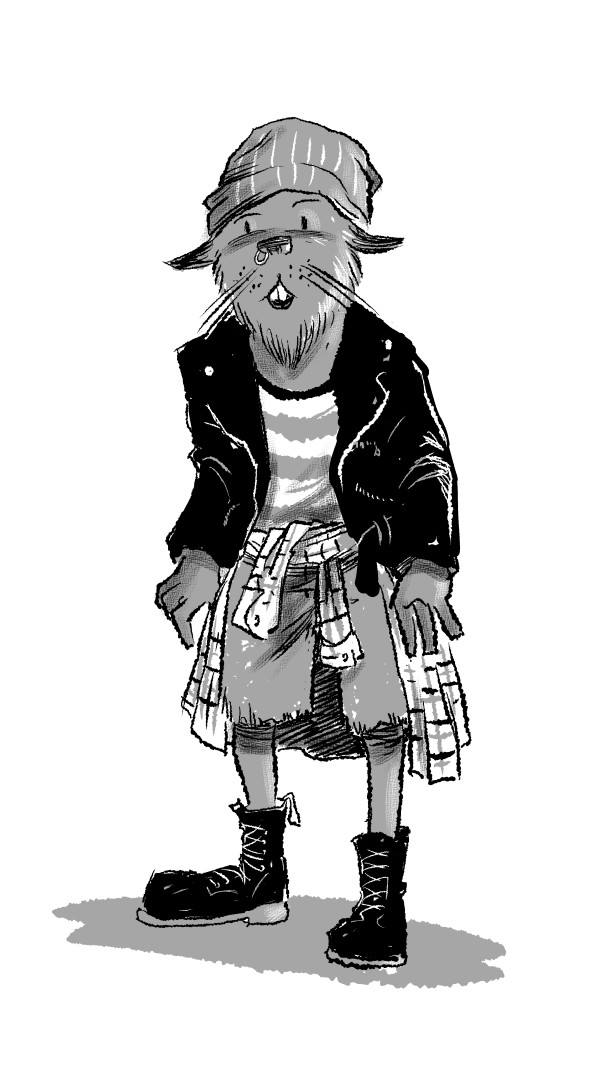
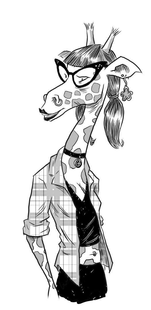
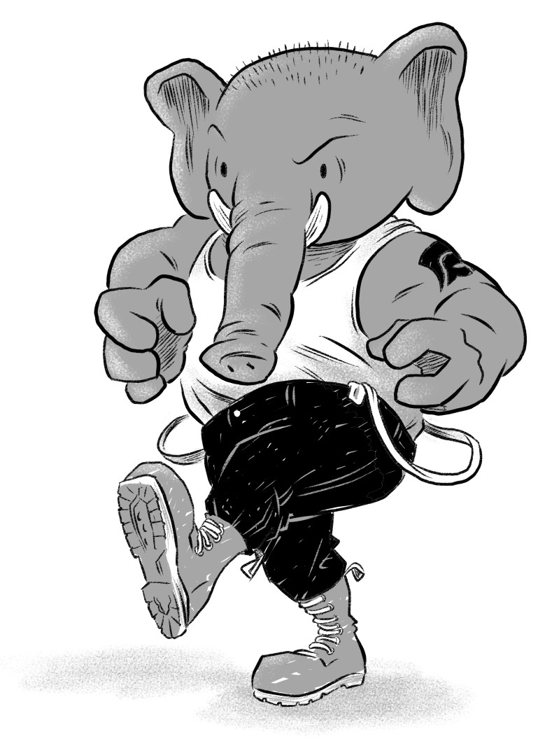
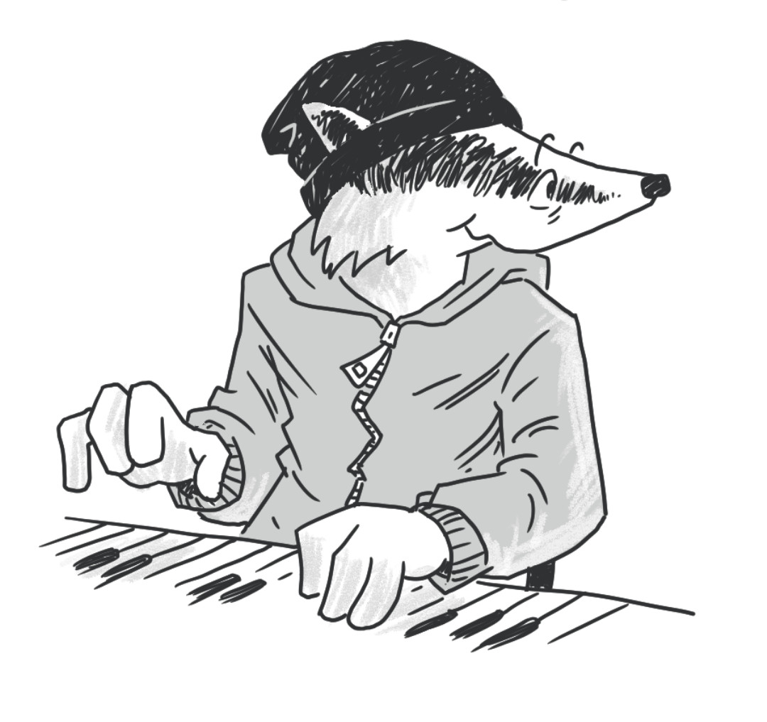
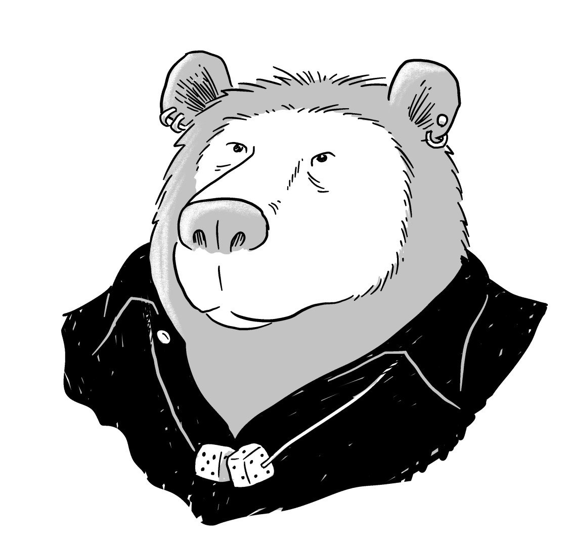
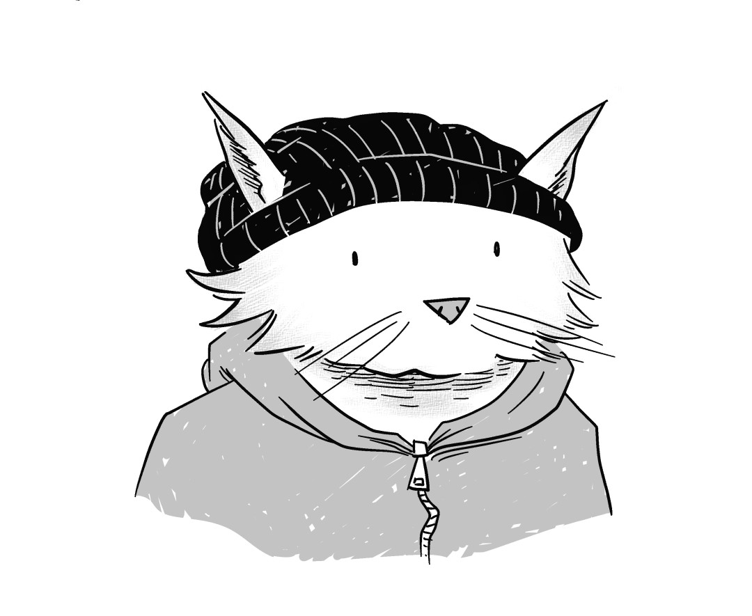
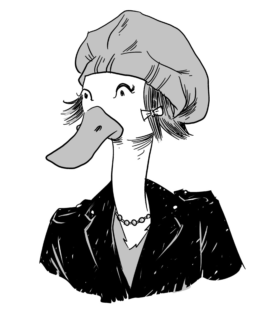
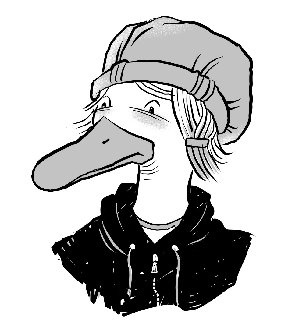
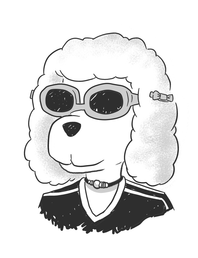
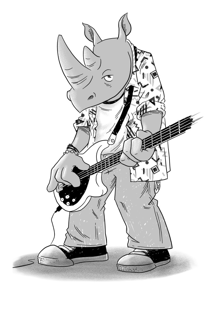
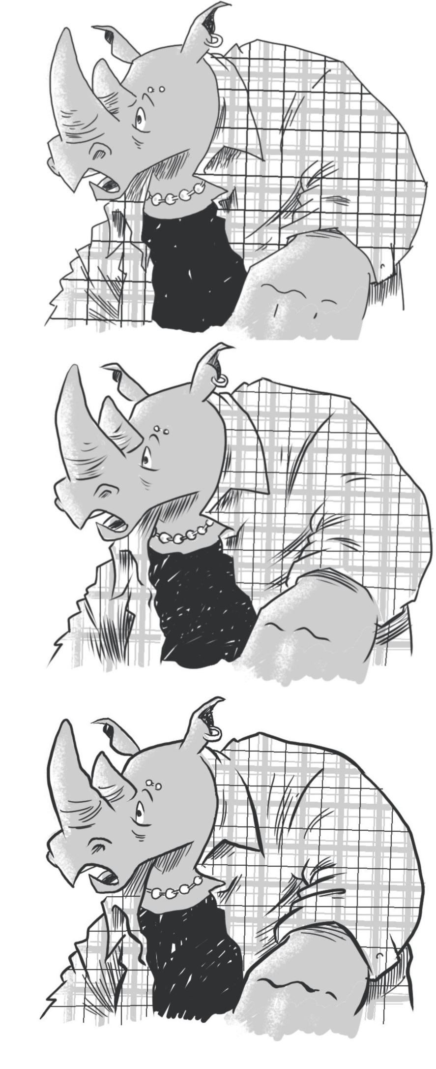
Finally, I started working on some original designs:


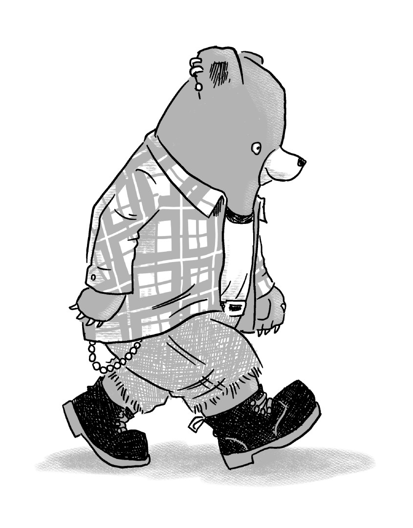
Of these, I think the poodle and rhino are keepers, and the badger and bear could be as well with a bit of further work.

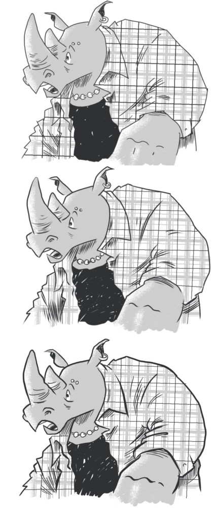
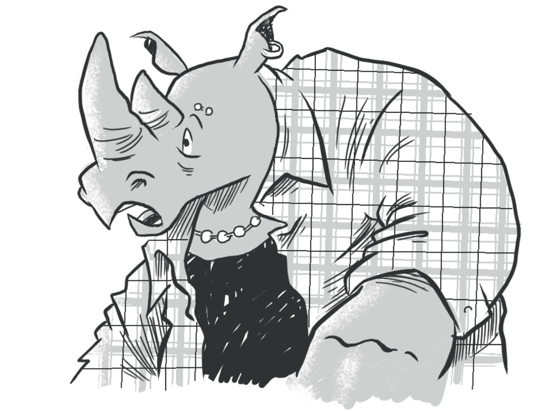
One thing I’ve really been struggling with is line weight. I started seriously working on comics in the late 90s/early 2000s when folks like Charles Burns and Dan Clowes were the big influences in the indie scene. They in turn were largely drawing influence from North American comic book artists from the 50s and 60s–most of whom inked with a brush and consequently featured a heavy, variable-width inking line. This sort of inking, though, seems to have fallen out of vogue recently and I’ve even found myself using less and less line weight. Oyster War, for example, was pretty much all dip pen. I’ve been experimenting a bit with a nearly “dead” line weight–which you see all over the place these days–but I seem to find myself gravitating back to tools with at least a bit of variation to them.

Here’s an experiment with a rhino character. The top is nearly dead line weight. The middle is a inker with a bit of variation used throughout. The bottom features heavier variable ink lines for the contours of the image but nearly dead line weight for the hatching.

side-by-side

I’m not sure where all this will wind up, but hopefully I’ll have a good batch of character designs wrapped up by about the time I finish my script revisions and then I can get rolling on.. my next comic!

In the Weeds! Coming who knows when! Hopefully published by someone! Woo-hoo!

Comics Retailers: Get Hand-Drawn Oyster War Book Plates!

As recently highlighted in Diamond Daily, Oni Press and I worked out a great Oyster War promotion: Order at least three copies of Oyster War and get a free hand-drawn book plate of an Oyster War character. The verbiage in the Diamond describes the plates as “ultra rare,” but note that these are not just “rare”–they’re individually hand drawn by me! As you can see here, these are drawn on book plate templates intended to be run through a printer, but instead I’ve hand drawn characters on them in brush pen. Each one is signed and dated, ready to be peeled off and stuck into a copy of Oyster War.

CZVsfW8WIAAVv_p

James Sturm Lecture/Ten Years of CCS Exhibit

On Wednesday I drove up to Boone, NC to hear James Sturm talk about the history of The Center for Cartoon Studies and to check out the exhibit of CCS-related original art at the Turchin Center. The exhibit was organized by my friend comics writer/comics professor Craig Fischer, who you may know from our annual “mega-panels” at HeroesCon. James was a professor at SCAD when I was a student there years ago, so it was great to have an opportunity to catch up with him as well. I’ve been up to visit CCS a few times, but the most recent was in maybe 2006, so it’s been a while.

James’s lecture covered a bit of his comics-making process and then went over the “origin story” of CCS. Afterwards there was a reception in the CCS exhibit hall. Two bits of interesting info that came up in my conversation with James earlier in the day: First, he has not one, but two, forthcoming children’s books from TOON Books. I got a look at a physical copy of one and a PDF of the other. They both look great. Second: In a discussion about what original comics art folks owned, James mentioned that either he or the school (I can’t recall which) has never-seen sample pages that Craig Thompson did for the James Sturm written Fantastic Four series, Unstable Molecules. Apparently Thompson was considered for art on the book before Guy Davis was settled on. The pages include the (in)famous “Johnny Storm masturbating” scene.

Here’s a small handful of pictures from the event:

Christmas Shopping for a Comics Fan

If you’re looking for gift suggestions for a comics fan, be sure to check out Oni Press’s 2015 Holiday Gift Guide. You’ll find all the suggestions here, among them Oyster War.

tumblr_inline_nyrenfdTpG1r2ab65_500

Also, just a reminder that I’ve got tons of original art from Oyster War for sale at my store:

cap

NYC Exhibition Reviews: Al Hirschfeld and Lynda Barry. Oh yeah, and the NY Comic-Con

So, just by happenstance my wife’s work was putting her up in NYC for a conference a few blocks from the Javitz Center the same week that the New York Comic-Con would be there. That seemed like too good a coincidence to pass up, so I booked a flight and tagged along. It was a last-minute deal (at least by convention planning standards) so I didn’t wind up getting an artists’ alley table, instead just doing a signing each day I was there (Thursday and Friday) at the booth of Oyster War publisher Oni Press.

NYCC

I wrote fairly extensive recent reports on CXC and SPX, but for NYCC, I’ll keep it short: The place was a zoo.

I spent some time on the floor on Thursday–presumably a “slow day”–and getting around was already thoroughly unpleasant. Yes, there was some cool stuff to see at the booths, but it took some doing to get around, especially in areas like the passageway to artists’ alley, which was very prone to bottlenecks and was even closed off at one point as a result.

IMG_20151008_120638

I attended one panel on Thursday, a Dark Horse panel that was billed as a panel on “Crafting the Original Story” and which I assumed would be about, ya know, the process of crafting a story. It was actually just the standard “guys talk about books they’re currently doing” panel. Not that there wasn’t some interesting stuff being discussed–the announced Van Jensen/Nate Powell book in particular looked great. The real takeaway moment from this panel, though, was when one of the panelists themselves, Ethan Young, asked moderator/Dark Horse PR person Steve Sunu whether their upcoming Moebius Library would retain the original coloring and he just straight-up declined to answer. (To be fair, it sounds like he wasn’t prepared to say anything about the Dark Horse Moebius Library other than that the project exists.)

The real high point of of NYCC for me was just getting to talk to people in person that I would really only run into at big mainstream events like this or SDCC. In particular, it was great to finally meet face-to-face a lot of the Oni folks, who I’ve been interacting with throughout the Oyster War publication process, but whom I’d never actually met in person before.

I did also really enjoy seeing the original art that some of the dealers on the floor had for sale. I’m always completely blown away by the stuff that’s just casually available in portfolios to flip through at cons. Seeing stuff like this totally blows my mind and seems like the equivalent of  seeing a bunch of Degas paintings at some yard sale:

IMG_20151008_155711 IMG_20151008_155800~2 IMG_20151008_155806~2 IMG_20151008_160944 IMG_20151008_161116

(That’s–top to bottom–Jack Kirby, Harvey Kurtzman, Basil Wolverton, Reed Crandall, and Barry Windsor-Smith)

All that said, I decided that one day at NYCC was plenty for me and since my Friday signing wasn’t until the evening I began hatching plans to do some things in the city Friday, rather than hang out at the con.

Al Hirschfeld at the New York Historical Society

The weekend of NYCC was the final weekend of a long-running exhibit of Al Hirschfeld originals at the New York Historical Society and that was stop number one for me. Unfortunately, photography was prohibited, so I’m going to have to make due with pictures I can find online, but here’re some observations about the exhibit:

IMG_5589

  • If you were at NYCC and didn’t hop on the subway to catch this exhibit, you really missed something. Al Hirschfeld is one of the greats and you’re probably not going to find another collection of Hirschfeld originals all together in one place like this again for a good long while.
  • Al Hirschfeld is known for his distinctive linework, but seen up close, you can see that his linework actually changes markedly over the years. Linework in his older pieces–up to maybe the 80s or so–has a lot of flowing uninterrupted lines made with a single stroke. At some point, though, he begins to move toward building up lines with lots of small scratchy strokes that emulate this look. I wonder if this is a change reflective of age, as with Schulz’s linework. Compare, for example, the linework in his Man of La Mancha illustration from 1977 (top) with this Tommy Tune drawing from 2012 (bottom): 1 2
  • Hirschfeld drew in a barber’s chair and they had a setup at the exhibit where you could sit in a similar barber’s chair and draw stuff on one of those magnetic kid’s drawing tablet things: Untitled-1
  • Hirschfeld is known for his distinctive drawing style, which is recognizable mainly because of its unmistakable line quality. The Al Hirschfeld documentary, for example, is called The Line King. That particular drawing style, though, is (not surprisingly) something that he developed over time. Judging by the works on display, he was in his currently recognizable style by the mid 1940s or so, but the works on display from before then were absolutely stunning and very, very different than what most people probably think of when they think of Hirschfeld.
  • There were plenty of these early works on display, mostly lithographs from the 1930s. They were quite stunning. Most of them were interiors or crowd scenes, not portraits, and exhibited a real concern with value as much as with line. If this doesn’t sound like the Al Hirschfeld we all know and love, we can hardly be blamed; this era and style Hirschfeld seems to be largely ignored. I could find precious few examples of this era of his work online and the group that I turned up leaned heavily on portraits. Even the official Al Hirschfeld website has only a few posted works from this era and they’ve selected only portraits/caricatures. 1940 1938 1939
  •  Even once settled into his now-recognizable style, Hirschfeld has a lot more going on than just his stunning linework. He employs an amazing vocabulary of patterns and textures and often uses them in brilliantly unconventional ways. For example, look at the crazy pattern he’s using to indicate stubble in this picture of Elia Kazan. (Sorry about the terrible image.) 5469049b04de6f6c5769db6bd2b9d81fOr how about the dry brush texture in The Defiant OnesFUGAAnd check out the hair in this 1970 Jane Fonda portrait: jane_fonda
  • He also had an amazing variety in the way he drew facial features. Hirschfeld had no “stock” methods that he fell back on for this stuff, and a lot of what he came up with bordered on the abstract in a wonderful way. Look at how he’s chosen to draw Lucille Ball’s eyelashes in this Mame image: 9501abd1ca493d316b05de69e5196622
  • Hirschfeld continued to change his style and explore new ways of representing faces and bodies until the end of his life. His final works really pushed minimalism. It seemed like he was trying to see with just how few lines he could possibly get away with. Check out how much of the torso and arms in the Rosemary Clooney illustration from 200 are implied rather than drawn: 2000
  • Seeing and thinking about all this linework made me a bit sad about the current vogue for dead or nearly-dead linework that’s prevalent in indie comics these days–and which has now filtered through things like Adventure Time and Over the Garden Wall and become a mainstream aesthetic. I like a lot of that work (and for sure love the sources it springs from influence-wise: Moebius, Katsuhiro Ôtomo, etc.) but I’ll always have an affinity for artists who are masters at expressive variable-width inking tools.
  • My only disappointment about the exhibition was purely a personal one. As a lifelong Trekkie I’d really hoped to see an original of one of Hirschfeld’s amazing crew portraits of the various Star Trek crews/shows. Alas, there were none to be found, but here they are:   Al_Hirschfeld_Star_Trek_Original_Cast hirsch-voy hirsch-tng2 hirsch-ds9

Lynda Barry at the Adam Baumgold Gallery

After a surprisingly reasonably-priced lunch at a vegetarian joint off Fifth Avenue I hopped on a rental bike, trucked across Central Park, and wound up at the Adam Buamgold Gallery, which was hosting a spectacular exhibition of Lynda Barry originals. The Gallery is tucked away in the bottom floor of a brownstone and I wasn’t sure I was even at the correct location when I rung the bell and was buzzed in. Adam seemed surprised anyone in town for NYCC was coming by to look at the exhibit–but I was frankly surprised no one else in town for NYCC had come by.

I don’t have a big list of observations about Barry’s art as I did with the Hirschfeld stuff, other than just that Lynda Barry is one of my favorite modern cartoonists and it was a real treat to see so many originals of hers in person. In particular, the stuff she’s done in the last seven or eight years or so were especially great to see since they’re multimedia/collage pieces that you can’t fully appreciate in a mechanically reproduced book.

Adam’s gallery is a really nice space in which to look at original comics art and from my minimal chatting with Adam he seemed like a great guy and a real champion of original comics art. Sadly/ironically, as a working cartoonist, I can’t actually afford to purchase a Barry original, but I was delighted to see on the list Adam showed me that the bulk of them had sold. He did, though, graciously allow me to take some pictures. Here’s a gallery of some of the stuff that was on display:

Etc.

On the way back to the Javitz Center for my Friday signing at the Oni table, I stopped by the French embassy, which has a French-language book store inside it. It’s a great shop and upstairs they have several shelves of French comics. I have to admit, I was surprised I didn’t find more stuff to buy, but I think that’s actually a positive sign. Ten years ago I’d have snapped up every Christophe Blain book I ever encountered, for example, but the bulk of the Blain books they had on the shelf had already been translated into English by various North American publishers so I didn’t buy them. I picked up a beautiful Nicolas De Crécy travelogue and I’m still kicking myself for not buying the new Blutch art book.

My trip to New York City was great and I got just enough time at the enormo-dome NYCC to get my fill. As you can probably tell from my write-up, though, most of my favorite stuff was ancillary to the con itself. But, hey, if I hadn’t been at the actual NYCC, would I have ever seen in-person this portrait of Tyrion Lannister made ENTIRELY OF PERLER BEADS?!?!

IMG_20151009_164517