Oyster War Characters – Inked

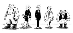
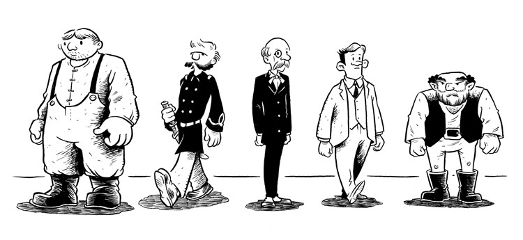
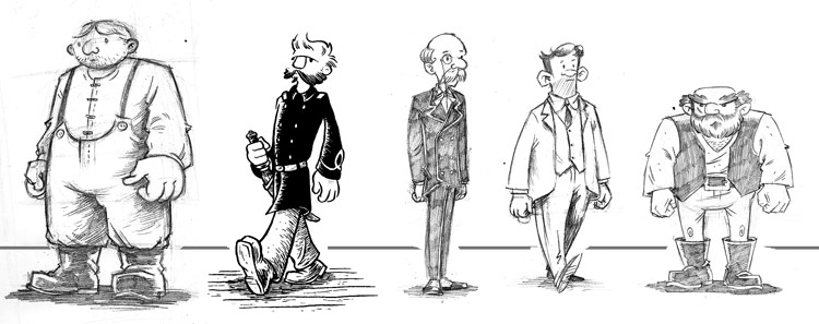
So, here’re inked versions of the Oyster War characters I posted yesterday.  This is actually my second attempt at inking them; the first was pretty disastrous.

I’m giving myself some real challenges with this book both because of the format and the technique I want to use.  First, I’m wanting the finished book trim size to be 8 1/2″ x 11 1/2″–or, more familiarly, “TinTin format,” the size of those ubiquitous large paperback editions of TinTin stories.   Keeping with this format, I’m going to follow Hergé’s four-tiered page grid, rather than the more standard three-tier style most common in smaller books.  This does, though, have the effect of making for some pretty small panels.  2 3/8″ is the usual height for a panel in TinTin.

Another thing, though, that’s adding to my list of challenges is that I want to do this book entirely with a dip pen–no brushes.  I haven’t worked this way much and there’s a real learning curve involved.  Now, I usually work pretty large–between 180% and 200% of print size–but I’d heard that with pen work, one wants to work closer to the final printed size, 150% or lower.  The problem, though, with my first inking pass was that 150% of 2 3/8″ is tiny.  I felt like I should be working with the aid of one of those spring-loaded magnifying glasses you can attach to a drafting table.  In addition to the small page size, I was trying to use my usual G-Pen nibs which I discovered just don’t produce fine enough line work.

On my next pass, though, I upped my page size to 180% and began using the G-Pen for just the big outlines and breaking out the old Hunts 102 for the rest.  The results this time around were much better, I think.  I’m going to have to find some higher-quality substitute for the 102, though.  I’d forgotten what poor quality most Hunts/Speedball nibs are these days.  The word on the street is that the maru pen nibs and saji pen nibs are very similar to the 102 line-wise, but with the same heft and quality as the G-Pen, so I’m planning on ordering some of those today to check out.

character_lineup_inked

Oyster War Character Designs

I’ve been using the few weeks since I wrapped up my Amelia pages to take on a number of tasks, among them getting back to work on Oyster War.  One of the first things I wanted to address was my character designs.  I really want to move away from the level of visual literalism that I’ve been using in things like Midnight Sun and Ameila and, for lack of a better word, get more “cartoony.”   But, man is it hard…. and it really shouldn’t be.  If you were to look at most of my free drawing in my sketchbook, you’d see things that are far looser and less realistic than what’s become my “house style” of late.

Anyway, here are a few old characters revamped ( one, in ink there,  left exactly the same) and a few new ones.  I’m reasonably satisfied with these, although I seem to have real difficulty moving beyond my standard egg/oval for a head shape.  One reason I put my characters together in a single image like this is to establish the relative heights of each, but more important at the design level is also to make sure that each character has a distinctive shape.  I try to imagine them all in silhouette and then ask myself if I’d be able to tell them apart even drawn relatively small.  I think these satisfy that reasonably well at least…

character_lineup

Wide Awake Press – Free Comic Book Day

wap-ancient-cover

Today’s the day.  You can hit your local comics shop for freebies, but even if you miss out on that, you can download a 100% free comic book anthology from Wide Awake Press at their website.  Alas, my contribution this year was only a spot illustration, but there’re plenty of great folks who contrbuted stories, so check it out.  The Ancient Age is available online, or in PDF or CBZ formats.

Separated at Birth: Briefer’s Frankensten and Ditko’s Aunt May?

Breifer’s Frankenstein:

frankenstein

Ditko’s Aunt May:

aunt_may

You be the judge:

compare

Craft: Razorback Pinup

I’d normally just post an image like this one without much verbiage, but I went through some extra steps putting this one together, so I thought I’d do a “start to finish” entry on it since there’s maybe information that’ll come out of describing my methods here that could be of interest to folks.

Here’s how this all started out:  A week or so ago I got an email calling for folks attending Heroes Con 2009 comics convention to submit pinups for potential inclusion in the convention booklet.  Like any rational person, when I heard “pinup” and “comics convention,” I immediately thought of the ridiculous but also kind of cool (in a “shag carpets are actually kind of cool” way) Marvel B-string hero Razorback.  If’n you’re not in the know, Razorback is a minor superhero who appeared in a couple of Spider-Man issues in the 70s.  His real name was Buford Hollis and he spoke in CB lingo even when not talking on a CB, wore a giant electrified boar head on his own head, and had a “superpower” that enabled him to drive anything, including of course his own semi cab, the “Big Pig.”  He wore a giant electrofied boar head on his own head.  I just thought that deserved mentioning again.

Anyway, I really do like Razorback and I thought this’d be a good opportunity to work up a pinup of the character.  I figured, though, that maybe I could throw Spider-Man as well and I’d imagined a pretty simple composition, with Razorback in the lower right and Spider-Man swooping in in the top left:

razor_sketch

(At this point I’d like to point out that normally I’d not be doing nearly this much work for a single image like this.  If this were just something that were going to be printed in a comic, I’d be doing most of the planning, revising and adjusting on the page.  This, though, is something I’m hoping to sell as an original, and when that’s the case I always try to have no visible evidence of planning or corrections on the bristol board, and certainly no non-photo blue pencil visible.)

So, I started by getting the image of Razorback himself together.  Here’s a a reference image and my first pass on the character:

200px-razorback_001

(This is the early 90s John Byrne version of the character, where he’s all buff–not the original 70s version where he’s got a beer gut, but you get the idea.)

razor_1

As you can see, I do a lot of correcting by drawing in different colors.  I think this is something I picked up when I worked very briefly in animation.  I start with light blue, then switch to orange, then red, and finally a regular old HB pencil.  This allows me to go over and over the image, gradually refining it.  You can see here, for example, how the position of his legs has changed substantially over the course of the process.  I can then use Image–>Adjustment–>Hue/Saturation in Photoshop to eliminate all but the pencil drawings by turning the lightness of reds, blues, cyans and magentas all up to 100%. ( If I didn’t need this to be drawn on bristol board, I could take this one step further by then changing the pencil drawing to non-photo blue, printing it out, inking directly on that, then scanning it and getting rid of the blue–leaving just the inked image.)

Then I moved on to Spider-Man.  Although it makes no sense chronologically, I decided I wanted to attempt a classic Steve Ditko “rubber leg” Spider-Man pose:

spiderman

I wasn’t really very happy with this drawing, but I went ahead and started trying to get the two drawings laid out in a single composition in Photoshop… but, alas, nothing was coming together very well.  Given that I didn’t really like the Spider-Man image much anyway, I decided to ditch the whole original idea and instead just draw Razorback in front of his trusty semi cab, “The Big Pig.”  (I’m not making this stuff up, I promise.)

razorback8

So, I just did a quick block-in of the Big Pig behind my original Razorback drawing:

razor_pencil

Then, using a sheet of graphite transfer paper, I transferred the image to a nice clean sheet of bristol board and inked it.  Here’s the result.  Whether the folks at Heroes Con will be inclined to include something so silly in their convention booklet, I don’t know…

razorback