If you follow me on Twitter, you’re already in the know, but if not… Yesterday I wrapped up chapter three of my webcomic Oyster War. (New pages posted here. Begin the story here.) Chapter three starts here and runs thirteen pages, I think–the longest chapter in the book so far. It’s also nearly wordless and easily the longest extended action sequence I’ve ever done. (For better or for worse, neither Amelia Earhart nor Umberto Nobile engaged in a whole lot of ass-kickkery.) I have to admit, staging this extended fight/chase was a real challenge for me. I gained a whole new level of respect for people who work in comics genres that routinely have a lot of fisticuffs as part of the story. I’m looking forward to a bit of a break from this stuff in chapter four, which has a bit of plan-making on-board the Layla but focuses mainly on Fink, Isabael, and the other assorted bad guys.
As I’ve done with each previous chapter, I’m going to take a single page and show my process from writing up through the final complete page. I hope folks may find this interesting and/or useful in their own work. Here goes…
Writing
I don’t want to get too much into my general writing process here, but if you’re interested I did a post about it a while back. I don’t always do this, but for Oyster War I actually wrote out a full prose summary of the plot before I began any drawing. Here’s the written summary of chapter 3:
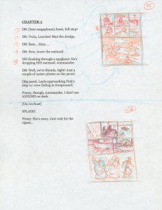
The only real purpose I can see to writing a full-on script for a comic is so that someone else can read it, so all I generally do as far as writing goes at this stage is writing out the dialog itself:
As you can see there’s not much there other than what’s said and who’s saying it. As mentioned, this chapter is nearly wordless, so other than some sound effects this is pretty much all of the dialog there is for the entire chapter. For any other chapter, though, there’d be a heck of a lot more dialog. I format my pages of script so that the writing only takes up the left half of the page and you’ll see why shortly.
Thumbnailing/Roughs
Thinking about it now, Page 35 probably wasn’t the best choice for a process post since it doesn’t contain any dialog, but just for the sake of explanation, here’re thumbnails of the opening pages of the chapter. You can now see what’s going on with that “script on one side” thing:
 I’m working super-rough and I’m starting with non-photo blue and going over and over with progressively darker colors to gradually build up a composition I’m happy with. I “map” the dialog to each panel either with an arrow or just by numbering them.
Page 35 is an interesting case, though. It originally contained all of the action that eventually wound up being spread over both page 35 and 36. You can see I’m really struggling here at the thumbnail stage to get something workable together (I desaturated and jacked up the contrast for legibility:
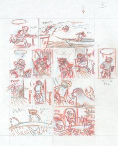
 Once I’ve got something I consider acceptable at the small/rough stage, I do a second larger and more polished thumbnail version of it. With the first round of thumbnails I’m really just trying to sort out basic layout problems: how many panels, what size panels, what basic action/dialog happens in each panel. With the second round, though, I’m thinking more about the developing the actual images themselves. For reference, my first-round thumbnails are about roughly 2″ x 3″; my second-round thumbs are 5½” x 7½” and correspond exactly to the shape of the final page. So, here’s my second-round thumbnail of page 35:
 Again, I’m working in successive layers of color here, gradually developing and refining the image. I’ve also made a few notes to myself, even redrawing a panel so that it’s flipped horizontally. I’ll swap this panel out in Photoshop.
Now, I’ll rescan the second-round thumbnails and make any needed corrections, like the flipped panel here. I also go in and drop in some “dummy lettering” to make sure that I’ve got enough room for all of my dialog. Before starting this project, I figured out the correct point size for the type that corresponds proportionally to how big I want my dialog in the final print book (assuming it ever gets printed). So here it is desaturated and lettered:
 I then print out a paper copy of this and put it in a “dummy binder” like this:
 I can’t over-stress how important I feel it is to, at some point in the process before you actually commit things to bristol board, have some kind of rough version of your story assembled into a form that you can actually sit down and read through page by page–as your readers will eventually do themselves. This way you can experience both the page-to-page flow and the panel-to-panel flow. It also allows you to catch any potential problems you might have related to “flip”–things like trying to save important story “reveals” for left-facing pages that get shown only when the reader flips the page. You also get to experience the book visually as a series of spreads. And (this is important!) in a printed book the fundamental “comics unit” you need to be concerned with is not the page, but the spread.
So, once I’d got the whole chapter through two rounds of thumbnails and into my binder, I sat down and gave it a good, critical read. One of the big problems I spotted was with this page in particular. First off, there’s just too much action going on in too small a place–both physical space and narrative space. Additionally the page has some really confusing back-and-forth between the two parallel stories going on here (Tevia pursuing the guy who jumps between ships, and Bulloch pursuing Isaebel).
Rather than overly-boring you with several more iterations of re-thumbnailing, I’ll just say that it occurred to me that if I have two parallel stories, why not have them become physically parallel on the page? I wound up spreading the action over two pages, with the two stories separated horizontally on the first page (35) and then separated even further–and vertically–on the second page (36). So, I grabbed a fresh sheet of printer paper, broke out the scissors and rubber cement, and started doing some old-timey cutting and pasting. Here’s what I came up with by rearranging existing panels and adding a few new ones:
 You can see here I’ve used a much thicker than usual horizontal gutter in order to reinforce divergence of the two storylines. At this point I was reasonably happy with the story in rough form and ready to (finally!) start work on the final pages.
A quick aside: if you’re saying to yourself, “I can’t believe he goes through so much mumbo-jumbo before actually drawing the damn pages!” you wouldn’t be the first to do so. I really believe, though, the the most undervalued and often ignored part of the cartooning process is editing–and that’s exactly what I’m doing with each iteration of the thumbnailing process. Much as any prose writer does multiple drafts of his/her work, as a cartoonist you should be doing this too. With each iteration you have a chance to think critically about how your story is put together and whether or not it’s working as well as it could be. And with each iteration you have a chance to fix things and make your comics into better comics.
Pencils
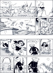
Now, for the easy part: actually drawing the pages! Don’t mistake “easy” for “fast”–it takes me forever to complete one of these pages–but all of the intellectual “heavy lifting” has been done at the thumbnail stage. Actually drawing the stuff just takes time and effort. Here are the pencils of page 35:
 You can see that the final page follows the second-round thumbnails pretty closely. And it should–all of my storytelling decisions should have already been made by the time I sit down to actually draw the page. You can see that I rough in each panel in non-photo blue. I’ll take this out later in the process.
Inking
I’ve described my inking process before, but in a nutshell: I use a Zebra G-Pen nib to do my outlines and a Zebra Tama nib for all of my hatching. Here’s an un-retouched scan of the inked page:
 You can see that I leave little notes for myself in non-photo blue. Usually (as is the case here) they have to do with the head/body ratio of the characters. I have a really hard time keeping this consistent for some reason, so I often have to tweak that in Photoshop after the fact. I’ve already covered my automated Photoshop page-prep system here, but here’s the processed ready-to color page with Bulloch’s head size scaled down slightly in panel nine:
 Coloring
This chapter contains a lot of back-and-forth between Fink’s ship and The Layla–both as far as the story jumping back and forth, and in the sense of the characters moving from ship to ship. To try to make this as non-confusing as possible I toned back the crazy non-literal coloring I’d been using in the first two chapters and developed a unique color palette for each ship and tried to stick to that for clarity’s sake. Here’s my color guide:
 And so–finally–here’s the completed page:
Well, I hope all that’s of some use! Feel free to comment if you have any questions.


5 comments
1 ping
Skip to comment form
Nice post. These Zebra nibs, do you like them? Could you compare their size/sharpness/flexibility to other North American nibs? Are they omni-directional?
thanks, Mahendra
Great post.
Do you completely redraw the final pages from the thumbnails? No tracing them off or anything?
I do the same color palette setup with the cartoons I work on. But I create a separate set for foreground and background colors. It really helps me to have have all my choices made ahead of time.
Author
@mahendra – Yeah, I really do love the Zebra nibs. Since first trying them, I’ve not gone back and used a Hunts (or any other U.S.) nib at all. They’re heavier and much more solid than U.S. nibs–and definitely pretty stiff. It’s been a while since I’ve used anything else, so it’s hard to compare, but they’re definitely a bit tighter than a Hunts 102, for example.
They’re for sure sharp. I use them either on 400 series Strathmore board or on nice Arches watercolor paper. I’d not use them in a sketchbook, for fear that they’d tear the page. Tou can (and should) really bear down on them, particularly the G-Pen nib, to get a pretty surprising amount of line variation.
Author
@Brad – Thanks! I’ll occasionally enlarge my thumbnails and then lightbox them or use graphite paper to transfer them. Honestly, though, that usually winds up taking longer than just eyeballing it.
Great write-up, Ben. You’re very meticulous in your creative process and it definitely pays off, that’s for sure. I gotta keep in mind what you said about the importance of the page spread.
I tried the Japanese nibs but they tear into my board something fierce. So I hunted down some 1900s Hunt 102s. Much better quality back then than now.
[…] characters and basic backgrounds and laying in digital placeholder text. (Described in more detail here.) With In the Weeds, though, I’m basically doing this all in one step–giving me […]