Four-Fisted Tales Is Done and Pre-Orders are Open!

If you’re signed up for my newsletter, you already know this, but… Four-Fisted Tales is done and will be released on August 18th. And at long last, I can finally reveal the cover!  

I couldn’t be happier to have this book wrapped up and about to be released into the wild. I think the final product is going to be a great-looking book. Look for it in book stores, online, and–hopefully, COVID-depending–at conventions being hawked by me personally!

I’ve a added a permanent Four-Fisted Tales page to the website with pull quotes, description, and ordering info–but here’s that info as well: 

“A fun and amazingly informative graphic novel I found hard to put down, Four-Fisted Tales is chock full of fascinating stories about animals that have fought—and died—alongside soldiers throughout history, all complemented beautifully by Ben Towle’s classic Roy Crane-esque cartooning.”

—Jake Tapper, CNN anchor  

Four-Fisted Tales brings you animal stories you had no idea you needed! From time immemorial to the Gulf War and beyond, each animal, each story makes you say, ‘What? No way!’ All brought to vivid life by the artistry of Ben Towle!”

Jeff Smith, writer and illustrator of Bone  

Four-Fisted Tales is a stellar graphic history whose art is exemplary, capturing action, humor, and poignancy alike.”

Foreword Reviews 

In virtually every military conflict in recorded history animals have fought—and often died—alongside their human counterparts. While countless stories of the men and women who’ve served in the trenches, jungles, and deserts of the world’s battlefields have been told, Four-Fisted Tales: Animals in Combat shares the stories of the animals who fought alongside them.  

From Hannibal’s elephants in ancient Rome to mine-sniffing rats in Vietnam and everything in between, Four-Fisted Tales highlights the real-life contributions of these underappreciated animal warriors. Whether in active combat or simply as companions, these animals served and made their mark on history.  

ISBN: 978-1-68247-416-7 

$24.95 

Pre-order from the publisher

Pre-order from Amazon

How Different Cartoonists Draw Water – Part II

Based on both site stats and how much social media traction it gets when it comes up in conversation, one of the most enduringly popular posts I’ve done on my blog is 2008’s How Different Cartoonists Draw Water. I wrote that post as I was in the midst of working on both Amelia Earhart: This Broad Ocean and Oyster War–drawing the former and likely just beginning to brainstorm on the latter. I was reminded of the post recently when watching a Cartoonist Kayfabe video that touched on the old practice of keeping a “morgue” pre-internet–a massive file system of clipped visual reference material. I remember mine having lots of hands, greenery/foliage, crowds, and of course water.

Over the past year or so I’ve been accumulating examples of what I consider particularly nice examples of cartoonists’ water drawings, and all that “morgue” talk reminded me that I should probably go ahead and put together a post of what I’ve accumulated. So here–with significantly less commentary than in my original post, and in no particular order–is a second set of How Different Cartoonists Draw Water.


The French cartoonist, Blutch, draws everything really well, so it’s not surprising that he draws water really well. If the beautiful dry brush work here reminds you a bit of Craig Thompson, well, that’s not a coincidence (the influence running Blutch to Thompson, not the other way around of course). I particularly love how, in the third image, so much of the waves/water is just implied gesturally, rather than rendered realistically. 

Here’s some nicely drawn water with an amazing sense of light/light source. I’m in awe of how much work the color choices are doing here to augment the already beautifully-drawn water in this panel from Matthieu Bonhomme’s Charlotte impératrice. I’m not sure if Bonhomme is doing the color here or not?

Looking back at my original post, I’m surprised I didn’t include any Hergé water. Here’re a few to remedy the situation. There’s a ton of water depicted in Tintin and these are only two of several different ways Hergé (and/or his assistants) drew water. I’ve “borrowed” liberally from the first version here for sure in my forthcoming book, Four-Fisted Tales

I don’t know a whole ton about Andreas Martens, but I saw this beautiful water-filled page making the rounds on Twitter and nabbed it. (The sky/clouds in the background are pretty amazing as well!) There’s a real Franklin Booth by way of Wrightson feel to a lot of the mark-making here. 

Breaking the run of French guys, here’s some water from Kamandi by Jack Kirby.  I love that his water looks like repurposed “Kirby krackle.”

Here’s a beautiful Goseki Kojima Lone Wolf and Cub panel. Check out the atmospheric perspective-ish thing going on as the mark-making for the pilings makes them appear hazier and less distinct as they recede into the background.  

Back to the French guys! Here’s a jaw-dropping Christophe Blain panel from the black and white Gus collection. Or maybe this is from volume 4? I can’t remember. I love the peculiar dry brush marks he’s using in those waves. He started using tons of that in the most recent Gus volumes. I’m guessing he’s using a “rake” brush. I really need to pick one up to experiment with.

So this probably shouldn’t be included thematically, as it’s not a depiction of the surface of a body of water, but I had to include it! This is Winsor McCay. I love how simple the parallel horizontal line thing is, and yet it indicates “underwater” so well. (Maybe someday I’ll do a specific post on depictions of underwater scenes?)

Here’re a couple from Masashi Tanaka’s amazing manga, Gon.  I recently got a gorgeous Italian slipcase collection and have been re-reading them. Like everything he draws, the water here is made with incredibly dense mark-making. I’m guessing there’s a reason this guy did a few odd manga series and then bowed out. 

Here’s a one-off from Jordi Lafebre’s Les Beaux Étés (the second volume, I think?). This one just floored me when I first saw it. The coloring is doing some pretty amazing stuff (the white surface pattern, the reflection from the sunlight) but the way he’s used those contour lines to indicate the visual distortion from the water is amazing. As I’ve mentioned before, I think Jordi Lafebre is one of the absolute best working cartoonists currently. 

If you know me, you know there’s only one thing I like more than comics that take place at sea: comics that take place at sea and in the arctic. Here’s a Junji Ito page with some very nice water from the recent U.S. release of his adaptation of Frankenstein.

Here’s an Alex Toth water panel from the must-have artists edition of Bravo for Adventure. Not surprising for Toth, his water is simple, beautiful, and graphic.

And, finally, I’ll wrap up with maybe my all-time favorite drawer-of-water, Hugo Pratt. I love everything about how Pratt draws water: It’s simple and graphic, yet remains loose and gestural; he uses an amazing variety of mark-making; and he’s got a sizable vocabulary of different ways to depict water. His simple, blocky reflections (usually of boats) are breathtaking. 

What I read in 2020

As I did last year, here’s a run-down of the comics and comics-related stuff I read this past year. As will be obvious as you look through the list, this is a list of things I read this year, not things that came out this year. It’s also not a “best of” list. I have, though, highlighted a few items that I thought were exceptionally great and/or interesting. I read a few French-language things and I indicated them with a parenthetical “FR” so no one winds up potentially frustrated looking for them in the U.S.


Rusty Brown – Chris Ware

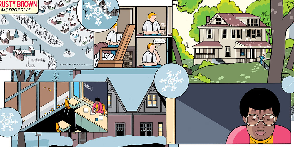
I’m continually baffled by the apparent “Chris Ware backlash” of the last decade or so. Comics-wise, Ware is operating both at a formal level and a craft level so far above pretty much anyone else working today that it’s flat-out astonishing. Rusty Brown is a stunning work, even for Ware. The Jordan Lint chapter in particular stands out as something that the medium has really never seen before. And, attention, haters: the book ends on a decidedly positive note. The first book I read this year and one of the best.

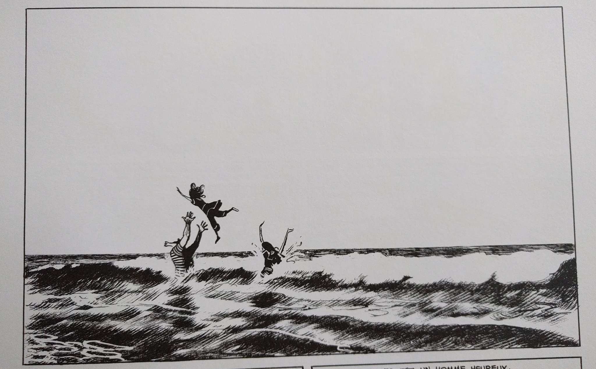
L’age D’or (FR) – Cyril Pedrosa

Another of my absolute favorites of 2020. (Since I initially read this, it’s been released in English by First Second as The Golden Age.) The story here is a solid fantasy/medieval deal with a bit of an unusual twist. What puts this at the top of my 2020 list, though, is the amazing artwork by Cyril Pedrosa–deliberately designed as a sort of mash-up of his natural drawing style with Pieter Bruegel and medieval tapestries with their distinctive gold and silver weft threading. He also employs some interesting–and distinctively medieval–visual storytelling, as I discussed in an earlier post this year. 

Making Comics – Lynda Barry
Lessons Drawn – ed. David D. Seelow
Hicotea: A Nightlights Story – Lorena Alvarez
Voltaire très amoureux, tome 2 (FR) – Clément Oubrerie

Little Lulu: Working Girl – John Stanley

As a huge Little Lulu fan, I’ve been eagerly awaiting this new series of collections from D&Q–and this first volume didn’t disappoint. Yeah, sure, it’d be great if they were doing a complete collection, but based on the stories selected here for the first volume, they’re making pretty solid picks–and this is all pretty early stuff; the best is yet to come. It does contain one of the all time classic Tubby stories–the one where a couple in a restaurant think he’s a starving child, treat him to a dinner, and then have their kindness completely abused. The production values and ancillary stuff really shine here as well: it’s a big beautiful hardcover with the original largely-unretouched coloring, and it’s got a couple of good essays–including one by Margaret Atwood. 

The Goat Getters – Eddie Campbell

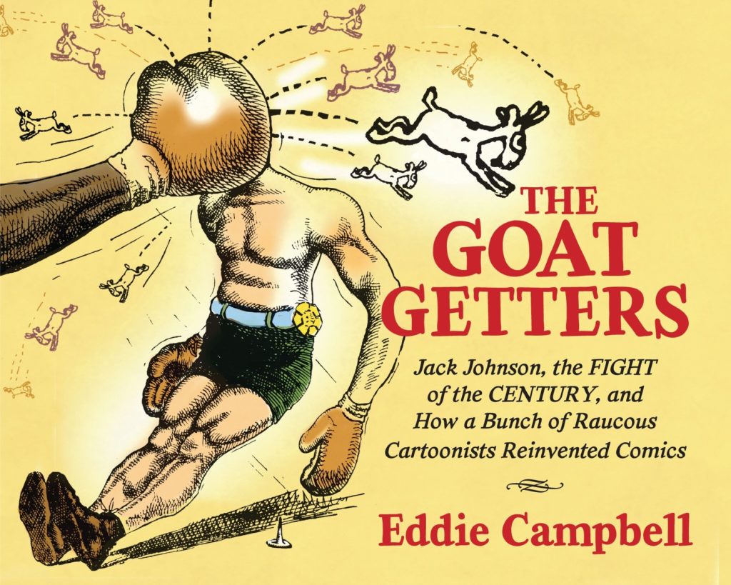
Eddie Campbell isn’t just one of the medium’s greatest cartoonists, he’s one of its best writers. In this heavily-researched book (shout-out to Columbus’s own Billy Ireland Cartoon Library and Museum!) Campbell explores a largely-forgotten genre of the early days of North American cartooning: sports cartooning. Much like other now-brushed aside corners of cartooning–“funny animal” comics, romance comics, etc.–sports cartooning was incredibly important to the development of the medium and Campbell’s tracing of sports cartooning’s origin and influence is fascinating. 

Witch Hat Atelier, vol 3 – Kamome Shirahama
Becoming Dr. Seuss: Theodor Geisel and the Making of an American Imagination – Brian Jay Jones

Fuzz & Pluck: The Moolah Tree – Ted Stearn

I’m not sure why it took me so long to get around to reading The Moolah Tree. Ted Stearn–who sadly passed away this year–was a fantastic cartoonist. He didn’t put out work very often, but when he did it was always amazing stuff, and this (unfortunately) final installment of the Fuzz & Pluck series is, in fact, amazing. As with all of Stearn’s work, a lot of the appeal is the story’s subtle mixture of humor and pathos. The Moolah Tree is maybe a bit more amiable and less overtly bizarre than the two earlier collections, but with the scales tipped in that direction, this book has an abundance of heart and charm that puts it in my definite top five reads of 2020–Ted’s art here is the best he’s done by far.  

A Bride’s Story, vol 6 – Kaoru Mori
The Graphic Novel an Introduction – Jan Baetens & Hugo Frey
Word of Edena – Moebius
Schulz and Peanuts: A Biography – David Michaelis
Free Shit – Charles Burns
Reincarnation Stories – Kim Deitch
A Gift for a Ghost – Borja González
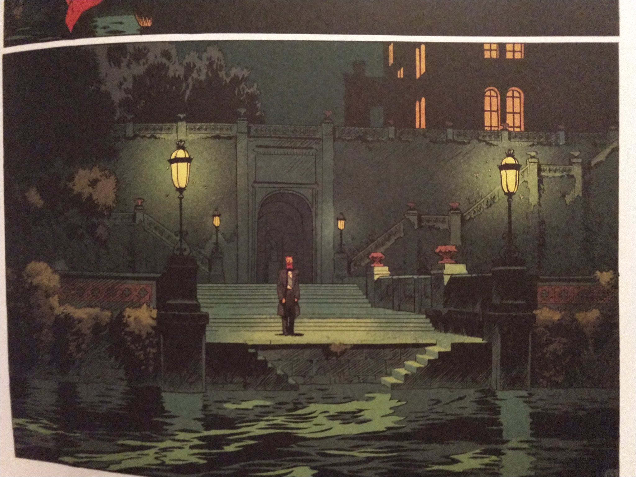
Corto Maltese, The Ethopian – Hugo Pratt
The Columbus Scribbler, #4, #5 – Various
Pathways to Fantasy – various
Cartoon Monarch: Otto Soglow & The Little King – Otto Soglow

Avec Hugo (FR) – Silvina Pratt

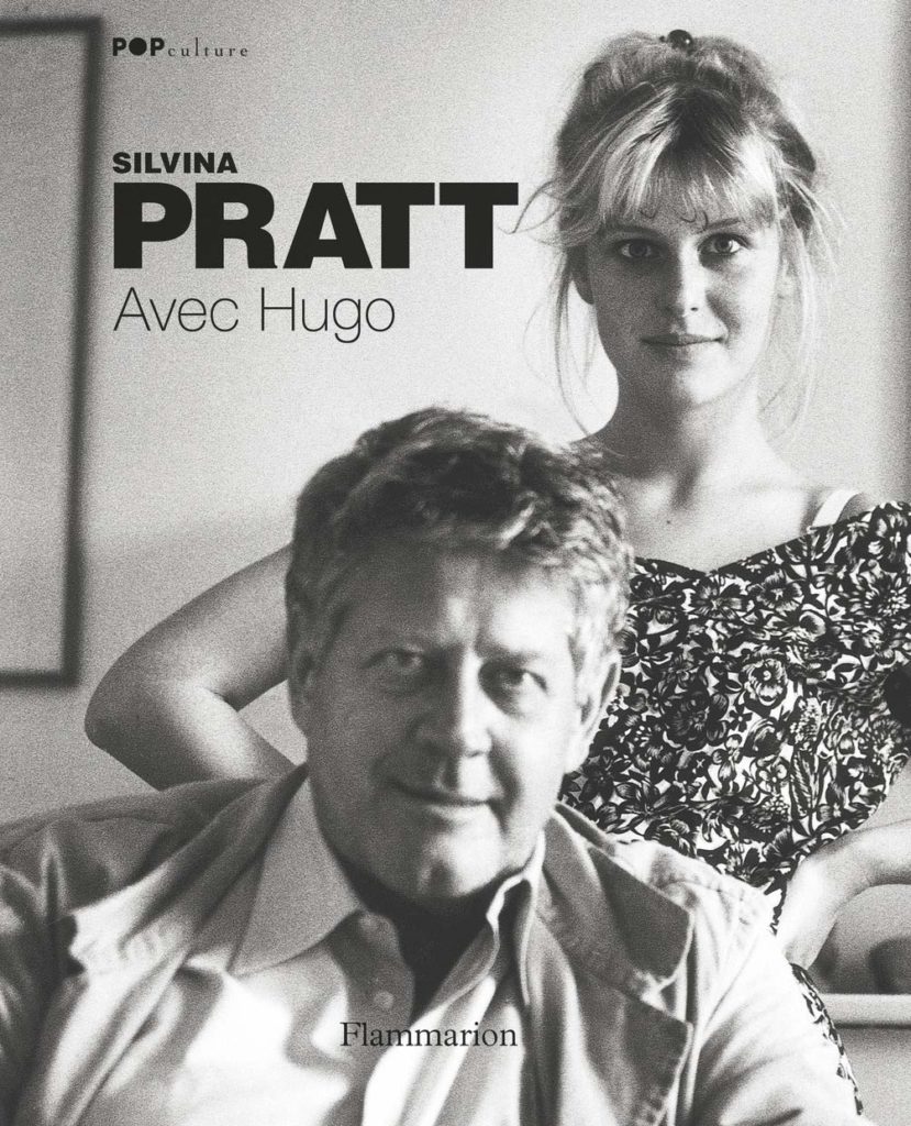
I probably wouldn’t have finished this if it weren’t for the benefit (hopefully) of getting some practice reading French. This book, written by his daughter Silvina–and ostensibly a memoir about cartoonist Hugo Pratt–isn’t bad; there’s just not that much information in it about the one thing you most want to know about in reference to Hugo Pratt: Corto Maltese. I definitely learned some things about Pratt’s life and career that I didn’t know before (a few of them things I wish I didn’t know, to be honest) but there’s really only passing mention of the nuts and bolts history of Pratt the cartoonist and of the evolution and history of his life’s work with Corto.  We (still) really need a good biography of Hugo Pratt.

Daniel Clowes: Original Art – Daniel Clowes

I own exactly two of these giant “artist edition” books (I wish I owned more, they’re just kinda pricey) but this is one that I considered a must-buy. If–like me–you’re a semi-obsessive Clowes fan, hear me now and believe me later: suck it up financially and buy this. Not only will you (like me) spend weeks going through this page-by-page just gawking at Clowe’s linework and speculating about every pasted-on head and whited-out mark, but you’ll marvel at the obsessive production values of the book itself–could it be otherwise with Daniel Clowes at the helm?

House of X/Powers of X, X-Men #1 – #8 – Jonathan Hickman
The Winter of the Cartoonist by Paco Roca
Kerry and the Knight of the Forest – Andi Watson

Paul at Home – Michel Rabagliati

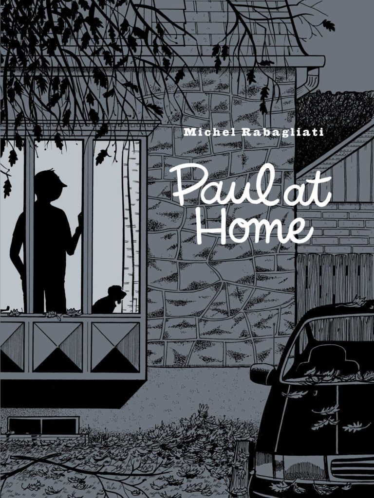
Another on of my faves of 2020. (Ok, ok, I guess I do have a “top four” at least: Rusty Brown, L’age d’or, Fuzz & Pluck: The Moolah TreePaul at Home.) The cartooning here is incredible–but at this point that’s “par for the course” from the amazing Michel Rabagliati. What most people seem to be noting about this book is the (supposedly) more dour and bitter tone–but, honestly, that’s not how it read to me. Perhaps it’s because I’ve recently been through a few of the major life events that the titular Paul from the series has just been through when we join him again in Paul at Home, but a lot of the things reviewers are citing as examples of this new, grouchier tone seemed to me to be being played for laughs–perhaps because I’m recognizing them as hilariously spot-on. (And, I’d also probably argue that the previous volumes of the Paul series aren’t really as happy-go-lucky and wistful as we often recall them to be.)

Les Cahiers de la BD, #6, #11 (FR) – ed. Vincent Bernière

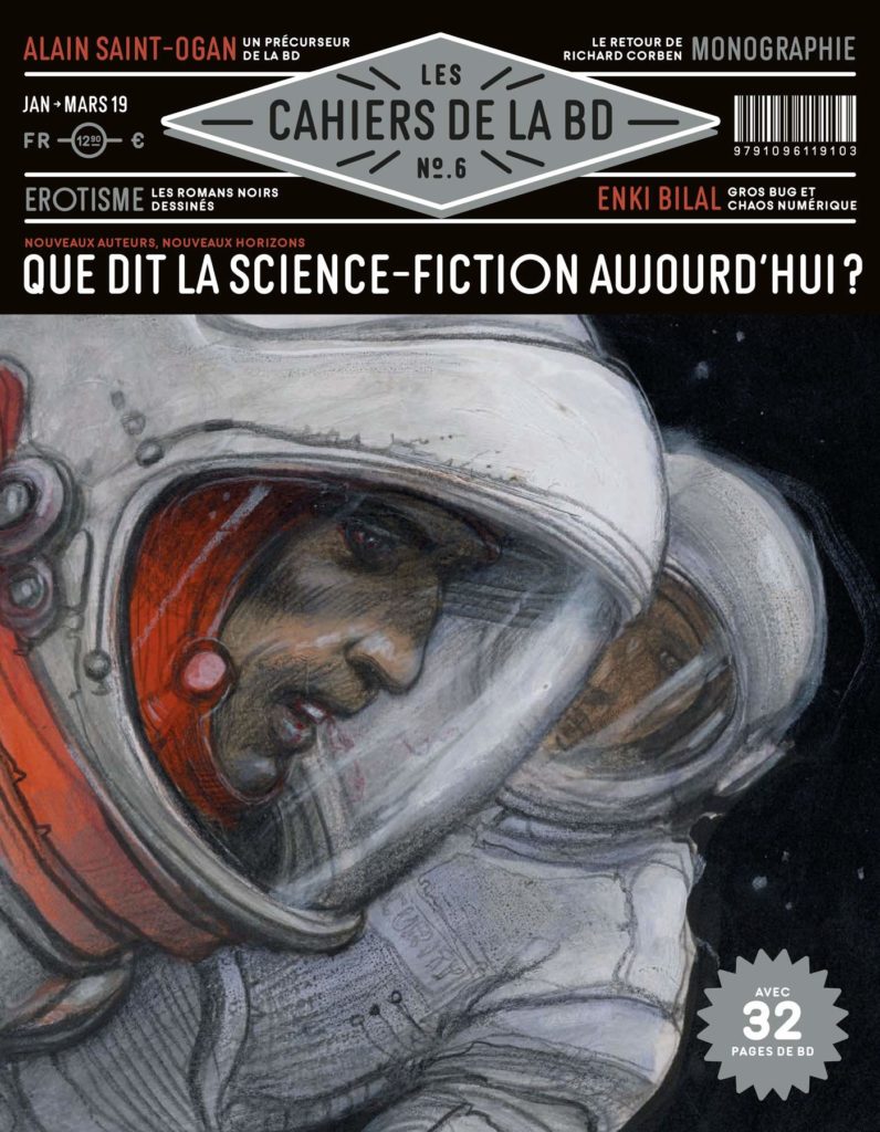
In 2020 I went ahead and subscribed to this French comics mag and from the few issues I’ve read so far, I can say that I wish we had a print comics mag like this in the U.S. (Do we even have a general interest comics magazine at all?) Far more substantive and less goofy than something like Wizard, but not as stodgy and insular as The Comics Journal, Les Cahiers de la BD is sort of the comics equivalent of something like Spin or Mojo at their best–the closest English language analog I can think of is the sadly long-gone Comic Art magazine.

Death to the Universe: The American Mainstream – Matt Seneca

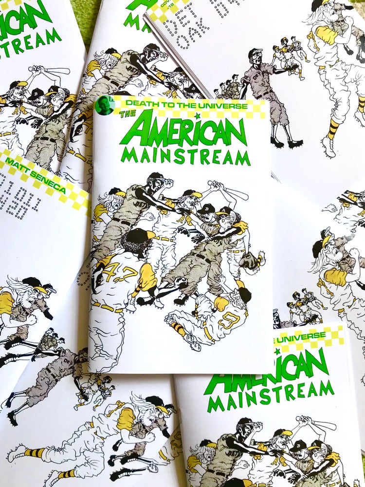
If you can get hold of this collection of comics writing by Matt Seneca you should (it’s sold out online, as far as I can tell). Seneca’s a great writer of comics criticism/analysis (you may know him from the Comic Books are Burning in Hell podcast) and the premise of this collection is fascinating: he’s examining the medium by looking at a series of seven commercial failures–dollar bin finds featuring some of the greats like Kirby, Wood, Ditko, and Toth.

Les Beaux Étés, Tome 3 – Mam’zelle Estérel (FR) – Zidrou and Jordi Lafebre

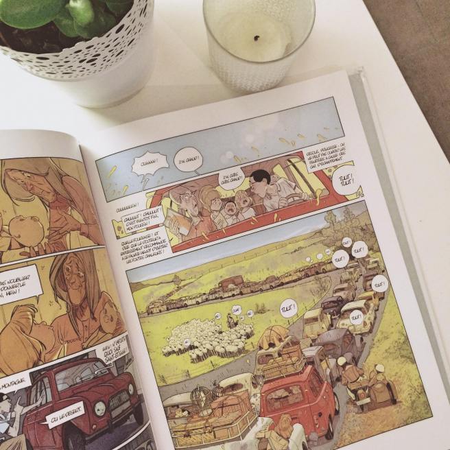
While story-wise this volume doesn’t pack anywhere near the emotional heft of the first installment, it’s a bit more substantive than the previous one. But, honestly, the reason to read this is Jordi Lafebre’s gobsmacking artwork. Pretty much no one working today has the mastery of facial expression, gesture, pose, and character design that Lafebre does. He’s easily one of the ten (five?) best working cartoonists today. Note: these are available digitally in English from Europe Comics. 

The True Origin of M.O.D.O.K.

As you may have heard, there’s going to be a stop-motion animated Hulu series starring Marvel’s M.O.D.O.K. Reading this news, I was struck by how it’s just de rigueur accepted that M.O.D.O.K.–once a “serious” Marvel villain (first full appearance: Tales of Suspense #94 – ed.)–is now a jokey semi-ironic gag character, a character that might, ya know, show up in an animated series voiced by Patton Oswalt.

…or be featured on merch like coffee cups (sadly one tiny foot on mine has chipped off): 

…or–somewhat horrifyingly–be available as a high-dollar statue you can have your own (giant) face 3-D printed onto:


This idea of “jokey M.O.D.O.K.” has become so endemic that  I wonder if the general Marvel property-consuming public has any idea that this entire modern semi-ironic M.O.D.O.K. phenomenon has its origin in one very specific event: a self-published zine from 2004 called The Journal of M.O.D.O.K. Studies.

I wrote a bit about the then-relatively-recent rise in M.O.D.O.K.-ery way back in 2007 for the no-longer-with-us comics news site, The Pulse, and interviewed the creator of The Journal of M.O.D.O.K. Studies, Robert Newsome. Given the likelihood of a new wave of M.O.D.O.K. interest, I thought now a good time to post that long-404’d article here to my blog. I’ve abridged the article somewhat, but here you go: 

There’s a whole lot of MODOK going on.

George Bush’s approval ratings may be in the pits, but MODOK’s cultural cache has never been better. Ten years ago, if you’d asked your average fanboy who MODOK was, you’d have been met with a blank stare, but these days you can’t swing a dead cat in your local comics shop without hitting some kind of MODOKery. This once obscure Marvel villain, spawn of Kirby and Lee from a 1967 issue of Tales of Suspense, is now the cock of the walk in the Marvel universe, featured in the recent All-MODOK Ultimate Avengers issue, in which the entire Avengers team become “MODOKs”; starring in his own miniseries, MODOK’s Eleven; getting off one of the bawdiest gags in Marvel’s history in their recent holiday special; and even appearing as a Marvel Legends “build-a-figure,” available only as a piece-by-piece collectable, packed in, one appendage at a time, with other figures.

MODOK’s newfound stardom isn’t confined to the hallowed halls of your local “Android’s Dungeon” comics shop, though. Wandering the isles of indy comics festivals like SPX or MoCCA these days, it’s not unusual to overhear alt-comics hipsters expound upon the virtues of MODOK with the same studied reverence with which they discuss the latest offerings from Top Shelf, Fantagraphics and Drawn and Quarterly. MODOKery has even oozed out of the seedy world of comics nerddom into the (relatively) mainstream world of animation: The Toonami series Megas XLR features an obvious MODOK homage (albeit one with the face of Bruce Campbell) and Disney has even gotten in on the act with their own faux-DOC., Technor, from their series Teamo Supremo.

So, you may ask, “Just who in the heck is this cause célèbre, MODOK?” Let us, as Lewis Carrol quothe, “begin at the beginning.”

As mentioned, MODOK is—like pretty much everything else cool in superhero comics—the creation of Stan Lee and Jack Kirby. He first appeared in Tales of Suspense in the late 60s and has reappeared sporadically since then, usually to receive an eventual beat-down by Captain America (God rest his soul, supposedly), Iron Man or occasionally the entire Avengers team. If you want to immerse yourself further in MODOK’s history in the Marvel universe, you can find out plenty online, but that’s not really necessary if you’re seeking just to understand MODOK’s appeal; all you’ve got to do is have a look at the guy:

You see, MODOK is an enormous head in a floating chair. He’s a Mental Organism Designed Only for Killing. And also he has little baby-lookin’ arms and legs. And he shoots some kind of ray out of that weird disco amulet-thing he wears on his head. And he’s got a pompadour. Did I mention he’s an enormous head in a floating chair? As the Comics Journal’s Dirk Deppey put it, MODOK’s “so bizarre [he’s] cool despite actually being really lame.” And therein lies the secret ingredient to this recent MODOK revival: a healthy dose of good, old-fashioned, post-modernist tongue-in-cheek irony.

The catalyst for MODOK’s rise from semi-obscure B-list villain to giant-headed belle of the ball was surprisingly obscure: a fanzine—or ‘zine’—from Athens, Georgia called The Journal of MODOK Studies published in 2004 by a supposed “George Tarleton.” Why supposed, you ask? Consult your Official Handbook of the Marvel Universe, folks—George Tarleton is MODOK’s real name, and an obvious pseudonym/homage from the scholar behind this “journal.”

The Journal of MODOK Studies—or JOMS as it’s known among the faithful—was an obvious labor of love. Printed on a photocopier, its old skool cred was evidenced by the still faintly visible lines around its pictures and blocks of text, betraying its literally “pasted up” nature. And of course, as its name makes clear, it was devoted to all things MODOK. What’s important about this publication isn’t just its single-minded devotion to MODOKery, though, but rather, that singular vision in combination with its tone: a half awed, half mocking ironic zeal focused on a subject that couldn’t have been more deserving of such treatment, a Kirby/Lee creation that was graphically half genius and half idiocy.

The Journal of MODOK Studies was published in the winter of 2003 and, as mentioned, was clearly a labor of love; according to the indicia, “MODOK is really awesome and this journal is only published because of this awesomeness, and not through any desire to make money…” This first issue begins with a play-by-play narration of MODOK’s original appearance in Tales of Suspense, then moves on to a piece supposedly reprinting the diary of a hapless food service employee recruited by MODOK’s parent organization, AIM (don’t ask). Included as well are MODOK pinups by a number of artists, including Johnny Ryan, Drew Weing and Patrick Dean—as well as a Bob the Angry Flower cartoon by Stephen Notley which introduces the character MODOKMODOK (Mental Organism Designed Only for Killing MODOK). To anyone prescient enough to have been onboard the hovering MODOK bandwagon at this stage, JOMS offered the following congratulatory remarks: “You are to be commended for your interest in MODOK which has lead you to this publication, and if you’ve found the Journal and do not posses such an interest, it is our hope that this publication will create this interest, and a love of MODOK in you.”

And indeed it did—for me and for many others.

The Journal would publish its third issue—and last to date—in 2004. By that point, though, its mission was largely accomplished; the gospel of MODOK had been launched and MODOKery was spreading like a benevolent pestilence. How is it, though, that a humble zine could launch such a revolution? MODOK himself is clearly the catalyst—but to what specifically can one attribute his appeal? Rather than simply speculate, I contacted “George Tarleton,” real name Robert Newsome, of Athens, Georgia, to ask him about the genesis of the Journal and about his enthusiasm for all things MODOK:

BT: What possessed you to create a zine devoted to the “study” of all things MODOK?

RN: MODOK is awesome. That should be all I need to say, because, just LOOK at that guy… But there is some background. My post-college roommate and I had a couple of the MODOK action figures from the Iron Man cartoon around the house and I couldn’t stop looking at the things. [MODOK] really is, I think, one of the best character designs in all of comics. So I kind of developed a mild obsession (if that’s possible). But at the time, there really wasn’t a whole lot of MODOK in the Marvel Universe. I started collecting all the MODOK comics (even the really BORING Sub-Mariner 3-issue arc with MODOK and Dr. Doom) as well as the appearances of MODAM, Ms. MODOK and SODAM. Really. I’d been working on other ‘zines, but I’d gotten sort of bored with them, so I decided to put the MODOK habit I’d developed into print. It just seemed like the right thing to do.

BT: What is the secret of MODOK’s appeal?

RN: Ridiculous Kirby character design. I honestly believe, without the irony that saturates so much of people’s appreciation for comics, especially comics of the ‘60s, that MODOK is one of the most interesting character designs in the Marvel Universe. When you look at him, you’re just drawn in. Why is his head so big? How did he get that chair? Can he brush his teeth? Who made that snappy headband? I found it impossible to look at this guy without wanting to know more.

BT: I’ve heard that you distributed free copied of the Journal to everyone at the Marvel Comics booth at the San Diego Comic-Con. What kind of reaction did you get?

RN: I had distribution through Last Gasp, and people writing me from all over the country, but I couldn’t get one to Marvel. All the copies I sent to them were returned unopened. Maybe they thought it was an unsolicited submission… I don’t know. I wanted them to see it, though. So I went to the Marvel booth at the San Diego Comic Convention and just gave one to everyone working there. I’m not sure they knew what was going on, they all looked pretty confused. Nobody from Marvel really said anything.

BT: Do you credit yourself with the current MODOK revival, and if so, do you have any plans to deservedly exploit the situation for your own benefit?

RN: Yeah, I’m taking credit for it. I know that it’s entirely possible for someone with more influence at Marvel to have noticed MODOK’s brilliance independent of my work, but nothing exists in a vacuum, you know? Plus, I placed enough phone calls to the poor receptionist at Marvel asking if he/she knew what MODOK stood for (nobody ever did) that somebody had to say SOMETHING, right?

I’m thinking about doing another issue soon, but I’m not sure what would be in it. There’s certainly enough out there to write about even without the modern MODOK revival, like the two novels featuring MODOK, or the time Jack Kirby just totally forgot how to draw MODOK, and I still haven’t done my all-MODAM issue!

I was unable to pin Robert down on a date for a possible next issue of The Journal of MODOK Studies, unfortunately, but I believe I speak for fans of MODOKery everywhere when I say, I hope it’s sooner rather than later.

And here’s a small gallery of images from the three issues of JOMS, including comics by Johnny Ryan and Patrick Dean:

As a final note, I’d be remiss if I didn’t pat myself on the back and point out that I was one of the earliest “converts” to The Church of the Semi-Ironic M.O.D.O.K. Shortly after the publication of The Journal of M.O.D.O.K. Studies, I did a kinda-autobiographical minicomic about teaching a summer art program during which the students became obsessed with M.O.D.O.K. In it, I appear as “a M.O.D.O.K.” 

You can read the whole thing here


Is the Cover of Detective Comics #1029 Derived from a Series of Fan Commissions?

I may be wrong–and please correct me in the comments if I am–but I believe this recent cover, the cover for Detective Comics #1029, is the first time a fan commission has (kind of) made it to the cover of an actual, published Marvel or DC book.

So, re. “kind of,” some caveats: first, the cover itself isn’t a fan commission, but the basic premise–a villain seated in front of a “trophy wall” of his vanquished adversaries–is. And that basic setup isn’t just from a single fan commissioned piece, it’s derived from a well-known original comics art collector’s very impressive themed collection of “trophy wall” commissions. 

The other caveat: yeah, it’s possible this is a total coincidence… but that seems unlikely. 

So, what about this themed collection? The owner and instigator of this collection is Chris C (I know his last name, but that’s how he appears on ComicArtFans.com, so that’s how I’ll refer to him) and you can see the very first such commission–by none other than Brian Bolland–from 2005 here on his ComicArtFans page

From the description on the page, it sounds like Chris came up with the idea and submitted it to Bolland along with a bunch of other possibilities, but that it was Bolland who ultimately chose the trophy wall premise from among those submitted.

I gave Brian a host of ideas for this piece and he picked the most “out-there” and graphic of them all. I was concerned that he would think it too macabre but he took to it like a fish to water. When you have a living legend of an artist who gets excited about a piece he is working on this is what you get….I am beside myself.

A Bolland original is amazing enough in its own right, but Chris C then apparently began commissioning pieces with the same basic setup from tons of artists. If you go to Chris’s ComicArtFans main page and scroll down to the bottom you’ll see that he’s currently got six pages full of them! It looks like there are about a hundred currently listed.


Chris has even purchased an original Ernie Bushmiller Nancy strip that features an a trophy wall gag:

Interestingly, the cover artist for Detective #1029, Kenneth Rocafort, doesn’t appear in Chris’s list of trophy wall commissions. I wondered if maybe he’d done one for Chris and then reused the concept for the Detective cover.

Back to the Joker commission… if it seems vaguely familiar to you, it might be from seeing this amazing cosplay of the image that was making the rounds a few years back. That’s all the same guy, just photo-collaged together. (I have no idea who colored the original commission image on the right or where that came from.)

You may be wondering: why the heck do I know all this back-story about trophy wall commissions, etc.? Well, it’s because I’ve done one. Here’s mine. The artists are given some leeway in their choice of villains to focus on and if I’m remembering correctly, I started off trying to work up an image with The Owl, who’s one of my fave Marvel villains. For reasons that I can’t remember now, that didn’t work out, so I went with another personal fave: Dr. Octopus! 

And you may notice, true believer, that Doc Ock’s still got a thing for Aunt May. 

(The perspective on that framed picture is wrong and it’s bugged me for twelve years!)

As for how Chris C’s venerable “trophy wall” theme made it to the cover of a major DC title: my guess would be via the fairly well-known Bolland piece, but who knows exactly? 

UPDATE #1:

Twitter user Ken Raining pointed out that a somewhat similar premise had been used by John Byrne for a cover of Namor The Submariner… in 1990! This is, though, to my mind only really a surface similarity. The villain here is The Headhunter and the heads here not heroes that are her now-slain adversaries, but just regular ol’ victims–and actually alive with just their heads protruding through the wall apparently. Obviously, we’ve also not got the trademark casually-seated-in-a-chair pose. I’d personally chalk this one up to coincidence rather than there being any real connection between this cover and the Bolland piece that latter appears. Still, though, maybe it’s possible that Chris or Bolland had seen this and it was in the back of their minds when the original commission came together.

(And is that Craftint on that Byrne cover? Be still, my heart!)

UPDATE #2:

Joe Grunewald (of The Beat) has made me aware of this interesting tidbit, that’d I’d never heard about before. (Surprising, since I’m a tremendous Walter Simonson fan!). Apparently the cover to Batman #366 was originally a piece that Walter Simonson had done as a sort of thank-you gift, but which wound up being used as a cover at the insistence of editor Len Wein back in 1984. So, not exactly a fan commission, if we want to get nit-pickey, but definitely an earlier instance of something pretty similar to the “trophy wall” scenario. You can read more about it here.

Here’s the original piece and the cover as it appeared: